My Idea, Purpose and Audience (1)

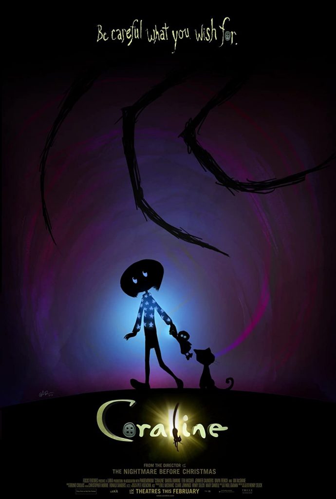
My business idea that I have chosen is that of a book cover design service, titled “Creator to Cover”. The idea for this service came to me when I was talking to one of my close friends who is an author, and she was talking about how it’s really hard to create covers for her books because she doesn’t necessarily have the skills for it and there aren’t really many options out there for custom covers that she could create. Her first book cover she asked a friend to create a simple art piece for her and then took this into Microsoft Powerpoint and added some text on top of it to create the cover. This was not the most efficient way to design the cover and it didn’t quite yield what my friend imagined at the start of the process. My idea would allow authors to get personal design advice and help with their book covers all in one place to help ease the process of this important design choice.

On this site I envision there to be a base form to fill out with information on the plot of your book that is relevant to your desired cover, the title of course and the genre of the work. Along with this there would be a place to submit files and images, be it a sketch you made of a general idea, some art work you had commissioned for your work, some reference images of the style you are going for etc. This information would then be taken and reviewed and some simple designs would be made. The author could then chose one of these they like most to be brought to the final design. A proper final design would then be made and the author would receive this new cover for their book. This service would of course be paid and a discount could be given for purchasing design services for multiple books in a series at once. I see “Creator to Cover” becoming a go to place recommended by freelance authors for their design needs when it comes to creating their book covers.

In addition there could also be a possibility of a cheaper however less personalised service on the website. I feel like this would be an additional point of sale to add to the site later on to bring in more varied audiences with differing budgets. This would be much like a design tool, with pre-made text and images (or alternatively an option to import their own images) that could be chosen and your title and information added to it. As this would be less personal and more generic it could cost less than a fully custom cover and could be a good option for authors on a lower budget. This would be a good idea as then there are two points of sale at the business allowing for people who want to spend a little or a lot being catered to.

I also think there is the option of having people design for the site, or even sell base designs on the site all in one place. This would be more like a Redbubble type of site where creators create the content, upload it and the site is the host. There are already individuals providing this service and having it concisely shown on one helpful website could help them garner sales of their work. This could be a future expansion on the idea for once it is established and consequently more designers could be hired to further produce content who are adding impressive work to the site. There are many other areas of expansion this business could encompass, such as possibly opening its own design and print on demand publishing business and other such large scale ideas.

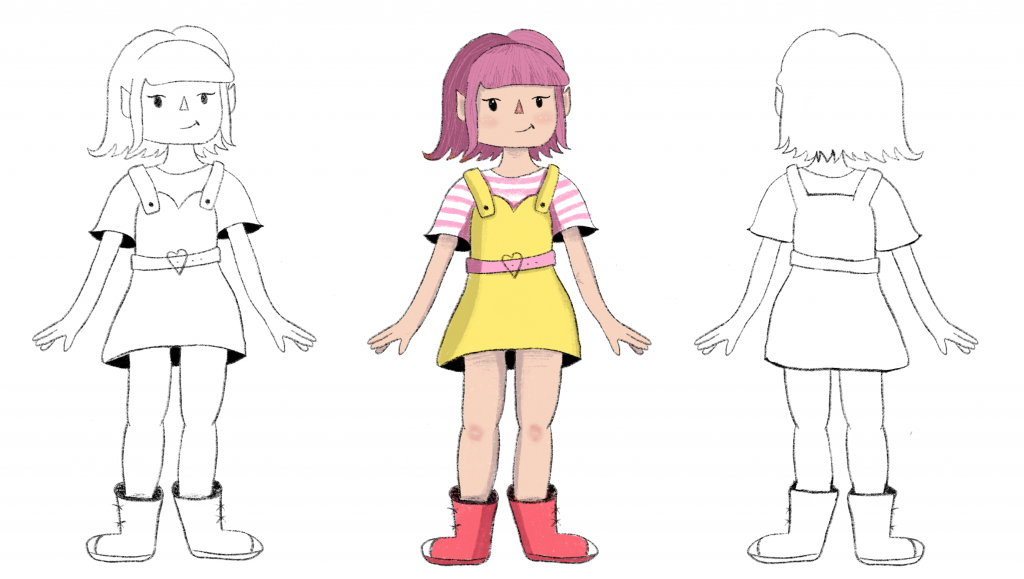
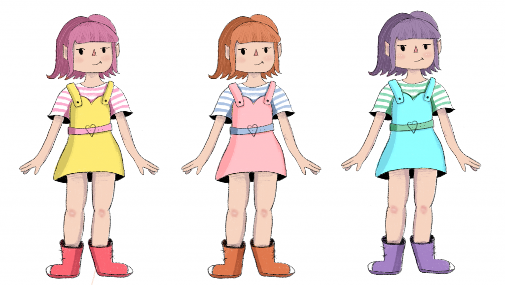
This business idea is something I find really interesting and to be something that I am passionate about. In college I had a final major project which allowed us to chose whatever we wanted, mine became redesigning some of my favourite books as illustrated covers. I really enjoyed this process and it was something I like doing, so if I had to create a business I do think that an idea centring about books and the publishing industry is something that I would realistically like to be involved in. I think this would be an idea that would interest smaller publishing companies and independent authors alike and would change the industry having easy design all in one place.

.

Micro-Macrocosm

For this concept of Micro/Macro I decided to use this poster from “Kubo and the Two Strings” (2016). Micro/macro is a concept created by Tufte which allows the designer to add smaller details which allows them to another layer of detail to an overarching design. Tufte can be quoted saying “to clarify, add detail” (Tufte, 1990), showing that a design can be emphasised by adding micro details that make up the whole macro image and add understanding.

Within this poster there are many uses of this concept and smaller details that may at first go unnoticed but add more complex information to the poster. One instance of this can be seen when looking closely at the group of characters. The furthest two appear to be carrying weapon whilst the closest appears to be carrying an instrument, this gives you more information about this character and his role in the film of being a more peaceful, relaxed character. The statue in the image you can see is buried in the snow, at first glance it just appears to be this but on further inspection you notice the broken sword and the battered nature, showing its age in relation to the characters and the broken sword could link with the themes of violence and peace. The moon also when looked at closely shows a clouded monstrous shape, adding information about the possible antagonist. The poster as a whole just shows characters venturing through a snowy landscape but with looking at the micro details you can recognise more information about the plot of the film and clarify information about it’s storyline. This poster also uses layering and separation to break up the focal points of the poster and add emphasis to important parts such as characters or the title.

Reference:

[1] Tufte, E., 1990. Envisioning Information. p.38.

[2] McGovern, J., 2016. Kubo And The Two Strings Trailer, Posters Debut. [online] EW.com. Available at: <https://ew.com/article/2016/07/06/kubo-and-two-strings-trailer-posters/> [Accessed 3 November
2020].

Layering and Separation

For layering and separation I found this poster from the animated movie Missing Link (Laika Studios, 2019). From what I understand, this Tufte principle is about combining design elements, pushing parts into the background and bringing others to the front to give separation of information. This helps to separate the important information into a layer in the design of its own and allow it to be highlighted. I think this poster could also show comparison of small multiples because it has the characters centralised in one location so the viewer can compare and contrast their designs together along with the foreground elements in the water able to be compared together.

Below is the example I have chosen and a version of it which I drew on guidelines to highlight some of the more obvious layers in the poster that I can see. In this poster the title and actors names are in the foreground of the design and are meant to be a promenant part of the design. However as you can see in this poster the characters are also a focal part of the design, shown on separate layers of the poster. The largest character is the main character of the movie and the two smaller ones, on a similar layer within the design, are the secondary side characters within the film. I think this is a clear use of this tufte principle as it shows the important information well and allows the viewer to garner information about the characters from their prominence and separation in the poster. There is also a layering effect with the mist used in the poster to add the background, mid and foreground layers of scenery to the poster. These are separated by this clouding mist element in the design which I think works really well.

References:

[1] Butler, C., 2020. Missing Link (2019) – Movie Posters (1 Of 2). [online] Joblo.com. Available at: https://www.joblo.com/movie-posters/2019/missing-link/image-35192 [Accessed 26 October 2020].

My Developing Idea

This is the idea I’ve had so far. I made the sketch above whilst just drawing to see what would happen and I ended up really liking the sketch on the left and taking it further. I drew the back and then a colour version to help visualise my developing idea.

I think the back story that I was coming up with when drawing this character is that of an elf girl who leaves her realm to come to the human world because she thinks it looks interesting and fun. I think she seems really fun loving and adventurous and that she would be really excitable. I think a good target audience for this could actually be children because it is a fun fantasy storyline and my art style is also quite childish at times. When drawing her clothing I was thinking about her personality and was thinking she seems really cute and fun loving and that her clothes should express that, so I chose yellow as the main colour and some j-fashion-esque clothing. J-fashion in my experience is all about having fun and being cute so I thought it fit well.

Narratives over Space and Time

For this blog post, due to my subject being animated films and subsequently film posters, I picked this poster from the 2012 movie “Paranorman.” Thistle poster fits this Tufte principle well. First clearly in the poster they are travelling in a car, from the angle of the car and the character’s reactions and clothing you can deduce that they are moving at great speed towards the “Camera”, showing the passage of time and letting you predict in your head what will happen next.

I believe this principle of time and space being shown can also be shown from the pun used at the top of the poster. This adds another element to the motion already seen in the poster and is a pun on the phrase “full steam ahead” which is usually used to say something is going really fast. This works in conjunction with the motion seen by the characters to give a sense of sequence to the poster and the poster as a whole helps you to infer the plot of the film.

I think this poster shows good progression of time and space, it also emphasises this concept by being a movie poster in itself, as movies are set over a period of time and a story is told. I believe it is also made apparent in the zombie character on the right who can be seen holding onto the car flying backwards. You can infer from the angle and the motion created by the car, the speed and that this character is barely clutching onto the vehicle. Overall I think this is a good use of this principle to my understanding and I think it’s executed well.

References:

[1] Cinematerial.com. 2020. Paranorman. [online] Available at: https://www.cinematerial.com/movies/paranorman-i1623288/p/cdxaqw0k [Accessed 19 October 2020].

Comparison of Small Multiples

For this post I decided to write about another Stop Motion movie by the creators of Coraline, Laika Studios. I find these movies created by the studio and their subsequent posters very interesting which is why I did not just stick to Coraline but expanded to more of the movies created by the same team.

In these posters I can see the use of the principle of small multiples being used by the characters on said posters being together and in close proximity to each other. This principle is used to show the difference between similar graphics, in this case the characters, especially the trolls in this instance. Having them be all clustered together in one area and all included on the poster allows the viewer to compare and contrast the characters and see the differences between their designs. I think it works really well in these posters that Laika Studios made and that it helps you to differentiate these new characters and get a sense of what they are like and how they are unique. It really allows you to compare not only the design but also the facial expressions of the characters, allowing a sense of their personality and reactions to come through.

The first poster does a particularly good job of using small multiples in my opinion by breaking it down further. In this poster you can see the trolls being on the bottom half and the humans on the top. This allows you to not only compare and contrast each set of characters towards each other but also allows you to compare the groups as well, adding an extra level of visual information and allowing the viewer to perceive and multitude of differences and uniqueness in the designs of these characters.

References:

[1] Movie Poster. 2020. The Boxtrolls – Movie Poster. [online] Available at: https://movieposter.gr/product/the-boxtrolls/ [Accessed 14 October 2020].

[2] Laika Wiki. 2020. The Boxtrolls. [online] Available at: https://laika-entertainment.fandom.com/wiki/The_Boxtrolls [Accessed 14 October 2020].

Creative Industries


(I’m unsure if I interpreted this task correctly)

When looking into and researching the creative industries an entrepreneur, I believe I fit well as a designer and an artist as I spend a lot of time designing for my Red Bubble store or creating art commissions for others. I have a passionate interest in graphic design and am always interested by web design, ui/ux design and branding. Web design and such are big areas within the design creative industry and with an increasingly digital world these industries are in demand due to the rise of online usage and presences.

The more I think about entrepreneurship and the idea of creating a business the more ideas I have. I have been able to think of a second possible idea for a creative business as I started thinking more about web presence and how this could fit with interests that I have. I have a a large interest in publishing and literature (which is a creative industry in itself) and I think for this project I could work to combine both of these areas by making a website design and idea based on design in the publishing industry. Doing research on the creative industries, and looking into the UK Creative Industries site and the links provided, has helped me to think more about what I want to create. Currently the second idea that I have is to make a website for aspiring authors to create and/or request a cover design for their books. This idea came from my interests and the fact that one of my best friends is an author herself and a service like this would have been really useful to her and others in her position.

Below are 3 examples of existing businesses which I admire and use a lot and really love the online presence and design for. I really enjoy more minimal web design which is simplistic and easy to navigate. I find these sites are always easiest to convert from desktop to mobile as well, which is really essential as both are used a lot. I think it is really important to have a simplistic yet well designed base for a website and something that can be themed easily. This is especially important for businesses like the ones below who release new products often as it means the site can be changed and customised for these releases and become something unique and memorable for each collection drop. The use of large creative graphics on these sites below is what draws me towards them and makes them really compelling to visit.

Examples of sites offering advice and examples of Creative Business:

Use of Colour

Tufte talks about how colour can be used as a noun and to measure information and add realism in a design, below are 3 different posters which do show the use of this theory.

In these posters an instance I can see of colour being used as a noun is in the shadows on the posters. The colour black is chosen to represent these elements and is effectively used to show depth and realism and to label them as such. A second use of this is in the sky being blue in the right half of the poster, the sky in the daytime is always associated with this colour and I think this fits to the principle. The colour black is also used as a colour to measure. It measures the quantity of the shadows in the posters, particularly the right one where there are gradients and variation in the shadows to of course show how close or far away they are to the light.This gives information on the distance from the light and measures its intensity. This colour is also used to show dimension as well and add visual depth to the posters, adding realism.

“It is not how much empty space there is, but rather how it is used.”[1] I think this quote adds to the theory as it talks about the use of space and therefore colour usage in design.

Colour is clearly used to enliven these posters, especially the left and middle ones, as the use of the colours purple and blue adds a bright focus to the posters. It makes it more engaging and eye-catching, along with the stand out yellow to draw people in. All of these colours have been chosen specifically to convey the tones of the movie and important visual information.

Reference:

[1] Goodreads.com. Quotes By Edward R. Tufte. [online] Available at: <https://www.goodreads.com/quotes/644974-it-is-not-how-much-empty-space-there-is-but> [Accessed 29 October 2020].

[2] IMDb. 2020. Coraline (2009) – Imdb. [online] Available at: https://www.imdb.com/title/tt0327597/mediaindex?page=4&ref_=ttmi_mi_sm [Accessed 8 October 2020]

[3] Impawards.com. 2020. Coraline Movie Poster (#1 Of 35). [online] Available at: http://www.impawards.com/2009/coraline.html [Accessed 8 October 2020].

Business Idea

Below is the idea that I had for this week’s task to develop an idea for a business that could have value in the next 3 years. My idea was to have a site which consolidates all of the order details and tracking information for online purchases into one site. Online purchases are always increasing, even more so with the pandemic happening this year, and I’d assume people buying things online will only increase over the years. For my idea I’d think the base site could be free allowing you to track a few items at a time with an additional premium subscription that would be a paid monthly amount with additional features. I think that this is a good idea as I know myself sometimes it gets hard to keep track of the status of things I order online, especially when they are from all different sites online. Usually you would have to remember which sites you had active orders from and log into each of them manually to see what the status of any orders was. Having all of this information accessible from one site would be a real time saver to a lot of people. Additionally I envision an app to go along with the site.