Micro- Macrocosm

My micro-marco concept GIF illustrated and created in procreate showing the other elements from my posts together and allowing for a further story to be inferred than that of the characters by themselves.

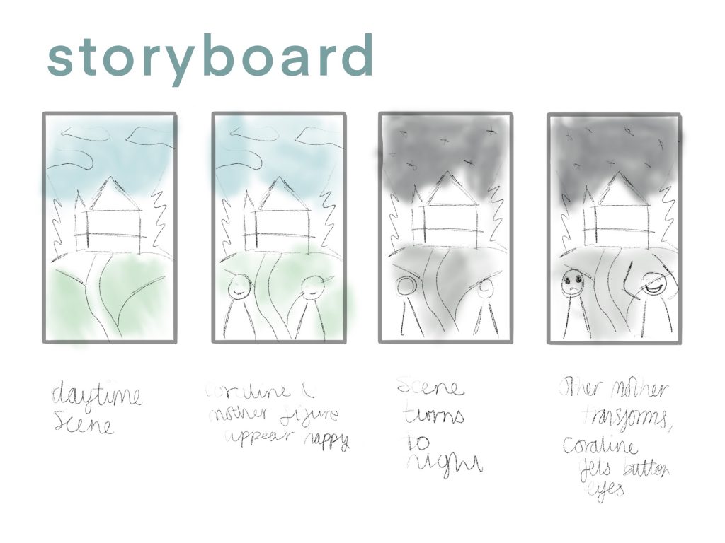
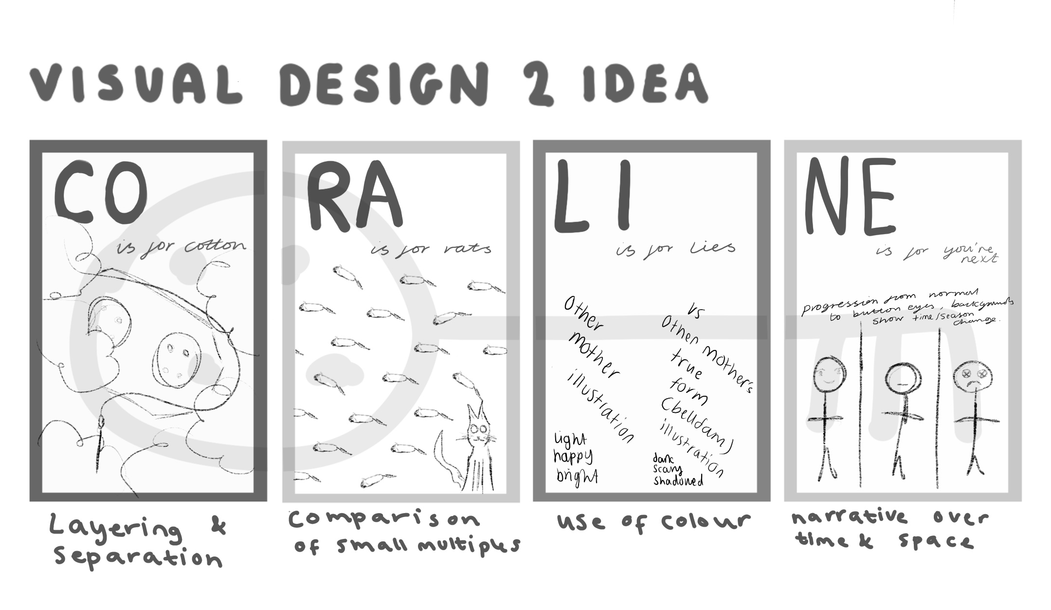
Micro-macro is a concept created by Tufte that talks about how a piece’s individual parts can have a different meaning when looked at all together. For my piece I worked to make sure the elements of my piece combined together in a way that gives another meaning to them which is alternative to the parts alone. To incorporate all of the other theories as well was difficult but I think my short gif outcome is able to work for all the theories and show off my understanding of Tufte’s concepts.

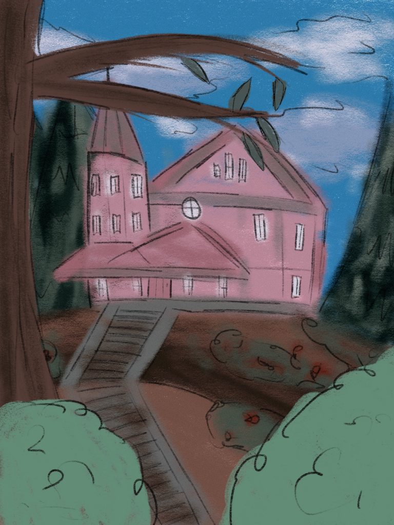
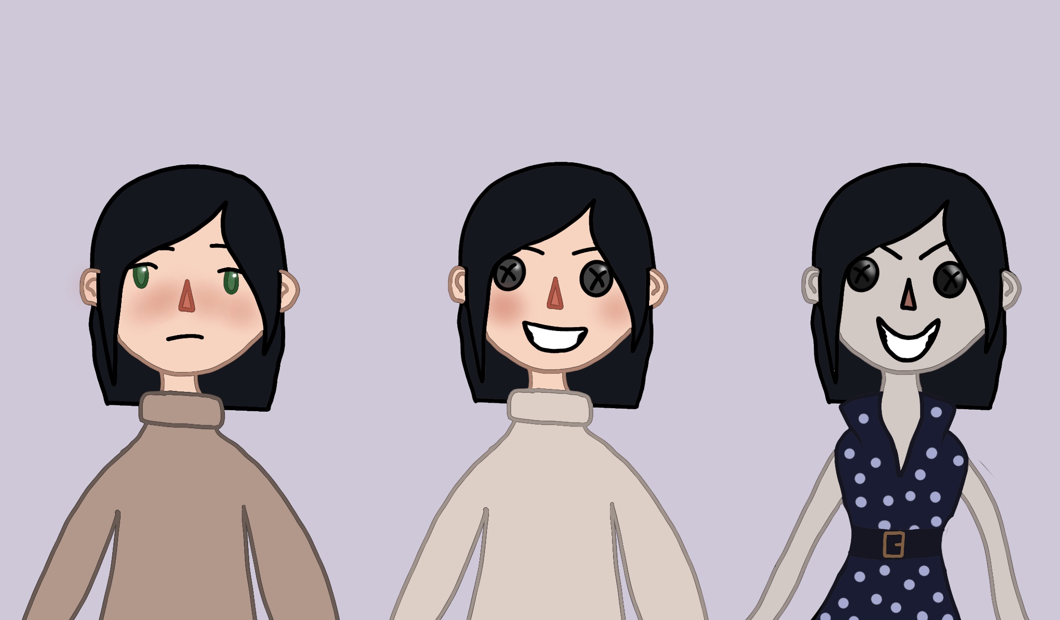
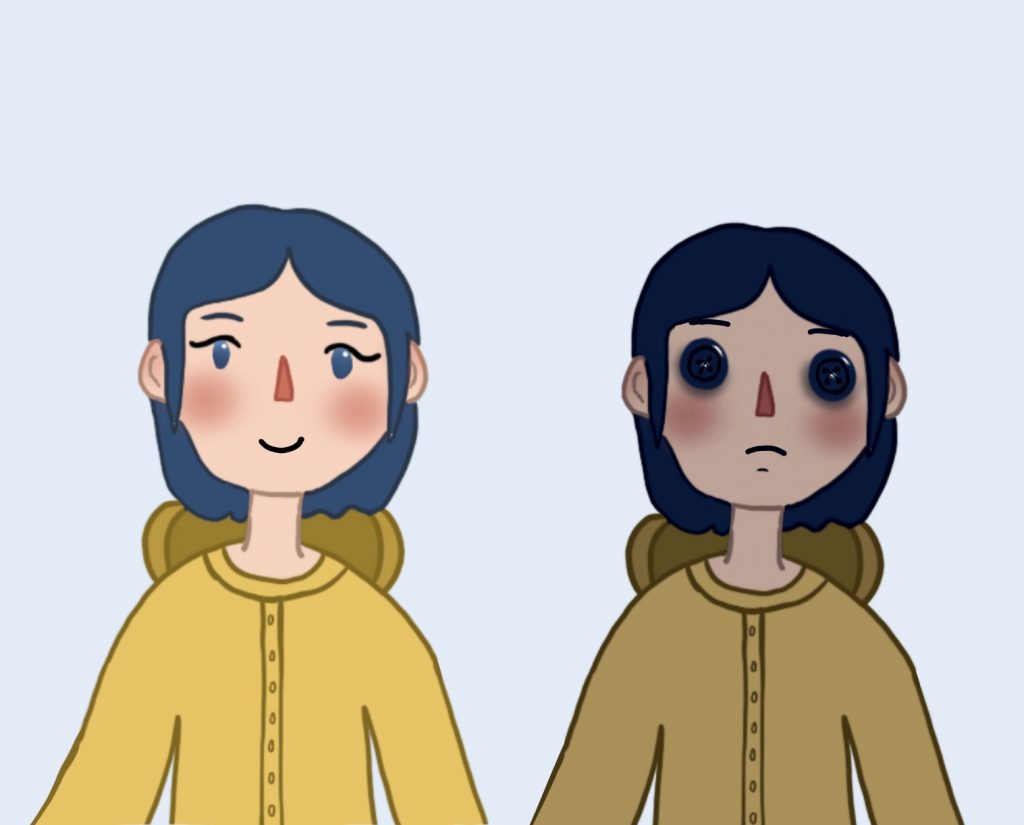
Within my micro-macro piece you can infer different things from each area of the image, the house turning day to night by itself just looks regular, normal, but paired with the other elements in the piece it takes on a more sinister nature and becomes scary and magical looking. The characters separate from each other you can only infer so much from their designs but placed together you can gather much more information about them and their relationship and your opinion on them may change. For example the left character alone could be seen as a scary villain by herself in her end form but paired with the mother figure you can see in the wider picture that she is in fact scared and that she is changed by the mother figure within the story. Seeing the characters within setting context too adds to the wider picture as you can see their influence on the surroundings and how plot and character can be inferred from an overarching image.

Narrative Over Space and Time

For this concept I wanted to create a storyboard for my graphic. I wanted to create something that would feed into my micro-macro piece and be a good element to combine. I decided to make a storyboard for a GIF animation I was planning to make for my 5th comprehensive graphic, this allowed me to plan out the final motion concept in a more illustrative way and better show off the narrative over space and time concept. This concept is graphics which show a narrative within a certain time and a certain space. For this I chose to take the house scene I created and combine it with my characters to show a story and progression of the characters over a period of time and then take this idea and transform it into a storyboard to show the concept off clearly. Within this storyboard I used pencil and water colours to illustrate my layout concepts for each stage and how the time was going to be shown changing and the changes to the characters which would be made, showing a shift in story and capturing an important plot point of the movie that being the descent from good to evil and back. This gif will be looping as well.

Layering and Separation

For layering and separation I really wanted to create a more detailed sketchy illustration of the world the characters from Coraline are based in. I chose to draw the house with some scenery around it as I knew this would work well for this theory. Within the artwork you can see from the layers and colours used the distance from the subject and can get a good sense of scale. The sky and background trees are on their own layer and the house in the middle is separated from them and becomes the focal point of the image as it is central and not as obstructed as other elements in the design. There is also some foreground plants and trees which are lighter in colour to show a different layer and that they are closer and separated from the plants further back in the image. These foreground elements however do not obscure the feature element of the poster. the house, and only serve to add to the depth of the image adding to the idea that the house is in a forest like rural area and very isolated, further bringing it to the viewer’s attention. I envision this design being adapted as the background of my micro-macro graphic and some text being added to add further depth to the image.

Comparison of Small Multiples

For the comparison of small multiples I wanted to make a character illustration of the mother from the movie and her evolution to evil within the plot of the story. She has 3 main forms in the story which I have illustrated here. I think this really shows off the principle of small multiples as it allows the viewer to compare these 3 forms together and contrast them against each other and pick out details and differences and similarities between them all. I created these illustrations using procreate and wanted to show how boring and regular to how strange and evil the mother comes within the movie and compare and contrast these together in one illustration. I think that my character designs are effective at portraying what I wanted to show to do with the character shown, I used differing colour palettes for each one to show off how the mood and feel changes and to add another element of comparison to the characters displayed in my piece. When you compare the multiples in the image you notice large changes along with the small things such as the change in eyebrows and the shift in tones used between the three.

Introduction / Use of Colour

For this project I knew I wanted to create some illustrations to fill a gap in my portfolio and to tie it into my first assignment I wanted to produce movie based ones thereby the content of this project being based around Coraline. I wanted to create something that encapsulated the changing tones of the movie and things that could make interesting illustrated pieces and show my understanding of the concepts.

For the use of colour I chose to do a character study of one of the characters who would appear in my final graphic. I experimented with how colour changes tone and mood and used straight forward colours to show off these elements. Darker shades are mostly associated with evil and sad things whereas lighter shades are associated with positivity and good. The raincoat is yellow as this is how a lot of people will picture one as it is an iconic colour and represents happiness. The black eyes on the right character design show sadness and deep emotion and are able to convey these feelings with only the deep colour used. These illustrations clearly show together the considered use of colour and show how colour can convey meaning and association and speak for itself.

Initial Idea

My initial idea so far for this project is to make 4 collectible posters that can be displayed together as a banner. My idea is to make hand drawn, illustrated posters for the movie Coraline. These will break down the name of the movie (and main character) and take main elements from the story using these 2 letters per poster and show one Tufte principle each. All together these posters will make a banner showing not only the name of the movie but also show the bright and dark in the movie, perfectly capturing the tone shifts throughout the plot. This is all I really have for this idea so far.

Micro-Macrocosm

For this concept of Micro/Macro I decided to use this poster from “Kubo and the Two Strings” (2016). Micro/macro is a concept created by Tufte which allows the designer to add smaller details which allows them to another layer of detail to an overarching design. Tufte can be quoted saying “to clarify, add detail” (Tufte, 1990), showing that a design can be emphasised by adding micro details that make up the whole macro image and add understanding.

Within this poster there are many uses of this concept and smaller details that may at first go unnoticed but add more complex information to the poster. One instance of this can be seen when looking closely at the group of characters. The furthest two appear to be carrying weapon whilst the closest appears to be carrying an instrument, this gives you more information about this character and his role in the film of being a more peaceful, relaxed character. The statue in the image you can see is buried in the snow, at first glance it just appears to be this but on further inspection you notice the broken sword and the battered nature, showing its age in relation to the characters and the broken sword could link with the themes of violence and peace. The moon also when looked at closely shows a clouded monstrous shape, adding information about the possible antagonist. The poster as a whole just shows characters venturing through a snowy landscape but with looking at the micro details you can recognise more information about the plot of the film and clarify information about it’s storyline. This poster also uses layering and separation to break up the focal points of the poster and add emphasis to important parts such as characters or the title.

Reference:

[1] Tufte, E., 1990. Envisioning Information. p.38.

[2] McGovern, J., 2016. Kubo And The Two Strings Trailer, Posters Debut. [online] EW.com. Available at: <https://ew.com/article/2016/07/06/kubo-and-two-strings-trailer-posters/> [Accessed 3 November
2020].

Layering and Separation

For layering and separation I found this poster from the animated movie Missing Link (Laika Studios, 2019). From what I understand, this Tufte principle is about combining design elements, pushing parts into the background and bringing others to the front to give separation of information. This helps to separate the important information into a layer in the design of its own and allow it to be highlighted. I think this poster could also show comparison of small multiples because it has the characters centralised in one location so the viewer can compare and contrast their designs together along with the foreground elements in the water able to be compared together.

Below is the example I have chosen and a version of it which I drew on guidelines to highlight some of the more obvious layers in the poster that I can see. In this poster the title and actors names are in the foreground of the design and are meant to be a promenant part of the design. However as you can see in this poster the characters are also a focal part of the design, shown on separate layers of the poster. The largest character is the main character of the movie and the two smaller ones, on a similar layer within the design, are the secondary side characters within the film. I think this is a clear use of this tufte principle as it shows the important information well and allows the viewer to garner information about the characters from their prominence and separation in the poster. There is also a layering effect with the mist used in the poster to add the background, mid and foreground layers of scenery to the poster. These are separated by this clouding mist element in the design which I think works really well.

References:

[1] Butler, C., 2020. Missing Link (2019) – Movie Posters (1 Of 2). [online] Joblo.com. Available at: https://www.joblo.com/movie-posters/2019/missing-link/image-35192 [Accessed 26 October 2020].

Narratives over Space and Time

For this blog post, due to my subject being animated films and subsequently film posters, I picked this poster from the 2012 movie “Paranorman.” Thistle poster fits this Tufte principle well. First clearly in the poster they are travelling in a car, from the angle of the car and the character’s reactions and clothing you can deduce that they are moving at great speed towards the “Camera”, showing the passage of time and letting you predict in your head what will happen next.

I believe this principle of time and space being shown can also be shown from the pun used at the top of the poster. This adds another element to the motion already seen in the poster and is a pun on the phrase “full steam ahead” which is usually used to say something is going really fast. This works in conjunction with the motion seen by the characters to give a sense of sequence to the poster and the poster as a whole helps you to infer the plot of the film.

I think this poster shows good progression of time and space, it also emphasises this concept by being a movie poster in itself, as movies are set over a period of time and a story is told. I believe it is also made apparent in the zombie character on the right who can be seen holding onto the car flying backwards. You can infer from the angle and the motion created by the car, the speed and that this character is barely clutching onto the vehicle. Overall I think this is a good use of this principle to my understanding and I think it’s executed well.

References:

[1] Cinematerial.com. 2020. Paranorman. [online] Available at: https://www.cinematerial.com/movies/paranorman-i1623288/p/cdxaqw0k [Accessed 19 October 2020].

Comparison of Small Multiples

For this post I decided to write about another Stop Motion movie by the creators of Coraline, Laika Studios. I find these movies created by the studio and their subsequent posters very interesting which is why I did not just stick to Coraline but expanded to more of the movies created by the same team.

In these posters I can see the use of the principle of small multiples being used by the characters on said posters being together and in close proximity to each other. This principle is used to show the difference between similar graphics, in this case the characters, especially the trolls in this instance. Having them be all clustered together in one area and all included on the poster allows the viewer to compare and contrast the characters and see the differences between their designs. I think it works really well in these posters that Laika Studios made and that it helps you to differentiate these new characters and get a sense of what they are like and how they are unique. It really allows you to compare not only the design but also the facial expressions of the characters, allowing a sense of their personality and reactions to come through.

The first poster does a particularly good job of using small multiples in my opinion by breaking it down further. In this poster you can see the trolls being on the bottom half and the humans on the top. This allows you to not only compare and contrast each set of characters towards each other but also allows you to compare the groups as well, adding an extra level of visual information and allowing the viewer to perceive and multitude of differences and uniqueness in the designs of these characters.

References:

[1] Movie Poster. 2020. The Boxtrolls – Movie Poster. [online] Available at: https://movieposter.gr/product/the-boxtrolls/ [Accessed 14 October 2020].

[2] Laika Wiki. 2020. The Boxtrolls. [online] Available at: https://laika-entertainment.fandom.com/wiki/The_Boxtrolls [Accessed 14 October 2020].