
Development Approaches
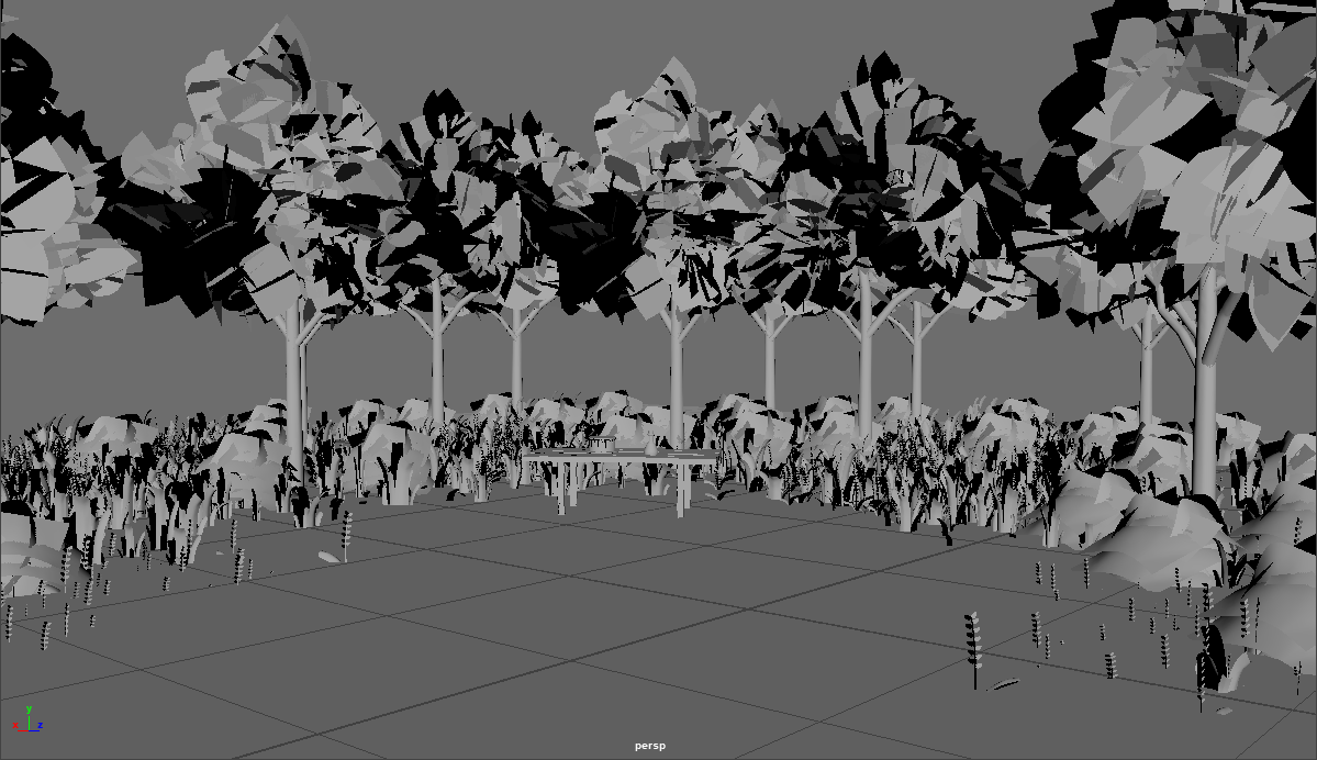
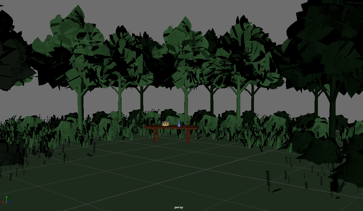
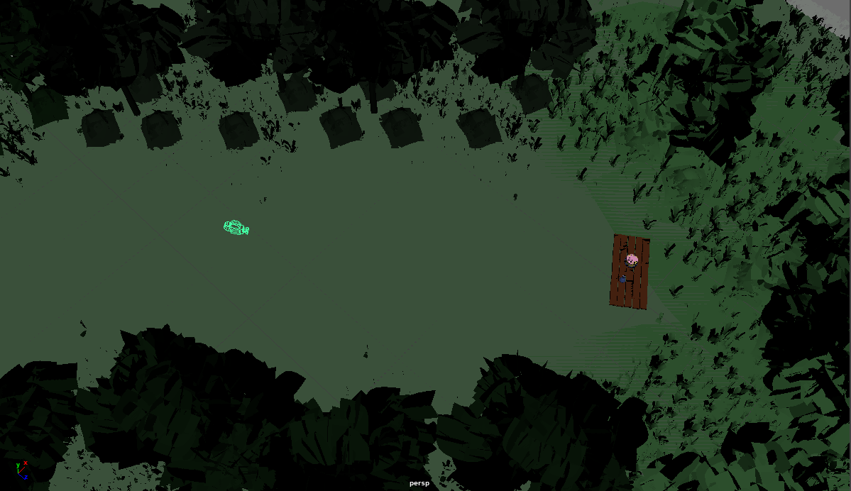
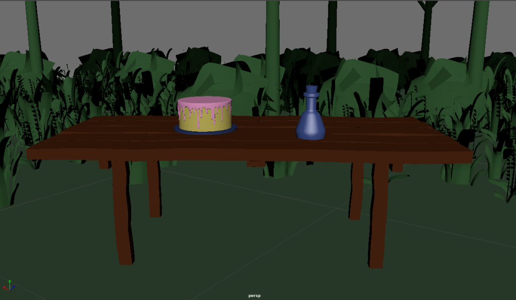
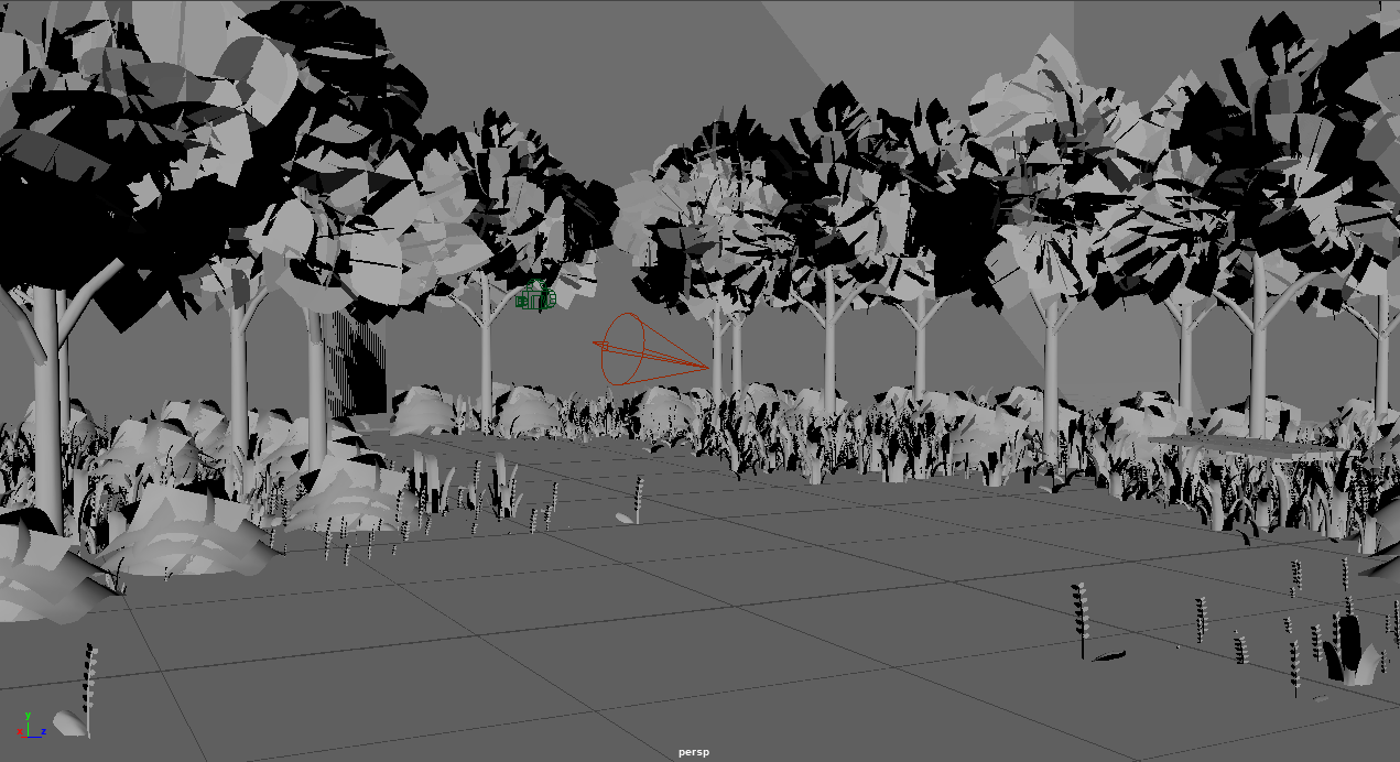
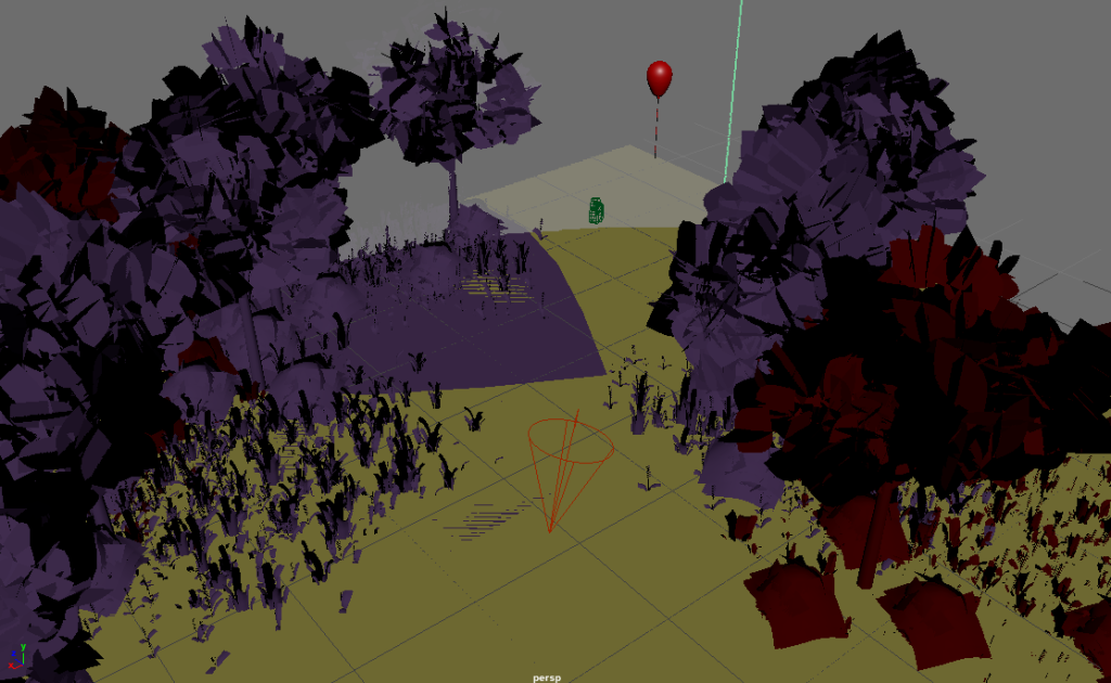
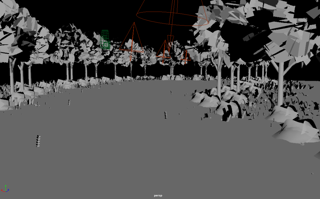
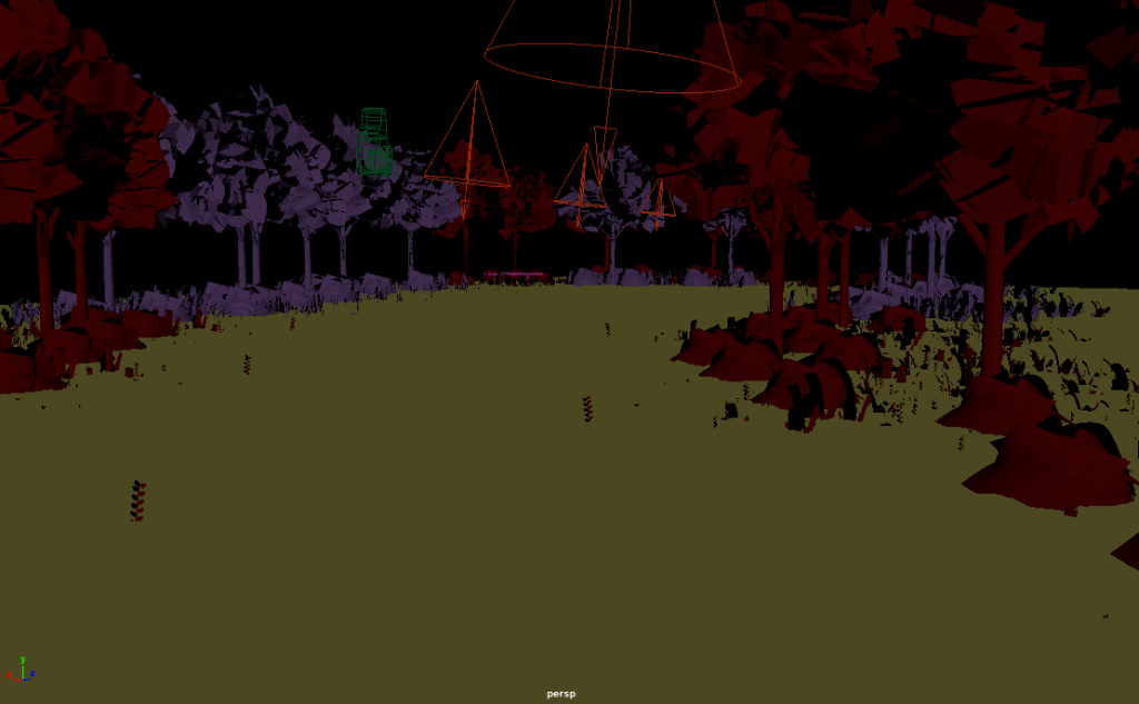
To begin my scene creation I first took all of the models I gathered from Sketchfab into Maya. I started by adding a cube to the scene to create the perimeter and the floor for the scene. I then added the items I collected into the file and started to duplicate the trees to make a path and suggest the presence of a forest. I then added the table and the bottle/cake. I had to edit the cake to be more simplistic to fit the rest of the scene and how I wanted to look. Once I had all of the pieces in place I then added textures to them. I opted for simplistic textures within my piece as I liked the style it gave my piece and made it also a lot easier to change them between scenes for different effects. I then added a simple sky dome light to the scene to add lighting. After I had the basis of the scene all set up I got to work creating the camera. I would be having my scenes follow simple paths through the worlds so I set the camera going through the clearing within the 30 second scene. As I had planned to have my world I created loop through the scenes with different routes this meant that once scene 1 was made the rest of the modelling was relatively easy to complete as all the assets were already present.
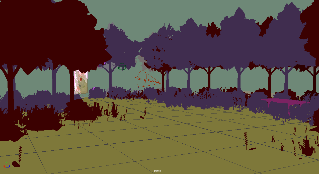
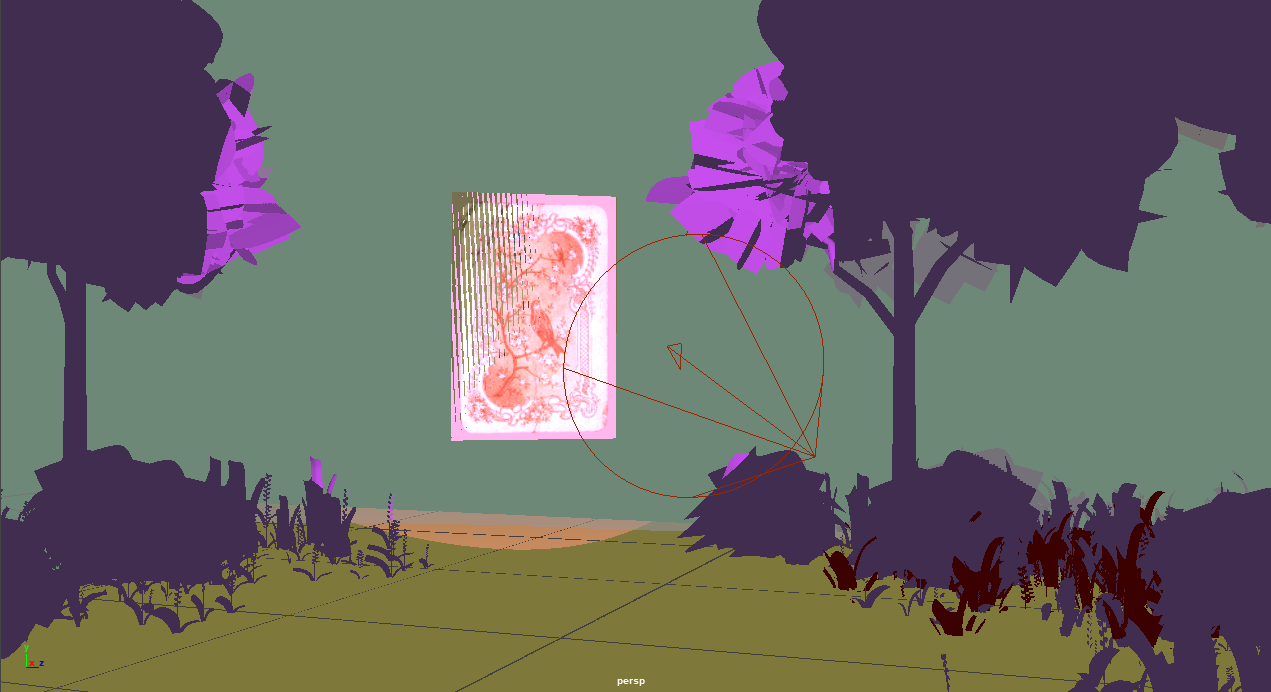
For scene 2 I first began by copying my first file and removing the textures from the assets. Once I had done this I was able to move the pieces around as I needed for scene 2. I was following my storyboard for a lot of this but wanted to create the forests as I went to have them have a more natural and organic look to them. Once I had the path to the left planned out I then added in a new item, the card that I also collected off Sketchfab. After everything was in place within the scene I added the textures which can be seen in scene 2 and changed up the colours to be something more strange and unusual. After this I added a sky dome light and an Arnold spotlight ,which I set to a bright pink colour to draw user attention. Scene 2 was also the first scene that I added more animation to, I added some keyframes to the card in the scene to make it look like it was magically floating up and down. I then finally added the camera going a similar path to scene 1 but skewed to the left and the scene was complete and ready to render.
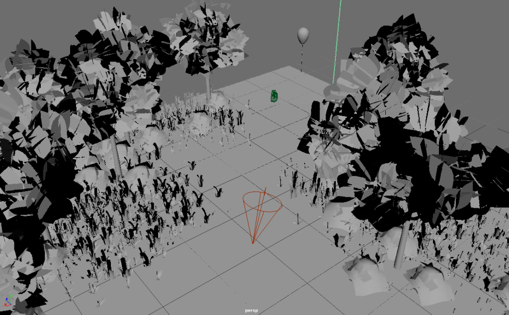
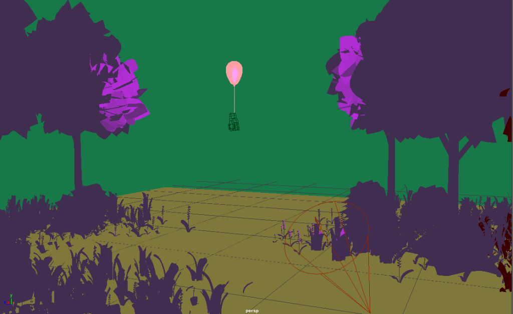
To create scene 3 I followed a similar pattern to the creation of scene 2. I knew the textures and colours within this scene had to be the same as scene 2 so I began by duplicating this file to have the objects already set up with the desired textures. From here I then assembled the scene with the path to the right and added a new object, the balloon, to the end of the new path. I then added some animations to this object to make the balloon appear as if it was floating as the user approached. This item was also lit with a pink spotlight to draw the users eye and attention to the area of the scene they are being walked to, which is the newly created path in the scene to the right.
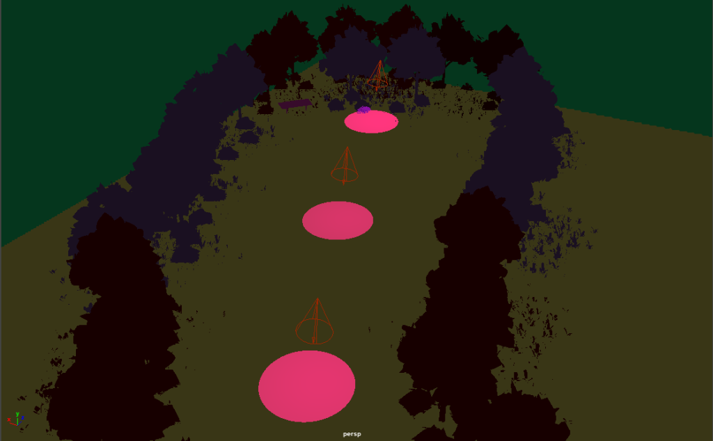
The final scene was a bit different than the last 2 as it involved more lights within the scene and a darker atmosphere. I wanted it to feel like the user’s final chance to pick a route, the central one. I added some intense spotlights though the dark scene to be a guide of the direction and I think its really atmospheric. Once I had this scene created I rendered each 600 frame scene individually at 1080p quality and then assembled them together in premiere pro to create my video. I then took this video, added the fade to white/black transitions to the appropriate areas between scenes and finally added my chosen soundtrack to the completed video. Once I had done the simple assembly process I uploaded the scene to YouTube and checked through it to make sure it was all correct with no issues. I did not have really any technical issues within this project and was able to complete the video smoothly and think my concept worked out ideally. Some elements from my storyboard I did not add as I didn’t want to overwhelm the scene (such as the orb of light guiding the user and instead opted for interesting coloured lights as a guide on where to look) but I think the final outcome is still true to the original idea I had and that I executed it to the best of my ability.
Model & Audio References
Models:
Aurora., 2020. Trees and foliage [online]. Available at: https://sketchfab.com/3d-models/trees-and-foliage-c3423a86515444a2b323d422ac16e710 [Accessed 1 Dec 2021].
Jochon., 2016. Table [online]. Available at: https://sketchfab.com/3d-models/table-08b62c750b414ea3b7fb6e2979ebb676 [Accessed 1 Dec 2021].
Sakthivel G., 2021. Birthday Cake [online]. Available at: https://sketchfab.com/3d-models/birthday-cake-29eb6a4e7bf8403fb05cc2495bfc2dd9 [Accessed 1 Dec 2021].
berzerkey., 2020. Stupid Simple Health Potion Bottle [online]. Available at: https://sketchfab.com/3d-models/stupid-simple-health-potion-bottle-24142fd436804991905b9b4788dc62bf [Accessed 1 Dec 2021].
Flynn, T., 2020. gezinkte Spielkarte KM-O.811 [online]. Available at: https://sketchfab.com/3d-models/gezinkte-spielkarte-km-o811-986967509d8d4774b87c6f4acc53a5ab#download [Accessed 1 Dec 2021].
Audio:
The Mind Orchestra., 2021. Bruwynn [online]. Available at: https://freemusicarchive.org/music/The_Mind_Orchestra/The_Mind_Orchestra_-_Singles_1084/bruwynn [Accessed 29 Dec 2021].
Navigation/ Audio Considerations
Within the piece that I am creating I will of course be considering the navigation of the user around the scene within my work. I will be making sure that any possible disorientation that the user could experience will be reduced within my piece. To do this I will be first having the distinction between scenes and resetting the placement in the scene of the user be done with fade in / outs. I will be making sure that in the transitions between my 4 scenes there will be fade to black or white transitions between them to reduce any disorientation between the changing environment and the large distance the user would be transported back to the beginning. The scene fading to either black or white will have meaning within my storyline too to make it more of an integrated part of my piece, black being the wrong path being taken through the scene and white being the transition to wonderland and the correct final choice being made. Within the piece I also will be having the user be walked through the scenes. The distance won’t be very far just from one end to the other in a path and will be at a relatively slow pace spanning 30 seconds each time. Not only is a slow pace good for allowing the user to look around the world that I have created but it is integral to helping to reduce any motion sickness the user could experience and allows the piece to have smooth motions and visuals throughout.
For the audio within my piece, I will be considering carefully what I want to do with this element as it can be a really important aspect of an immersive experience. I want anything I incorporate to add to the atmosphere of my piece, this being slightly eerie and creepy yet overall quite wonderful. I will be making use of audio libraries to find some free use content to incorporate into my piece. I want to mainly add just music to my creation as I think the strange silence and absence of expected sounds such as walking or environmental sounds will add to the atmosphere that I want to create. I want to find a piece of music which will start at the beginning of scene 2 once Wonderland is entered. I think that having no sound within the first 30 seconds through the first scene in the normal world will be really strange and almost creepy and add the desired effect to my piece. I will then start the music as some quite background music within the scenes after this to add to the mysterious Wonderland vibes of the world around the user. I will be adding this audio to the piece when creating my video in Premiere Pro and making use of fade in/ fade out transitions to match these transitions present in the visuals and add smooth change between the elements in the scene.
Digital Affordance
Within my piece I will be using mainly colour and lighting changes to show the user where to look within the space I am creating. I will be incorporating this into my story and using strange lighting and mysteriously lit up objects as a magical element to the piece to tie in with the Alice in Wonderland themed world. I will be using these effects on the objects on the table in scene 1 and on the mysterious objects down the paths in the 2nd and 3rd scenes in particular so that they know that they are going to be taken in that direction and that they will be moved towards the key objects.
When the scene changes to something more fantastical the colours within the world will skew and be different from the norm which will make the user want to look around the space to see all of the changes and the different things within the world. Colour will be important to make the user want to look around and explore the world and add some interest to the piece. Brighter colours to the objects on the table in front of the user will also help to make sure that they know where to look within the piece and the contrast between other items in the scene will make it really apparent that they are important aspects of the piece. The world between scenes 1 and 2 will change from normal expected colours to something more strange and weird such as having yellow grass, green surroundings and pink/red trees. This will create some distinction between the ‘real’ world and the fantastical wonderland world as part of the story progression of my piece. It is important in my eyes to have a clear distinction here so that the user is more aware of what is happening and is able to look at the world around them and instantly know that they have then been transported to a different version of the world, Wonderland.
For audio within the piece I think that I will add some mysterious music that I can find which will start as background music 30 seconds in once the 2nd scene is reached. I think that having strange and wonderful music playing in the background once you get to Wonderland will add an interesting immersive effect to the piece and allow the user to really feel like they have been taken to a different world. I will be using royalty free music in my piece and searching for the perfect background music that I think fits the wonderful yet slightly eerie tone I am trying to put across to the viewer of the piece.
Example Visuals
I really wanted to create some sketches and plans for the look I was going for in this project. I created the below visuals to really show the style and layering I want to achieve within the project.
Below is the first one I created. I created my design on the app Procreate on my iPad so I could draw all the elements and edit precisely. I started by sketching out a layout of the design, using different coloured pencils to indicate the different layers and how the design would go together. The blue parts would be the places of images to go and the green would be the layering of hand drawn doodles and elements over the top of the design. Once I had this sketch I then decided that I would realise it a bit more and add some real images and text to the piece to make a strong example of the visual style and outcomes I am attempting to create.
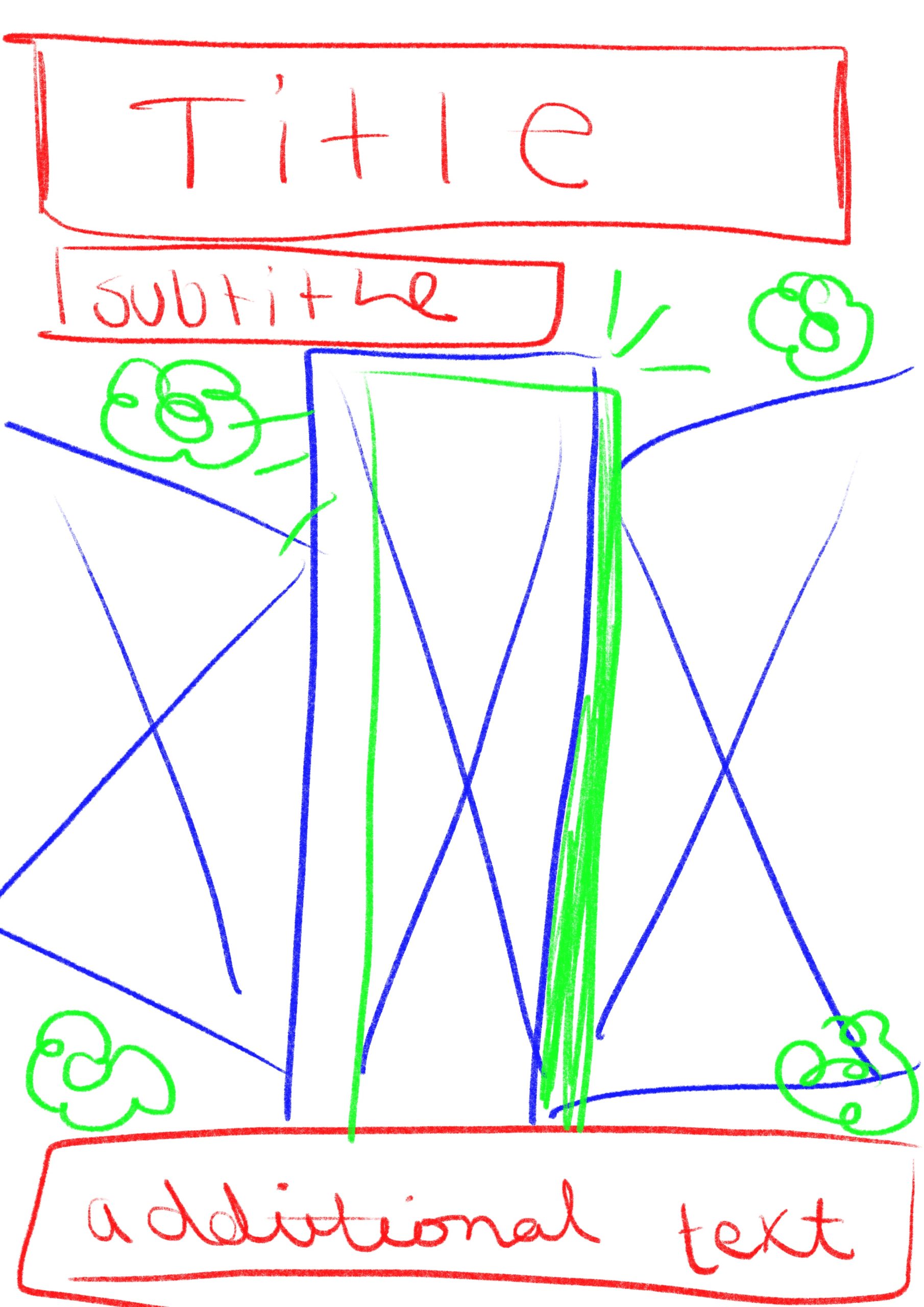
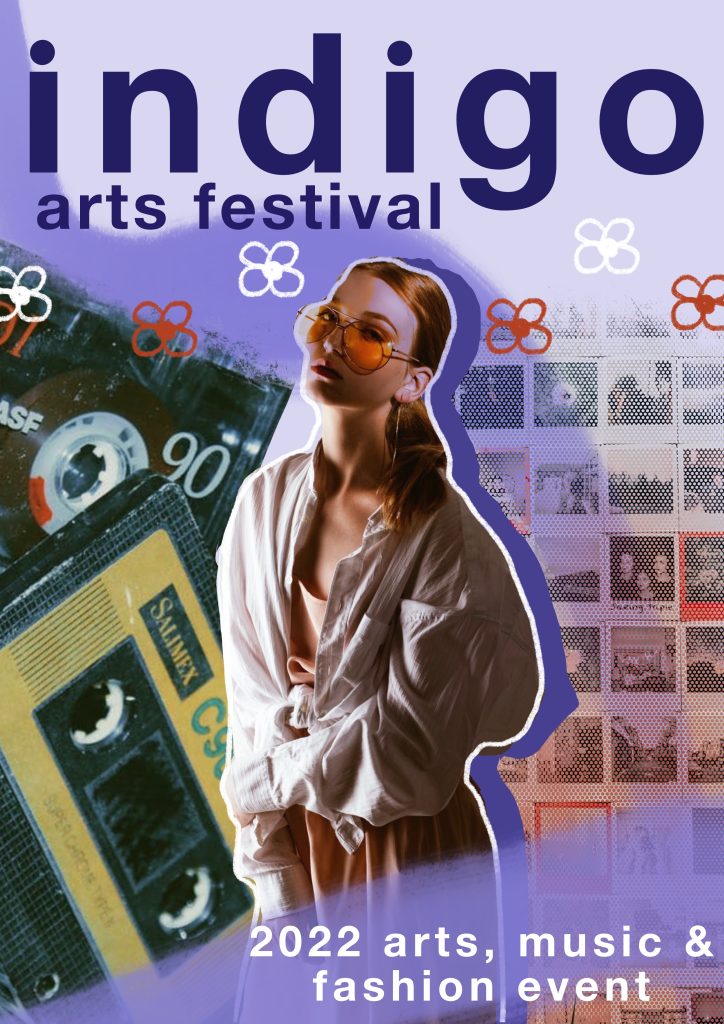
To make the version on the right I first used my sketch as a base layer to build on. I came up with the name Indigo to use as a placeholder (though I really like how it sounds for the festival and may carry it forward). I used the font Helvetica Neue for the text in bold as I felt it was really striking and eye catching. I also decided to use only lowercase text on the piece as that aligns with the common writing style of my target audience. I then added some paint strokes in the background and behind the bottom text. Next I decided to use some free use stock images and found 3 I wanted to use that gave the vibe I was going for. I edited these images and took away background and pieces I didn’t want. I also changed the colours on the main image of the woman to make it fit the colour scheme my piece was evolving to have. I then layered these images and used varying eraser brushes to add texture to them. I finally finished by adding the shadow to the main image along with the doodled outline and then drew the flowers. I really love how this visual turned out and I think it really shows what I’m going for.
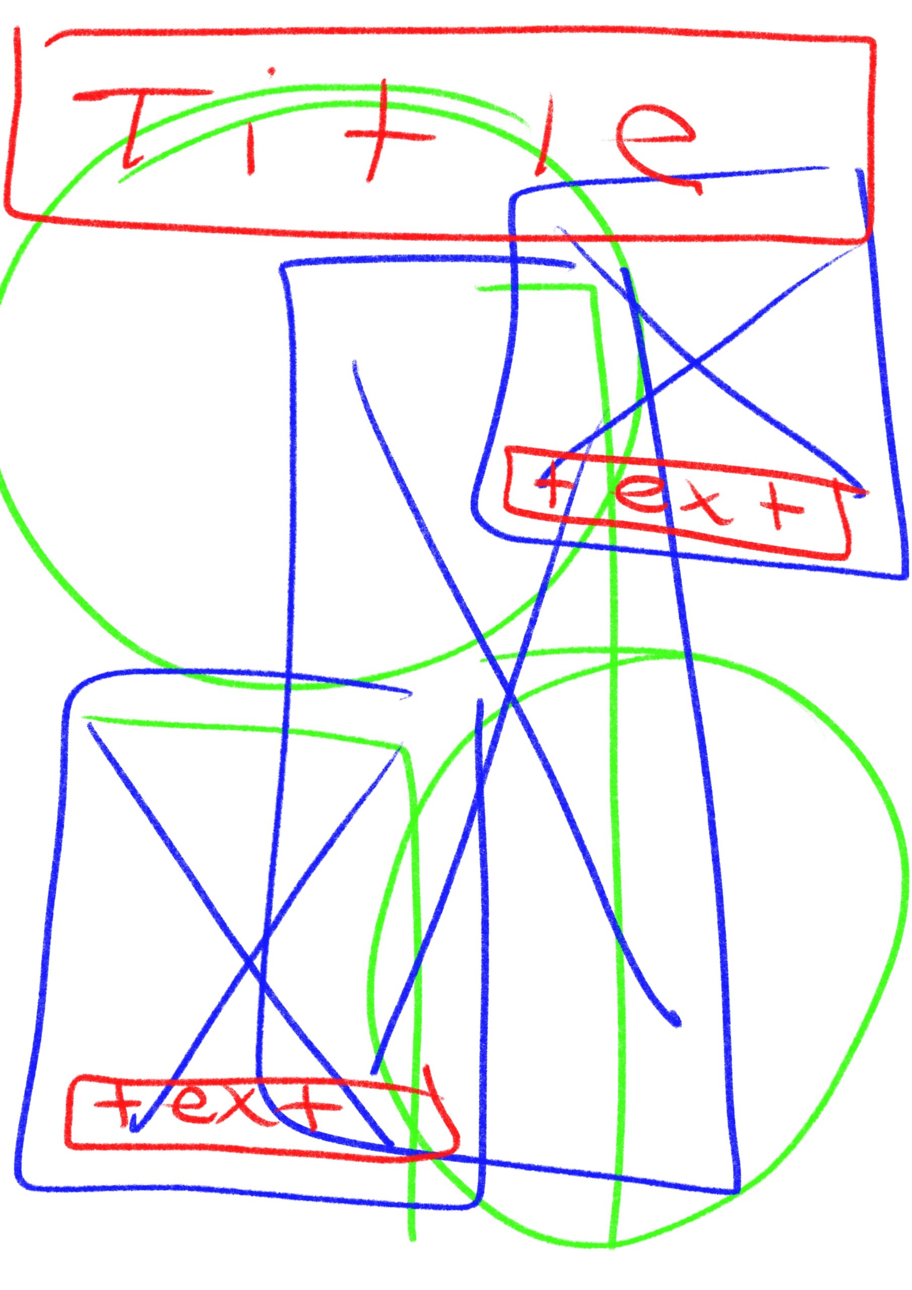
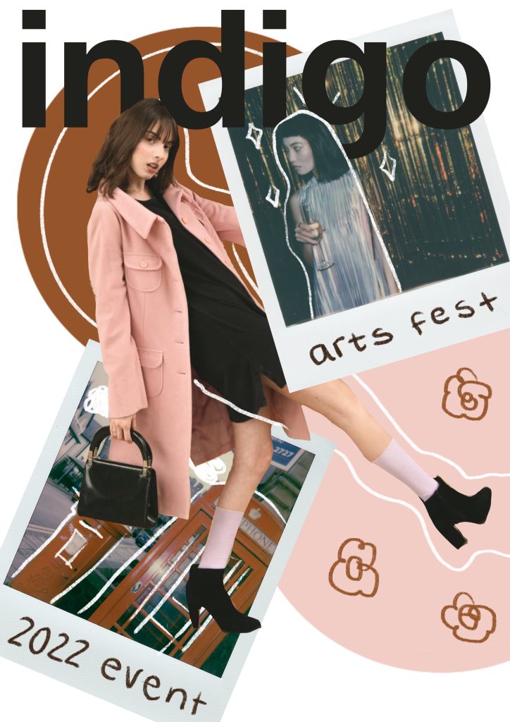
This above is the second visual I have created for this project. I wanted to have some varying designs but with the same visual style to show the different possibilities with the theme I have chosen. This image I first started by creating the sketch design on the left. I created this sketch using colour coding again to show the different layers on the image and how these would interact together, red for text, blue for images and then green for any additional graphics or illustrations I wanted to add to the piece. Creating these base sketches to work from really helps me to get a sense of how layers of the collage are going to interact with each other and what I want to be where on the image. To create the version on the right I again started with some stock images I found on a free image site and found some that I liked and wanted to use. I really liked the Polaroid style images so I had to use them in this piece. I started by creating the background circles I wanted in the design, pulling colours from the images within the file, once I had a good base I then edited the middle image to have no background. I then placed this where I wanted it and layered in the polaroid photos. I wanted things to be on different layers and images to interact and overlap each other. Once I had the images in the place I liked I added the title text, taking time to erase parts around the images so things overlapped with each other and added more dimension to the collage aspect. I then decided to write the sub text on the Polaroids to add more of that hand drawn doodle style to the piece, I think it adds an interesting element. Finally I took a white pencil brush and added in some lines and doodles along with some flowers to tie back to the other example visual.
Creating these visuals I think is able to show well the direction I want to go with my project and how I want to approach the promotional materials that I am creating. I think that I will be using some found stock images and trying to mix in some images of my own into the project to add elements of found and original content, which I feel sticks true to the collage art form. I may also print some images to be able to create jagged ripped edges on some of the pieces which I wasn’t able to create digitally. I think it would add a nice physical element to the digital pieces.
References:
Athena, 2019. Woman Wearing Pink Overcoat and Black Inner Top [online]. Available at: https://www.pexels.com/photo/woman-wearing-pink-overcoat-and-black-inner-top-2043590/ [Accessed 22 Nov 2021].
Balbarde. L, 2020. Pile of Cassette Tapes [online]. Available at: https://www.pexels.com/photo/pile-of-cassette-tapes-3642350/ [Accessed 22 Nov 2021].
Lisa, 2020. Collection of old instant photos with trips [online]. Available at: https://www.pexels.com/photo/collection-of-old-instant-photos-with-trips-5653734/ [Accessed 22 Nov 2021].
Lisa, 2020. Vintage Red Telephone Booth on Street [online]. Available at: https://www.pexels.com/photo/vintage-red-telephone-booth-on-street-3704052/ [Accessed 22 Nov 2021].
Mishchenko. K, 2019.Woman Standing Indoor [online]. Available at: https://www.pexels.com/photo/woman-standing-indoor-1926769/ [Accessed 22 Nov 2021].
Seliverstova. I, 2020. Woman In Silver Dress [online]. Available at: https://www.pexels.com/photo/woman-in-silver-dress-3550243/ [Accessed 22 Nov 2021].
What I Am Planning to Create
For this project I think I have a clear heading in what I want to produce as my final outcomes. I want to create a series of promotional materials, including posters, online advertisements and a social media presence for the festival. These posters that I create will be presented as both a digital asset (present on the social media sites) and a physical asset as real life posters. These posters can additionally be used as collectible merchandise for the festival itself and possibly even presented to be sold on tote bags or t-shirts. If I have time in the project I will be attempting to create some video content as an asset like this would be really useful in helping to reach my target audience of young people. The social media app TikTok is an impactful tool which can be used to reach many people whilst remaining easy to consume short form content.
For each piece I will be creating I will be spending time planning each part of it and making use of creating mockups and sketches of my work to make the design process smoother and to really test out ideas. Within the visual collage pieces themselves I will be using stock images for a lot of the elements but I will try to incorporate my own photography where I can to add more personality to the pieces. I will also be making use of printing some of the images that I will be using in my designs and physically tearing them and distressing them then scanning the images back to digital to add more organic looking collage elements to the edges. I think this will achieve a much more unique and traditional look to the materials whilst still keeping the digital elements and format I wish to work with for the majority. I will be using a various array of softwares such as Procreate, Adobe Photoshop and Adobe Illustrator to create my work.
Marketing & Branding Research
As my project will include creating promotional materials for the arts festival that I am creating, I felt it was important to do some research on branding and marketing, including what the difference is and what these terms really entail.
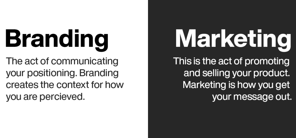
To put it simply, branding is the creation and styling of your business. Branding is something that every company or project must do to create a recognisable and useable look for their business which can be used within any marketing materials. Branding can include defining the companies values, mission statement and the creation of a style guide including a logo and colour scheme to differentiate the company from others with a strong visual style. Branding helps a consumer to have an idea of the business that they are supporting and tells them at face value what they can expect from your services. All companies should start with branding as marketing strategies can only be devised once you know clearly what your brand is about. Branding is something that will stick with the company for years to come until it is refreshed, whereas marketing can be changed and updated whenever to push new campaigns.
On the other hand, marketing is the opposite of brand creation. Marketing is the way that the brand then takes their message and gets it out to the world and potential consumers. Marketing can be achieved using a number of tools and can be specifically catered to your brand’s chosen target audience and can come in the form of online or offline methods. Methods for marketing a brand can include: social media, advertising, newsletter/ promotional emails, website content, SEO campaigns and may other methods. Additionally marketing can be done the traditional way with use of print medias. These print methods include: posters, leaflets, merchandise, billboards etc. The methods employed by the brand depend on the target audience, where they are most likely to view the marketing campaigns, and what is popular at the time is also a factor. Choosing a popular social media platform for instance or leaning into a trending merchandising gimmick for promotional marketing, can lead to an increase in consumer attention and promotion for the brand.
To apply these concepts to my own work, I will of course need some sort of logo for my arts festival to put on the promotional materials that I will be creating to ensure a recognisable brand for the audience. I will also need to decide on which areas of marketing I would have the most success with when creating the promotional materials for the event. I was thinking about using both print and digital media to promote my festival as this will reach the largest target audience. Using things such as posters and stickers is a way for my target audience to physically interact with the event beforehand and a chance for them to spread the word and to show off the marketing they have seen in person on their social media accounts in photographs. Digital marketing will also be really important for me as my target audience is young adults and people in their 20’s. Having social media advertisements on platforms such as Instagram and Twitter will be beneficial as many young people use these platforms. I have also considered using the widely popular video sharing app, TikTok, to spread content about the festival as well in the form of advertisements and promoted videos.
References:
deBara.D, (2019.) Marketing vs. branding: what’s the difference? [online]. Available at: https://99designs.co.uk/blog/marketing-advertising/marketing-vs-branding/ [Accessed 17 Nov 2021].
Keplinger. M, 2021. Branding vs. Marketing: What’s the Difference? [online]. Available at: https://www.smashbrand.com/articles/branding-vs-marketing-whats-the-difference/ [Accessed 17 Nov 2021].
Newell.C, (2021.) The Basics of Marketing [PowerPoint Presentation]. Available at: https://hullacuk-my.sharepoint.com/:p:/g/personal/c_newell_hull_ac_uk/EVG5hN1SPydJkIjSrSAdw9UBDB9YAjqoLOPCVnyH9uy4lQ?e=4%3AFbqE6H&at=9 [Accessed 17 Nov 2021]
Outbrain, (2021.) Branding vs. Marketing – what is brand marketing? [online]. Available at: https://www.outbrain.com/help/advertisers/branding-vs-marketing/ [Accessed 17 Nov 2021]
Development Storyboard
For this project, I felt it was important to create a storyboard with each element of the experience within it to help me in planning and creating my piece. I have created the below storyboard on the iPad app, Procreate. I am hoping to follow the storyboard closely when creating my project though some parts may change due to logistic difficulties when creating the actual piece.
Each sequence within the experience will be around 30 seconds long, the total time amounting to the required 2 minutes as there are 4 sequences. The first of these sequences is set in the regular world and will look really dull and boring. The user will first see a black screen that fades into the start of the scene. Sequence 1 consists of a forest scene with a light in the middle leading to a clearing. The user will then be walked forward into the clearing towards a table in the middle. This table will have the eat me drink me items on top of it and the camera viewpoint will pan down towards this table and turn to white as if the user has decided to consume these items. This will last around 30 seconds.
In sequence 2 the player will continue with the white screen and it will pan back up and the world around will look different. The world will now be strange colours instead of the normal world. If my skills allow it there will be floating objects in the sky of the world that link to the Alice in Wonderland theme. The user will be directed to look towards the left path by an orb of light. This glowing light will lead them down a short path and they will see a red hearts playing card ahead of them. As they approach the view will fade to black as if the wrong path was chosen. In the third sequence within the piece a similar thing will happen and the player will walk down the path on the left following the orb. They will be lead towards a balloon and the view will similarly fade to black just as it did in the scene beforehand signifying the wrong path further into wonderland was chosen again and the user will be reset to the middle of the clearing yet again. Each of these sequences, the left path and the right path, will last 30 seconds each. This will allow the user enough time to look around the scene and walk slowly through the space to take it in.
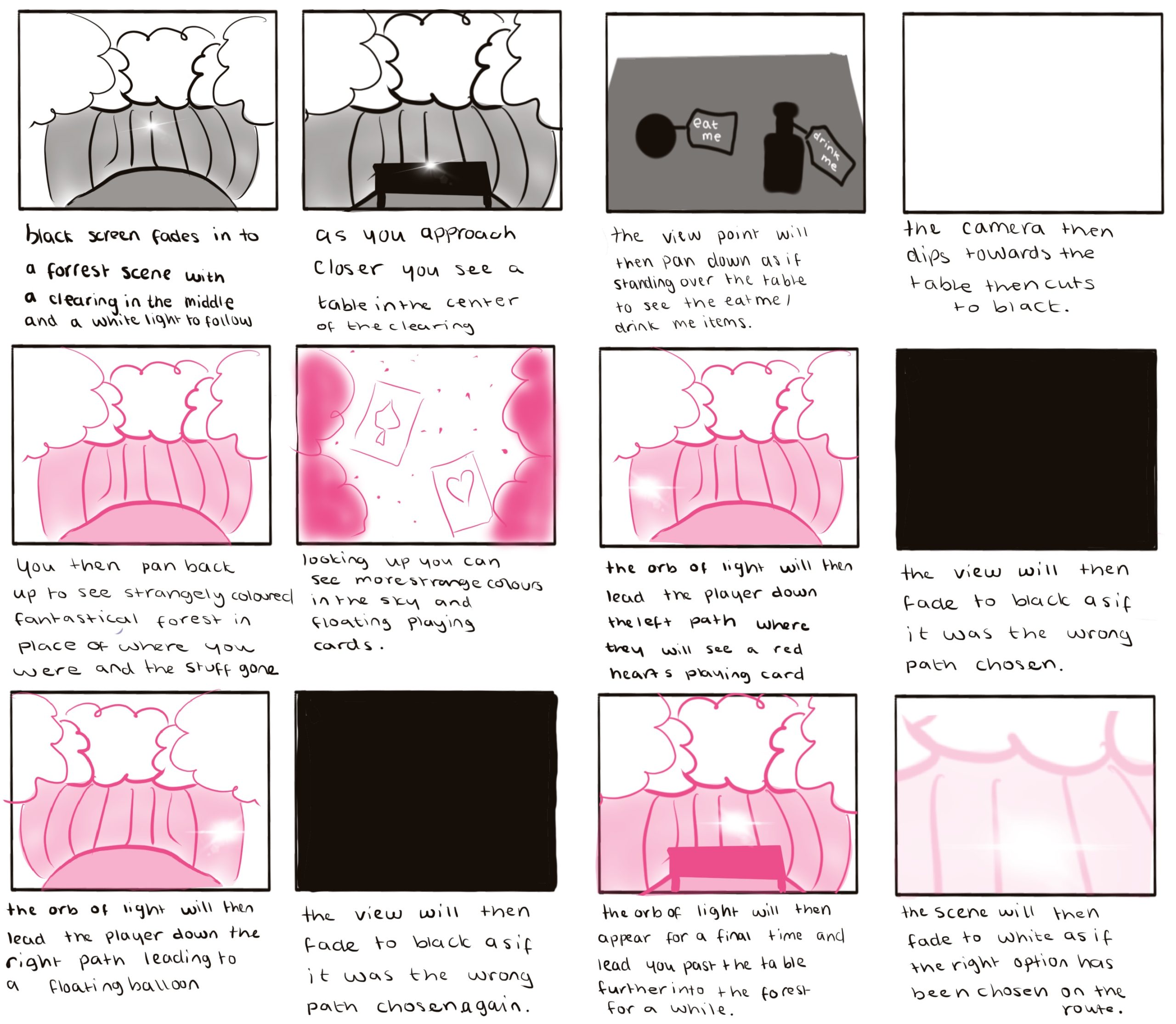
For the final sequence within the piece, the user will be lead forward through the forest instead of to the left or right. It will lead forwards past the clearing until the scene fades to white as if the user has chosen the right path into the world. This sequence will again last a total of 30 seconds. The fade in and fade out sequences within the piece will be part of that timeframe and will be around 5 seconds each time.
I have decided that I would have some sections that repeated within the piece and that evolved into a chose your route (though only one will be correct) piece. I think this is interesting as every time will be different and it will allow the user a lot of time to look around the world as they are being reset every 30 or so seconds. I think it will also be helpful in allowing me to create the scenes easier with my minimal skill set in the Maya software. I will be attempting to make some of the more simple models whilst using pre made objects for the remainder of the assets.
Production Notes
I will be using 3 pieces of software for this piece. I will be using Adobe After Effects for the majority of the assembly. I will be creating my backgrounds in Photoshop and I will be hand drawing my characters within the app Procreate.
For my storyboard I have allotted around 5 seconds per scene on as I have 12 panels within it and will be using it as a guide on how to create my piece. I will be using it as a structure and working from it to create the scenes with added lighting and particle effects
For the characters, I will be spending time drawing them within the piece to use within the final outcome. I will be creating 4 characters and each one will have a front and side view to it. I will be creating them on the iPad app, Procreate.
For the backgrounds of my piece, I will be using stock images that I have gathered from pixabay.com as free use images. I will be using my skills in Photoshop to combine these images together to create the background scenes that I want in my piece.
References:
Images
Antranias, 2016. Forest, Forest Path, Nature [online]. Available at: https://pixabay.com/photos/path-forest-forest-path-nature-1548326/ [Accessed 17 Nov 2021].
bertvthul, 2015. Avenue Trees Path [online]. Available at: https://pixabay.com/photos/avenue-trees-path-sunbeams-sunrays-815297/ [Accessed 17 Nov 2021]
Dlee, 2015. Sandcastle, Beach, Summer, Sand [online]. Available at: https://pixabay.com/illustrations/sandcastle-beach-summer-sand-766949/ [Accessed 17 Nov 2021].
FelixMittermeier, 2017. Path, Spring, Forest, Nature, Trees [online]. Available at: https://pixabay.com/photos/path-spring-forest-nature-trees-2291385/ [Accessed 17 Nov 2021].
OpenClipart-Vectors, 2015. Free Image on Pixabay – Tree, Trunk, Leaves, Branches [online]. Available at: https://pixabay.com/vectors/tree-trunk-leaves-branches-nature-576847/ [Accessed 17 Nov 2021].
Valiphotos, 2015. Forest, Trees, Sun Rays, Sunlight [online]. Available at: https://pixabay.com/photos/forest-trees-sun-rays-sunlight-fog-1072828/ [Accessed 17 Nov 2021].
Audio
Quadrado.S , 2021. Serge Quadrado – Good Evening Loop [online]. Available at: https://freemusicarchive.org/music/serge-quadrado/kids-tv/good-evening-loop-1 [Accessed 17 Nov 2021].