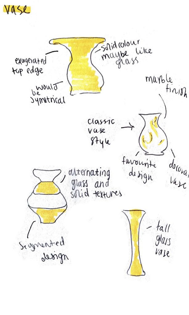
Below are the last 2 assets that I made sketches for. As I said I only felt like I needed to make sketches for assets that I was unsure about or that were more complicated. For example the vase that I wanted to create wasn’t a complicated asset but I wanted to sketch this one out to pick the kind of style that I wanted to make as there are many different types of vases that come to mind when I was thinking about this asset. I sketched out some different vases for this with different textures in mind. I ended up going for a marble design which was very simple and would look nice on a side table. I sketched out some taller ones or ones with alternating textures but I felt that a marble vase would look the best and also match the fireplace I was planning on creating.
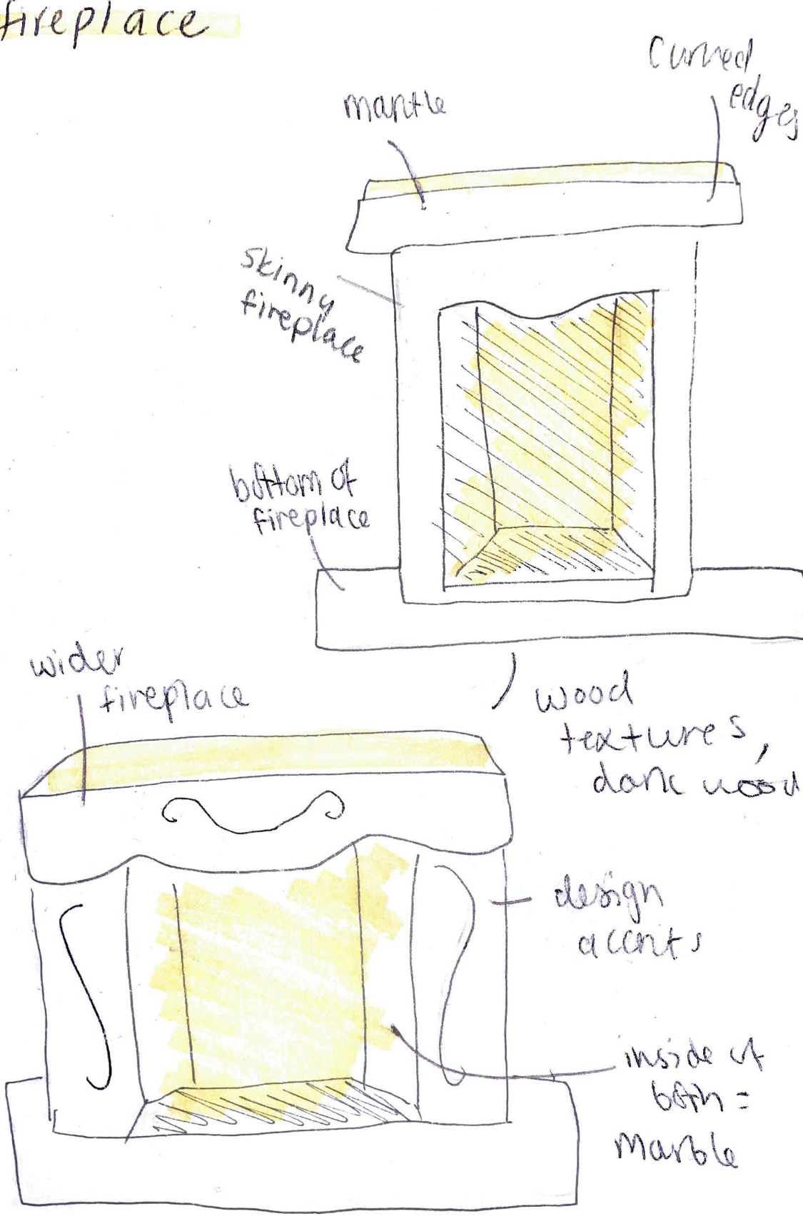
The fireplace was one I also wanted to sketch out but because I wanted to sketch out some different widths to visualise how this would look. I drew a wider one and a narrower one as when looking for reference pictures I noticed this trend. I felt like these sketches were quite helpful to visualise how the fireplace I wanted to make looked and to chose which one I preferred. I ended up going with a wider fireplace rather than a tall skinny one as I felt that it would look better in the room and more proportional as I wasn’t planning on having high ceilings. I had planned on having wood textures or a dark wood look when I was making my sketches but when i was creating the asset itself I felt it would be better to have a plain brown material on the main body of the fireplace so that it didn’t clash with the marble and also so that it didn’t look like too much wood with everything else in the scene I was making.
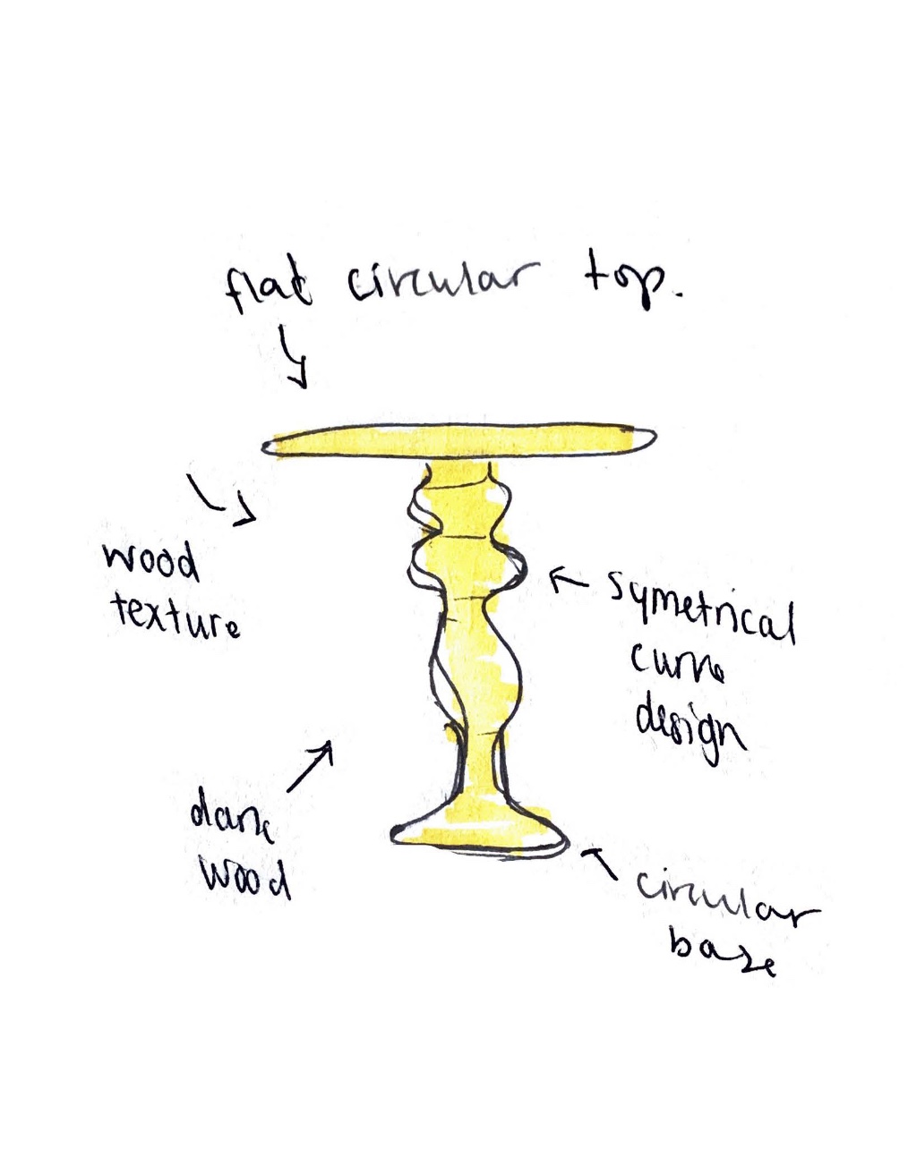
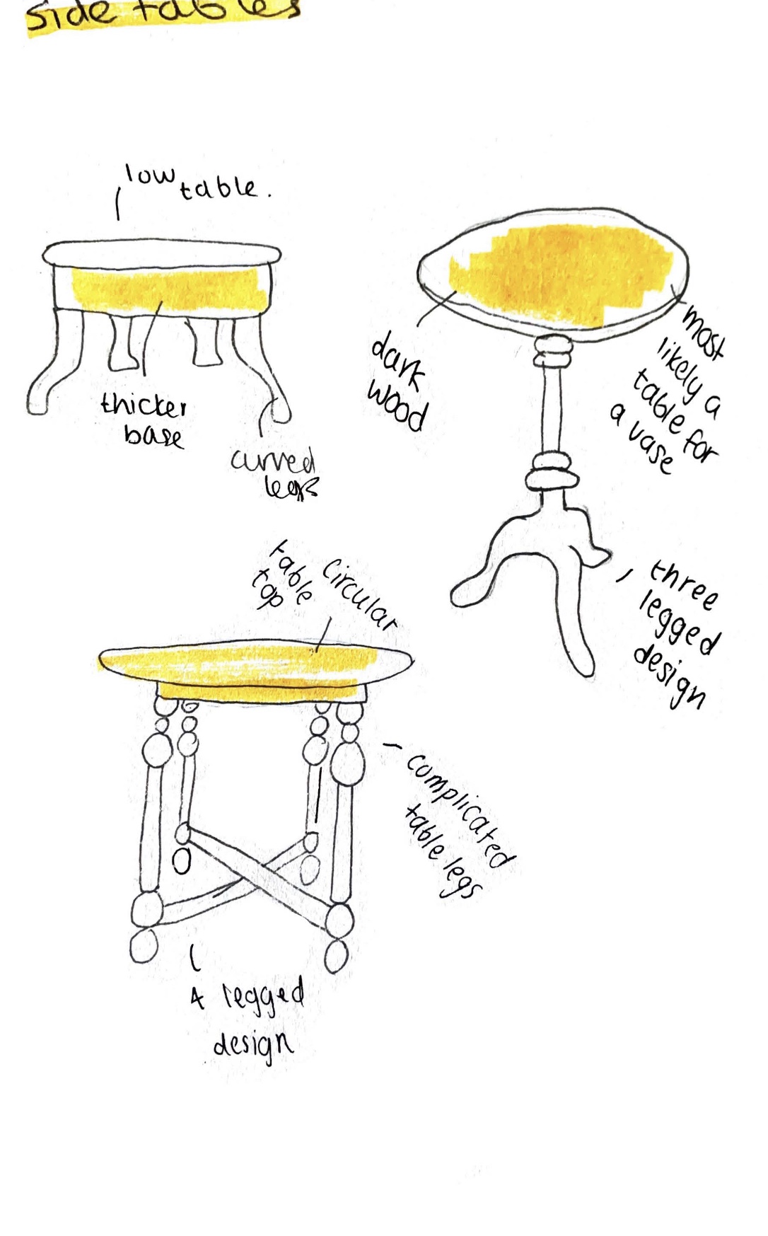
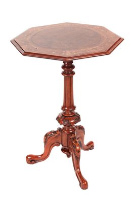
Above are some of the side table designs I was considering creating. i came up with pretty varied designs for this asset as I wasn’t sure how I wanted it to look. I drew some designs with one central leg and some with 4 legs as I felt these were all signature vintage designs. The 3 designs I drew on the right were the ones I created first in my sketchbook. At one point I was really leaning towards creating the bottom design on that page as I felt it looked really cool, however I wasn’t sure I’d be able to execute such a design so I created a more simple design as seen on the left. I ended up going with the design on the left as in the lectures we learned about using the revolve tool and I thought that this would be a perfect opportunity to use this.
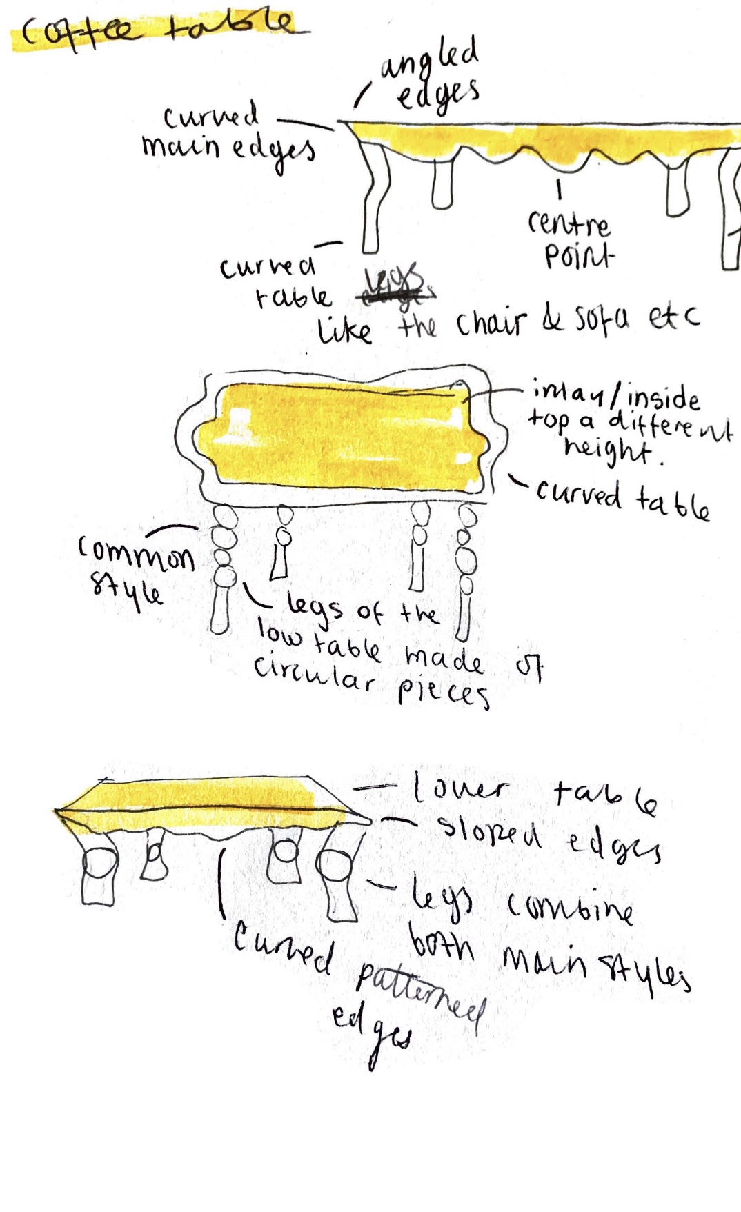
Below are the three coffee table designs that I came up with. They are actually pretty similar in design as I was struggling with coming up with things that were distinct as I feel like coffee tables are usually pretty similar. The bottom design was a combination of the top 2 that I drew however I didn’t like this very much once I had drawn it as I felt it looked a little strange. The top design is the one that I ended up taking further and making in Maya. I chose this one over the middle one as I thought that it matched best with the side table design that I had chosen to make. I thought by making the designs sort of similar it would be more realistic as people usually buy matching furniture if they can. I felt the coffee table design that I chose would look the best in the scene and after I had created the sketches I proceeded to make it in Maya.
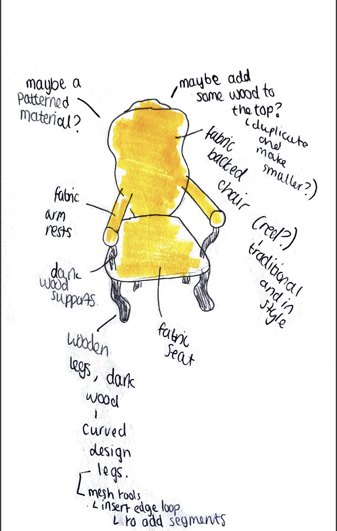
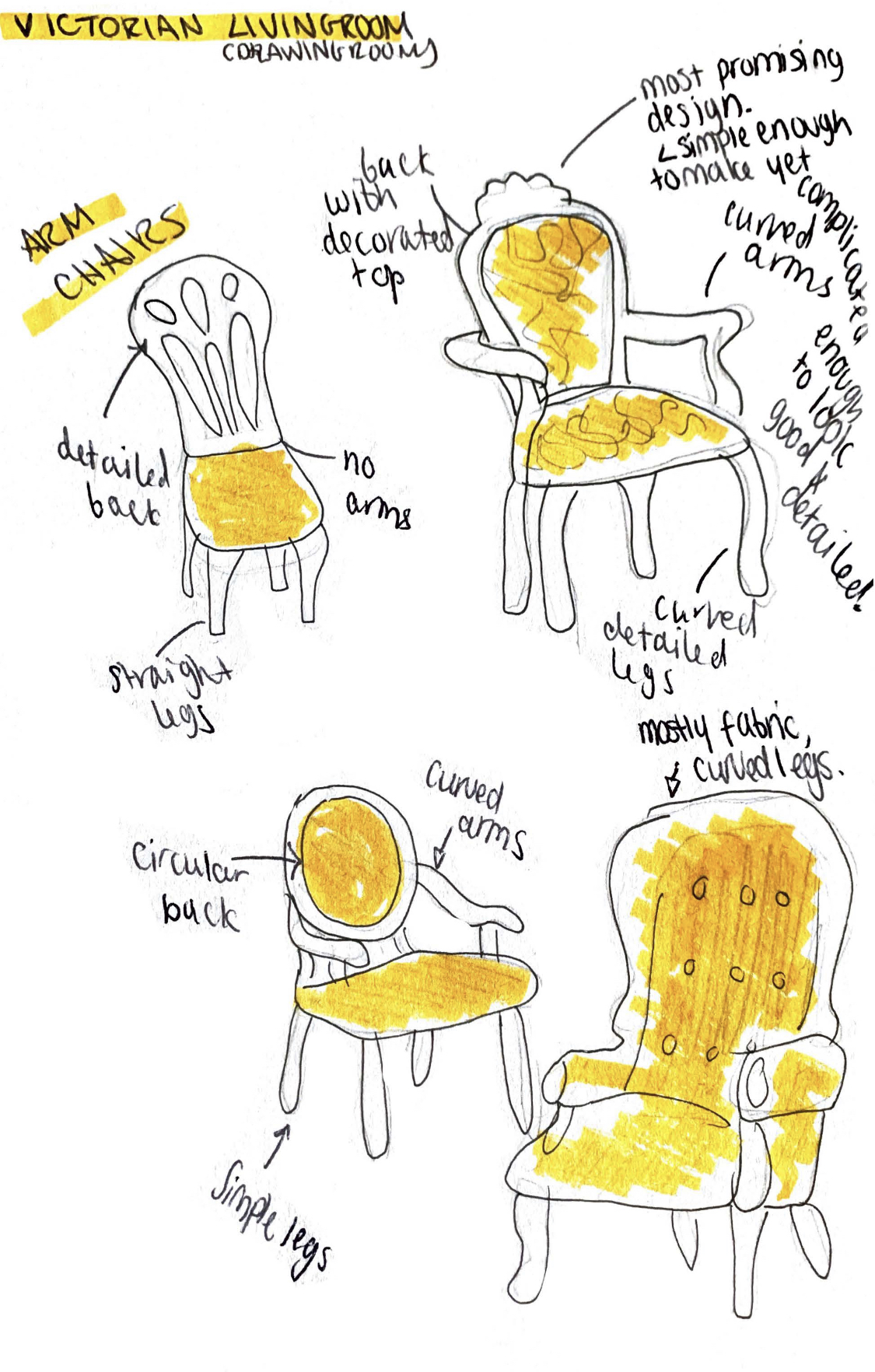
Above are some of the sketches that I created after some google searching for inspiration. I was searching terms like ‘victorian chair’ and ‘1800’s armchair’ etc, the images I used for reference and inspiration can be seen in the appropriate blogposts. I didn’t create sketches for every asset as some of them were pretty straightforward or simple so I didn’t feel like it was necessary to create them for all. I did however create them for the more complex assets. The page on the right was the first 4 designs I came up with for the chair. I took inspiration from the images I found and made some interesting concepts. Once I had sketched out some in pencil I drew over them with fine liners, added some colour and added some annotations. I always like to annotate my sketches as it helps me solidify the ideas and makes them easier to refer back to. Once I had created these first 4 sketches I made the design on the left, I used the first 4 as inspiration before creating the design I wanted to use. Creating the first 4 and getting some ideas down made it easier to create the one on the left. I felt like this was a strong design and would be perfect to create in maya and it was the one that I ended up doing.
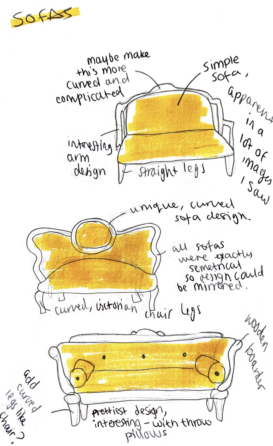
For the sofa I made the three sketches below. I used the images I found on google as inspiration when drawing them to get a more accurate design. With these sketches however I wasn’t sure which one I liked best so I actually decided once I got into maya and started making the sofa itself. I ended up making a variation of the bottom design. I ended up not adding the wooden boarder to the sofa to make it cleaner looking and so it would stand out more against my other assets. I made sure to make my sofa designs symmetrical when trying to come up with a design as then I could mirror the design to make it match up. This meant that it would be easier to create as I could copy paste elements and flip them. I really like how these sketches turned out and I think they were helpful to work off of.
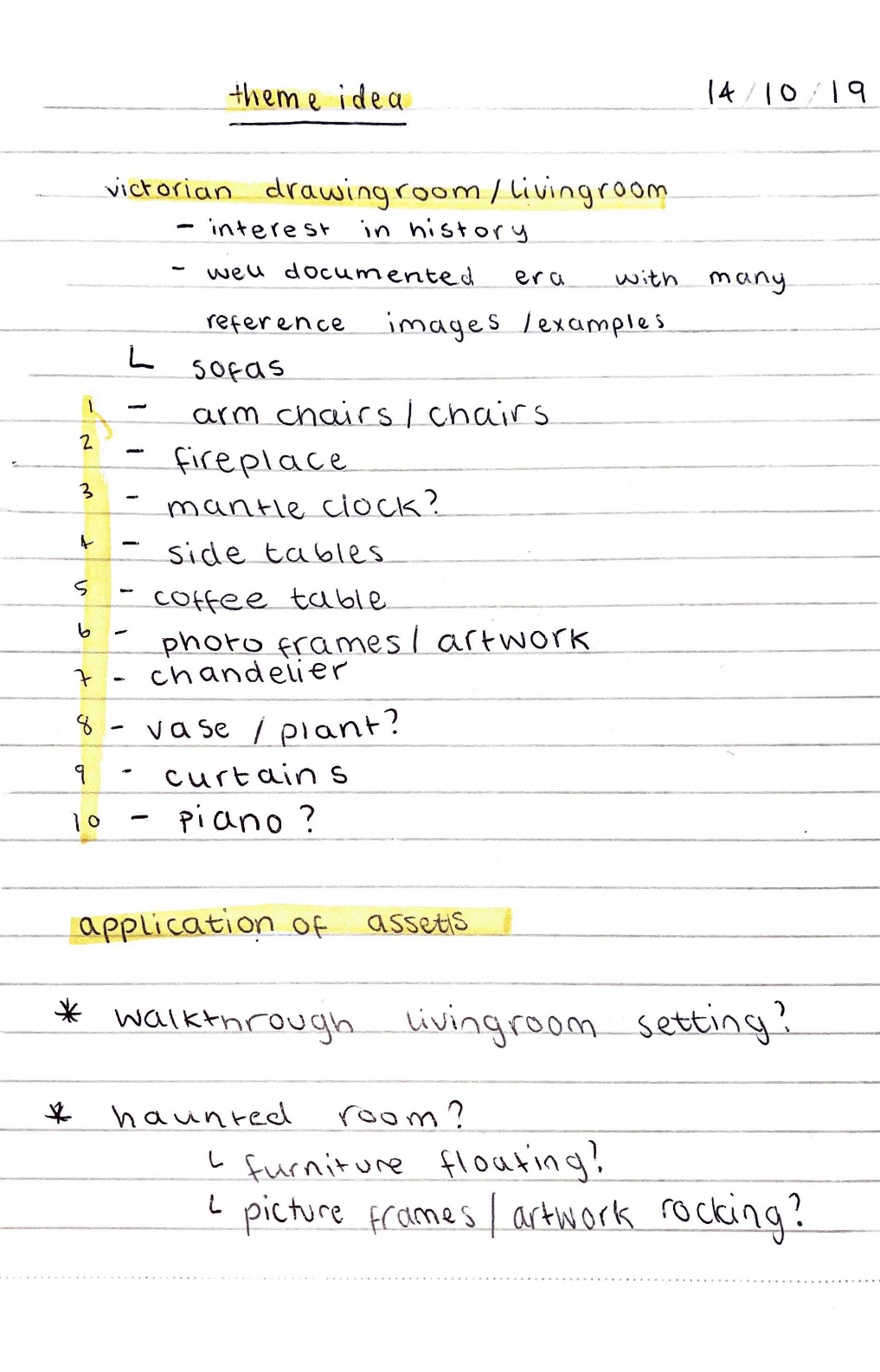
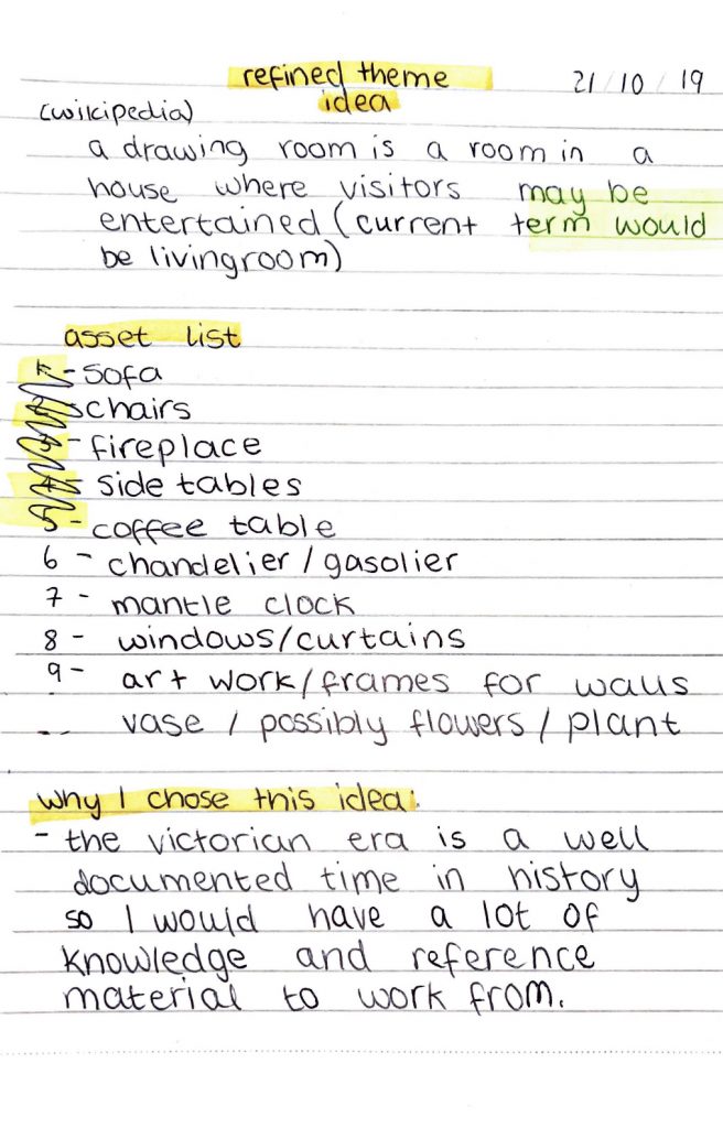
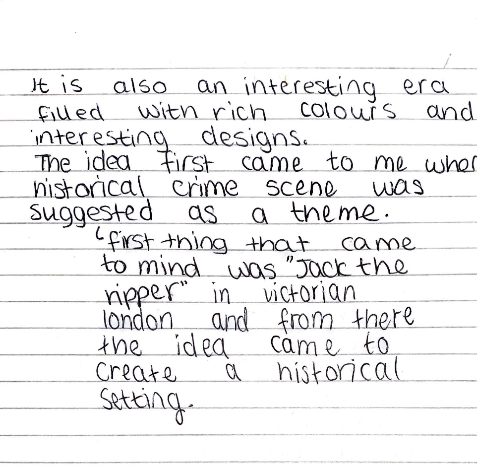
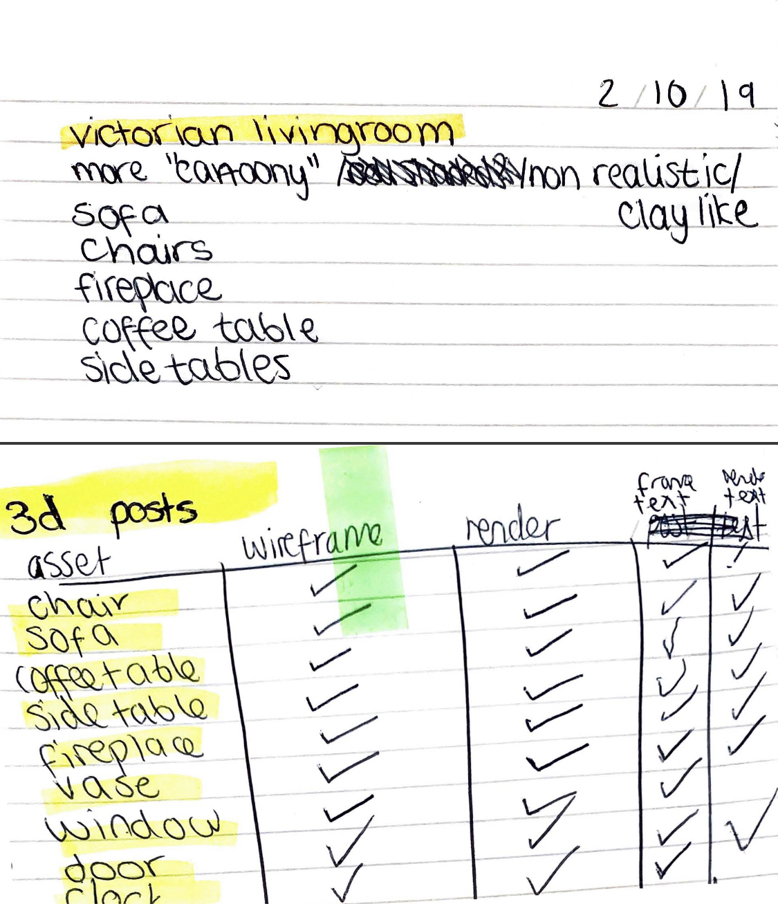
Within this blog post are some of the plans and notes that I had taken down for this project. I liked to write out my ideas and have some to do lists etc of things I wanted to try to create, along with extra ideas. I think this was a useful thing to do to keep me on track with my work and to make sure that I didn’t forget anything. It also helped me to consolidate my ideas and develop them. I knew pretty early on what I wanted my theme to be and the general idea of why and what I wanted to be in it. Below are some scans of pages from my notebook:
(All pictures used for inspiration and reference in the subsequent blogposts are numbered and referenced in blog post #20)
[5]
[6]
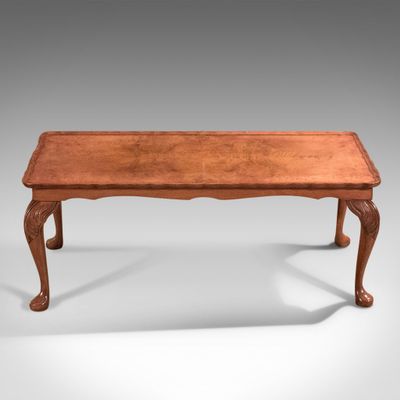
These two photos above are the ones I used for the two tables I made, my designs ended up looking pretty similar to these photos but more rounded in my opinion. The side table I referenced had the general shape that I wanted my table to have so I used this picture as inspiration, I saw a lot like it when looking online for victorian side tables. My table however I went for a more simple approach using this reference as inspiration, I wanted to do this to match the coffee table that I planned to make. The coffee table above looks quite like mine did, I drew some sketches of ones inspired by this but always fell back to the same sort of design, the simple style shown above. I really liked how this looked as it is simple yet looks period accurate. All the tables I saw were obviously made of wood, I saw none that were painted, so when making my tables I went for a classic wood texture. Using references I think was effective in this case and was something I needed to do as a lot of victorian tables have nice curves and distinct detailing to them.
[7]
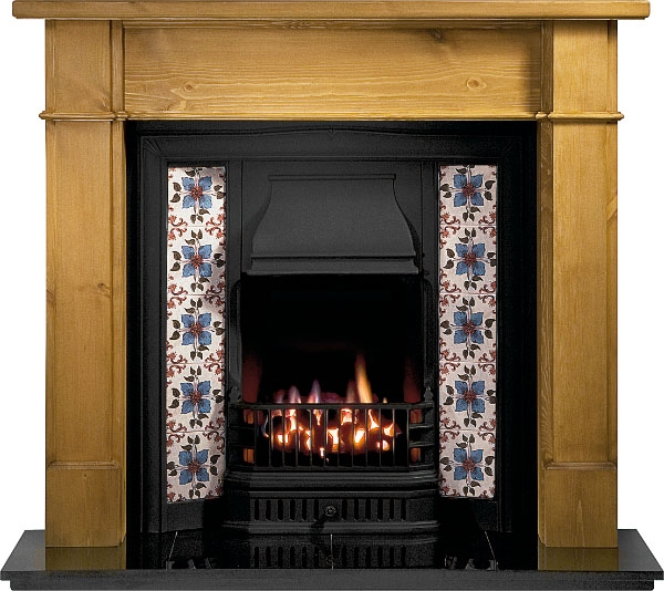
Above is the fireplace image I used as reference. I saw a lot of wood fireplaces online when i was looking, a lot of them had either tile patterned parts or marble textured pieces, I went for a marble look on my design as I wanted it to match in with the Vase and I wasn’t sure how to get a proper tile pattern onto my asset due to my lack of Maya experience. A lot of fireplaces I looked up were either really skinny or really wide, but then I found this reference picture of a replica victorian fireplace that I felt would look proportional to the room that I wanted to create. I used this as inspiration for my sketches. I did neglect to include the actual fire grate and leave it as an empty chimney in my design however as I was not sure how to go about creating this. It was helpful tho to have a reference image to look back on and my sketches to work off for the designs. I only used references for these 5 assets as I felt they were the only ones I needed a little help making correctly and accurately.
(All pictures used for inspiration and reference in the subsequent blogposts are numbered and referenced in blog post #20)
[1]
[2]
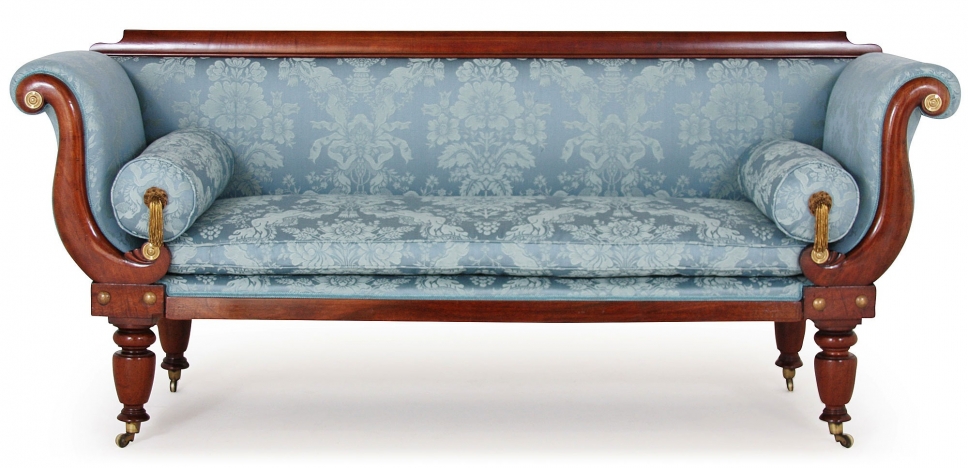
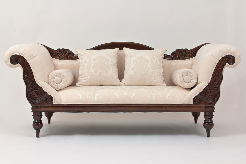
For this project when making my sketches I used reference pictures for some of the assets. I wanted to use reference pictures for some of them so my project would be more accurate but I didn’t feel like all of them needed reference pictures. Above is the 2 pictures that I found online for inspiration for the sofa that I made. There weren’t many period pieces photographed online so a lot of my inspiration came from recreations and replicas from furniture sites. I really liked the cylindrical throw pillows I saw in a lot of the sofas so ended up incorporating these into my sketches and subsequent final designs. I also really liked the curved arms on the sofas, I also used these in my final design however I went for something with mostly fabric and less wood as I didn’t wanna have too much wood on my sofa as the room I was creating was already going to have a lot of wood on it. I also liked the use of the blue fabric in the first picture so decided to make my sofa a shade of blue as well. Using reference pictures was very useful as it helped me make something that looked like it would fit in and meant I didn’t have to make up the design based on what I thought it should look like.
[3]
[4]
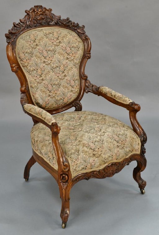
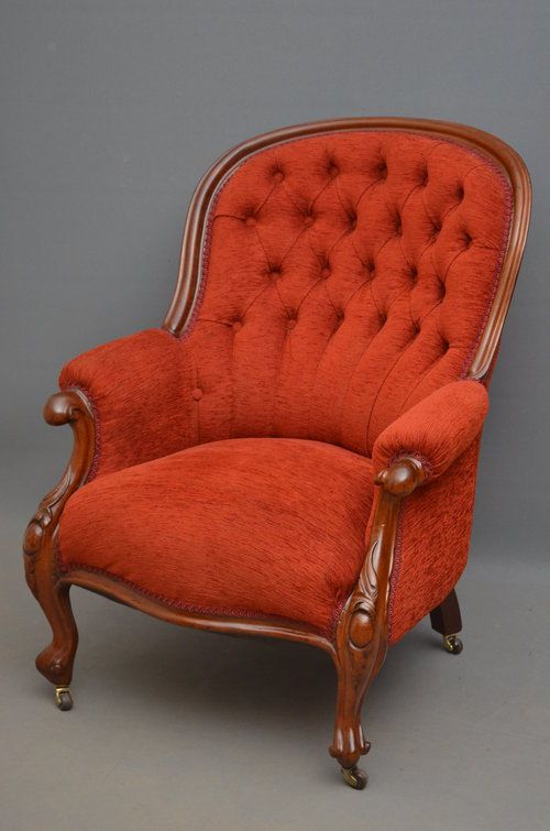
These two pictures are the ones I used for the arm chair, I actually ended up combining the two and creating something that I thought was nice and period accurate. There were a lot of designs I saw on the internet for victorian arm chairs but the two styles above were the ones I saw the most, I also noticed a lot of them were in deep red tones so I decided to use this in my design as I thought it would stand out and look nice. I like the chair that I ended up making and think it looked really good in the final room scene I put together. When sketching I put together a few possible designs from the inspiration/ reference photos I had and I think any of them could have worked. I however really liked the one I came up with as I felt that it looks nice and really has that victorian influence to it. Again using reference pictures for this piece I felt was necessary as there was specific styles then and I wanted it to look accurate to my theme.
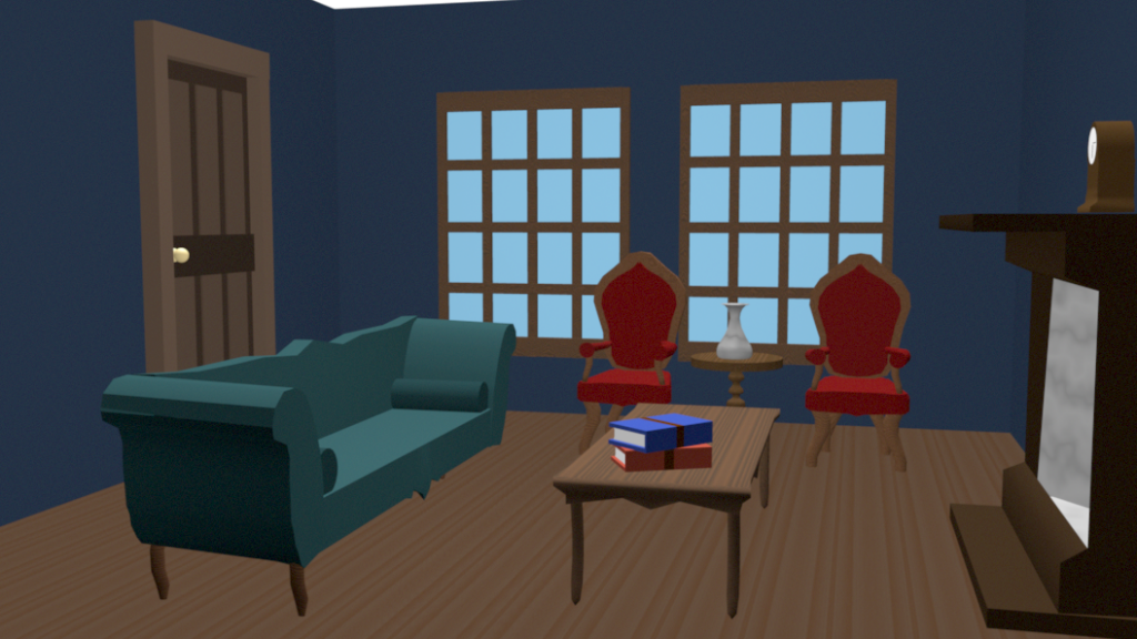
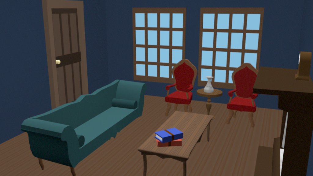
Below are some renders of the room scene that I created out of my assets. To do this I first took the room scene I had been rendering my assets in to use as a base for the room. I then started with the door and the window assets and imported these into the maya document I was working on. I then used the move and scale tools to position them and scale them to the right size. Once this was done I imported the fireplace and clock and did the same thing, I placed the fireplace on one of the empty walls. After I had imported that I then added in all my other assets, duplicated the chair and scaled everything to size. It was at this point, when I had added all my assets into the room and placed them where I thought looked best, that I decided to change the colour of the walls of the room. I decided to go for a deep blue for the walls as I felt this was a nice colour which was between that of the sofa and the chair fabrics. I think the deep blue was a good choice as it makes the furniture stand out but also simultaneously matches with each of the pieces.
Looking at everything in the room together I think I made the right decision using differing wood tones on my assets, I think that overall it looks good together. I think that if I had of used the same settings and colours for all of the wood it would have been too much and all blended in together and not looked as realistic. I think I was able to achieve what I set out to make and made something in a semi realistic style that I’m happy with.
After the scene was created I then set to create my animation. This was actually easier to create than I anticipated. I wanted to do a camera going through the room and turning around as if it was someone ‘filming it’. To do this I made a path with the curve tool, and traced the path that I wanted the camera to follow. Once i had this path I placed a camera and used the ‘attach to motion path’ setting located in the constrain, motion paths part of the rendering tab. After this was done I checked what the animation looked like in maya and then set to rendering it. When I was attempting to render as a video from batch sequence I kept receiving errors, the same for when I tried rendering the individual frames on batch sequence, every time I’d view a render there would be incorrect textures, missing pieces and distorted elements to my assets. I did attempt to sit and render each frame individually using the ‘render current frame’ setting, after doing about 500 this way I did some more research and decided to try out Render Sequence. I used Render Sequence to render the remaining 1500 frames in batch, this took about a day to achieve but was ultimately faster than rendering individually. Once I had all of the frames rendered and in a file on my desktop I then took them into some video editing software and pieced them together to make the animation, I did have some issues here too with exporting and file size so I’m not sure if I met all of the specifics due to computer issues but I did manage to get my video to be around 30 seconds.I changed some brightness settings and colour grading and then exported it as a .mp4. After I had this done I just had to upload the animation to Canvas once I was ready to submit my project. I like how my animation turned out and I’m quite proud of it for my first attempt at a 3D project or using Maya.
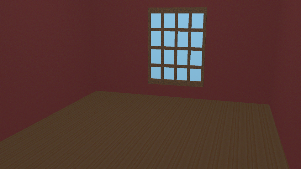
Above is the window that I created for this project. I actually had a lot of issues with this asset due to the renderer that I was using. I had initially planned to create an actual glass texture on the window pane, which I had learned in the lectures and was certain I was going to be able to achieve again, but when I tried to render this with the Maya renderer it would not become transparent looking and glass like. When I alternatively tried to render it with Arnold this worked however Arnold does not support wood textures so it actually removed the texture from the window frame itself and the scene. This meant that if I wanted to actually use the wood textures in my final finished animation I would have to compromise and move away from the idea of making the panes look like real glass. I instead used the Blinn material and changed it to a very light blue colour to give the appearance of glass and as if it is a really bright day outside. I chose to do this due to the limitations and issues I was having with rendering glass and I think it looks okay and fits in with the general vibe of my assets as I wasn’t going for something super realistic, only semi-realistic. After I figured out the glass situation I then used the same technique as previous assets and added the wood texture to the window frame. Once this was done I used the scene I created and imported this into the file and generated the render above using the Maya Software Renderer. I think despite the lack of proper glass texture this window looks nice and fits in will with my other assets.
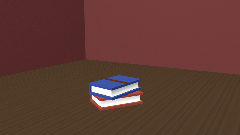
Above is the render for the stack of books that I created. As this was one of my last assets it was the quickest and easiest to produce and render of. I first began by selecting the interior pages of the book and adding the Blinn material, I then changed the colour of this to a more white tone to be the pages. I then started to work on the bottom book’s outside, I first applied the Blinn material and changed it to a red colour. After that I wanted to add a brown stripe to the front and spine of the book to add some detail and character. To do this I switched from object mode to faces and selected the faces that I wanted to change the colour of, I then applied another Blinn material and changed the colour of this to a brown shade. I thought this could mimic leather and add a bit of interest to the asset. Once this red book was complete I repeated these steps on the blue one and coloured this too. I think that overall the textures on these books look really nice and that they are very clean assets, I like how they turned out and I think that a stack of books was a good choice for my final asset.
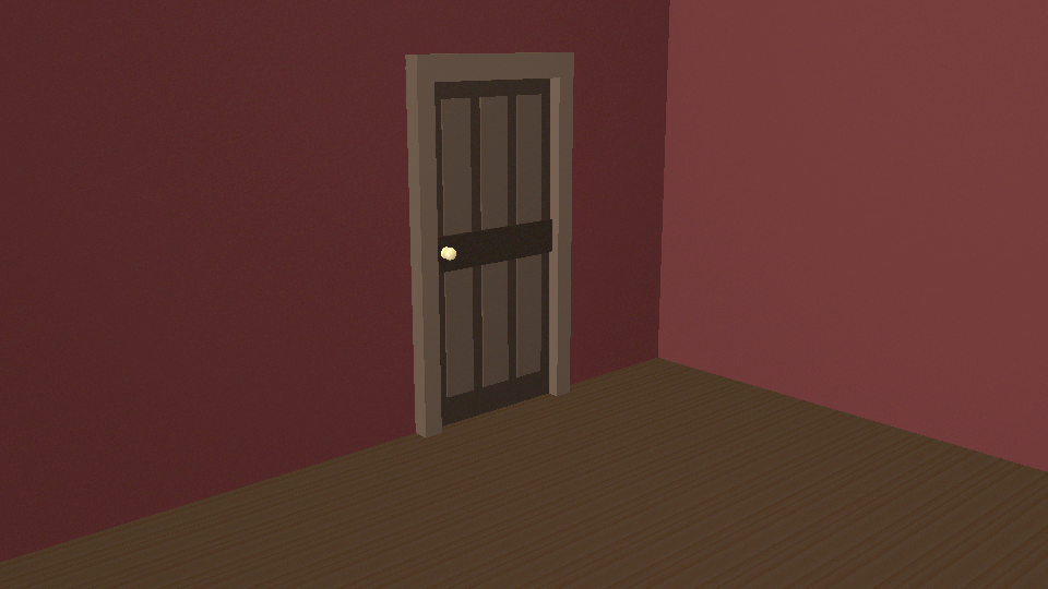
This is the door that I created for this project with the materials and textures assigned to it in the render. For the door I actually attempted to use wood textures on it but for some unknown reason I could not troubleshoot they did not render for me and kept showing up as the regular grey material once rendered. Because of this I actually stuck with the basic Blinn material for the majority of the door (excluding the handle for which I used Phong) and just changed the tones to varying brown shades so that it would really show off the separate elements so they didn’t blend together. I think I was able to achieve this and think it looks okay but I wouldn’t say it was my favourite asset of the ones I made. For the handle I used the Phong material as I knew this is one that makes assets look shiny so I thought it would be perfect for a metal handle. Once I applied this material to the handle I just had to change the colour of it to a more yellowy colour to make it appear gold. I didn’t end up changing any of the other settings for this material as I thought it actually looked good how it was by default. After materials were applied I just had to import my room scene, add lights, set up the camera angle and render the door using the Maya Software renderer again. I am happy with how this turned out and think that the render of this asset looks good, well lit and shows it off well.