Final Poster Design

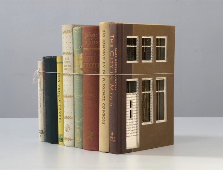
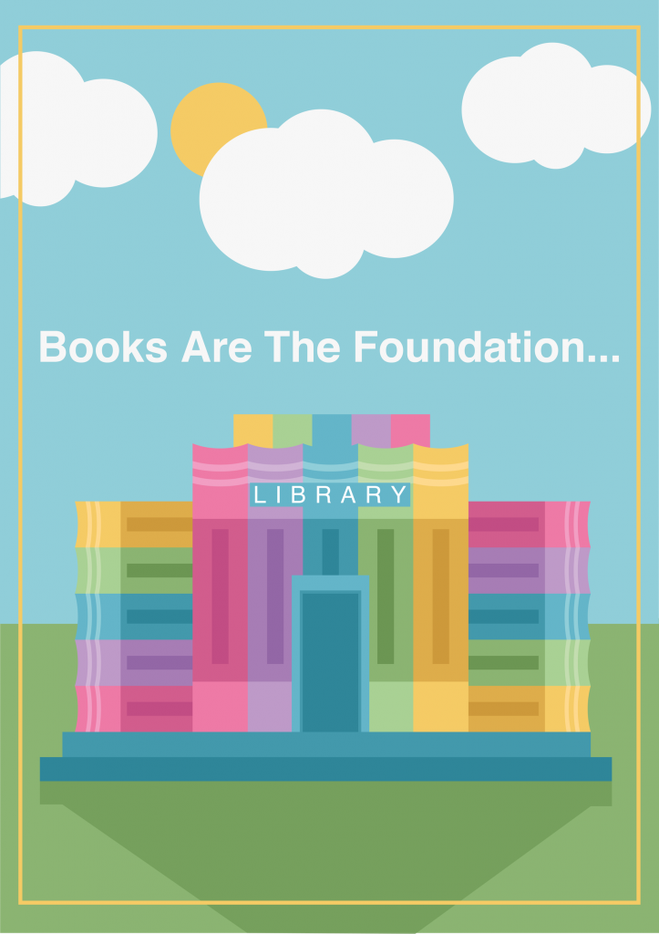
This is the poster that I created for the second half of this project. I am really proud of the outcome and I think it is suitable for my target audience and purpose that I chose earlier on in this project. My approach to this poster was to first start off with making some sketches of the design elements I had thought of and the placements they could have on a poster. I came up with 2 designs for this poster using my idea of making a building out of books.

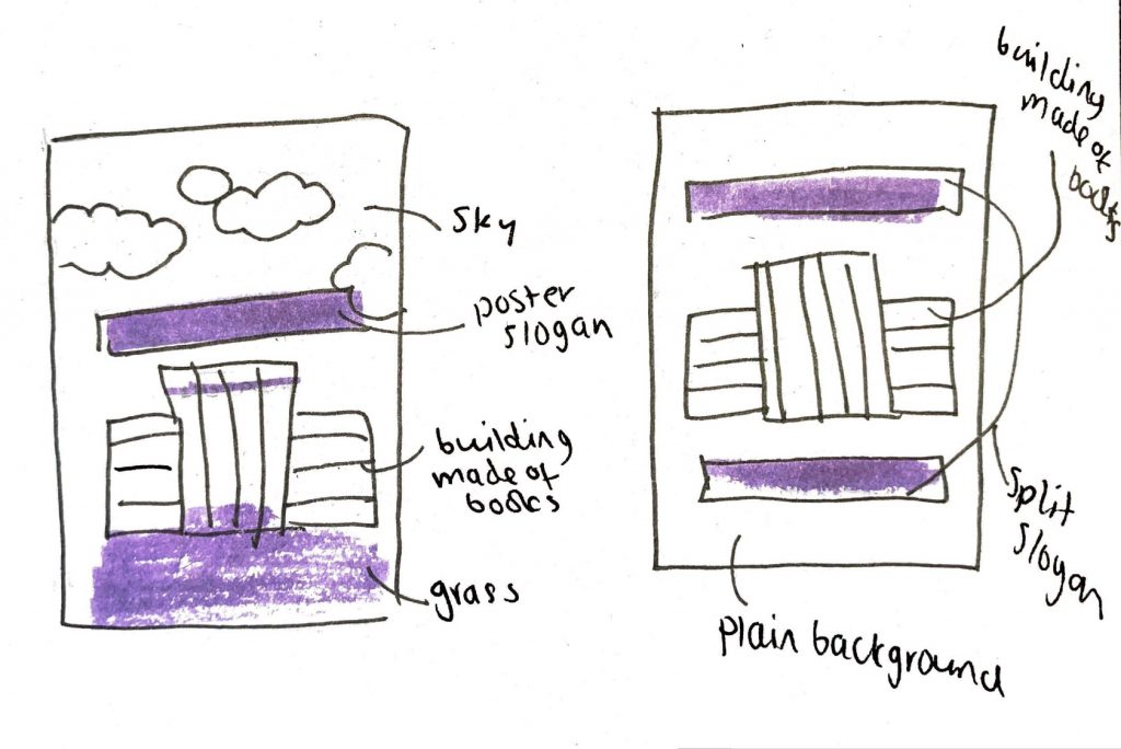
The sketch on the right was the first idea that I had. I initially thought that I would make the building out of books and then place it onto a plain colour background. I would then use the slogan title of the poster to go above and below the library in the middle of the page. I think this would have been a nice effective design but I worried that it wouldn’t show off that it was a building made of books if it wasn’t in an environment. From this I then created the sketch on the left.

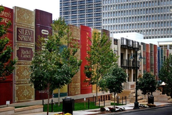
This sketch on the left xhad the same basic idea of having the library central to the design but I added a sky with some clouds and some grass at the bottom below the building. This I think really cuts the poster into sections and uses the rule of thirds to proportion things out on the poster. I think it looks better having an environment around it too as it is more clear what I was going for and what the design is meant to be. I think that it also adds more of a childlike element to it as it is similar to children’s picture books in its design.

To create the poster itself I first searched for the proportions of an A1 poster for screens. I then took these pixel measurements and set up my Illustrator document. I also played with adobe colour online to get a colour scheme that I wanted to use for my poster. I felt that working from a colour scheme would be helpful in picking colours that matched well together and looked uniform. Below is the basic colour scheme that I came up with for my poster. I decided to go for colours that were more childlike in appearance and were light and bright. I then took these initial colours and made extra swatches in illustrator of some darker and lighter tones of them all that I could use in my final poster for depth and dimension.

Once I had decided on colours to use and a general layout of my poster from my sketches, I then began to create my poster. I started with creating a book. I created this using the rectangular shape tool and also the minus/subtract pathfinder tool. To create the basic book I just layered some rectangles together in differing shades of one colour. To create the circular end I took a circle shape and subtracted it from the book. It then left me with a circular top edge of the book which gave it a more 3D appearance.

After I had created this initial book I then duplicated it so I had 5 of them and used the swatches that I made earlier on to change the colours of them so I had 5 different coloured books. I took these books after I was done changing the colours and individually grouped them together so that they were individual objects. From here I duplicated them some more and assembled the building out of books. Once I had done that I used the pathfinder tools to merge some circles together to make a cloud and added the sun and the shadow on the grass at the bottom. After this was done I added the text onto the poster, with a little text that said library on the building and added the yellow barrier around the outside to add a little more interest to the outside of the poster.

Once I had finished creating the poster I saved it and went to upload it to my blog however WordPress doesn’t support photos that are that large so I scaled it down by 50% for WordPress to be able to display it.

Overall I am really happy with how my poster came out and how it looks. I think that it fits the criteria of the project well and is an effective conceptual design. I like how it does look childlike and the colours I chose ended up working for the scenery too as it ties the whole thing together and looks very coordinated. I think that doing the earlier blog posts really helped me to get my ideas together and helped me gradually come to a suitable solution to the brief.

Creative Anxiety v. Creative Satisfaction

For this project, I was struggling to get my head around conceptual design at the point it was being introduced. I came up with my idea of a poster for libraries from my personal influences of reading literature and also as my local library closed recently, as many are starting to do. It took me a few weeks after that initial lecture to really start coming up with a conceptual idea that may work. The lecture that I think really helped me to consolidate my ideas the most was the one where we we were tasked to come up with 2 columns of words and create icons for them. This stage really helped me to start thinking of elements I could put together to make a conceptual design. It definitely took a lot of revising of my blogposts to settle onto something that I really liked as an idea and felt fit the brief well.

Talking through my ideas in groups last week also helped me to see what other people were doing and to get some peer feedback on my idea. By this point I was set on the idea of a library building created out of books. I think that this will be a really interesting poster design and really captures what I’m trying to portray, about how books are really important to learning and education. Also talking with Chris Newell about my ideas was helpful in this lesson as it helped me consolidate the idea of a primary school aged audience and gave me the new perspective of making the poster something that would be eye catching to teachers too to make them purchase it for their classroom.

I was a little worried at the start of this project but slowly as the weeks went by and I was working on the blog posts my ideas fell into place and I was able to come up with an idea I felt was satisfactory. It was really relieving to finally have the idea completely in place and to begin to start working on the poster itself.

Bob’s Atomic Pizza- The Conceptual Design Process

In the lecture this week the task was to come up with a logo design for a fictional company ‘Bob’s Atomic Pizza’. To do this the first step was to play with the words, their orientation, positioning and case etc. The first page in my notebook was dedicated to this step. I took the words and started to scribble down some different ways I imagined the typography, along with some random ideas I had related to the words. This was really helpful as it helped me to see what way the words looked best.

The second step, shown on my 2nd page, was to take the two main words (being Atomic and Pizza in this instance) and writing down any words that came to mind associated with these 2 words. We went around the class after establishing these lists and shared ideas to come up with more words, this was particularly helpful as people came up with things that I hadn’t even thought of and vice versa.

The next step was to draw some small icons next to the words to represent them, this was really helpful as it made me consider what other things I could add to a logo for the pizza place. Once I had these small icons drawn I used the bottom of my page to combine some of them together to make some sort of conceptual ideas. My favourite two are the pizza with the bomb explosion at the top and the pizza with the atom icon on it, becoming part of the cheese.

In the lab I then took these ideas that I made from all the stages of the exercise from the lecture and started to create them in illustrator. I played around with different typography and concepts and I think I came up with some that are visually appealing. For the font I used Futura, I chose this font as it is obviously a really modern and futuristic font and I feel like after making the list of words for Atom, I got a very scientific and futuristic vibe.

I think the design below is the best one out of the four examples that I made, I think it is my favourite as it really combines two ideas well and is a good conceptual design. The cheese has some missing parts in it to create an atom outline and the pepperoni on the pizza almost becomes atomic particles within the atom icon. I think this one is a really good idea and is an interesting take on the concept. I don’t think I would have been able to come up with this idea without doing the exercise in the lab first, and I think it was a particularly effective way of idea generation.

For the typography I chose one of the sketches that I made in step one when playing with the words and placed the words on a curve using the area type tool in Illustrator. I think this works well as it is curved like the pizza and really adds to the whole look. For the colour palette I used complementing colours and kind of muted hues to create a cohesive look for the design, with the blue almost contrasting the pizza in the middle yet matching with the yellow very nicely.

Discussion and Feedback on Work in Progress

Within the lecture the other day we were taken through some steps we could use to come up with concepts and ideas for our A2 poster design. I found this particularly helpful as it generated further ideas for myself and I think strengthened my design idea and gave me an alternate route incase I changed my mind on my primary school poster idea.

I think however this task still helped me to be more set in my idea of a library poster to encourage the use of libraries and to get people interested and to help them stay open through new users.

Below is the document I produced within the lesson as ideas were being realised:

I found it particularly helpful to make the lists of words to use. I did struggle coming up with a few of them but we were instructed to work in groups for this step which was very helpful. Being able to ask for an outside opinion helped me write down more related words and get a better idea for my lists.

Above is some of the symbols from Pages on Mac OS, which is what I was using to type out my work within the lecture. One of the steps was to think of icons/images which matched up with some of the words we came up with in the lists. I think that these icons that I chose from the symbols category actually sum up a lot of my words really well.

Overall the idea of getting peer feedback and the help from the lecturer taking us through steps, I think helped to strengthen my idea and make it something that I can really create something good with. It really helped me to think of other ideas that I could fall back on incase I have trouble with creating the book building idea I’m working on.

Poster Subject, Purpose, Audience

I think that for Assignment 2 my poster subject will be something to do with books. In my every day life I read many books and I have quite an extensive collection. I was thinking that I could make a poster where the book spines on it make something else, like another shape. This would combine my one idea of creating vectors of spines of books that I like and also of making them into another shape, maybe of a heart or a city scape, or maybe even a tree which of course books are made out of. I think this would be an interesting idea and would create an interesting conceptual poster design.

I think the purpose of this poster would be to encourage people to read more books, and get interested in the medium. It could be a sort of advertisement for using your local library to get younger people more interested in reading and supporting their community libraries.

I think the audience of this poster would be primary school aged children. I think this is a good target audience as children are very impressionable and I believe easy to design for. This poster could be targeted at children but advertised to teachers to put up in their classrooms to motivate the children to get interested in their libraries. The poster would have some fun catchy slogan on it for the adults which would get stuck in their head such as “books are the foundation” as I think the design will tie together two ideas to make a building out of books.

My Bookcases

Whilst looking for things relevant to my idea I did not find any existing posters but I did find some art/ buildings. Below is the Kansas City Public Library. This being a library, a place for books and education, the entirety of the outside of the building has spines of famous books built onto it. This is a very unique architectural design and from looking at pictures art first you would assume that it was photoshop as it is a very interesting and kind of unbelievable design.

Kansas City Public Library, https://www.pouted.com/15-creative-building-designs-around-the-world/

Below is another piece of creative art that actually uses real books. At first glance this looks like a nice stack of books yet on further inspection there is actually windows and a door cut into the side of the book, it actually goes all the way through so you can see inside of it. Looking at the spines again after realising that it is a building you could see it as a city scape almost as if they are differing height buildings.

Built of Books, Frank Halmans, https://khooll.com/post/118665812197/built-of-books-frank-halmans

I think that my idea to create a building out of books is an adequate conceptual design and that it could be really effective if I am able to execute it well. I think by choosing a young audience it will be easier to create as I will go for a more minimal and colourful design for the poster. I will be making this poster in Illustrator where I have pervious experience, and hope that it will be an effective piece of design.

Conceptual Design

For this blogpost it took me a little while to find some good examples of conceptual design. I ended up finding some by searching terms like “logos with hidden meanings” and “hidden designs”. I felt this was the best way to find work that had two design ideas together that created a different yet effective outcome. A lot of these were logo designs so the first one I will talk about is the logo for the Tour De France.

This design is the logo for the cycling event. The font used in this logo is very unique and looks hand written almost, it makes it look very free and natural. The hidden part of the design is the “OUR” in “Tour” actually being a person riding a bike. The yellow circle behind the text is actually the front wheel of the bicycle. This works as the event is obviously about cycling and it adds some depth to the logo and the meaning behind it.

Tour De France Logo, https://toni-marino.com/tour-de-france-logo/

Below is another, yet different design I found of The Night King from Game of Thrones. I saw many posters and art pieces like this whilst researching and it is a very popular concept. This one has a design in the centre of a key scene from the series which is pretty much monochrome and is really nice artwork. This scene however is actually shaped like the character the poster is about, using negative space to create a sort of silhouette of their outline. When you look at this more you notice in the scenery in the background that the mountains make up the collar of the characters clothing, the birds place the eyes and the moon in the middle actually highlights where the original character has a crest on his outfit. The more you look at it the more you notice different elements of each design separately and see that they work on 2 levels and combine to create an interesting poster.

Game of Thrones Poster, https://displate.com/displate/916904

Inspiration

This task was to identify things that made me into the person that I am today. It took me a while to think of events in my life that made me who I am, but I thought of some eventually that link to my interests today.

When I was little I spent a lot of time with my Nanna, she lived in Asia for a portion of her life so she showed me many subtitled animated movies and such from Japan that she would read to me. Later in life, in my early teens, I stumbled back upon that art style myself and remembered it from my childhood. This spurred me into exploring Japanese culture and media, from there I became an avid collector of comic books and have built a collection. Watching Anime as a kid influenced me and developed my interests to this day in this art style and culture. Subsequently it influenced me as a designer as in my spare time I create minimalist vector art of characters from the shows that I watch and read, and helped me to learn more about Adobe Illustrator to make these.

Along the same lines I also read a lot of novels as a child, once I had read through all the books in my classroom one of the teachers gave me a copy of Harry Potter. This got me interested in the fantasy genre and encouraged me to keep reading as the series continued. Today I own close to 600 books and have a passion for reading and knowledge. In college my final major project was about redesigning book covers and creating new editions with marketing and such to go along with them. This was one of my favourite projects I’ve ever done and the research taught me a lot about the design industry within publishing, I think reading influences me a lot in my design and my life as I spend a lot of time reading.

These two things in my life could connect to a poster somehow by taking design influences from common styles in the areas. I could create a poster inspired by a classic book cover or something along these lines.

Below is the graphic that I created in Adobe Illustrator of my name:

Design Experience – Brynmor Jones Library

The task I was given this week was to explore a design experience I had witnessed, I chose to go and observe the library entrance barriers as my artifact for this assignment.

These barriers in the library are situated on the ground floor with access from both sides of the building, on each side there are 3 machines, one side has 2 in and 1, the other is the opposite. These barriers are used to scan in and out of the library, this permits access only to students and faculty of the University.

The steps to use these barriers are: walk up to it, take your student card, place it on the light to scan the card, the gates will open, then you walk through and they close behind you.

Whilst observing students use these barriers I noticed that a lot of people were getting confused about which machines could be used to enter and which could be used to exit. A few people looked confused and walked up to the wrong ones and had to wait to use the correct ones, which in turn sometimes started queues forming. The signs for the direction of the barrier are on the small screen on the front and cannot be identified easily from a distance. This means that people have to quickly identify which barrier is which from a closer distance, which leads to mistakes, and in turn causes waiting at the machines and delay for entrance and exit.

Adobe Colour Influence: Bauhaus

As with the magazine layout, I again took the same approach in doing my Bauhaus piece again. I created them in illustrator and improved it in some areas I felt needed improvement. However this time instead of trying different settings on adobe colour I chose the triad colour scheme and took the 3 main colours from my Bauhaus piece and created colour schemes for these.

Below are my new Bauhaus inspired pieces using red, yellow and blue triad colour schemes:

Adobe Colour Influence: Magazine

For this task, we had to experiment with Adobe Colour, a tool for generating colour palettes. For this, I took the magazine layout I previously created in XD and remade it in Adobe Illustrator. This time I made sure to improve the design and fix the small issues/mistakes in my first go.

Things I did include: making sure my photos lined up properly, using rulers to make sure that spacing was equal and uniform, using the justified text for the columns, and making sure any shapes in the background didn’t overlap lines of text. I think that the general design of the magazine looks improved and I found it easier to create in Illustrator due to features such as the column options on text boxes and the rulers.

Once I had remade the design I went to the Adobe Colour website and took the blue shade that I used in the original design’s hex code and used this for the base colour for the palettes. I experimented with Analogous, Monochromatic and Triad colour combinations and implemented them into my designs. Below is the magazine influenced by adobe colour: