Example Visuals

I really wanted to create some sketches and plans for the look I was going for in this project. I created the below visuals to really show the style and layering I want to achieve within the project.

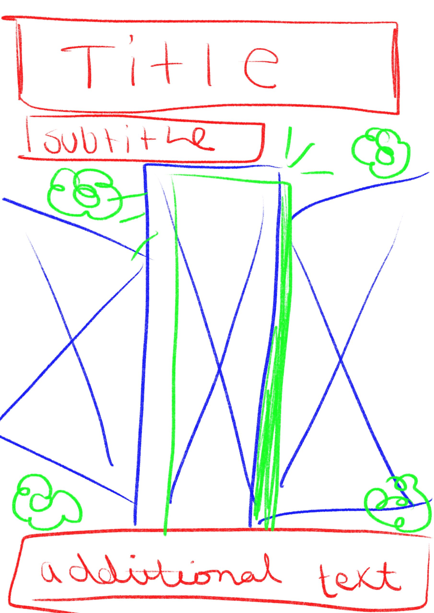
Below is the first one I created. I created my design on the app Procreate on my iPad so I could draw all the elements and edit precisely. I started by sketching out a layout of the design, using different coloured pencils to indicate the different layers and how the design would go together. The blue parts would be the places of images to go and the green would be the layering of hand drawn doodles and elements over the top of the design. Once I had this sketch I then decided that I would realise it a bit more and add some real images and text to the piece to make a strong example of the visual style and outcomes I am attempting to create.

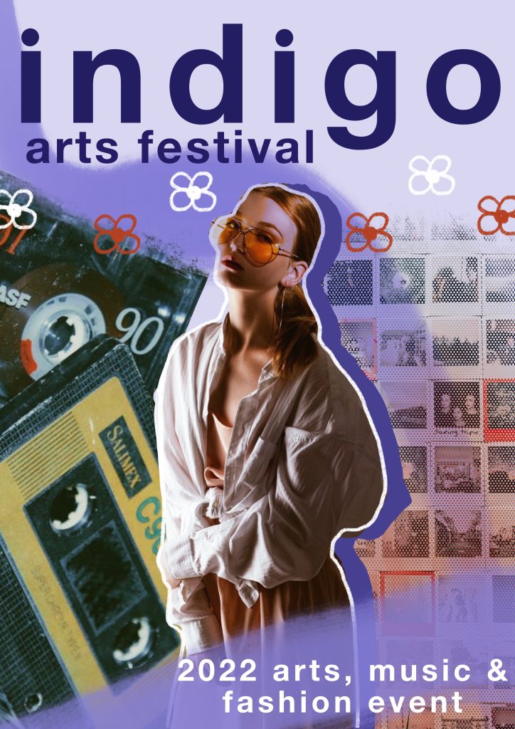
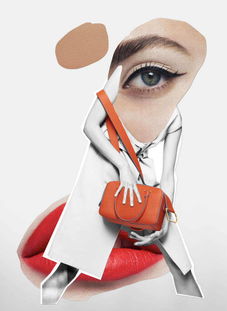
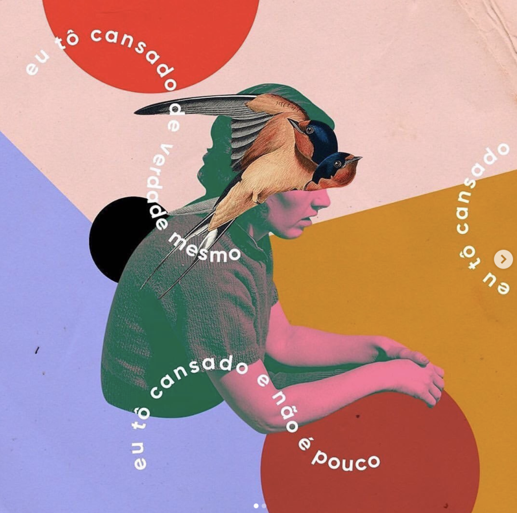
To make the version on the right I first used my sketch as a base layer to build on. I came up with the name Indigo to use as a placeholder (though I really like how it sounds for the festival and may carry it forward). I used the font Helvetica Neue for the text in bold as I felt it was really striking and eye catching. I also decided to use only lowercase text on the piece as that aligns with the common writing style of my target audience. I then added some paint strokes in the background and behind the bottom text. Next I decided to use some free use stock images and found 3 I wanted to use that gave the vibe I was going for. I edited these images and took away background and pieces I didn’t want. I also changed the colours on the main image of the woman to make it fit the colour scheme my piece was evolving to have. I then layered these images and used varying eraser brushes to add texture to them. I finally finished by adding the shadow to the main image along with the doodled outline and then drew the flowers. I really love how this visual turned out and I think it really shows what I’m going for.

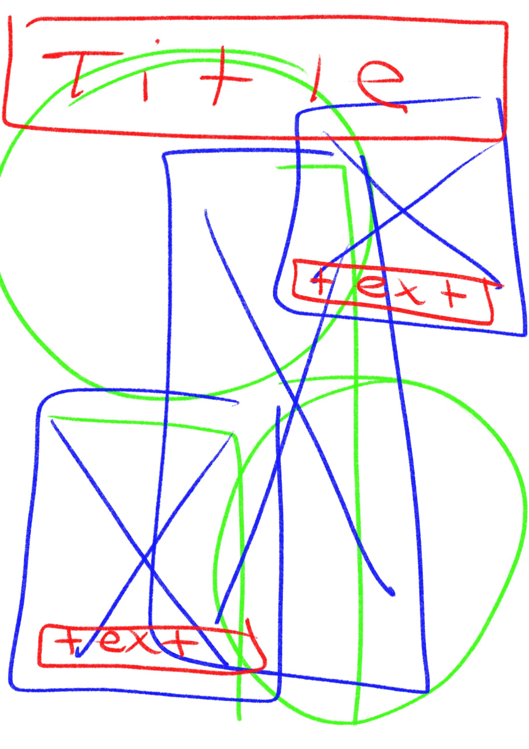
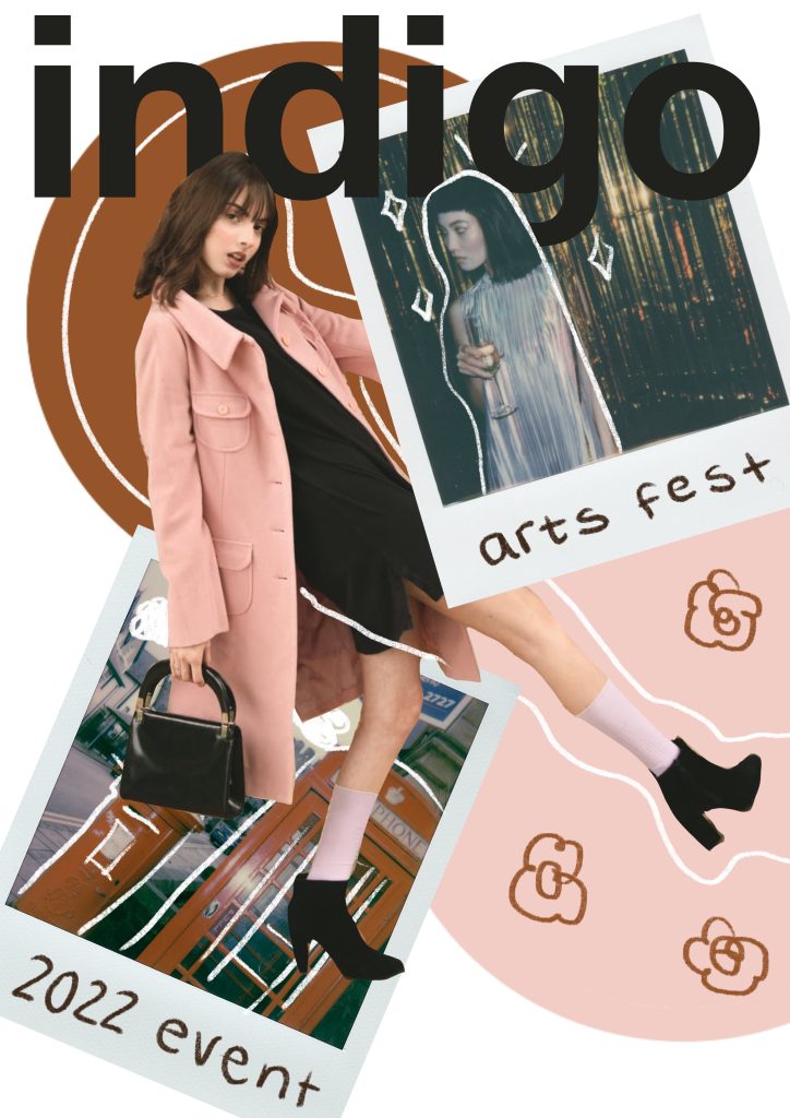
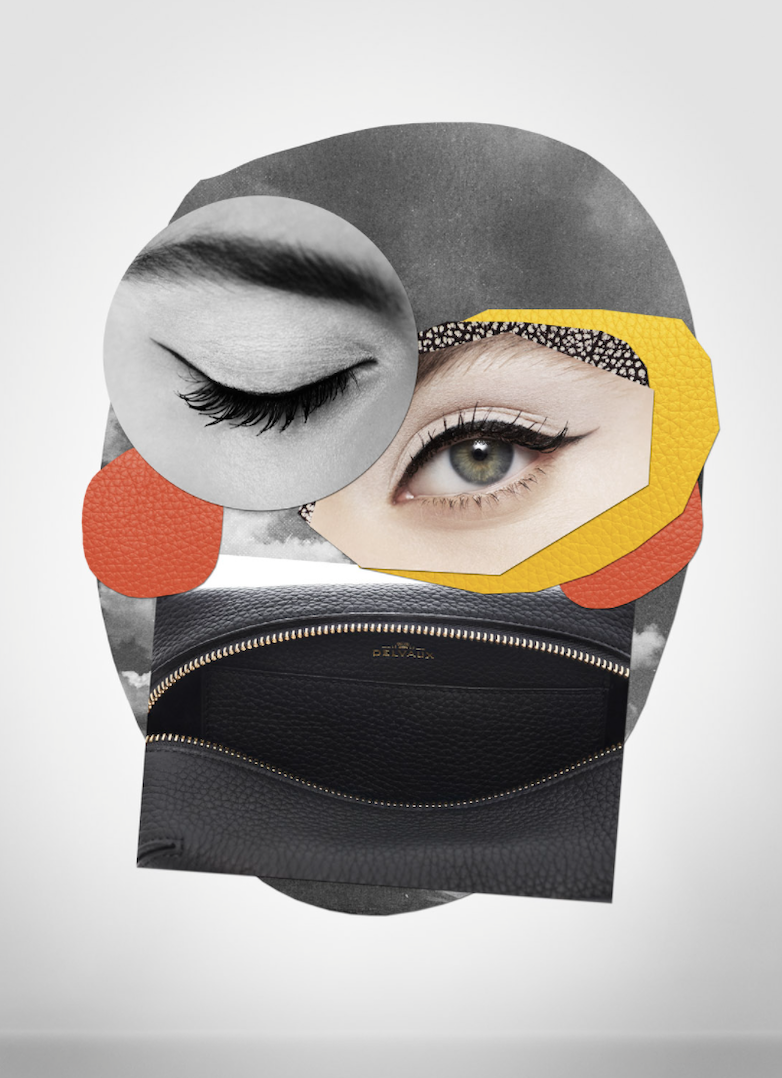
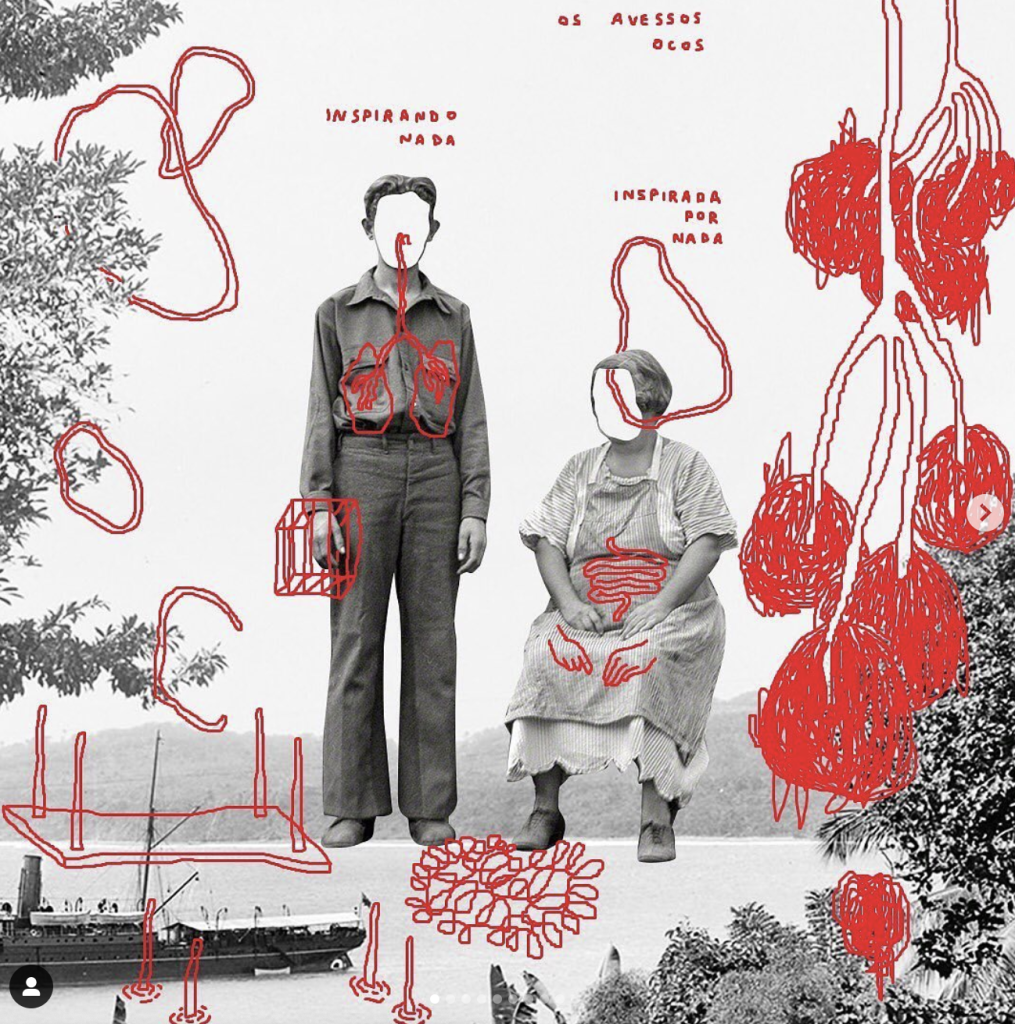
This above is the second visual I have created for this project. I wanted to have some varying designs but with the same visual style to show the different possibilities with the theme I have chosen. This image I first started by creating the sketch design on the left. I created this sketch using colour coding again to show the different layers on the image and how these would interact together, red for text, blue for images and then green for any additional graphics or illustrations I wanted to add to the piece. Creating these base sketches to work from really helps me to get a sense of how layers of the collage are going to interact with each other and what I want to be where on the image. To create the version on the right I again started with some stock images I found on a free image site and found some that I liked and wanted to use. I really liked the Polaroid style images so I had to use them in this piece. I started by creating the background circles I wanted in the design, pulling colours from the images within the file, once I had a good base I then edited the middle image to have no background. I then placed this where I wanted it and layered in the polaroid photos. I wanted things to be on different layers and images to interact and overlap each other. Once I had the images in the place I liked I added the title text, taking time to erase parts around the images so things overlapped with each other and added more dimension to the collage aspect. I then decided to write the sub text on the Polaroids to add more of that hand drawn doodle style to the piece, I think it adds an interesting element. Finally I took a white pencil brush and added in some lines and doodles along with some flowers to tie back to the other example visual.

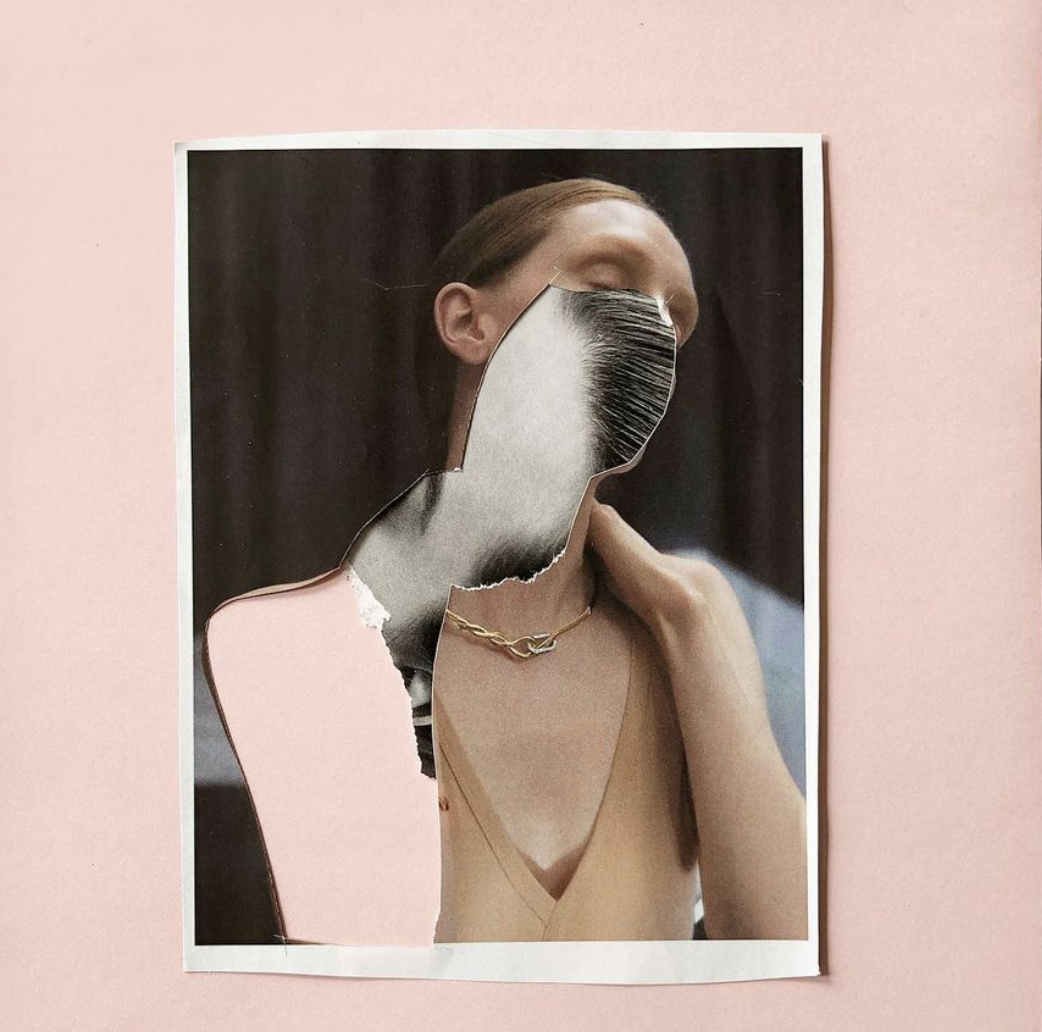
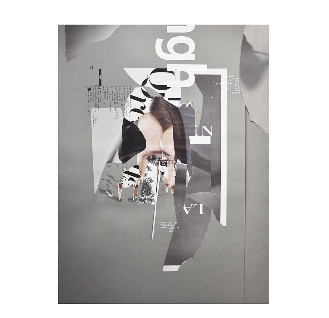
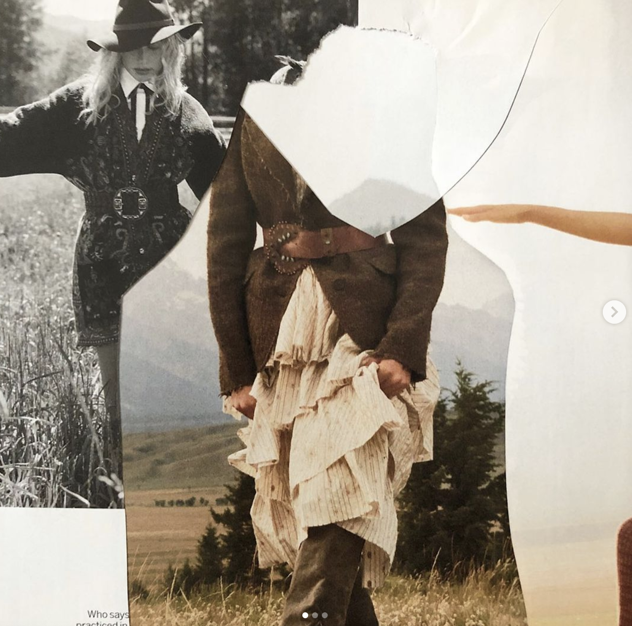
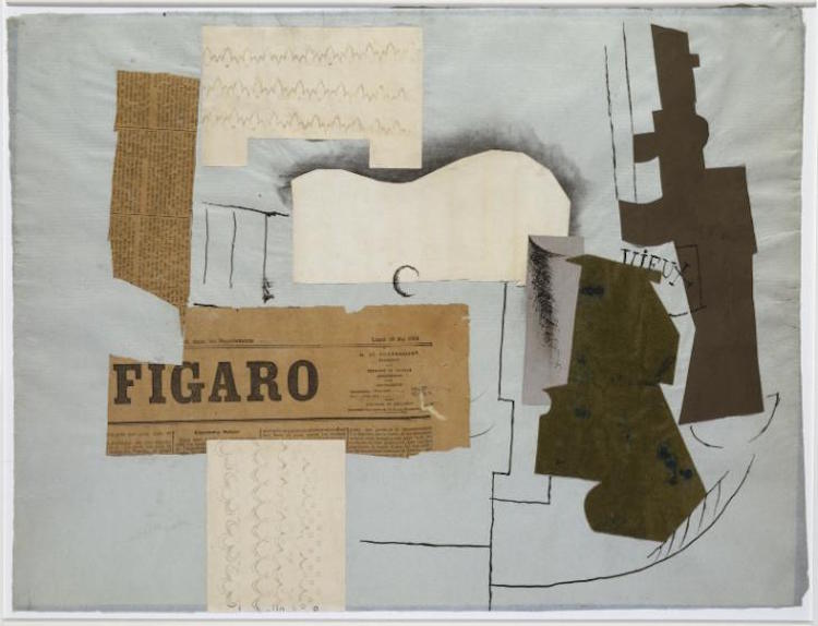
Creating these visuals I think is able to show well the direction I want to go with my project and how I want to approach the promotional materials that I am creating. I think that I will be using some found stock images and trying to mix in some images of my own into the project to add elements of found and original content, which I feel sticks true to the collage art form. I may also print some images to be able to create jagged ripped edges on some of the pieces which I wasn’t able to create digitally. I think it would add a nice physical element to the digital pieces.


References:

Athena, 2019. Woman Wearing Pink Overcoat and Black Inner Top [online]. Available at: https://www.pexels.com/photo/woman-wearing-pink-overcoat-and-black-inner-top-2043590/ [Accessed 22 Nov 2021].

Balbarde. L, 2020. Pile of Cassette Tapes [online]. Available at: https://www.pexels.com/photo/pile-of-cassette-tapes-3642350/ [Accessed 22 Nov 2021].

Lisa, 2020. Collection of old instant photos with trips [online]. Available at: https://www.pexels.com/photo/collection-of-old-instant-photos-with-trips-5653734/ [Accessed 22 Nov 2021].

Lisa, 2020. Vintage Red Telephone Booth on Street [online]. Available at: https://www.pexels.com/photo/vintage-red-telephone-booth-on-street-3704052/ [Accessed 22 Nov 2021].

Mishchenko. K, 2019.Woman Standing Indoor [online]. Available at: https://www.pexels.com/photo/woman-standing-indoor-1926769/ [Accessed 22 Nov 2021].

Seliverstova. I, 2020. Woman In Silver Dress [online]. Available at: https://www.pexels.com/photo/woman-in-silver-dress-3550243/ [Accessed 22 Nov 2021].

What I Am Planning to Create

For this project I think I have a clear heading in what I want to produce as my final outcomes. I want to create a series of promotional materials, including posters, online advertisements and a social media presence for the festival. These posters that I create will be presented as both a digital asset (present on the social media sites) and a physical asset as real life posters. These posters can additionally be used as collectible merchandise for the festival itself and possibly even presented to be sold on tote bags or t-shirts. If I have time in the project I will be attempting to create some video content as an asset like this would be really useful in helping to reach my target audience of young people. The social media app TikTok is an impactful tool which can be used to reach many people whilst remaining easy to consume short form content.

For each piece I will be creating I will be spending time planning each part of it and making use of creating mockups and sketches of my work to make the design process smoother and to really test out ideas. Within the visual collage pieces themselves I will be using stock images for a lot of the elements but I will try to incorporate my own photography where I can to add more personality to the pieces. I will also be making use of printing some of the images that I will be using in my designs and physically tearing them and distressing them then scanning the images back to digital to add more organic looking collage elements to the edges. I think this will achieve a much more unique and traditional look to the materials whilst still keeping the digital elements and format I wish to work with for the majority. I will be using a various array of softwares such as Procreate, Adobe Photoshop and Adobe Illustrator to create my work.

Marketing & Branding Research

As my project will include creating promotional materials for the arts festival that I am creating, I felt it was important to do some research on branding and marketing, including what the difference is and what these terms really entail.

To put it simply, branding is the creation and styling of your business. Branding is something that every company or project must do to create a recognisable and useable look for their business which can be used within any marketing materials. Branding can include defining the companies values, mission statement and the creation of a style guide including a logo and colour scheme to differentiate the company from others with a strong visual style. Branding helps a consumer to have an idea of the business that they are supporting and tells them at face value what they can expect from your services. All companies should start with branding as marketing strategies can only be devised once you know clearly what your brand is about. Branding is something that will stick with the company for years to come until it is refreshed, whereas marketing can be changed and updated whenever to push new campaigns.

On the other hand, marketing is the opposite of brand creation. Marketing is the way that the brand then takes their message and gets it out to the world and potential consumers. Marketing can be achieved using a number of tools and can be specifically catered to your brand’s chosen target audience and can come in the form of online or offline methods. Methods for marketing a brand can include: social media, advertising, newsletter/ promotional emails, website content, SEO campaigns and may other methods. Additionally marketing can be done the traditional way with use of print medias. These print methods include: posters, leaflets, merchandise, billboards etc. The methods employed by the brand depend on the target audience, where they are most likely to view the marketing campaigns, and what is popular at the time is also a factor. Choosing a popular social media platform for instance or leaning into a trending merchandising gimmick for promotional marketing, can lead to an increase in consumer attention and promotion for the brand.

To apply these concepts to my own work, I will of course need some sort of logo for my arts festival to put on the promotional materials that I will be creating to ensure a recognisable brand for the audience. I will also need to decide on which areas of marketing I would have the most success with when creating the promotional materials for the event. I was thinking about using both print and digital media to promote my festival as this will reach the largest target audience. Using things such as posters and stickers is a way for my target audience to physically interact with the event beforehand and a chance for them to spread the word and to show off the marketing they have seen in person on their social media accounts in photographs. Digital marketing will also be really important for me as my target audience is young adults and people in their 20’s. Having social media advertisements on platforms such as Instagram and Twitter will be beneficial as many young people use these platforms. I have also considered using the widely popular video sharing app, TikTok, to spread content about the festival as well in the form of advertisements and promoted videos.


References:

deBara.D, (2019.) Marketing vs. branding: what’s the difference? [online]. Available at: https://99designs.co.uk/blog/marketing-advertising/marketing-vs-branding/ [Accessed 17 Nov 2021].

Keplinger. M, 2021. Branding vs. Marketing: What’s the Difference? [online]. Available at: https://www.smashbrand.com/articles/branding-vs-marketing-whats-the-difference/ [Accessed 17 Nov 2021].

Newell.C, (2021.) The Basics of Marketing [PowerPoint Presentation]. Available at: https://hullacuk-my.sharepoint.com/:p:/g/personal/c_newell_hull_ac_uk/EVG5hN1SPydJkIjSrSAdw9UBDB9YAjqoLOPCVnyH9uy4lQ?e=4%3AFbqE6H&at=9 [Accessed 17 Nov 2021]

Outbrain, (2021.) Branding vs. Marketing – what is brand marketing? [online]. Available at: https://www.outbrain.com/help/advertisers/branding-vs-marketing/ [Accessed 17 Nov 2021]

Arts Festival Examples / Inspiration

There are many arts festivals all over the world but I wanted to look at ones within the UK for inspiration for existing festivals and fairs so that I could gather knowledge about how things are done within the UK design community.

The Frieze Art Fair is a festival that happens around October every year in London. This festival was created to celebrate living artists and show off contemporary creations to a range of viewers. The festival hosts over 170 galleries and artists, showing a unique and diverse range of artworks. As the selection of media and art genres is so broad the branding and promotion for the festival seems to lean more to being bold, minimalist and striking rather than creating anything overly complicated to sum up the event.

The main advertising posters which are viewable outside of the event are a solid blue colour with a minimal amount of text. The logo used on this poster is really interesting as the font is broken up by blue lines and to me almost resembles blocks fitting together to create the letters. This makes me think that the logo sums up the festival well as it is of course the works of various artists coming together to make something new. The logo also has some corner pieces to it, showing the boundary of the logo and giving the illusion of there being a box around it. The poster is very simple in itself but I think it is very striking and the minimalism draws the eye to the elements you want the viewer to focus on. The minimal text allows the information that is there to be bold and the forefront of the design. I will take this into account and on top of my collage designs will think carefully about the text that I am adding to my pieces to make sure the information is striking and important so no space is wasted.

The festival’s website follows a similar style to their posters, that being minimalism as the forefront of the design. The images seem to be carefully chosen to draw the eye and add some colour to the simplistic site. This puts the artwork itself in the forefront and makes it very eye catching. The website also seems to prioritise important information over much visual clutter. The art piece shown on this page is bright and colourful and catches the eye and is layered with important text.

The other festival I chose to look at is Brighton Festival. This is the largest art and cultural festival held in Brighton every year. Beginning in the late 1960’s this festival constantly works to become more diverse and ambitious with its featured artists every year. The festival hosts a range of artists from performance and music to traditional medias and is constantly working in collaboration to bring new forms of media and creators to the spotlight. The event hosts artists and performers from across the world but also works to promote the work of local artists as well.

The promotion for this festival seems to be focused on creating really recognisable and strong branding to make a memorable impression on the viewer. The logo is the forefront of the website with elements of it being used across the website. The pointed edges of the F logo can be seen in various parts of the website. The site also focuses on multimedia assets and there is a video showing interesting pieces and exhibitions from the event. The logo and the important text are layered over the top of this video. This feels like a form of collage within the site as it is layering different elements together with different media’s and it gives a really interesting effect as it is very bold and makes the viewer keep looking at it to see all of the pieces. The rest of their visual branding and promotion follows the same style of layering assets and the same bright pink colour scheme.


References:

‌Brighton Festival. (2021) About the Festival. [online] Available at: https://brightonfestival.org/about-the-festival/ [Accessed 12/11/2021]

‌Frieze. (2021). Frieze London | Frieze. [online] Available at: https://www.frieze.com/fairs/frieze-london. [Accessed 12/11/2021]

Yoo.A. (2012). 10 Must-Visit Art Festivals Around the World. [online] Available at: https://mymodernmet.com/must-visit-art-festivals/. [Accessed 12/11/2021]

What Is An Arts Festival?

Arts festivals are a type of festival that combines a diverse array of art forms into one cohesive space in which creators can display and sell their work and gain a new audience. These art forms can include but are not limited to: art, fashion, literature, performance theatre, photography, film and music. These festivals can combine a wide range of these formats or be solidified into just one kind, such as a music festival or a film festival meant to showcase each of these artistic disciplines. The genres of artistic expression portrayed in these events can vary as well and can either stick to one genre/theme or try and display a range of them to bring in a larger more diverse audience.

These events are first and foremost created to celebrate art and the work displayed at them. It gives artists freedom of expression and a chance to showcase their work to an audience who may not usually see their work and allow them to grow in popularity. The artist can also have a chance to interact with individuals who admire them and host meet and greets to meet these fans. The artists at these events can also put their artwork up for purchase and sell art commissions to interested buyers who may be attending. Additionally at some arts festivals workshops and demonstrations can be ticketed events within the main event, allowing customers to develop skills from professional artists.

The range of events and artworks that can be seen at an arts festival varies from event to event. A lot of more modern festivals choosing to add more musical elements to their festivals to draw in larger crowds as notable musicians and bands can play at these events. These festivals also can host local or notable designers for clothing boutiques and brands to allow people to purchase sustainable clothing and remove the need for purchasing on the internet from your favourite artist and harming the environment with the transport of your package. A lot of young people are interested in helping the environment and buying from sustainable creators, brands and local businesses for a range of art forms. Many like to support a local artist, so arts festivals are a good chance to be able to do this by purchasing an art print or some merchandise from the creator.


References:

BridgesandBalloons. (2019). Five of the best arts festivals in the UK. [online] Available at: https://bridgesandballoons.com/best-uk-festivals/ [Accessed 30/10/2021]

Kilchermann. L. (2021). What Is An Art Festival? [online] Available at: https://www.wisegeek.net/what-is-an-art-festival.htm [Accessed 28/10/2021]

Payton-Lombardo. H. (2013). Festivals in the Frame. [online] Available at: https://www.artsprofessional.co.uk/magazine/268/article/festivals-frame#:~:text=Arts%20festivals%20also%20enhance%20local,perceptions%20of%20places%20and%20people. [Accessed 24/10/2021]

Rainbow BKK/Shutterstock. (2018). Festivals are bigger business than ever before. [online] Available at: https://theconversation.com/festivals-are-bigger-business-than-ever-before-but-that-doesnt-mean-theyve-lost-their-care-free-spirit-98777 [Accessed 20/10/2021]

Collage Examples / Inspiration

To help inspire me and look at existing examples of modern collage, I decided to find some artists that I thought were interesting and creating work in a similar style and for a similar purpose. Below is a collage artist that I discovered, Martin Vallin, who works primarily in creating unique and interesting advertising campaigns for designer brands. I was particularly drawn to the work produced by Vallin as I think looking at relevant advertising campaigns is important, to see how things are being done by professionals in the industry of promotion and advertisement.

I was most drawn to the use of multiple layers of images with the differing in colour vs black and white within a lot of the work. I think it really helps the feature elements to stand out. I also am inspired by how centralised the designs are in the middle of the advertisements, it is really striking in contrast to the plain backgrounds and I could see something similar being a technique I use. I think creating some of my poster marketing to be inspired by this style of collage would lend well to my project as there is a lot of room at the edges to add textual information to the piece whilst not compromising the collage.

I really like how Vallin plays with the size of items and how the images are cut together. The differing sizes and shapes give a surreal feeling to the advertisements and make them stand out a lot. You could spend a lot of time looking at them and finding new elements every time, making the audience want to come back multiple times just to investigate the images.

I decided that a good place to look for more interesting modern collage artists would be Instagram. A lot of artists enjoy using platforms like this for their portfolio’s. The first artist I discovered that I loved the style of was Marcos Coelho. Coelho uses digital collage techniques to make interesting, colourful designs, incorporating photography, drawings and graphical elements with text to create unique pieces. These pieces that I have included in my post were the ones that struck me the most and I found most interesting and similar to the style I have thought about for my own pieces.

I really enjoy the interesting combinations of images with the shapes and colours of the graphic backgrounds. I think it’s really striking and adds an interesting brightness to the pieces. The use of different techniques and digital materials adds depth to each piece and really shows off the layers between each element. I particularly like the top right image as I think the contrasting edited colours of the image compared to the background really draw the eye and that the curved text is a unique addition that relates the text to the background patterns and adds purpose. Additionally I really enjoy the bottom left image. The photo collage aspect is minimal but the drawing on top adds an extra layer to the design and is similar to what I was considering creating for my promotional materials. I think the drawings on top add a personal touch to the designs and really elevate the piece, offering depth and an insight into the artists thoughts as each additional drawing is purposeful to the design.

The final artist I found to study the work of is J. Nathan Dziedzic also from Instagram. His style is very editorial in my opinion and even though he uses colour sparingly I think he is able to use it very effectively. From reading his captions, Dziedzic uses digital and physical collage techniques and is a fan of screen printing to create his pieces. Most of the imagery used is found content from magazines and such. I really like the texture and jaggedness of this artist and I think that his collage work is really striking.

Each of the pieces I have added to this post feels very distinctive and the images used give a really professional feel to them. The colour pink was used a lot in a lot of the pieces I saw and I think it is a great contrast to the images used within them. Elements of graphic shapes are used in quite a lot of the pieces I saw along with some typography which I think adds a lot of depth. The fact the artist uses physical collage techniques in some of his pieces is really evident from the jagged textures on the edges of some images and adds an organic look. Printing images to then destroy physically and scan back in to assemble may be something that I end up doing as I think it looks much more natural than anything that could be created using digital erasing brushes or textures. I really like the top 2 images here the most, they have less collage elements than some of the other pieces but I think the minimal aspect of them adds to the pieces and makes the collage elements that are there more interesting to pick apart with your eyes and view the layers.

Additionally I also created this Pinterest board that I am actively adding to and using to amass different collage artwork from different artists around the Internet. I spent some time trying to find some images which were inspiring to me and had elements that I want to include in my designs. I am still particularly drawn to the ‘vintage’ early 00’s style posters as can often be seen in this Pinterest board. I think that the nostalgia of the editing style and the collage techniques together will be really relevant to the young adult/ early 20’s target audience which I want to cater to. The use of doodles and other small graphic artworks layered with the images and the addition of text, I think is very visually appealing. Paired with the bright colours, I think it would fit really well with the art and fashion festival that I have in mind to create. I really enjoy how purposely imperfect a lot of the images I’ve gathered look and I like the use of ripped looking images, to call back to old collage techniques.

Poster / Advertisement Collage Inspiration Pinterest Board that I created.

Looking at an artist’s portfolio who makes graphic work similar to the brief of my project and also creating the Pinterest board to more broadly gather a mood board of the styles and aesthetics that I am interested in I think has been a useful exercise. I think it has helped me to see the vision that I want to create and show the artistic direction that I have been thinking about taking.


References:

Coelho. M, 2021. Marcus Coelho (@_mrczz). [online] Available at: https://www.instagram.com/_mrczz/. [Accessed 22/11/21]

MilyKadz, 2021. Martin Vallin Photographer & Director. [online] Available at:
http://www.milykadz.com/index.php/artists/martinvallin .[Accessed 6/10/21].

Nathan Dziedzic. J, 2021. J. Nathan Dziedzic (@formandtype). [online] Available at: https://www.instagram.com/formandtype/. [Accessed 20/11/21]

Pinterest, 2021. Collage Inspo. [online] Available at: https://www.pinterest.co.uk/victorialouuu/collage-inspo/. [Accessed 6/10/21]

The History of Collage

Collage, though thought by many to be a more modern form of artistic method, is actually a centuries old practice. Historically the act of gluing paper onto other materials can be seen in the 1100’s with artists in Japan using silk and paper to create artwork. It can also be seen in the 1400’s and later centuries in Europe in the rise of medicine and medical texts, such as creating anatomical diagrams with collage techniques implemented much in the same way as a children’s flap book.

Collage also has a prevalence in the Victorian era in the form of a rise in scrapbooking as a hobby by many young women. The Victorian’s also incorporated nature into their scrapbooking techniques in the form of pressing flowers and layering them to create natural looking collages. The term for the technique, however, was actually coined in the early 1900’s to describe some of the works that Pablo Picasso and Georges Braque were creating at the time despite the practice existing in various forms through history from the invention of paper.

Collage doesn’t have to just include paper being stuck onto a surface however, though this is often the default and what is usually thought of first when the medium is mentioned.. Collages can be made using photography, fabrics, painting, drawing or even sculptural elements and working in three dimensions. Digital forms of collage have started to become more prevalent in the last few decades due to the advancements in technology and the advent of programmes such as Adobe Photoshop to help layer images and vectors together virtually.

There are different sub techniques of collage, including montage and photomontage. Montage is a form of collage which usually consists of a group of images which are gathered together to create a piece of art. These images usually have some relevance to each other and are often based on a theme. Photomontage however, though similar, is usually used as a form of political protest and brings together images to get across a point to the viewer and make a statement. Montage and photomontage techniques are very similar to what digital artists are producing and how a lot of promotional materials are created. Images are collected together which fit the product or business theme then overlaid in creative ways, often creating something new from the found materials.


References:

Corenell. J (1940) ‘Untitled (Celestial Fantasy with Tamara Toumanova’ . [online] Available at: https://mymodernmet.com/collage-art-collage/ [Accessed 20/10/21].

Picasso (1913) ‘Bottle of Vieux Marc, Glass, Guitar and Newspaper’ . [online] Available at: https://mymodernmet.com/collage-art-collage/ [Accessed 20/10/21].

Richamn-Abdou. K (2021) Exploring the Cutting-Edge History and Evolution of Collage Art. [online] Available at: https://mymodernmet.com/collage-art-collage/ [Accessed 15/10/21].

Riley. S (2019) Stick ‘em up! A surprising history of collage. [online] Available at: https://www.economist.com/1843/2019/07/24/stick-em-up-a-surprising-history-of-collage [Accessed 15/10/21].

Tate (2021) Collage – Art Term. [online] Available at: https://www.tate.org.uk/art/art-terms/c/collage [Accessed 6/10/21].

Introduction

The assignment that I have chosen for my major project is based in collage and creating marketing and assets for a fictitious arts festival. I have chosen to expand this and interpret it in a way that is more interesting to the target audience I want to pursue. My idea is for a modern arts, fashion and music festival which caters to the trending styles and sensibilities of young adults.

For this project I will be creating a series of assets for this festival which can be used in advertising and marketing towards the target group. I will be making use of physical promotion and digital promotion for this, including making posters, social media posts and possibly incorporating the popular video app, TikTok, into my promotion to be more relevant to the young adults I wish to reach with this project. I will be using a mix of found materials from stock photo sites etc, using my own photography and creating art/graphic pieces to incorporate into the collage pieces. I am inspired by the current trends in fashion and pop culture which are popular with Gen Z, namely the rise of the Y2K aesthetic and vintage/ nostalgia content, and believe this could tie in well with the collage aspect of the project.

For this project I will be beginning by researching overall the history of collage, touching briefly on early history, looking into arts festivals and finding some examples of collage styles that interest me for inspiration for my project. I will also be making use of platforms like Pinterest to amass a board of images that I find inspiring and essentially creating a digital mood board.