Micro- Macrocosm

My micro-marco concept GIF illustrated and created in procreate showing the other elements from my posts together and allowing for a further story to be inferred than that of the characters by themselves.

Micro-macro is a concept created by Tufte that talks about how a piece’s individual parts can have a different meaning when looked at all together. For my piece I worked to make sure the elements of my piece combined together in a way that gives another meaning to them which is alternative to the parts alone. To incorporate all of the other theories as well was difficult but I think my short gif outcome is able to work for all the theories and show off my understanding of Tufte’s concepts.

Within my micro-macro piece you can infer different things from each area of the image, the house turning day to night by itself just looks regular, normal, but paired with the other elements in the piece it takes on a more sinister nature and becomes scary and magical looking. The characters separate from each other you can only infer so much from their designs but placed together you can gather much more information about them and their relationship and your opinion on them may change. For example the left character alone could be seen as a scary villain by herself in her end form but paired with the mother figure you can see in the wider picture that she is in fact scared and that she is changed by the mother figure within the story. Seeing the characters within setting context too adds to the wider picture as you can see their influence on the surroundings and how plot and character can be inferred from an overarching image.
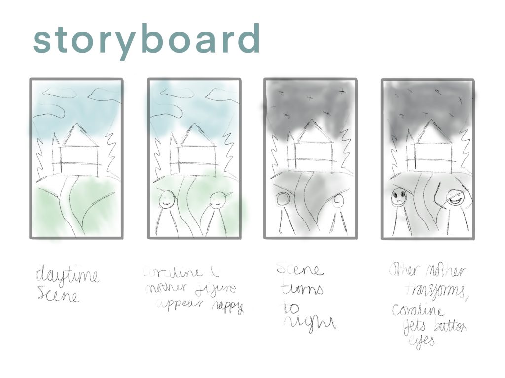
Narrative Over Space and Time

For this concept I wanted to create a storyboard for my graphic. I wanted to create something that would feed into my micro-macro piece and be a good element to combine. I decided to make a storyboard for a GIF animation I was planning to make for my 5th comprehensive graphic, this allowed me to plan out the final motion concept in a more illustrative way and better show off the narrative over space and time concept. This concept is graphics which show a narrative within a certain time and a certain space. For this I chose to take the house scene I created and combine it with my characters to show a story and progression of the characters over a period of time and then take this idea and transform it into a storyboard to show the concept off clearly. Within this storyboard I used pencil and water colours to illustrate my layout concepts for each stage and how the time was going to be shown changing and the changes to the characters which would be made, showing a shift in story and capturing an important plot point of the movie that being the descent from good to evil and back. This gif will be looping as well.

Layering and Separation

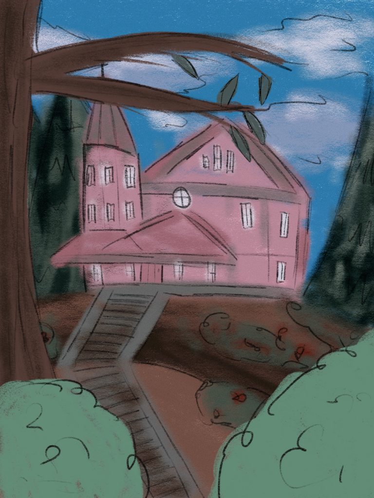
For layering and separation I really wanted to create a more detailed sketchy illustration of the world the characters from Coraline are based in. I chose to draw the house with some scenery around it as I knew this would work well for this theory. Within the artwork you can see from the layers and colours used the distance from the subject and can get a good sense of scale. The sky and background trees are on their own layer and the house in the middle is separated from them and becomes the focal point of the image as it is central and not as obstructed as other elements in the design. There is also some foreground plants and trees which are lighter in colour to show a different layer and that they are closer and separated from the plants further back in the image. These foreground elements however do not obscure the feature element of the poster. the house, and only serve to add to the depth of the image adding to the idea that the house is in a forest like rural area and very isolated, further bringing it to the viewer’s attention. I envision this design being adapted as the background of my micro-macro graphic and some text being added to add further depth to the image.

Comparison of Small Multiples

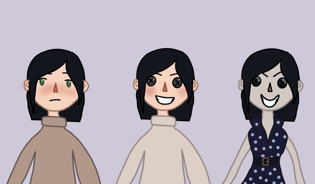
For the comparison of small multiples I wanted to make a character illustration of the mother from the movie and her evolution to evil within the plot of the story. She has 3 main forms in the story which I have illustrated here. I think this really shows off the principle of small multiples as it allows the viewer to compare these 3 forms together and contrast them against each other and pick out details and differences and similarities between them all. I created these illustrations using procreate and wanted to show how boring and regular to how strange and evil the mother comes within the movie and compare and contrast these together in one illustration. I think that my character designs are effective at portraying what I wanted to show to do with the character shown, I used differing colour palettes for each one to show off how the mood and feel changes and to add another element of comparison to the characters displayed in my piece. When you compare the multiples in the image you notice large changes along with the small things such as the change in eyebrows and the shift in tones used between the three.

Introduction / Use of Colour

For this project I knew I wanted to create some illustrations to fill a gap in my portfolio and to tie it into my first assignment I wanted to produce movie based ones thereby the content of this project being based around Coraline. I wanted to create something that encapsulated the changing tones of the movie and things that could make interesting illustrated pieces and show my understanding of the concepts.

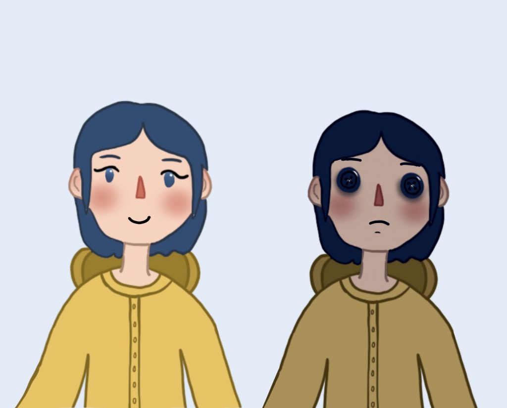
For the use of colour I chose to do a character study of one of the characters who would appear in my final graphic. I experimented with how colour changes tone and mood and used straight forward colours to show off these elements. Darker shades are mostly associated with evil and sad things whereas lighter shades are associated with positivity and good. The raincoat is yellow as this is how a lot of people will picture one as it is an iconic colour and represents happiness. The black eyes on the right character design show sadness and deep emotion and are able to convey these feelings with only the deep colour used. These illustrations clearly show together the considered use of colour and show how colour can convey meaning and association and speak for itself.