
For this post I decided to write about another Stop Motion movie by the creators of Coraline, Laika Studios. I find these movies created by the studio and their subsequent posters very interesting which is why I did not just stick to Coraline but expanded to more of the movies created by the same team.
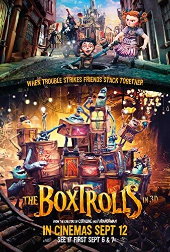
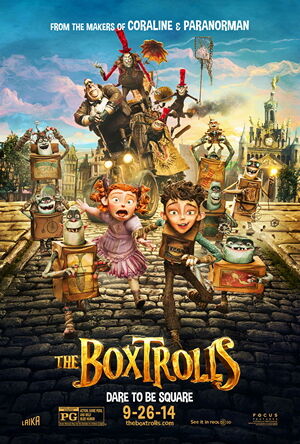
In these posters I can see the use of the principle of small multiples being used by the characters on said posters being together and in close proximity to each other. This principle is used to show the difference between similar graphics, in this case the characters, especially the trolls in this instance. Having them be all clustered together in one area and all included on the poster allows the viewer to compare and contrast the characters and see the differences between their designs. I think it works really well in these posters that Laika Studios made and that it helps you to differentiate these new characters and get a sense of what they are like and how they are unique. It really allows you to compare not only the design but also the facial expressions of the characters, allowing a sense of their personality and reactions to come through.
The first poster does a particularly good job of using small multiples in my opinion by breaking it down further. In this poster you can see the trolls being on the bottom half and the humans on the top. This allows you to not only compare and contrast each set of characters towards each other but also allows you to compare the groups as well, adding an extra level of visual information and allowing the viewer to perceive and multitude of differences and uniqueness in the designs of these characters.
References:
[1] Movie Poster. 2020. The Boxtrolls – Movie Poster. [online] Available at: https://movieposter.gr/product/the-boxtrolls/ [Accessed 14 October 2020].
[2] Laika Wiki. 2020. The Boxtrolls. [online] Available at: https://laika-entertainment.fandom.com/wiki/The_Boxtrolls [Accessed 14 October 2020].