https://xd.adobe.com/view/3952688d-e385-4973-486b-71fecea9c4f7-4f63/
Planning for the Prototype
In this blog post I will be talking through the layout sketches that I created that show the idea I have for the app. I felt it was necessary to first get my ideas visualised and down on paper before I started to work in XD as this would lead to less mistakes in the long run and make it easier to create the prototype itself.
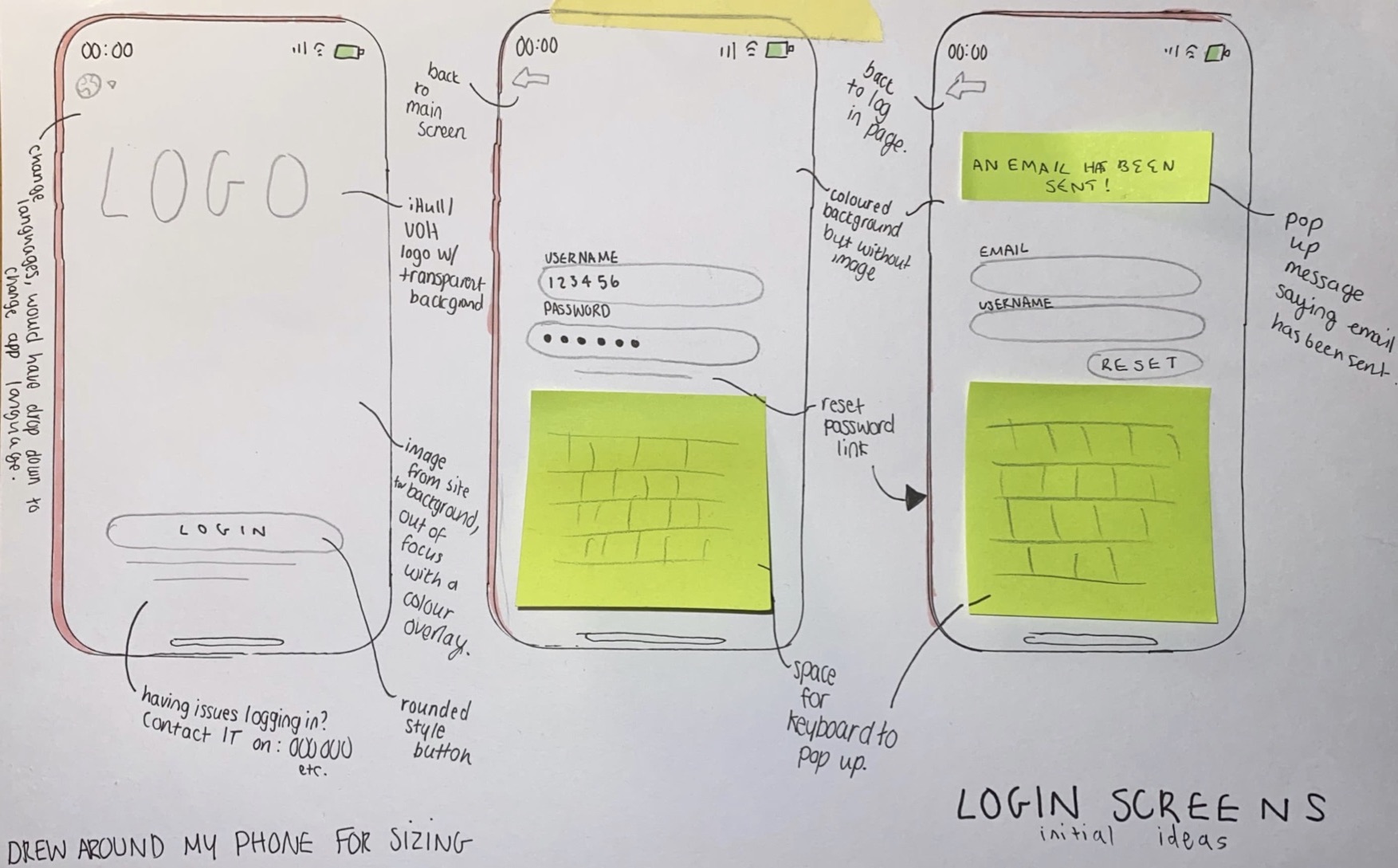
Below is the idea and sketches I had for the log in screen of the app. I wanted something minimal and that was easy to navigate. Having less options on a screen like this simplifies and streamlines the user experience and makes it a lot more simple. At the top of the main page I have added a globe symbol, this would lead to a drop down with the available app languages so that it is easy to change the language of the app to accommodate international students. I chose to use a symbol as I thought this would be easier than using the word as this will be clearer for people to understand. I added text underneath of the log in button and on the subsequent pages for if students are having trouble with the provided log in details and a way to reset the password. I think that these designs are nice and simple and I will be using this kind of principle throughout my app to add consistency and make a smooth experience. I have chosen to use a rounded button style as I think this is the most aesthetically pleasing and will look nice with the idea that I have for the app overall. The colour scheme I’m planning to use as default is the same pink colour that can be seen on the Hull University website, there will be other options able to be chosen from the settings within the app that will also pull from colours on this website to add some uniformity between the university’s services.
Below are the layout sketches for the main dashboard of the app, one showing a pop up and one without to show the design underneath. I was inspired by the widget sections on a lot of phones with my design and tried to come up with something that would enable people to chose which parts of the app they wanted to see. I unfortunately do not know how to actually implement this into the prototype itself so I will be showing off the sections of the app as if the student had the majority of them selected on their dashboard as I am unsure on how to switch them out on command.
I wanted to keep all of the sections on the dashboard clear and easy to understand and mostly rely on visuals if I could, I wanted to do this to make it easier to get the information needed within the app and make the process quicker. I have annotated these layouts so further information about my ideas as I was creating them can be seen below.
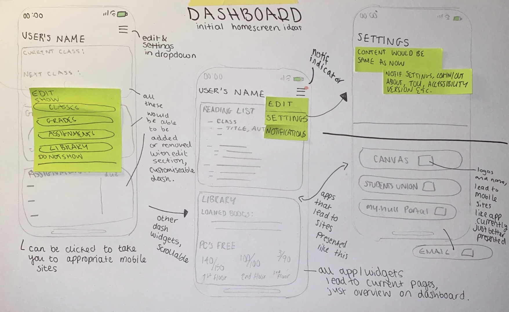
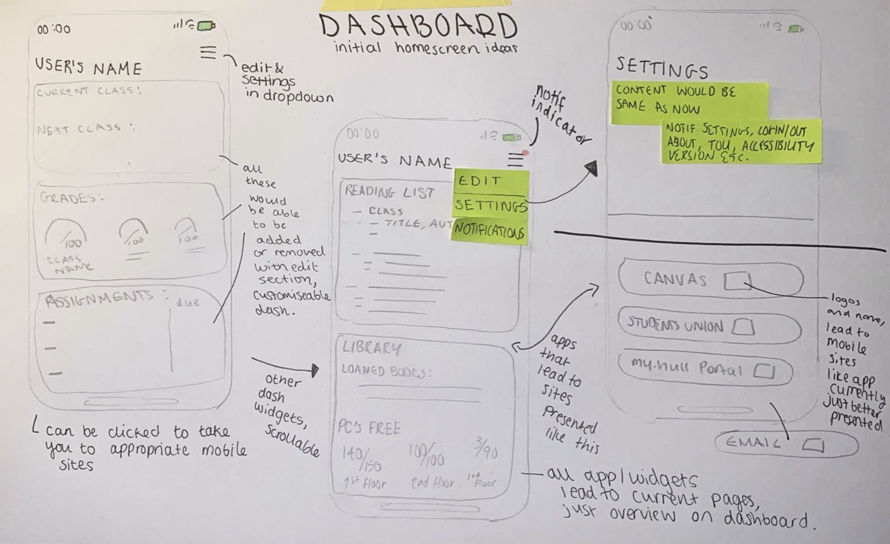
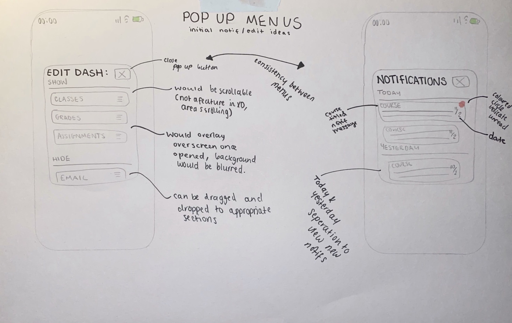
Below is what the pop up menus would look like on my app, the background would be blurred on the app itself to make the pop up the centre of the design and make it clear to read.
User Considerations
For this app, the target audience I was shooting for is obviously the University students . I wanted to create something that would be easily laid out, simplistic and yet customisable to the student. My inspiration came from current phone interfaces and things that are already implemented into the devices we use in every day life to ease usage of the app and make it more familiar to the students. This idea came to me from looking at my own phone and seeing how the notification centre and widget section of my iPhone operated. This area of the iPhone allows you to chose which widgets from which apps you see on the page, making for a unique and customisable experience for each user. My plan is to have my app work with an almost widget like element to it so each user can customise which parts of the app they want to see. This will help to streamline information for that student and help them to find the things that they need to see in a faster manner.
Within my app I will also have an option on the main screen of the app to change the language of it, this will help international students with daily university life by making it easier to access for them in their native language. Along with this element I also would have voice over support to my app to help any visually impaired students to use the app without hindrance, this cannot be accomplished in a prototype but the settings for it will be included in the prototype that I am planning to make. Along with this all elements would be scaleable with the font size chosen on the phone itself to make sure that the app is readable to everyone as it would use their desired font choice. These are all elements that I am considering whilst designing my app and are things that I will add settings options for to show that they would be included in a full version of the app.
Another idea I had for the app to help with customisability and accessibility would be the choice to chose from a set number of monochromatic colour schemes for the app which would help students with issues relating to colour but also help bring some more uniqueness and personality to the app itself. I was thinking of using the teal, purple, dark blue and pink colours which are shown on the Hull University website for some consistency between the two platforms. These features are not something that I know how to accomplish in the XD software but will again be things that options are left in for in the settings to show their presence.
I think that if there were to be a staff version of the app, which could be easily integrated, it would use the same visuals as the student version of the app. I will not be adding this currently as I am choosing to focus on the student version of the app but I believe the staff version would be basically the same, with the same implementations and the same idea of choosing what is on the dashboard for each staff member to make it customisable.
When thinking about the design for my app I tried to think of things to make it as customisable and accessible as possible to all students, I think with the implementations that I have listed above this could be accomplished well in a full version of the app.
Hull University App UI/UX Review
Before starting work on my own redesign for the iHull app, I actually wanted to look at the existing one and see what this app manages to do well and what I think it does poorly in its design. I decided to look at the app myself first and give my own opinion on it, as I was doing this I also decided that I was going to have an unfamiliar user, one of my friends, look at the app to get a different view point and will write this into a later post. I think getting 2 viewpoints and ideas will be useful and help me to better design a new app.
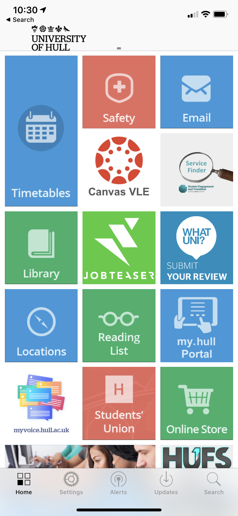
Below are some screenshots of the iHull app, the main page, the tabs at the bottom and what some of the tiles on the main page lead to. A lot of the tiles on the main page lead to websites and other things outside of the app and are useful in itself but in my opinion they are better designed than the ones that lead to in app pages and this makes it jarring to look at these pages as there is not enough modernisation on the current app. The transition from current recently designed web pages and the in app pages is quite apparent and makes the app look quite old. When I first got the app when I first joined the University I could tell really quickly that the app had not been updated in a long time and felt that the design looked really plain and simple and not very exciting. I actually at first thought the app had not been optimised for newer iOS systems as it looked quite old fashioned in design from apps I’m used to using. It was also really apparent that the current design and branding and colour scheme of the Hull University had not been brought over.
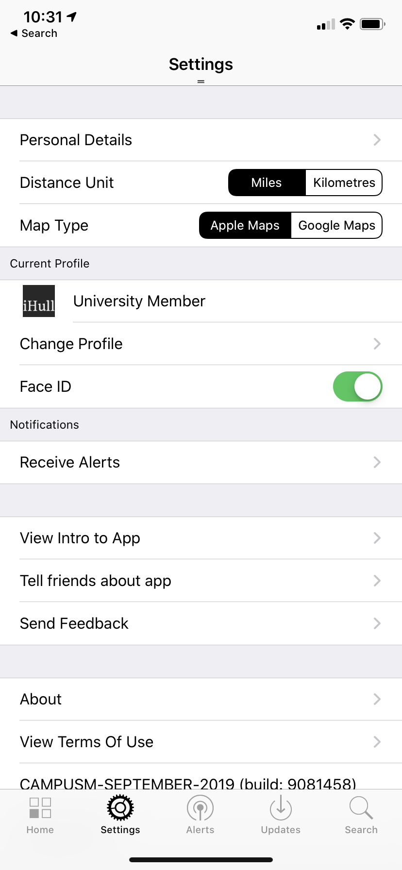
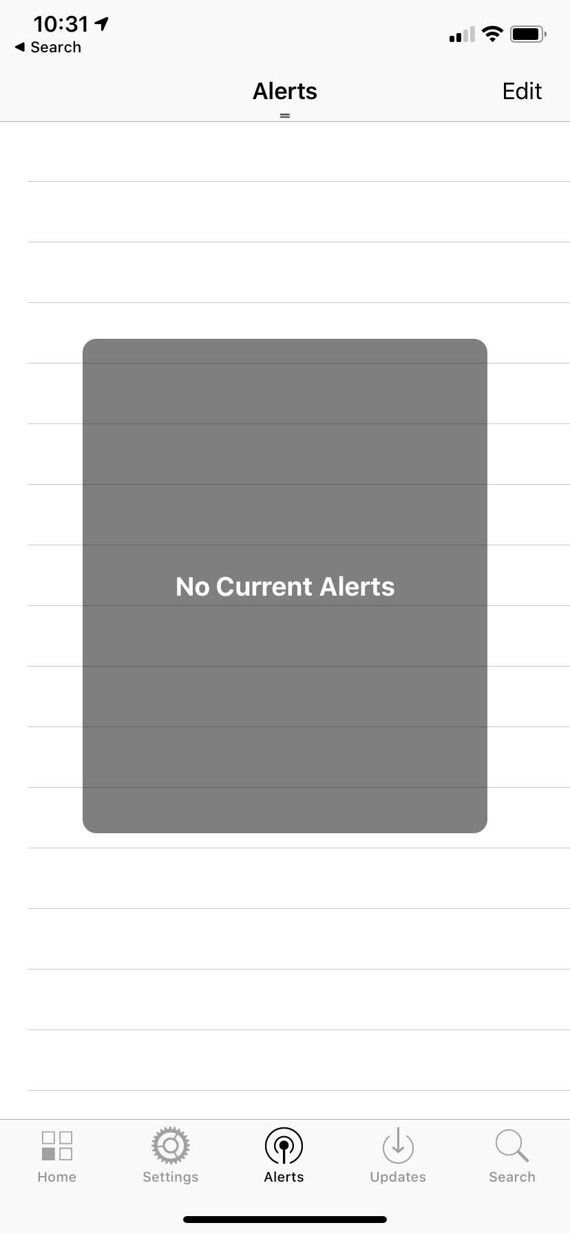
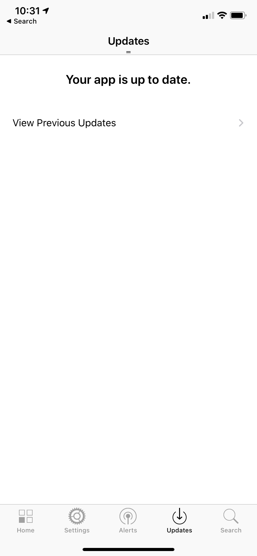
The app is quite easy to find your way around however I do not think all of the parts are necessary, especially to be on the main page. I only find myself using the timetables part of the iHull app as Canvas and email (the other 2 parts I may use) already have their own more effective apps and work better from there than from the websites generated from clicking the tiles in the iHull app. I only really explored the rest of the app for this task and taking the screenshots below. I never used the tabs at the bottom and I think a lot of them are pointless, especially the Updates tab. I’m not sure what the purpose of this tab is as it seems to be a place for patch notes for the app, but this for one isn’t essential information and also if it was needed it is on the app store on the app download page. It seems like an odd thing to have within the app itself.
The fact I am not using all of the elements of the app got me thinking about how I could customise the app to each user and have an option to pick the parts that they want on their home screen like a dashboard of essentials. Different users would use different things within the app and it would be a good idea to keep all of the elements and filter them like this rather than cutting away any parts of the home screen that people may find themselves using.
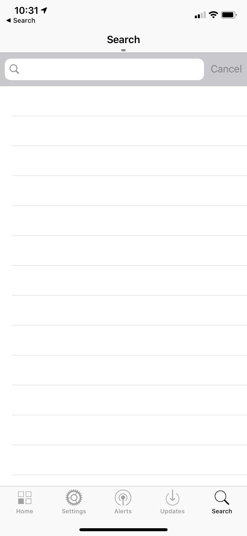
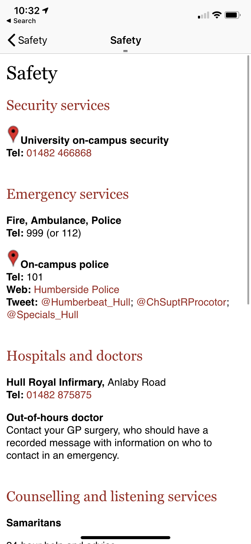
Another tab that I haven’t found myself using is the search tab as everything on the app can be found really easily from the tiles on the home page and searching isn’t really necessary with how the app is built. It also could have just been a search button at the top of the screen on the white bar instead of being its own tab on the app. My main issue with the app itself is that a lot of the tiles on the windows phone esque homepage just lead to simple white pages with typed text on them. For example the Safety page does this. This page just leads to a list of text, I think it would be a lot more useful if these were clickable links and useable phone numbers so that the relevant information could be accessed from inside the app rather than taking this information and transferring it to a web browser to search for these sites etc.
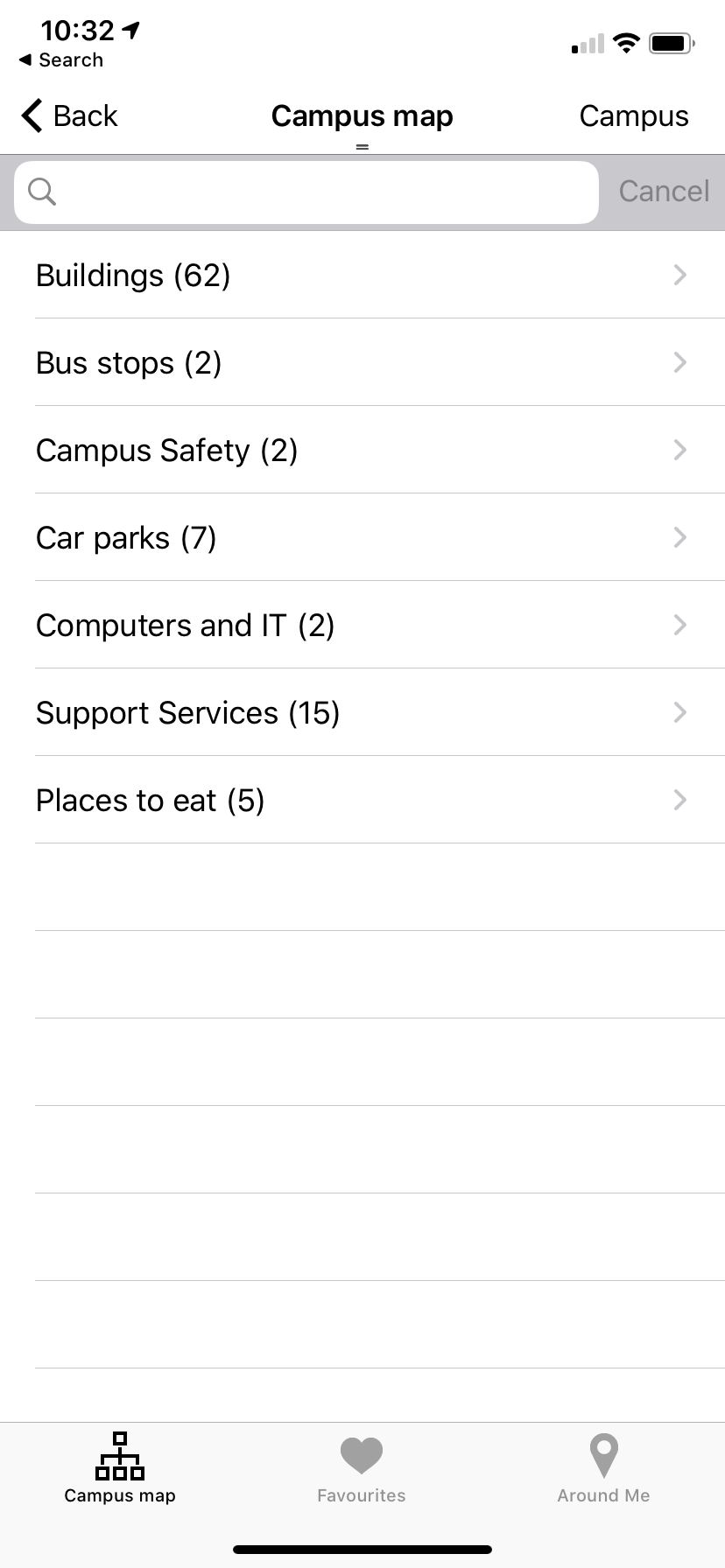
Another tile I do not like within this app is the Campus Map. When I first clicked on the locations tile I was expecting an interactive map of the campus or at least an image of the map however what greeted me was a list of places, within these another list, and finally once I clicked a location it showed me a pin on google maps and a grainy picture. There was an option for directions but you have to put in your own locations once this is clicked so t is not an effective system for locating buildings. An interactive map would be much more useful for this as currently you cannot see your current location, the exact buildings on a map (only a bunch of pins once you press campus) or even a clear image. It would be useful to see yourself on the map and almost essential to new students and users to find their way around the campus.
Overall there are actually more features that I do not like than the ones that I like. I will take all of these observations on board and compare them with my friend who is not a student to see how these differ and are similar and see if this helps me with planning out my app. I think there are a lot of things I want to change but some things that I do like, such as the fact not everything leads to outside apps and is native to the iHull app and the tile interface is quite nice however the style of it within the app itself does make it look dated. I will consider everything I have thought about whilst looking at the existing app and use this within my own designs.
Edit: Due to the current pandemic, I was not able to get together with a friend to have them test the app on my iPhone, I do still think that this would have been a useful exercise to undertake. I have chosen to leave this part in my blogpost as it is still part of my planning for this project .
Simplifying Spellzone.com
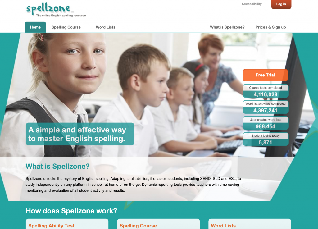
Within a lecture for UI/UX we were given a task to simplify the above site, spellzone.com. The Task was to redesign the introductory screens and the on-boarding section of the website. We were also tasked to use UI Kits and wireframes to achieve this. This was a task meant to get us more used to using XD and to use a UI Kit for the first time. For this task I first visited the Spellzone site, looking at the original site was essential to redesigning it as I wanted to see what had already been done and how I could take a simpler approach to it. I think this was a good task for a lab as it helped me to think more about what I was going to do for my main project and how I was going to approach that. I also got to look more at UI kits and see all of the possible elements that I could use for an app and also how simple it was to put something together.
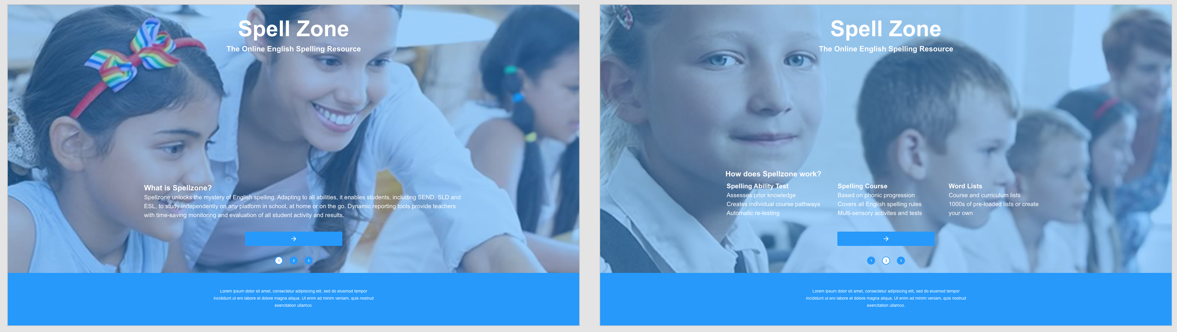
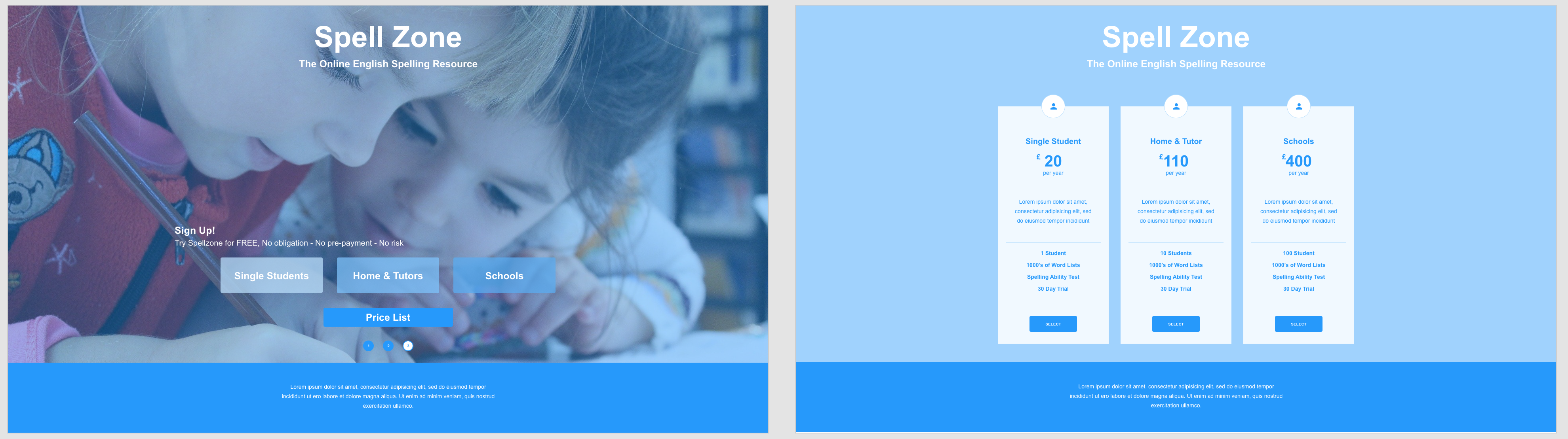
To redesign spellzone, once I had looked at the original site, I actually went and saved some of the images off this site. I wanted to use existing images in my attempt at a redesign as I felt like it would keep it consistent with the original. I was thinking as I was designing the first 3 screens that I wanted the images to be the background of the site as I felt that it would look good and reduce the amount of useable space, allowing me to simplify the site. I found this quite effective and limited the amount of text and possible buttons on these screens to simplify the process of gaining the relevant information. I decided to focus on the text and what the site does on these first pages as a way of introducing the site to new users. On a full version I would have a log in button in the top right corner for existing users to bypass all of the on-boarding from the site. After these initial explanation screens there a re two routes that a user can take, one to a price list and a payment screen and the other to sign up to a free trial for the site. I felt these were 2 of the obvious paths for the site to take after the initial information and it was enough time for the user to get to know the site, what it does and chose the next steps.
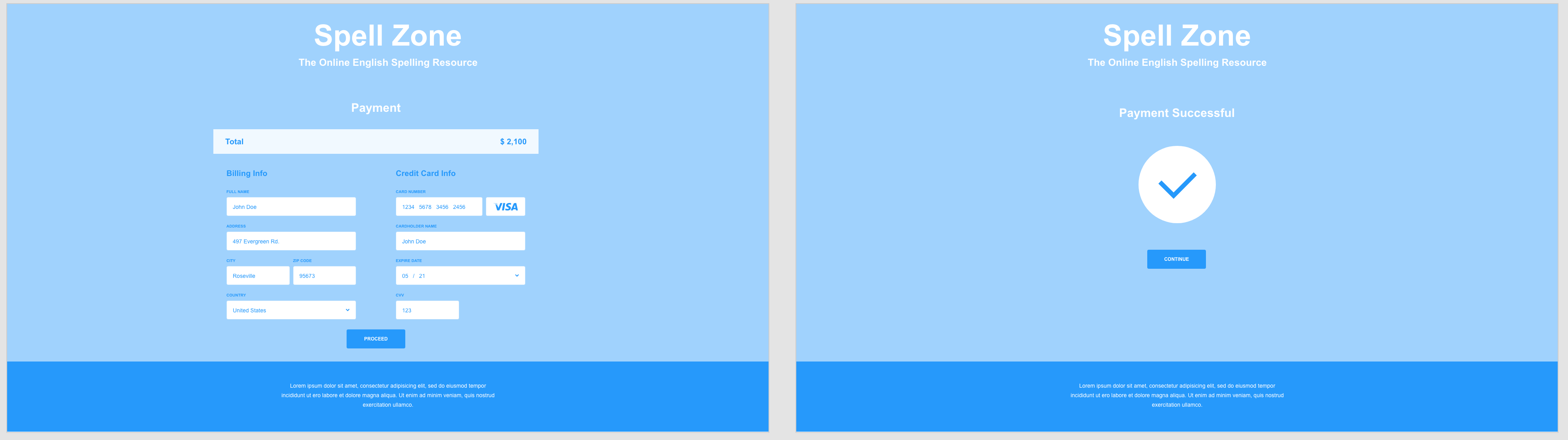
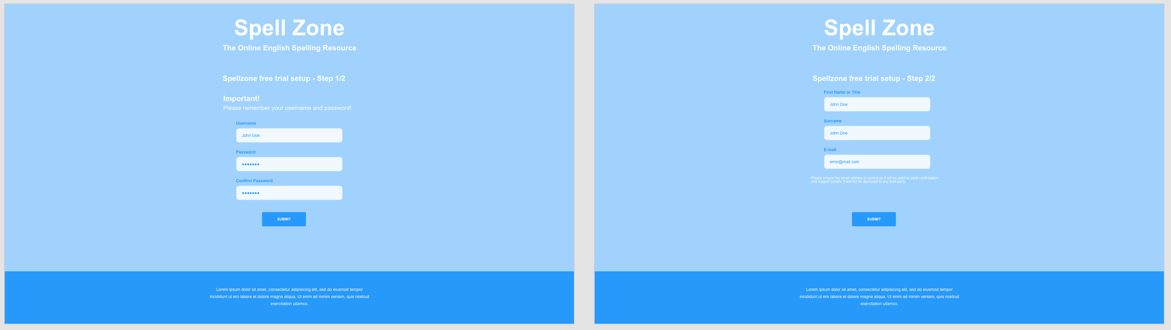
I think that creating this simplified version of spellzone was a really useful task to do and it helped me to think more about all of the screens and steps involved in creating a website or app. As I was making this I kept thinking of more and more screens that I wanted to produce and just how many are required to get the points and parts across that I wanted to. Redesigning the on-boarding of spellzone I wasn’t sure when to stop as I kept wanting to make more pages and really visualise the site as a whole. There are many steps and screens that you don’t really consider till you make something yourself and this was really useful to my final assignment.
UI/UX Articles from Medium.com
The first article I read was titled ‘The Evolution of UI/UX Designers Into Product Designers’. This article talks about how design has become the most important feature of creating a great product and how the term product has changed to be used in relation to digital products as well as physical products. The article then goes on to talk about the definitions of UI (how the product looks) and UX (how the product feels) . Then it talks about the term product designer, this paragraph goes into how a product designer is involved with the creation of the look and feel of a whole product and combines the design of UI and UX together. Many product designers think of themselves as ‘designers who design experiences’. The article also talks about how the term ‘product designer’ is used differently within companies however the general definition is a person who works to hit a user’s needs. This article was useful to read as it showed me more about the history of this industry and about terms used and how this relates to the current uses. It was really interesting to read about how design has become such an important feature in creating products.
The next article I looked at was called ‘UI/UX Design Trends for 2020’ . This article contains 20 predicted design trends for design within the coming year. The ones that stood out to me the most were ‘asymmetry & split screen’ . This part of the article talks about how with a lot of wide screen desktop displays in use the idea of blocks and split screens is a good use of space and helps combat things being too minimal. It also talks about how asymmetry, although not mainstream, can be visually appealing. Another section talked about ‘low-key gradients’. It talks about how less is more in modern design and subtlety in colours adds to the simplification of design. Softer gradients are predicted to be more popular as despite adding colour they still make things look less harsh. Another expected design trend is ‘harmonious colours’. This is talking about how colour palettes are expected to be more natural and toned down compared to previous years. It also talks about how that doesn’t mean that all colours should be the same palette just more uniform and less bold. It also suggests how a bright, sudden out of place colour within this harmonious scheme could help express meaning better within a design as it would stand out. This article was really interesting as a lot of the trends happened to be things that I was noticing in designs in my own time and aesthetics that i really liked. There were some trends that I did not know about that were really nice and things that I will further look into in my own time. The colour scheme trends are really interesting and cool to see evolve,I really like the idea of a harmonious colour scheme with one standout colour and may carry this forward into my design of the iHull app as it may help get important information across effectively to the users.