Design Experience – Brynmor Jones Library

The task I was given this week was to explore a design experience I had witnessed, I chose to go and observe the library entrance barriers as my artifact for this assignment.

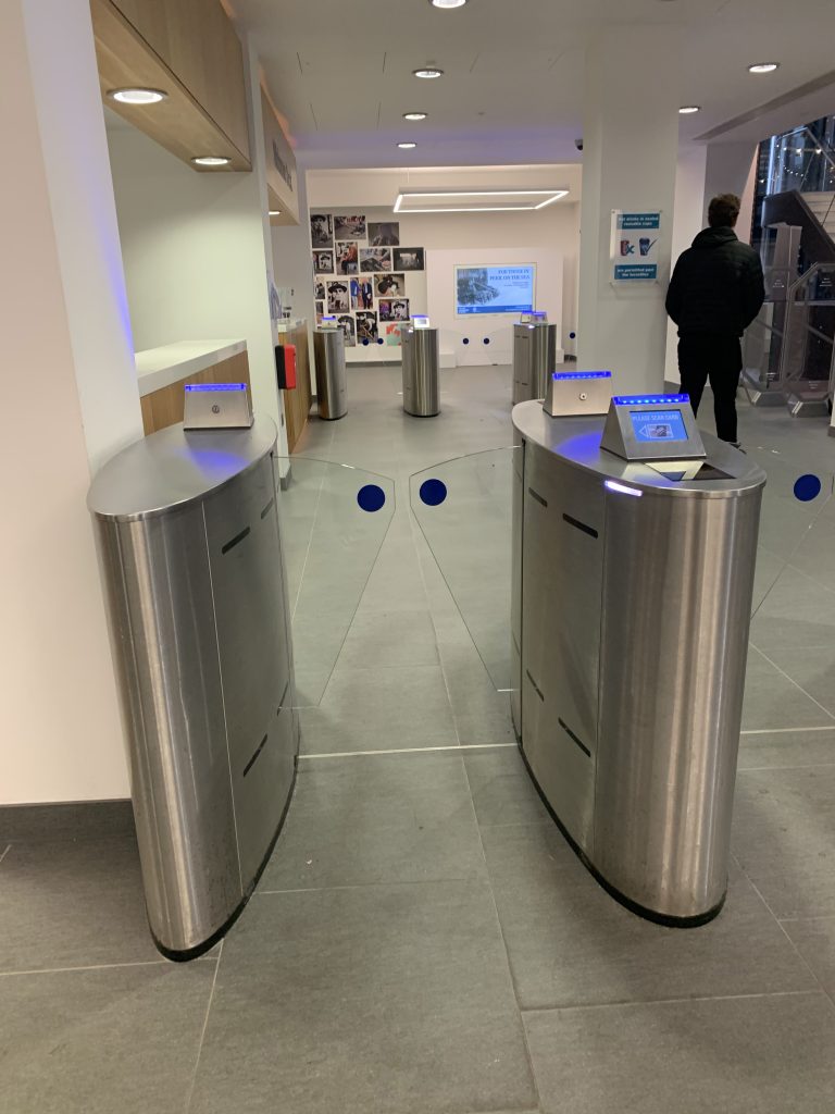
These barriers in the library are situated on the ground floor with access from both sides of the building, on each side there are 3 machines, one side has 2 in and 1, the other is the opposite. These barriers are used to scan in and out of the library, this permits access only to students and faculty of the University.

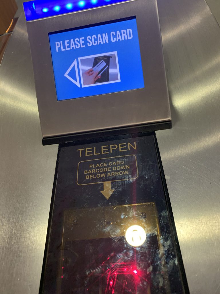
The steps to use these barriers are: walk up to it, take your student card, place it on the light to scan the card, the gates will open, then you walk through and they close behind you.

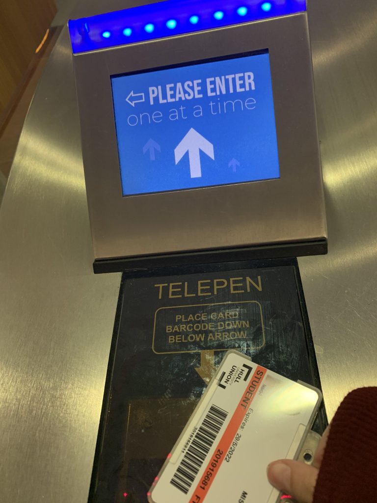
Whilst observing students use these barriers I noticed that a lot of people were getting confused about which machines could be used to enter and which could be used to exit. A few people looked confused and walked up to the wrong ones and had to wait to use the correct ones, which in turn sometimes started queues forming. The signs for the direction of the barrier are on the small screen on the front and cannot be identified easily from a distance. This means that people have to quickly identify which barrier is which from a closer distance, which leads to mistakes, and in turn causes waiting at the machines and delay for entrance and exit.

Adobe Colour Influence: Bauhaus

As with the magazine layout, I again took the same approach in doing my Bauhaus piece again. I created them in illustrator and improved it in some areas I felt needed improvement. However this time instead of trying different settings on adobe colour I chose the triad colour scheme and took the 3 main colours from my Bauhaus piece and created colour schemes for these.

Below are my new Bauhaus inspired pieces using red, yellow and blue triad colour schemes:

Adobe Colour Influence: Magazine

For this task, we had to experiment with Adobe Colour, a tool for generating colour palettes. For this, I took the magazine layout I previously created in XD and remade it in Adobe Illustrator. This time I made sure to improve the design and fix the small issues/mistakes in my first go.

Things I did include: making sure my photos lined up properly, using rulers to make sure that spacing was equal and uniform, using the justified text for the columns, and making sure any shapes in the background didn’t overlap lines of text. I think that the general design of the magazine looks improved and I found it easier to create in Illustrator due to features such as the column options on text boxes and the rulers.

Once I had remade the design I went to the Adobe Colour website and took the blue shade that I used in the original design’s hex code and used this for the base colour for the palettes. I experimented with Analogous, Monochromatic and Triad colour combinations and implemented them into my designs. Below is the magazine influenced by adobe colour:

Multicolumn Magazine Design

For this task, I looked through the photos on my phone and decided I was going to make this page themed about my kitten Pixel. I had the most photos of him so I decided that this would make a consistent page. I chose blue as the theme for the shapes on the page as the bandana that is on his collar in one photo is this shade of blue so it ties the images in.

I chose to do a 3 column grid for this as it looks most aesthetically pleasing and it allows for dynamic sizing of images. The title I chose to make off-centered and to the left as I felt that this made it match with the body text and make it more consistent. I also decided that I would only have a title on one side and not the other page as I think it adds some interest to the pages and also increases the white space.

To add more colour along with the boxes going behind the images on both pages, I made the title of the page the same shade of blue. As well I increased the size of the first word of each “segment” of text, bolded it and made it blue to add another pop of colour and make the white background less plain.

Below are some of the sketches I made first of possible layouts for the pages. I used these as a reference when creating my design and this made it easier and faster to create. I like my sketches as they have some good possible layouts on them and it took playing with the images to finally decide which one I wanted to use. I do really like the four-column design that I drew but I think this would work best at A3 size, not the A4 that I worked at.

Bauhaus Influences

This is my favourite of the images that I took around campus which I felt had a Bauhaus influence. A lot of Bauhaus architecture seems to have angular lines and modern aesthetics.

These are two of the photos I took of Bauhaus influenced things around the Campus. These were my two favourites as I really like the composition of both of the photos with the contrast of the plain sky and I also feel like the buildings with their rows of windows look very Bauhaus influenced.

Below are some sketches I made whilst walking around the campus of other Bauhaus influenced architecture including buildings and a bench.

Below is a bauhaus influenced design I created in class using the XD programme. I went for simple shapes and overlapping vectors as I saw this a lot in the pieces I saw whilst looking up the style. I also went for sans serif text on the piece as this seems to be part of the Bauhaus style as well.

Principles of Visual Design in the Library

For this task I decided to go to level 7 of the library as this is where the fine art books are and I wanted to look for a book on Bauhaus as this is what the lesson I previously attended was about. Once I took the elevator to the 7th floor I was greeted with the large wall sign below.

The design is relatively simple, using only the information needed and sticking within a limited colour scheme. The use of the yellow for the floor numbers makes them stand out and shows the sections clearly, in contrast the reversal of this colour scheme for the overarching header of the floor number creates a nice contrast and separation of the “title” of the sign from the informational text below.

There is a small map of the floor on the sign, along with a key to tell the important elements apart. The use of a key creates a more simplified design and allows for the design to draw the eye downwards with the list of places. The unique colours for the elements of the map add a bit more colour to the sign without sacrificing the overall colour scheme.

The other image above is of a sign on the end of one of the stacks. The use of white space makes this sign aesthetically pleasing, simple and easy to understand. The stacks are clearly numbered and the line down the middle splits the 2 sides of the stack in half. The use of the line down the middle to show separation means that there is no need for the use of arrows or any such device as the line adds a visual element that separates the information. The colour scheme from the wall sign is carried onto this for continuity.

Above are two images of some bauhaus work from a book I found in the library. These are 2 of the more interesting pages I found within the book. The use of overlapping shapes and flat objects makes them effective designs. The book was in black and white so I can’t speak on the colour but the different contrasting shades are interesting and draw the eye to the designs as it is very bold. Much of the text is a sans serif font and and is placed in balance with the shapes or often in the confines of them. There is also good use of white space so the images don’t feel overcrowded.

Personal Brand

I started this task by making a short list within my sketchbook of my ideas. I then took this list and started sketching some simple ideas. As I was creating this at home I was limited to using phone apps for creating the actual brand icon and final images so I tried to keep this in mind and to keep it simple. Below is a scan of my sketchbook and my ideas:

I ended up choosing the bottom idea of a sketchbook with my name on it as I like art and sketching and I think that this sums me up quite well as a personal brand. I used this stock vector image from a free image website as again I was limited to what I could create on the apps on my phone. (https://pixabay.com/vectors/sketchbook-book-notes-calendar-156775/)

I took this image into the app PicsArt and used the colour dropping and selection tools to change the colour of the band on the sketchbook to a purple shade. I then chose a font and tried to position the text onto the sketchbook. I think that this would have looked better if there were more options to configure the text but I think this does look good.

I made a darker and lighter version of the design because I couldn’t choose which I liked best and thought they both could have good uses.