Micro-Macrocosm

For this concept of Micro/Macro I decided to use this poster from “Kubo and the Two Strings” (2016). Micro/macro is a concept created by Tufte which allows the designer to add smaller details which allows them to another layer of detail to an overarching design. Tufte can be quoted saying “to clarify, add detail” (Tufte, 1990), showing that a design can be emphasised by adding micro details that make up the whole macro image and add understanding.

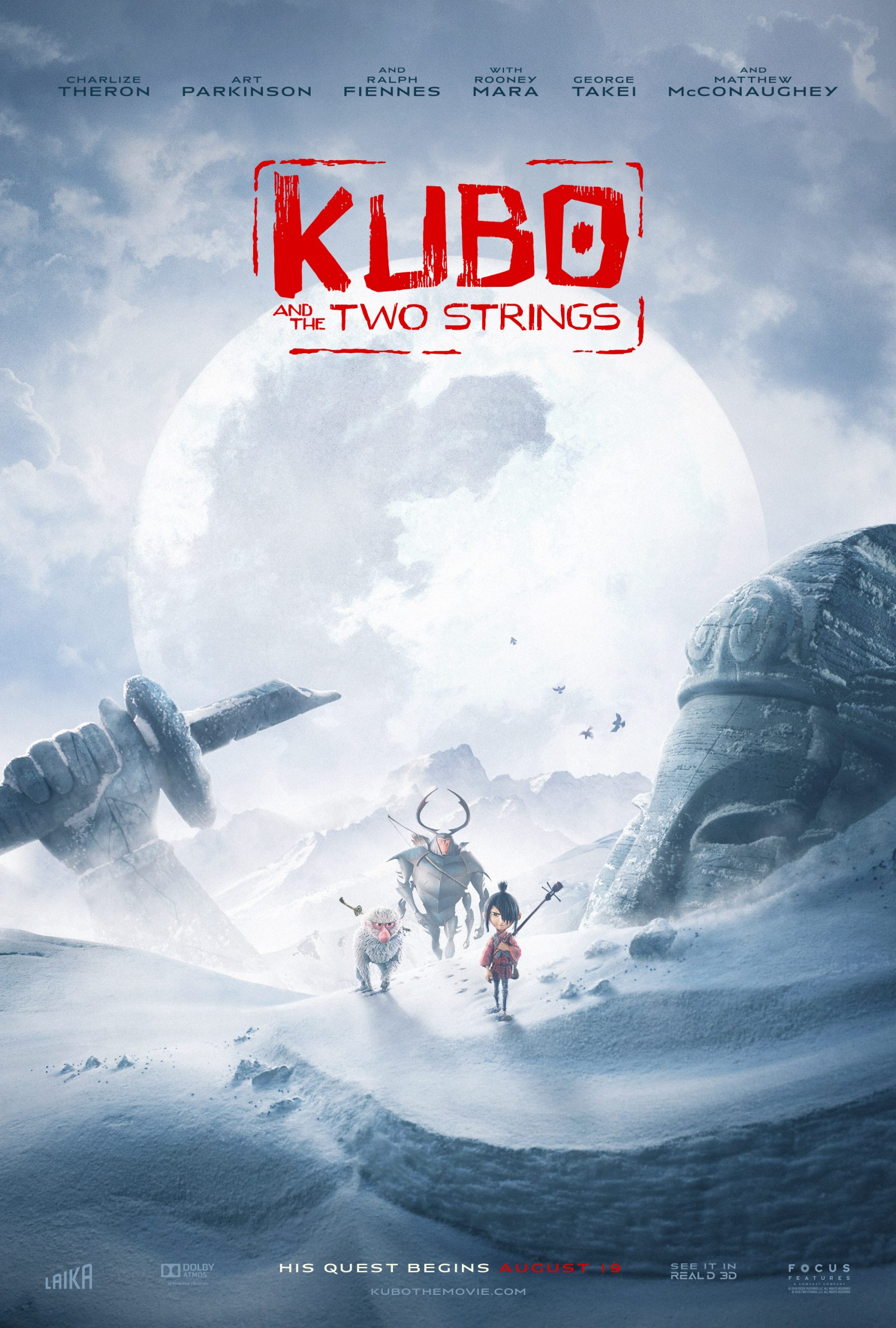
Within this poster there are many uses of this concept and smaller details that may at first go unnoticed but add more complex information to the poster. One instance of this can be seen when looking closely at the group of characters. The furthest two appear to be carrying weapon whilst the closest appears to be carrying an instrument, this gives you more information about this character and his role in the film of being a more peaceful, relaxed character. The statue in the image you can see is buried in the snow, at first glance it just appears to be this but on further inspection you notice the broken sword and the battered nature, showing its age in relation to the characters and the broken sword could link with the themes of violence and peace. The moon also when looked at closely shows a clouded monstrous shape, adding information about the possible antagonist. The poster as a whole just shows characters venturing through a snowy landscape but with looking at the micro details you can recognise more information about the plot of the film and clarify information about it’s storyline. This poster also uses layering and separation to break up the focal points of the poster and add emphasis to important parts such as characters or the title.

Reference:

[1] Tufte, E., 1990. Envisioning Information. p.38.

[2] McGovern, J., 2016. Kubo And The Two Strings Trailer, Posters Debut. [online] EW.com. Available at: <https://ew.com/article/2016/07/06/kubo-and-two-strings-trailer-posters/> [Accessed 3 November
2020].

Layering and Separation

For layering and separation I found this poster from the animated movie Missing Link (Laika Studios, 2019). From what I understand, this Tufte principle is about combining design elements, pushing parts into the background and bringing others to the front to give separation of information. This helps to separate the important information into a layer in the design of its own and allow it to be highlighted. I think this poster could also show comparison of small multiples because it has the characters centralised in one location so the viewer can compare and contrast their designs together along with the foreground elements in the water able to be compared together.

Below is the example I have chosen and a version of it which I drew on guidelines to highlight some of the more obvious layers in the poster that I can see. In this poster the title and actors names are in the foreground of the design and are meant to be a promenant part of the design. However as you can see in this poster the characters are also a focal part of the design, shown on separate layers of the poster. The largest character is the main character of the movie and the two smaller ones, on a similar layer within the design, are the secondary side characters within the film. I think this is a clear use of this tufte principle as it shows the important information well and allows the viewer to garner information about the characters from their prominence and separation in the poster. There is also a layering effect with the mist used in the poster to add the background, mid and foreground layers of scenery to the poster. These are separated by this clouding mist element in the design which I think works really well.

References:

[1] Butler, C., 2020. Missing Link (2019) – Movie Posters (1 Of 2). [online] Joblo.com. Available at: https://www.joblo.com/movie-posters/2019/missing-link/image-35192 [Accessed 26 October 2020].

Narratives over Space and Time

For this blog post, due to my subject being animated films and subsequently film posters, I picked this poster from the 2012 movie “Paranorman.” Thistle poster fits this Tufte principle well. First clearly in the poster they are travelling in a car, from the angle of the car and the character’s reactions and clothing you can deduce that they are moving at great speed towards the “Camera”, showing the passage of time and letting you predict in your head what will happen next.

I believe this principle of time and space being shown can also be shown from the pun used at the top of the poster. This adds another element to the motion already seen in the poster and is a pun on the phrase “full steam ahead” which is usually used to say something is going really fast. This works in conjunction with the motion seen by the characters to give a sense of sequence to the poster and the poster as a whole helps you to infer the plot of the film.

I think this poster shows good progression of time and space, it also emphasises this concept by being a movie poster in itself, as movies are set over a period of time and a story is told. I believe it is also made apparent in the zombie character on the right who can be seen holding onto the car flying backwards. You can infer from the angle and the motion created by the car, the speed and that this character is barely clutching onto the vehicle. Overall I think this is a good use of this principle to my understanding and I think it’s executed well.

References:

[1] Cinematerial.com. 2020. Paranorman. [online] Available at: https://www.cinematerial.com/movies/paranorman-i1623288/p/cdxaqw0k [Accessed 19 October 2020].

Comparison of Small Multiples

For this post I decided to write about another Stop Motion movie by the creators of Coraline, Laika Studios. I find these movies created by the studio and their subsequent posters very interesting which is why I did not just stick to Coraline but expanded to more of the movies created by the same team.

In these posters I can see the use of the principle of small multiples being used by the characters on said posters being together and in close proximity to each other. This principle is used to show the difference between similar graphics, in this case the characters, especially the trolls in this instance. Having them be all clustered together in one area and all included on the poster allows the viewer to compare and contrast the characters and see the differences between their designs. I think it works really well in these posters that Laika Studios made and that it helps you to differentiate these new characters and get a sense of what they are like and how they are unique. It really allows you to compare not only the design but also the facial expressions of the characters, allowing a sense of their personality and reactions to come through.

The first poster does a particularly good job of using small multiples in my opinion by breaking it down further. In this poster you can see the trolls being on the bottom half and the humans on the top. This allows you to not only compare and contrast each set of characters towards each other but also allows you to compare the groups as well, adding an extra level of visual information and allowing the viewer to perceive and multitude of differences and uniqueness in the designs of these characters.

References:

[1] Movie Poster. 2020. The Boxtrolls – Movie Poster. [online] Available at: https://movieposter.gr/product/the-boxtrolls/ [Accessed 14 October 2020].

[2] Laika Wiki. 2020. The Boxtrolls. [online] Available at: https://laika-entertainment.fandom.com/wiki/The_Boxtrolls [Accessed 14 October 2020].

Use of Colour

Tufte talks about how colour can be used as a noun and to measure information and add realism in a design, below are 3 different posters which do show the use of this theory.

In these posters an instance I can see of colour being used as a noun is in the shadows on the posters. The colour black is chosen to represent these elements and is effectively used to show depth and realism and to label them as such. A second use of this is in the sky being blue in the right half of the poster, the sky in the daytime is always associated with this colour and I think this fits to the principle. The colour black is also used as a colour to measure. It measures the quantity of the shadows in the posters, particularly the right one where there are gradients and variation in the shadows to of course show how close or far away they are to the light.This gives information on the distance from the light and measures its intensity. This colour is also used to show dimension as well and add visual depth to the posters, adding realism.

“It is not how much empty space there is, but rather how it is used.”[1] I think this quote adds to the theory as it talks about the use of space and therefore colour usage in design.

Colour is clearly used to enliven these posters, especially the left and middle ones, as the use of the colours purple and blue adds a bright focus to the posters. It makes it more engaging and eye-catching, along with the stand out yellow to draw people in. All of these colours have been chosen specifically to convey the tones of the movie and important visual information.

Reference:

[1] Goodreads.com. Quotes By Edward R. Tufte. [online] Available at: <https://www.goodreads.com/quotes/644974-it-is-not-how-much-empty-space-there-is-but> [Accessed 29 October 2020].

[2] IMDb. 2020. Coraline (2009) – Imdb. [online] Available at: https://www.imdb.com/title/tt0327597/mediaindex?page=4&ref_=ttmi_mi_sm [Accessed 8 October 2020]

[3] Impawards.com. 2020. Coraline Movie Poster (#1 Of 35). [online] Available at: http://www.impawards.com/2009/coraline.html [Accessed 8 October 2020].