

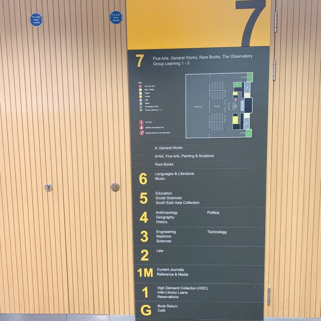
For this task I decided to go to level 7 of the library as this is where the fine art books are and I wanted to look for a book on Bauhaus as this is what the lesson I previously attended was about. Once I took the elevator to the 7th floor I was greeted with the large wall sign below.
The design is relatively simple, using only the information needed and sticking within a limited colour scheme. The use of the yellow for the floor numbers makes them stand out and shows the sections clearly, in contrast the reversal of this colour scheme for the overarching header of the floor number creates a nice contrast and separation of the “title” of the sign from the informational text below.
There is a small map of the floor on the sign, along with a key to tell the important elements apart. The use of a key creates a more simplified design and allows for the design to draw the eye downwards with the list of places. The unique colours for the elements of the map add a bit more colour to the sign without sacrificing the overall colour scheme.
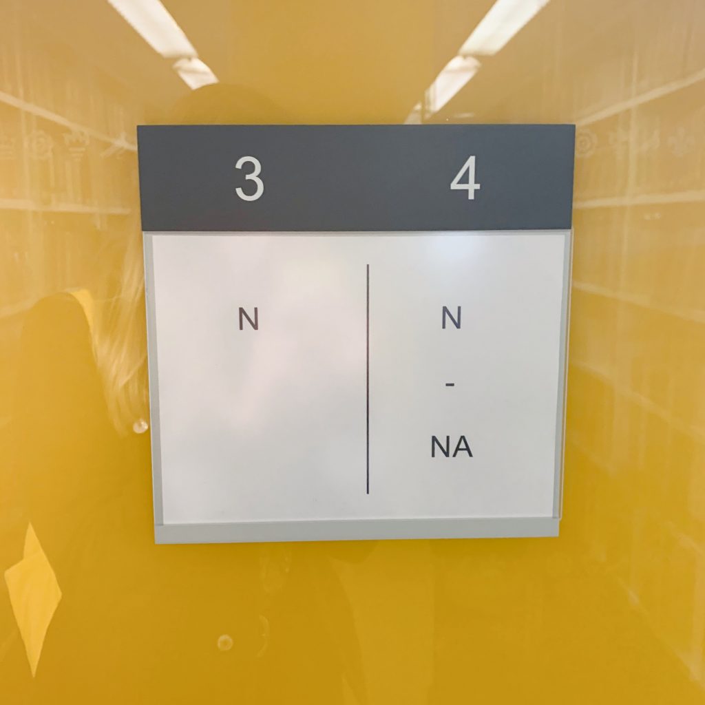
The other image above is of a sign on the end of one of the stacks. The use of white space makes this sign aesthetically pleasing, simple and easy to understand. The stacks are clearly numbered and the line down the middle splits the 2 sides of the stack in half. The use of the line down the middle to show separation means that there is no need for the use of arrows or any such device as the line adds a visual element that separates the information. The colour scheme from the wall sign is carried onto this for continuity.
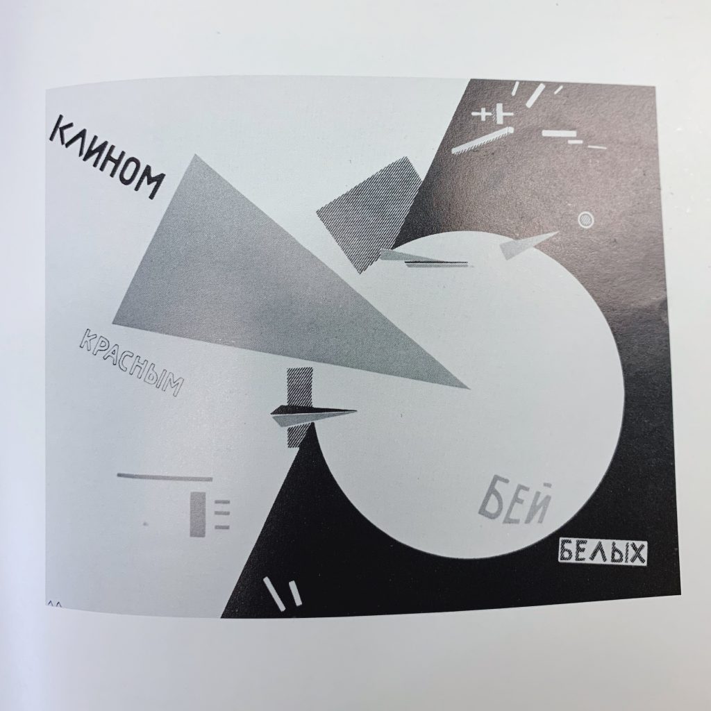
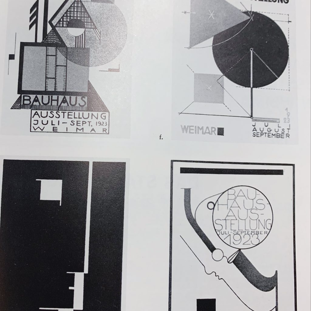
Above are two images of some bauhaus work from a book I found in the library. These are 2 of the more interesting pages I found within the book. The use of overlapping shapes and flat objects makes them effective designs. The book was in black and white so I can’t speak on the colour but the different contrasting shades are interesting and draw the eye to the designs as it is very bold. Much of the text is a sans serif font and and is placed in balance with the shapes or often in the confines of them. There is also good use of white space so the images don’t feel overcrowded.