Silent Video
Narrated Video

Digital Design
Silent Video
Narrated Video
To go with my posters and digital advertising I decided that merchandise was an interesting next step for my arts festival, merchandise is always a good way to promote an event and allows people to indirectly spread the word about an event. I decided that a good step for what merchandise to make for the festival was tote bags. As my target audience is young people I know that a lot of the current y2k/ indie fashion trends encompass totes as the bag of choice.
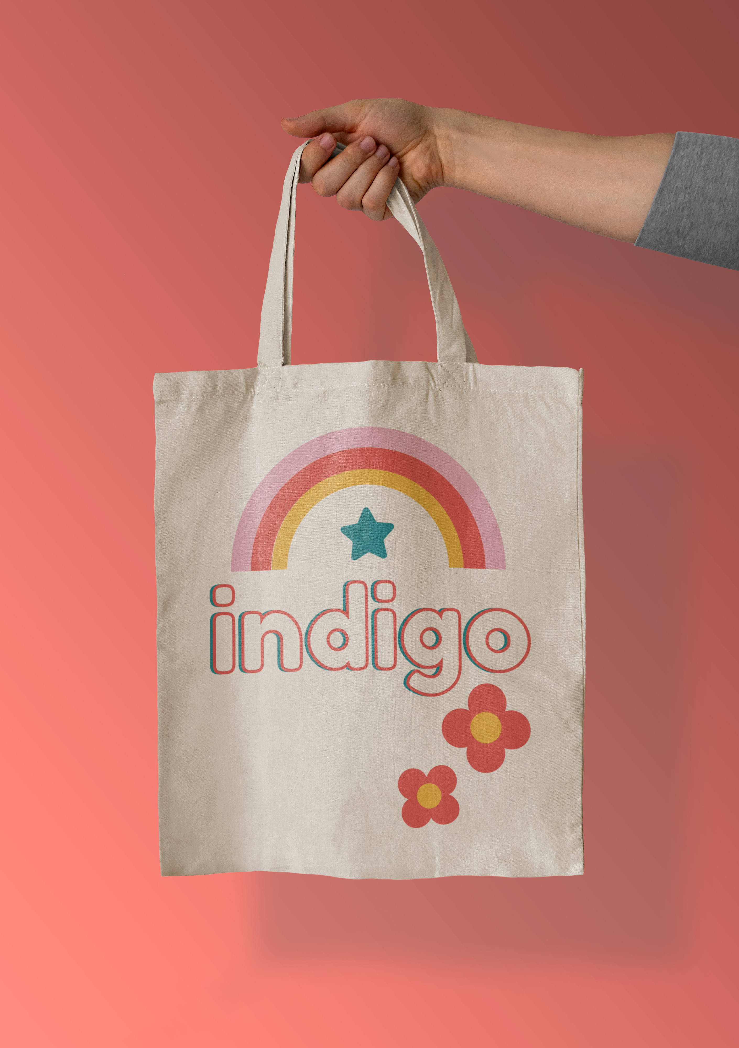
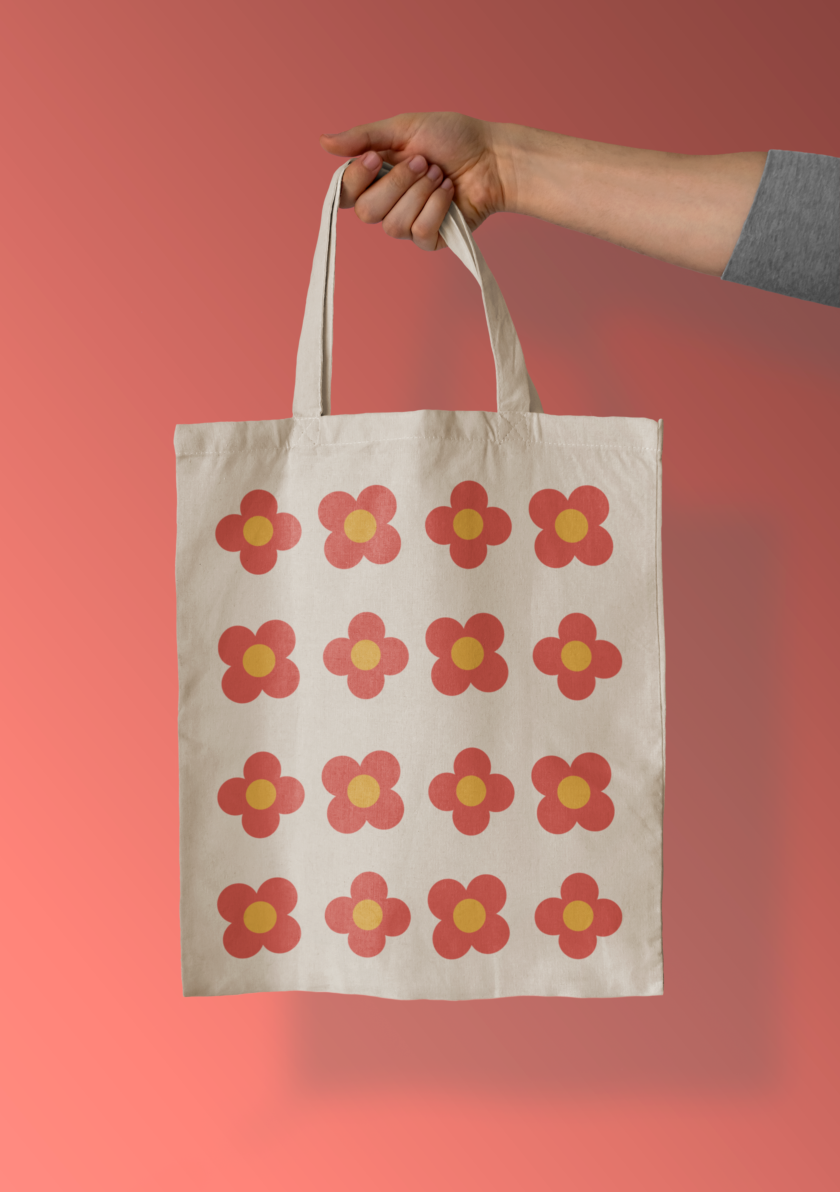
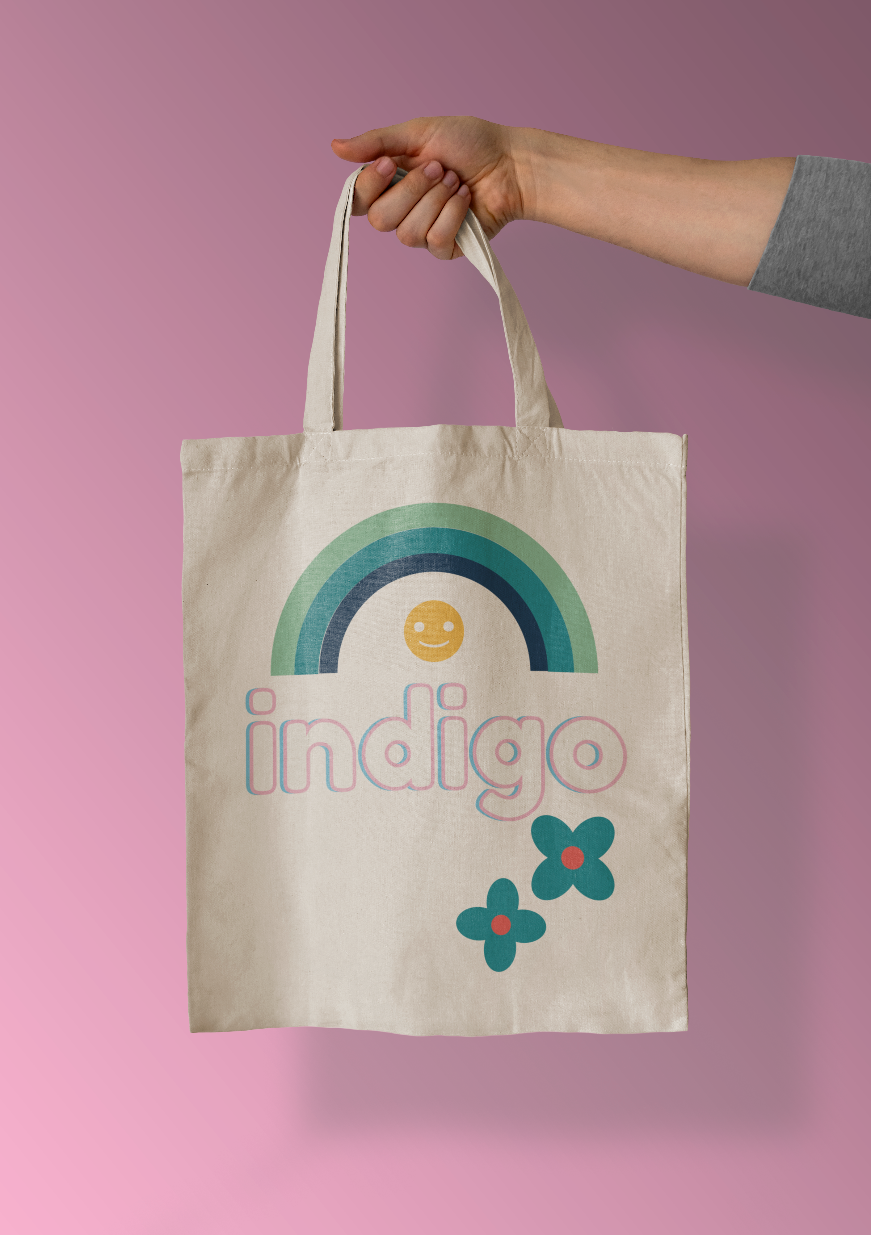
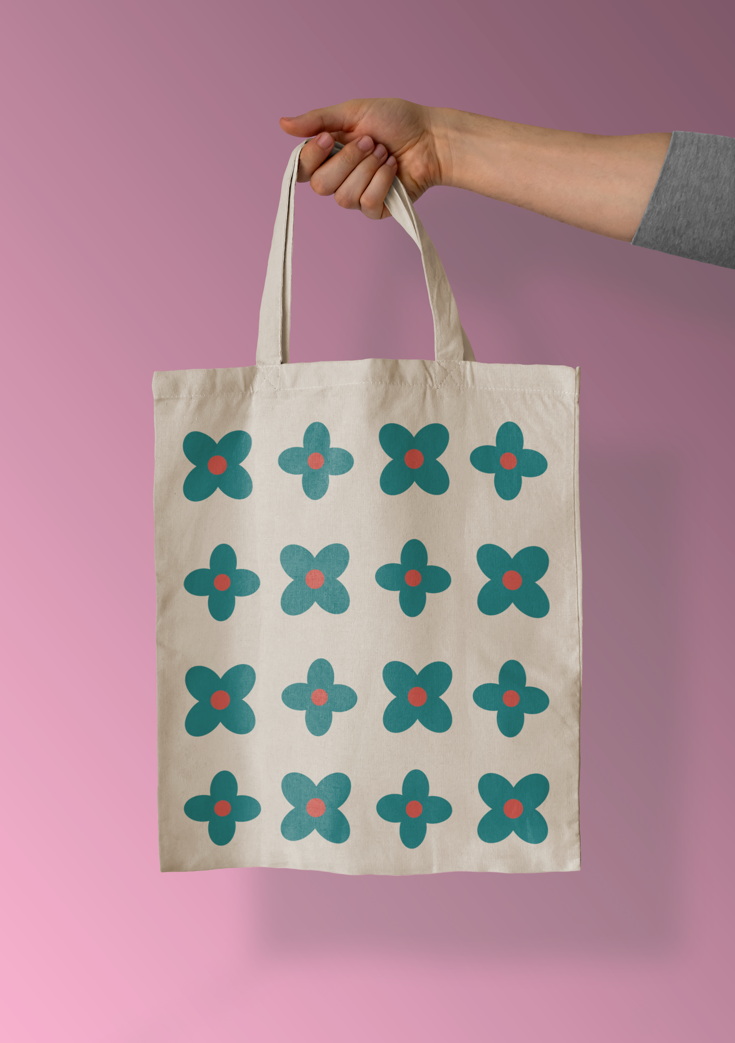
I searched on freepik for a free use tote bag mock up to use to showcase my designs. Once I had this I started to edit the file and place my graphics onto it. I wanted to create the designs directly onto the bags instead of working in another file first as I felt it helped me to really visualise the space better and allow for the design to develop organically to fit the space. I made two variations of this bag, a blue version and an orange version, keeping a similar layout for both. I took the text directly from 2 of my posters to tie it into the advertising designs strongly. I initially was only going to design the front of the bags but created a fun flower pattern for the back side which I really love the mismatched vintage feel of.
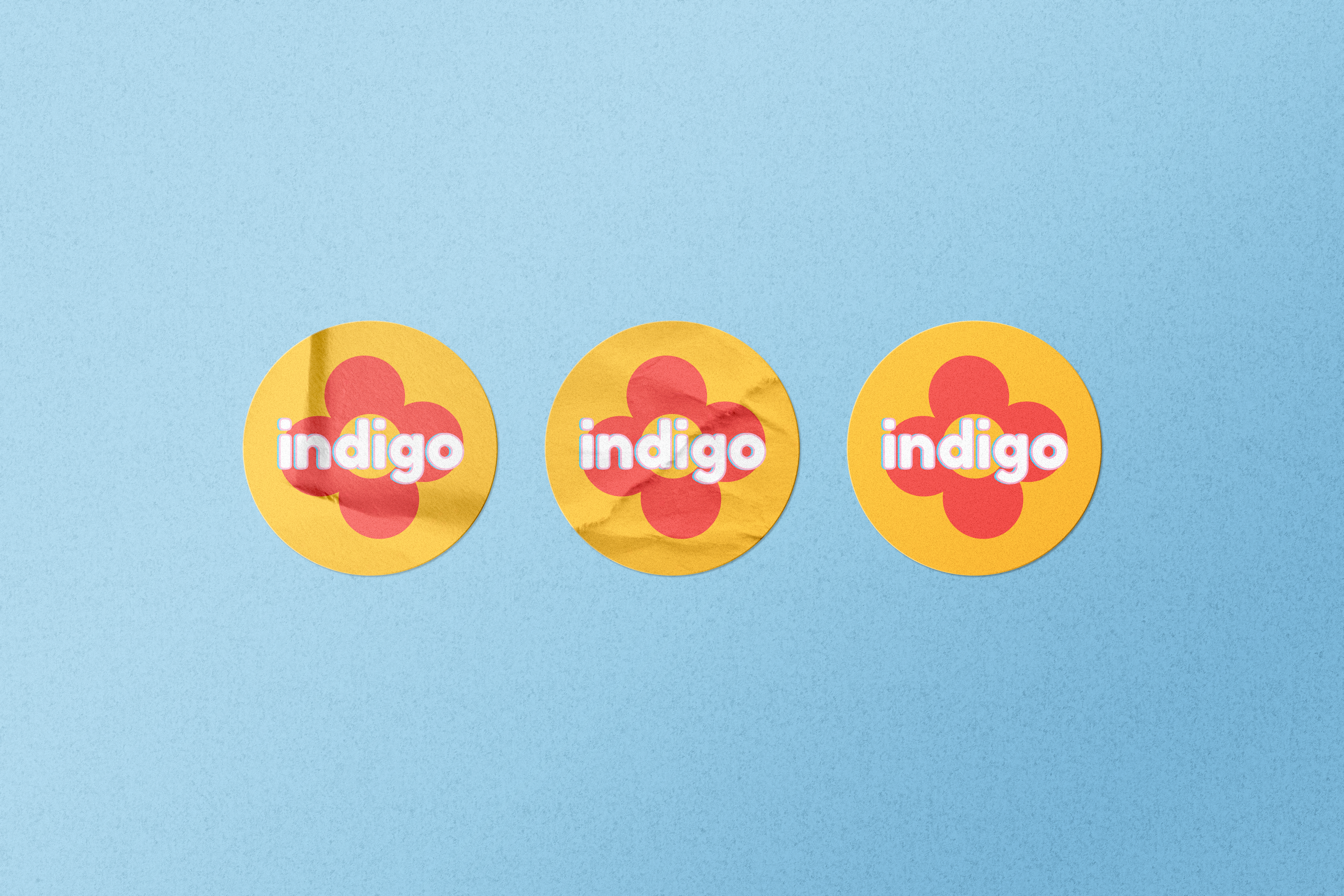
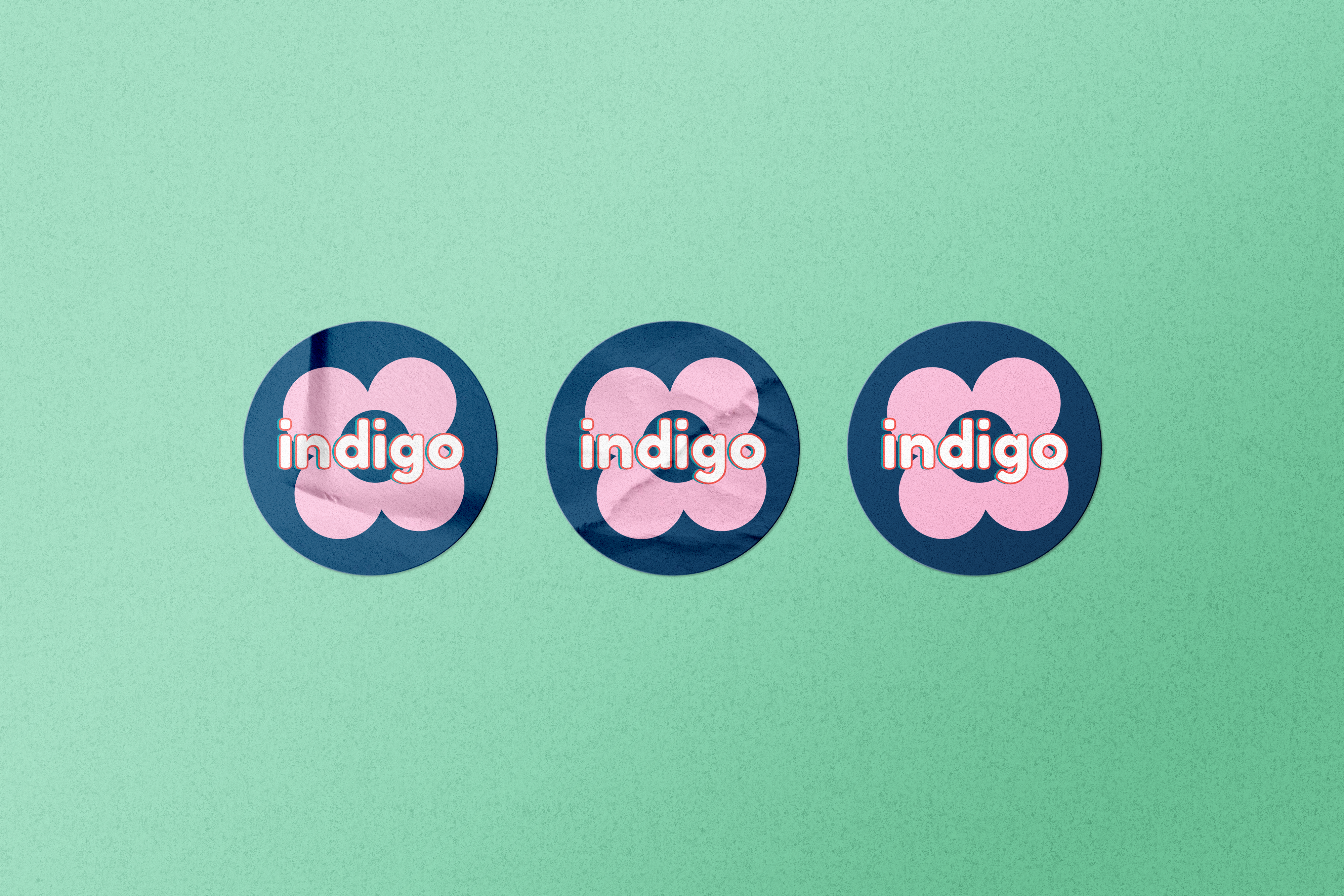
After I made tote bags I decided that stickers would be another thing that would fit well with the branding and promotion for the festival itself. I decided that the designs would be reminiscent of the icons for the social media accounts. I wanted to do this so there would be a link to the physical merchandising and the digital branding. I created some square designs to start using my font and some of my graphics following the colour scheme and then went to find a mock up file for stickers. I found this also on freepik for free use to showcase the designs properly and show how stickers would look for the brand. I think that these could be a fun edition as either freebies for consumers to promote the event or sold at the festival as paid merchandise. I think they are a really good thing to have for advertising and promotion as stickers fit well with my y2k/vintage target audience and a lot of my design scheme is based on sticker graphics, stickers can be put on anything so are a great way to receive free promotion and press for an event with minimal to no effort on the organisers part except creating the stickers.
Mock Up References:
Cosmo Studio, 2022. Round sticker mockup Free Psd. [online] Available at: https://www.freepik.com/free-psd/round-sticker-mockup_12006123.htm#query=rectangle%20sticker&position=0&from_view=keyword [Accessed 15th April 2022].
vectorium, 2022. Tote bag on black mockup Free Psd. [online] Available at: https://www.freepik.com/free-psd/tote-bag-black-mockup_11810572.htm#query=tote%20bag&position=0&from_view=search [Accessed 15th April 2022].
As I had made advertising mockups for my assets on social media, I decided to take my poster designs and add them into a mock up environment to show what these would look like in the real world. I again, as with all my other mock ups, used freepik to find some free use mock up files in styles I wanted. I first found this mock up of a wall with a pasted on poster and thought that this would be a good way to show the physical use of my designs. I added my poster images from my illustrator document into the photoshop file and as I had been working to standard sizing they fit perfectly within the file. I think that these mock ups really show how bright and interesting my designs would look out in the real world. I think that the main title text and the subheading is bold and readable and that the smaller informational text is a good size to get the information across to the viewer effectively. I think they work really well in this type of physical setting and also that posters like this could also be used as merchandise as they are interesting and colourful and make for good decoration.
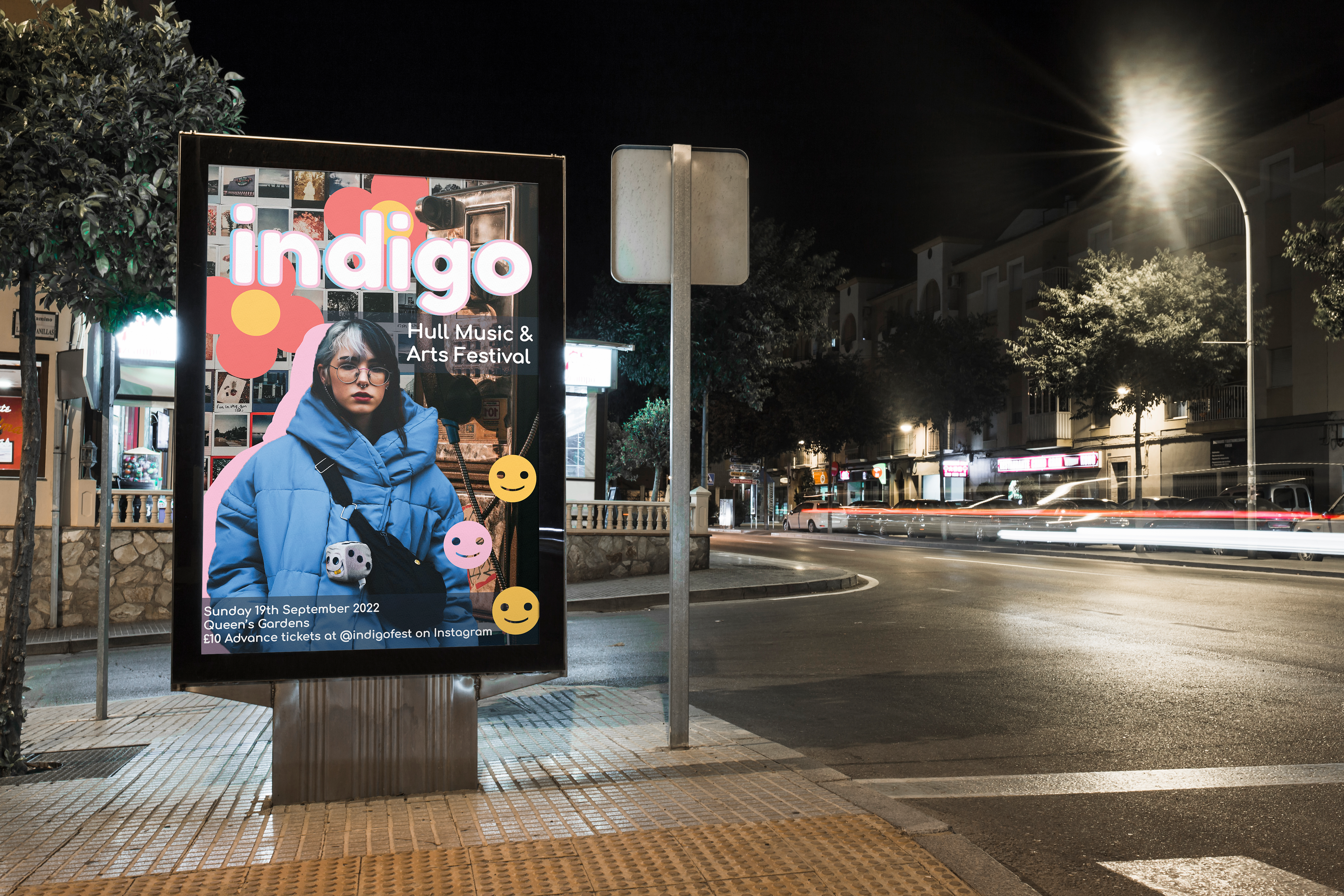
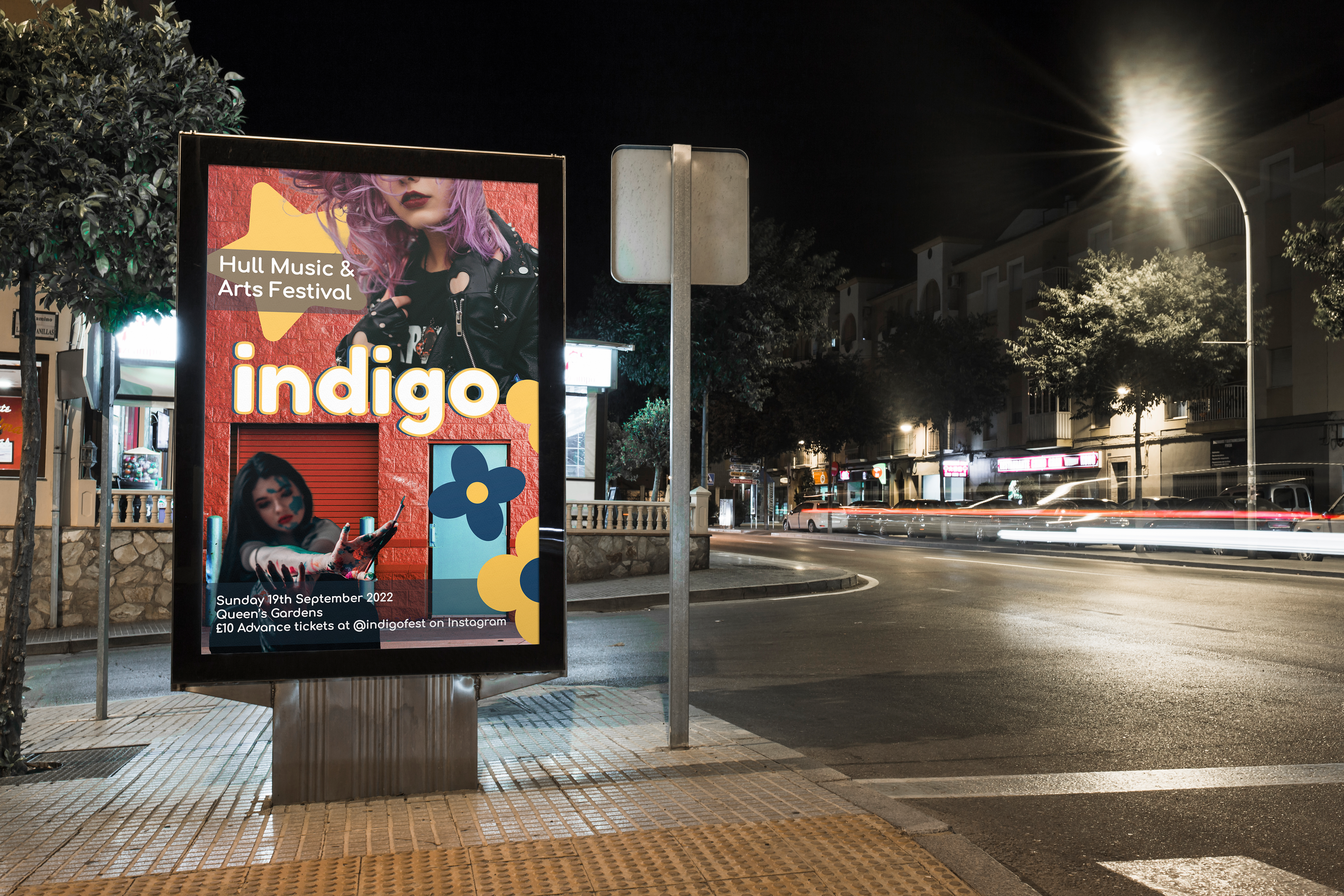
The second mock up design that I chose to create was one for a poster board. As we have a lot of these around the city of Hull I thought it would be good to see how my design would look in an environment like this as this would most likely be how it would be primarily advertised in person. I found a night time city mockup for the poster board and inserted my images again. I really love how this ended up looking and seeing my designs properly in all the appropriate physical settings really helps to visualise how the outcomes look. I think within my poster designs I was really able to achieve something that relates strongly back to my research and target audience and shows off the styles and collage design elements I wanted to bring together for the advertising for this project.
Mock Up References:
Vectorium, 2022. Crumpled poster mockup Free Psd.[online] Available at: https://www.freepik.com/free-psd/crumpled-poster-mockup_11024024.htm#query=poster&position=22&from_view=search [Accessed 21 April 2022]
freepik, 2022, Billboard mockup in city at night Free Psd. [online] Available at: https://www.freepik.com/free-psd/billboard-mockup-city-night_2879640.htm#query=billboard&position=4&from_view=keyword [Accessed 21 April 2022]
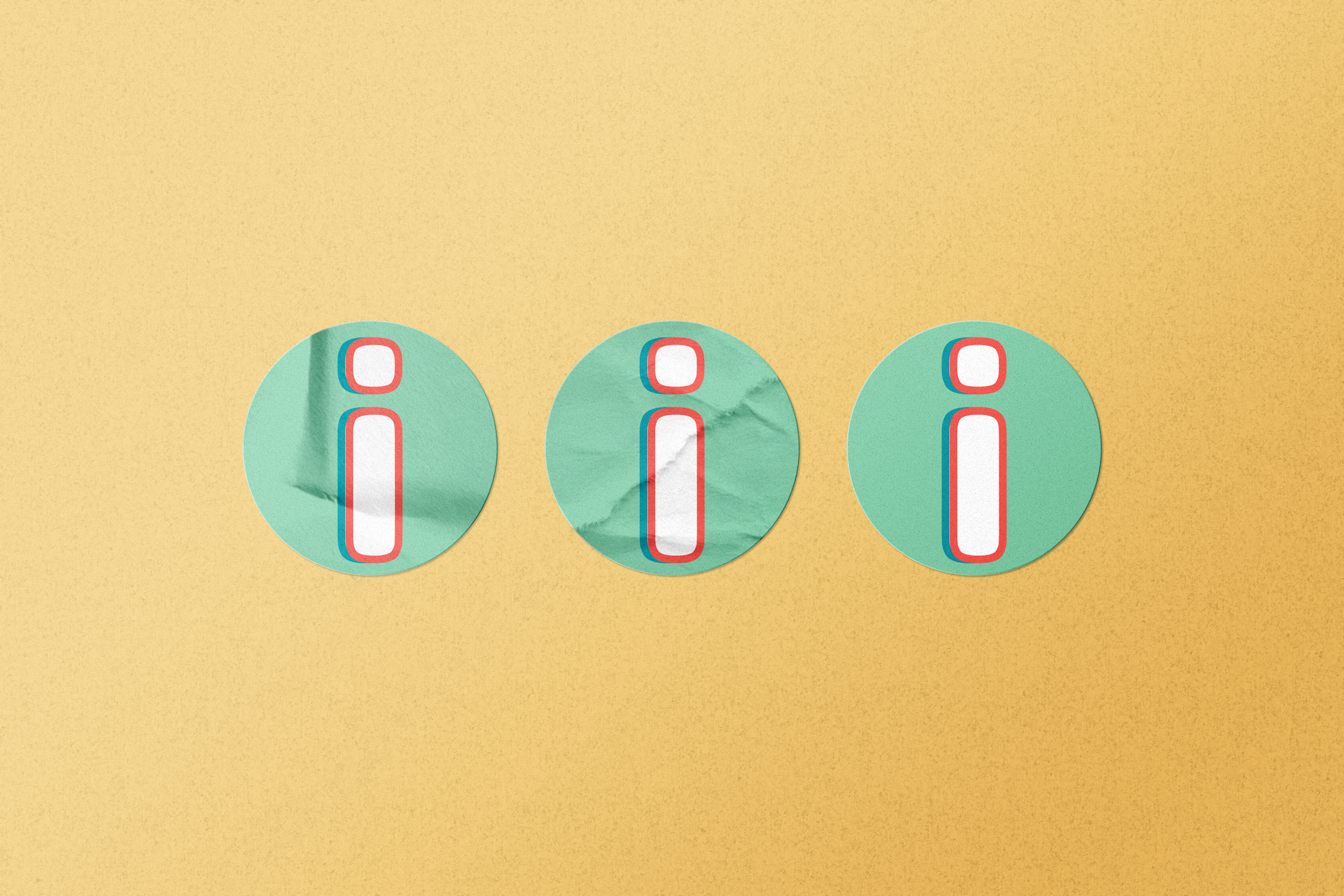
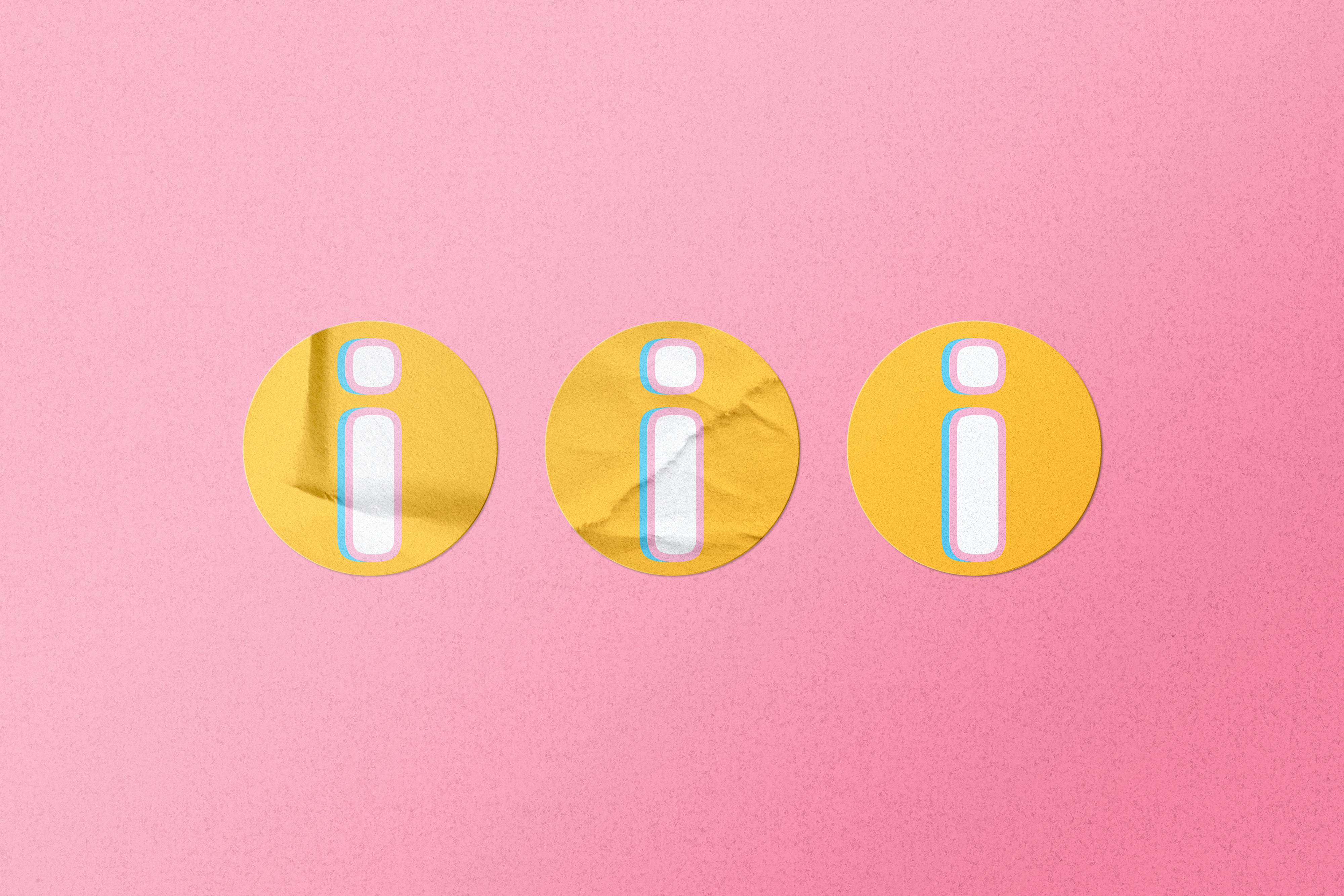
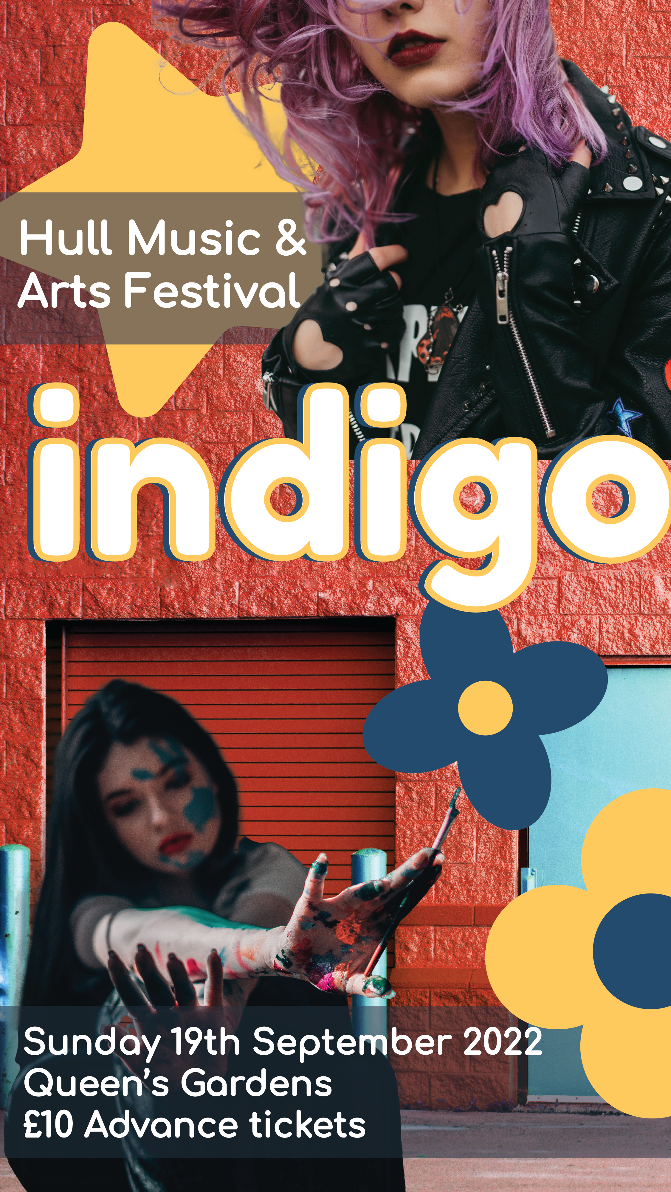
I decided that a good next step with my 3 final designs and their social media variants would be to place these in situation to really get the full effect of the digital presence they would have. Before starting this however I decided that I should make some icons use within the Instagram mockups I was creating. I created these in a square size to make them universally useable for anything I may have needed. I created 4 variants for this, two with just the letter I for Indigo on them and 2 others with images similar to those of the posters. I really like all 3 of the icons I created using my colour scheme, font, graphics and photographic assets and I think all of them turned out really well. I do however like the yellow I design and the first one with the rainbow the most as I think both are striking in their own ways and can be used in many ways.
Once I had these images created, I set to editing a screenshot of the Instagram app to resemble an account for the festival. I used photoshop to construct this mock up of an instagram profile for the festival and tried to make it look as realistic as possible. I used the yellow icon for the profile photo and ended up using the other 3 for highlight reels with more information accessible about the festival for the audience. I kept the description simple and added the link as mentioned on my posters so that the profile looked complete, from here I added in my instagram sized design assets and placed them as posts on the feed, I think this looks like a convincing instagram profile and is really able to capture the essence of the festival I was trying to go for in my research.
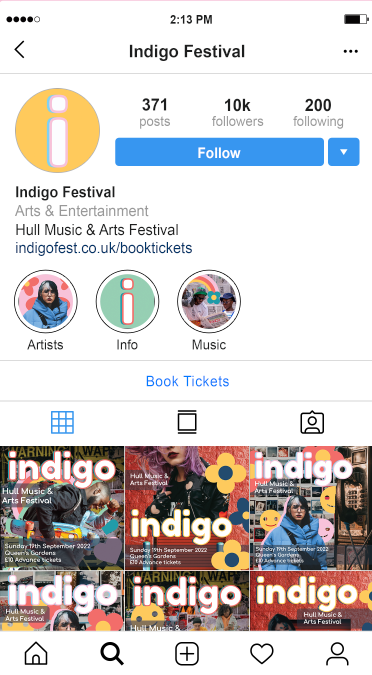
Below are the post mock ups that I created for the festival, showing off the designs I have made and how they would be used in context of advertising the festival to the intended target audience from my research. I really do think this was an important further step in my design process so I could see how the advertisements and their information come through in a real situation that they would be viewed. I created 6 of these design mock ups to show how each of my designs would look in the context and I think all 3 of my design themes are very effective and the colours are striking and eye catching, matching together into a cohesive advertising brand whilst also staying individual and memorable to themselves. I think the use of an ongoing colour palette used throughout the designs and the consistency of the sticker graphics, it really pulls all the designs together.
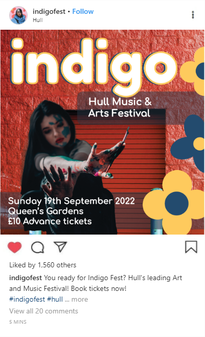
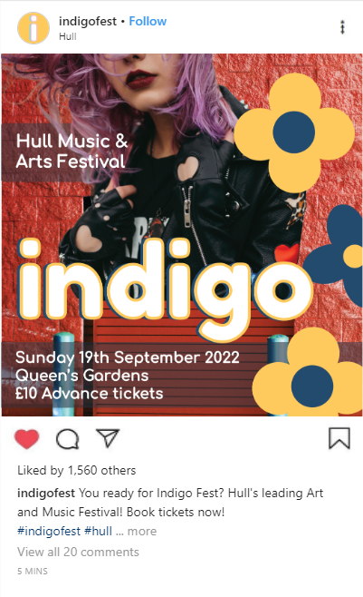
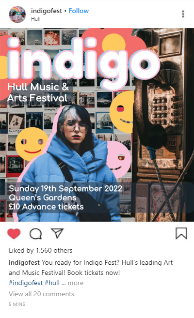
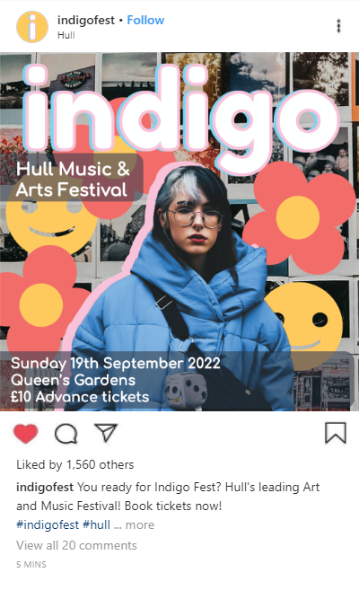
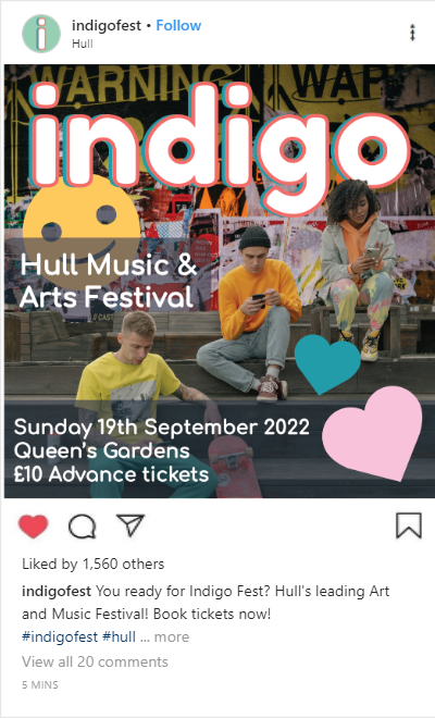
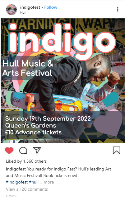
Image References:
Adesina. D, 2018. Woman in Yellow Coat With Black Crossbody Bag Closing Her Eyes. [online] Available at: https://www.pexels.com/photo/woman-in-yellow-coat-with-black-crossbody-bag-closing-her-eyes-833052/ [Accessed 8 April 2022].
uncoveredlens, 2019. Photo Of Man Bringing Radio. [online] Available at: https://www.pexels.com/photo/photo-of-man-bringing-radio-3620411/ [Accessed 9 April 2022].
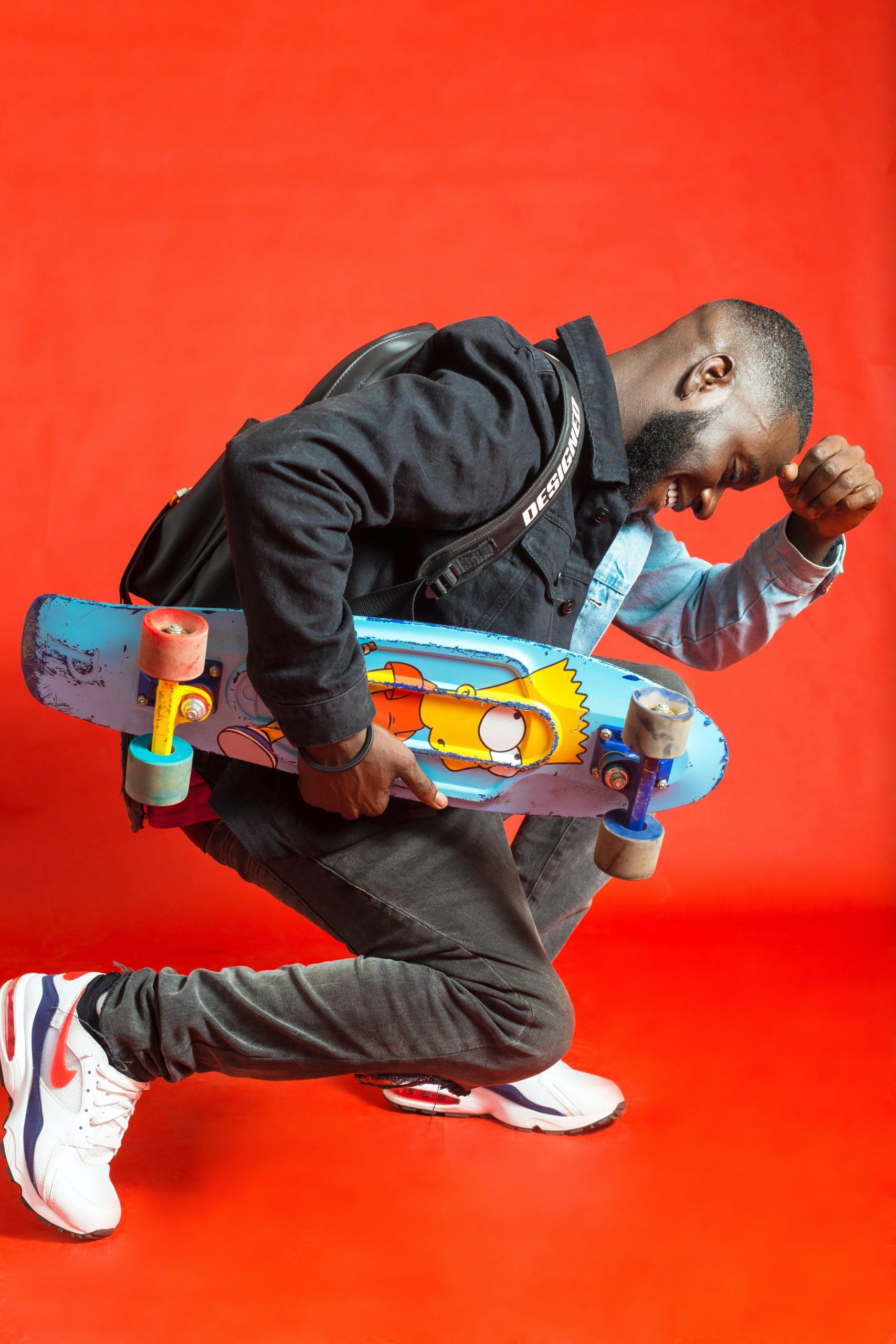
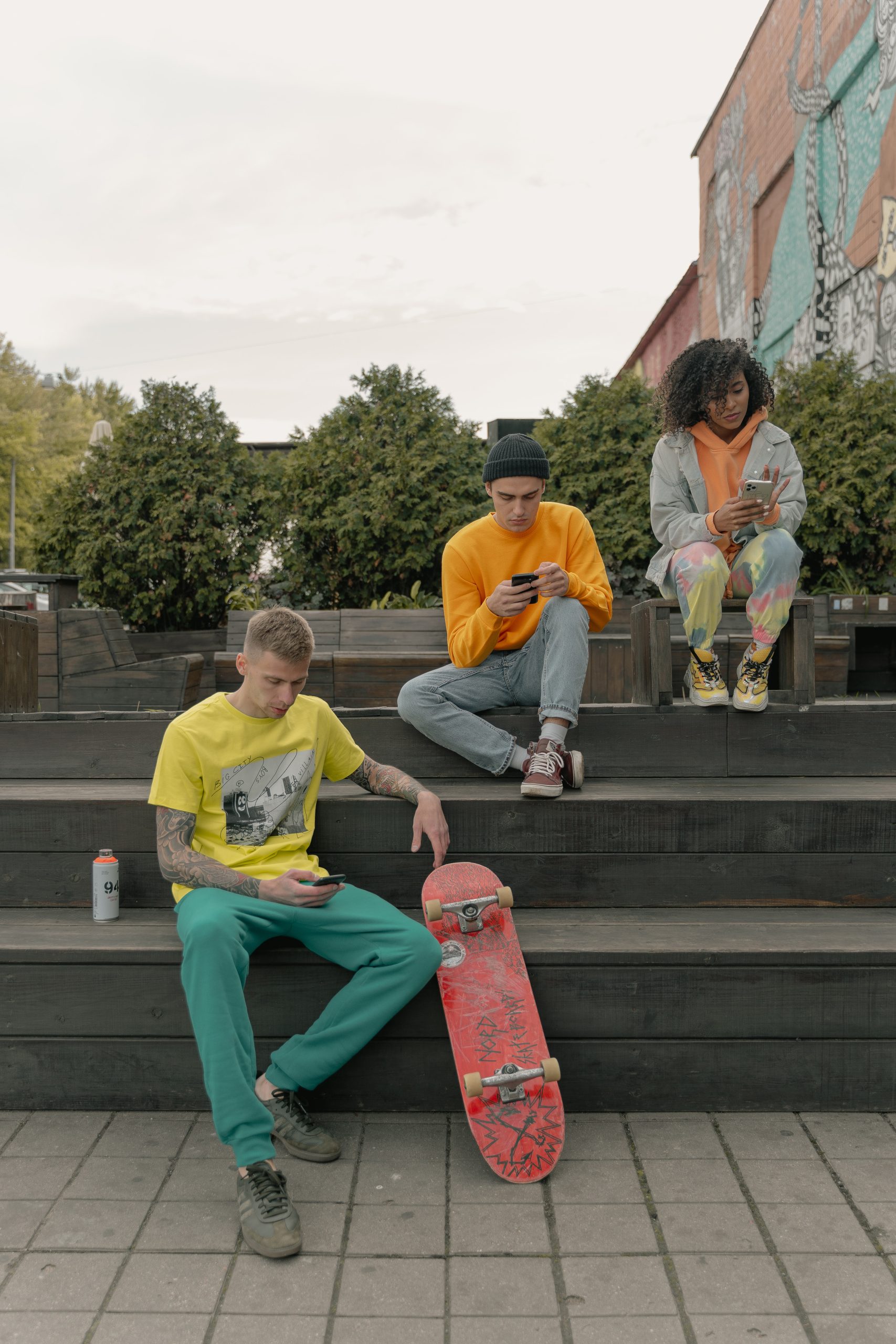
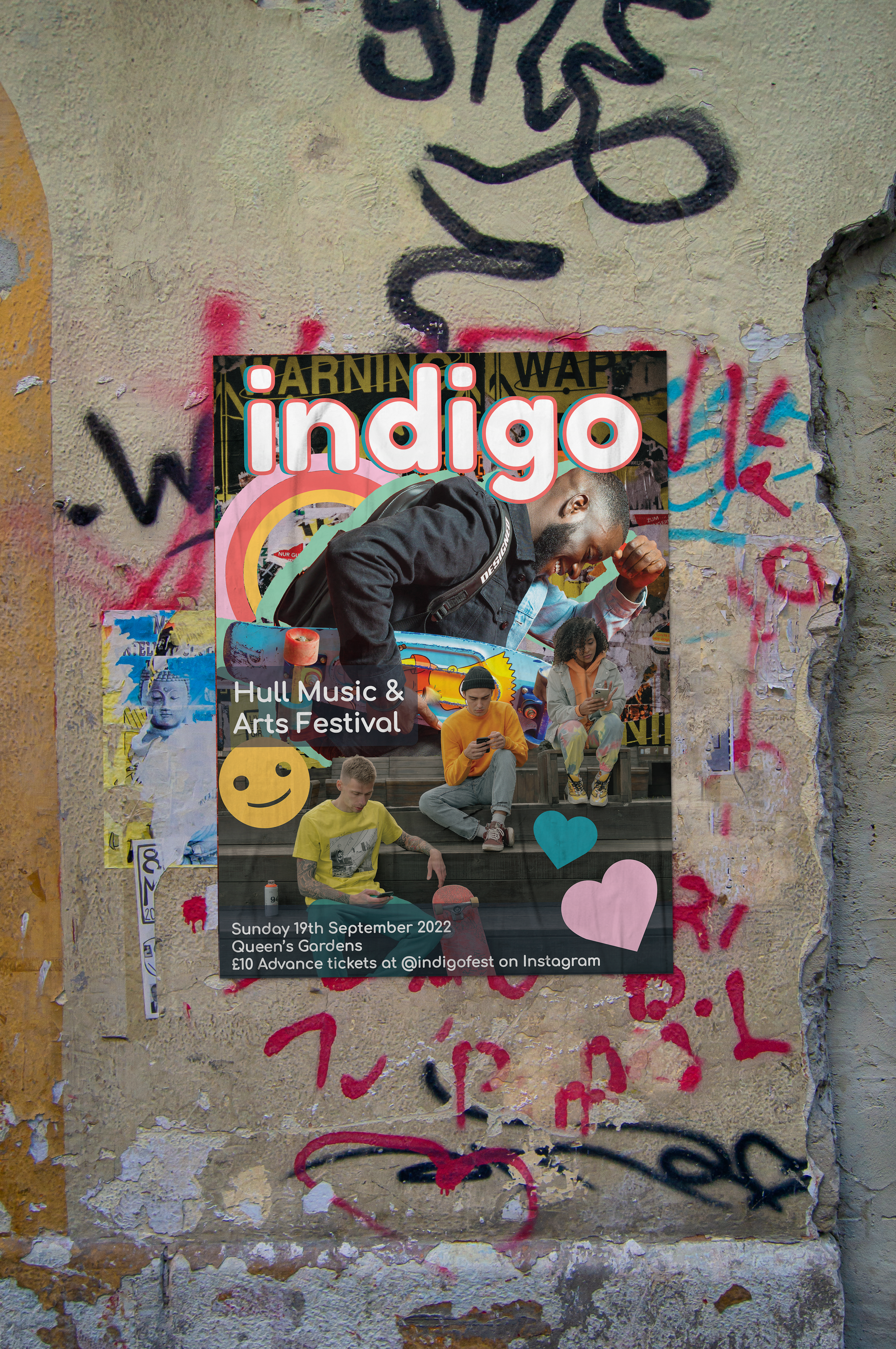
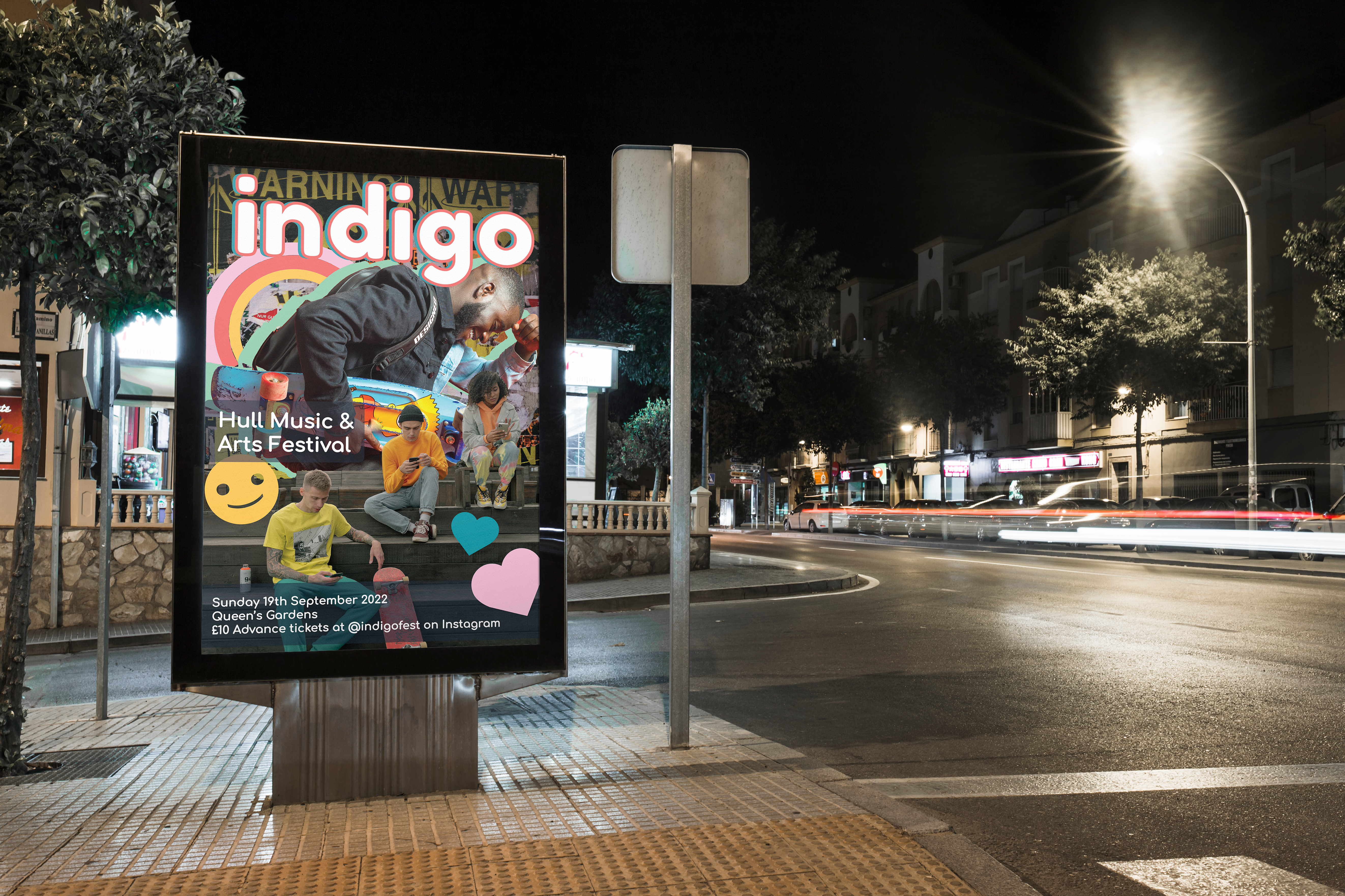
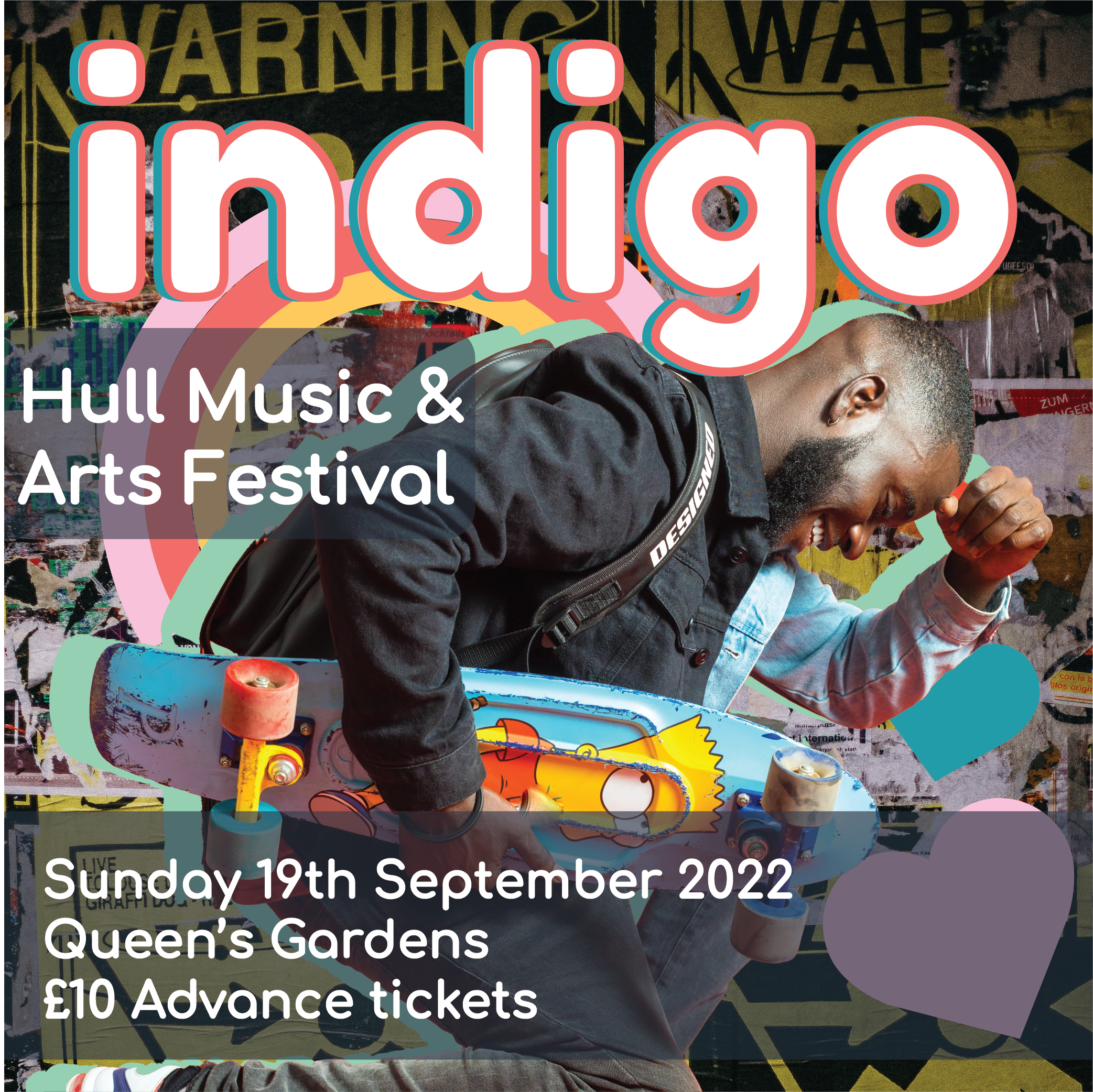
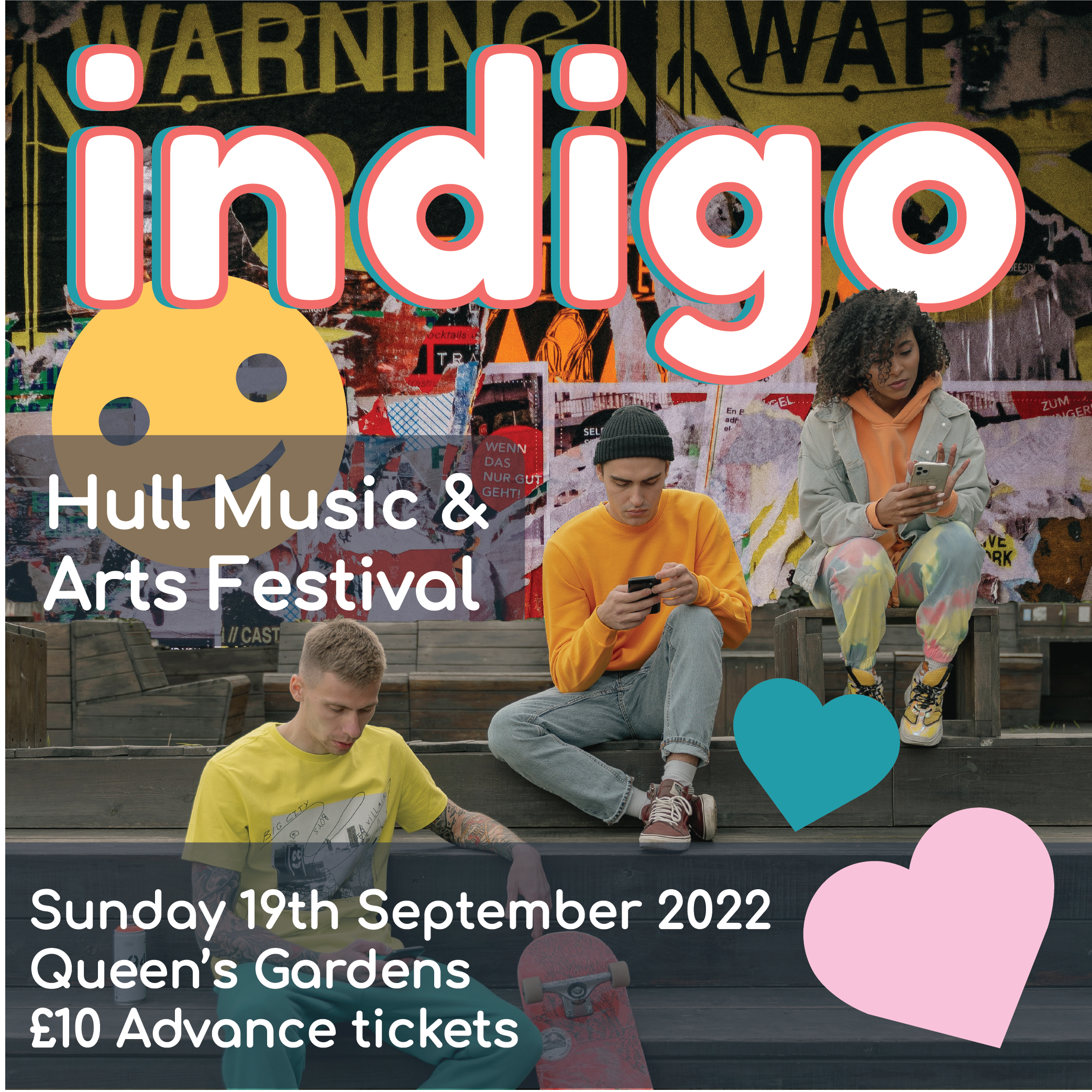
For my 3rd and final design for the festival’s promotional materials I first started by choosing my images that I wanted to use and liked the look of. I chose some images with skateboards in to tie them in together. All of the images I chose for each of these designs was carefully selected as I wanted the modern style vibes of each image and the right aesthetic for my overall target audience to appreciate. Once I had my three images chosen, one for the background and two others for the foreground layering elements I set to editing these last 2 images so I could start making my poster design.
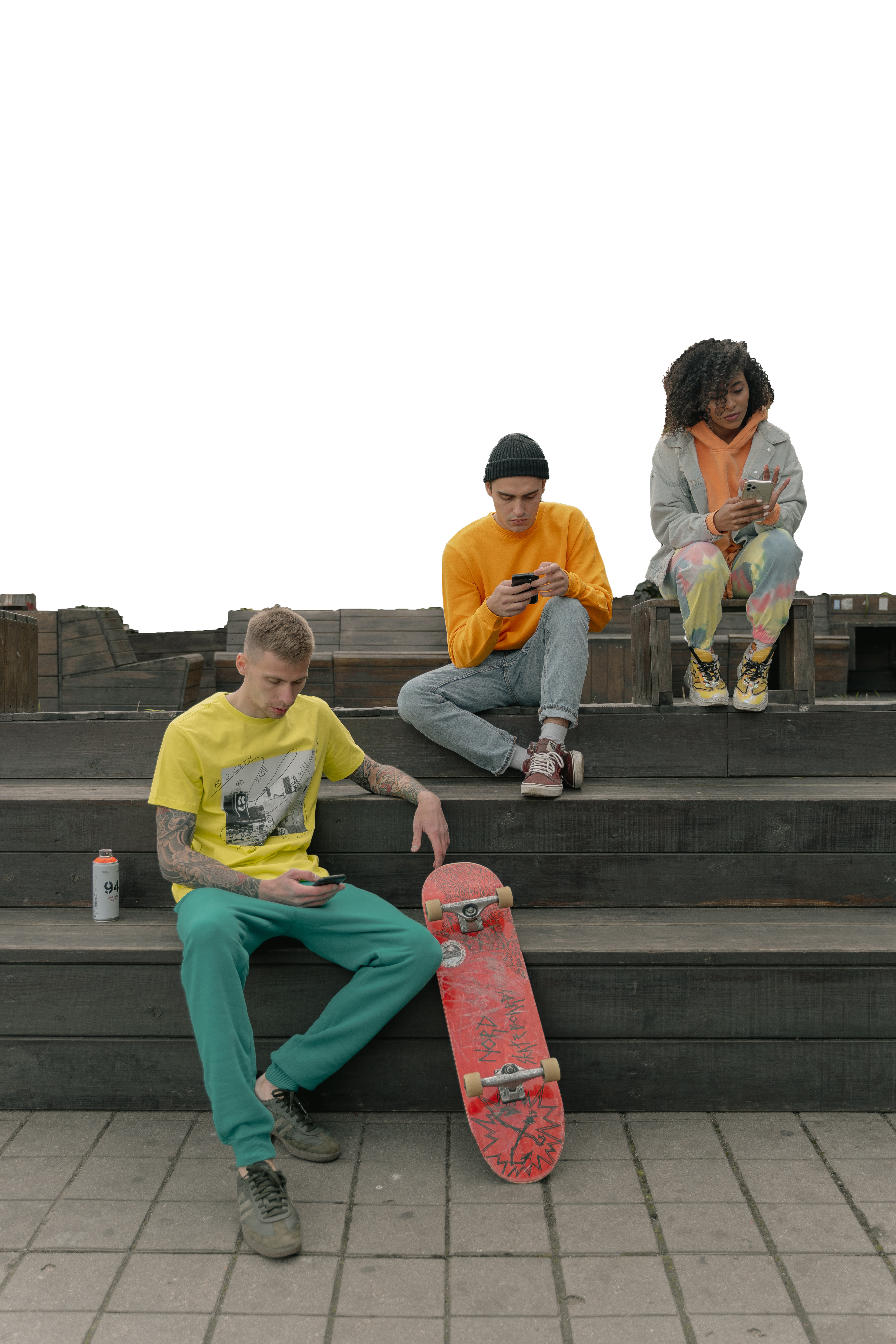
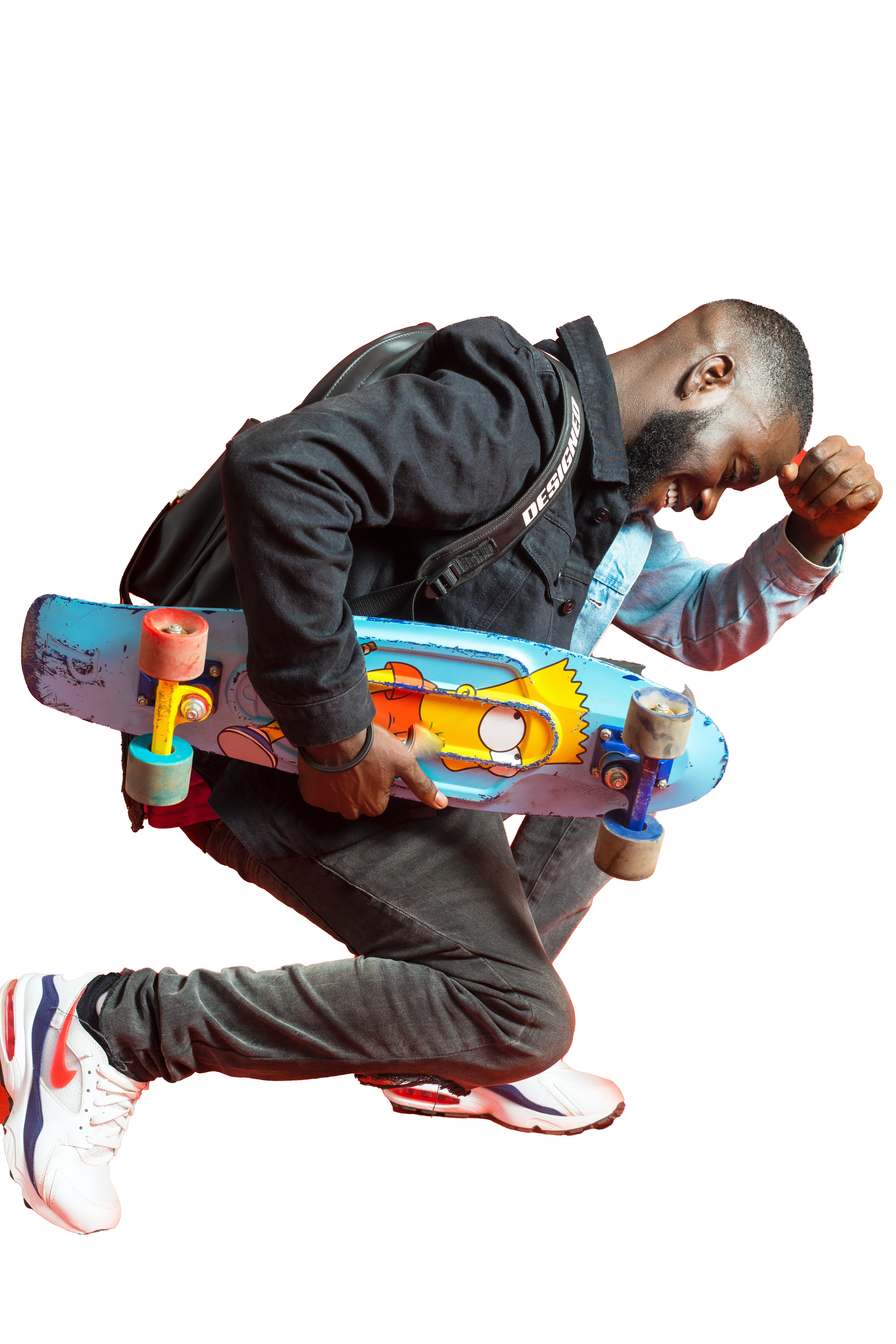
To edit the two images I took them both into photoshop and used the selection tool to select the elements of the background that I didn’t want within my design. Removing the backgrounds was an easy process as I used the techniques I had previously used in my other designs. For the image with the Simpsons skateboard, this was quite hard to edit with the background being red and reflecting onto the subject making it difficult to cleanly select the image so I had to make some adjustments with the eraser tool to make sure the image was clean and looked professional. For the other image I decided not to remove the flooring and the steps from the image, only the top portion of the background. I felt this would give a cleaner overall design and allow for more dynamic layering within my design piece.
Now that I had all my images prepared to create the collage I took these into illustrator and started to play around with all the different images together to see how they looked best. I decided on making the image with the people on the steps the foreground images and then the other figure the middle centre of the image to draw the most attention. I then added in the logo on top of the guy layering it in front of him as I really liked how the curve of the G in the logo fits within the image, I chose the blue and an orange for the title as I hadn’t used this combination yet on any of my other poster designs. Once I added the title and the bottom text from the other posters so it would match, I then referred back to my sticker document and chose some smiley faces and hearts to put into the document. I felt this was looking a bit plain at first so pulled the idea of an outline of the figure from my first document and applied it to the main figure in this poster design, I decided to use the green from my colour palette as I didn’t really find another place to fit it and I think it has a fun contrast to the piece whilst matching with all of the blue and yellow tones. I also decided to add in the rainbow sticker decal as well to balance out the poster and fill the empty space, adding to the collage effect.
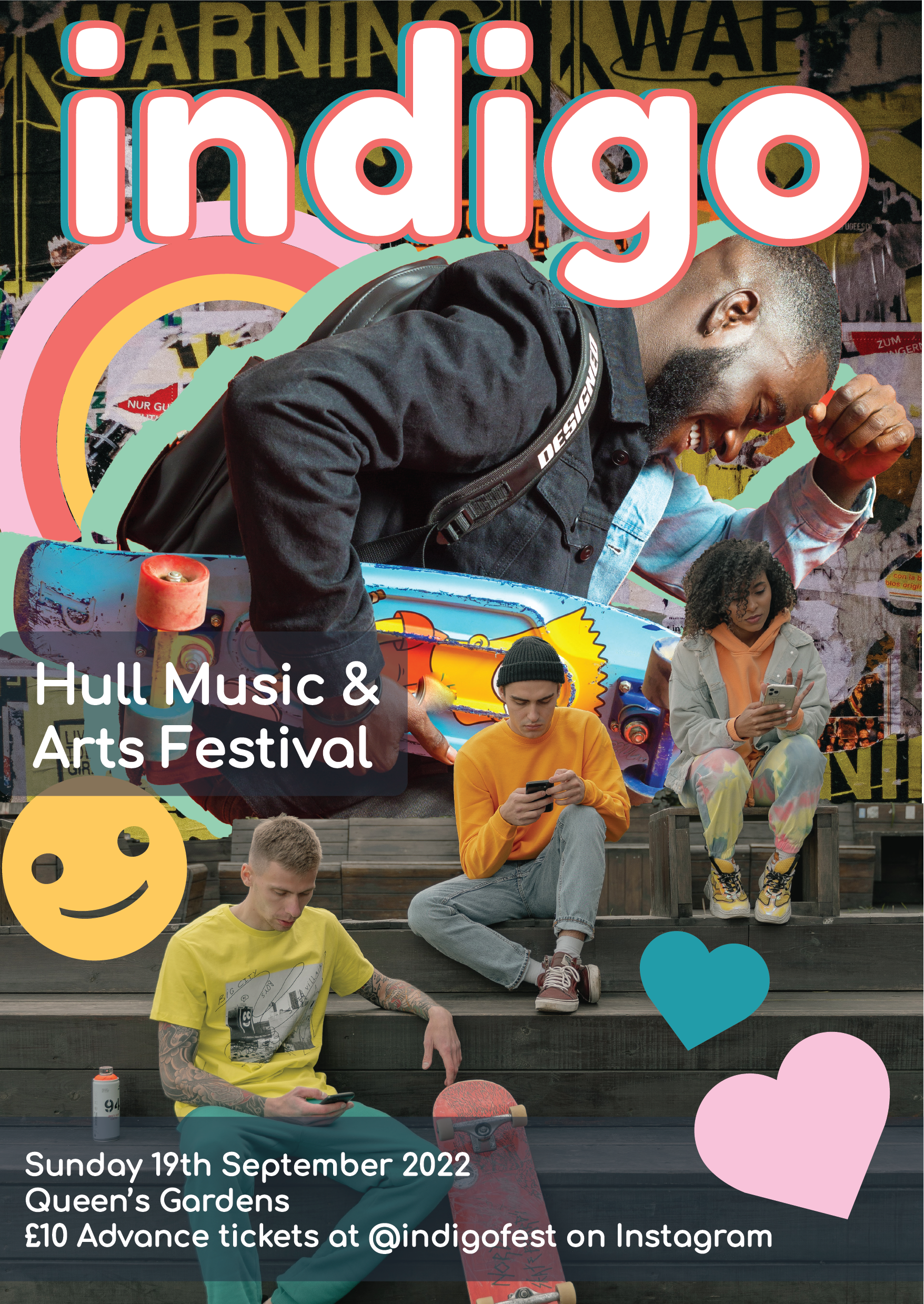
Once I had this main poster made and all the additional elements in place I was happy with the outcome and proceeded to create the instagram/social media sized digital materials. I created these in a similar way to how I made the ones for design 2. I decided that each one would have one of the foreground images on it so that they could really be the focus individually to show off the design elements. I created these with the same text as the previous designs and added one image onto each ad. I think that these look really effective and interesting and draw the users eye to them in their own ways with the fun bright colours and cool stickers.
After these two social media sized designs were complete I set to making the wider social media story style advertisement. I again used my previous designs as reference and the assets from my existing design 3 pieces. I actually layered these very similarly to my initial poster as I did really enjoy the layout and felt it was the most effective way to display the images and information. Overall I think that I enjoy design 3 the most out of my 3 designs and their assets. I think that this 3rd one really combines the things I like out of the others and is really one of the strongest design sets, making use of my whole colour palette and having the most visually striking images of the 3 posters that I created.
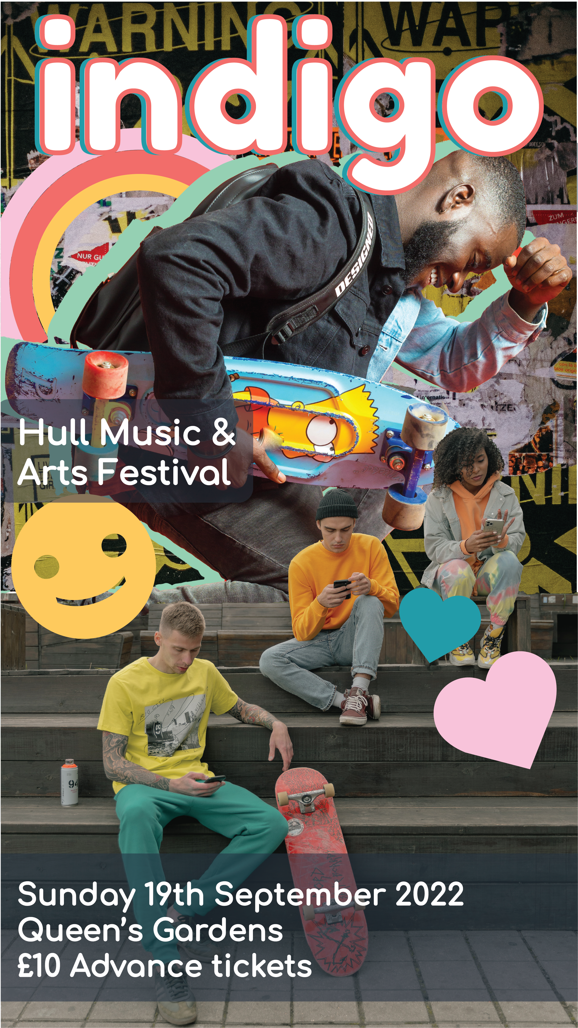
Image References:
cottonbbro, 2019. Yellow Black and White Batman Logo [online] Available at: https://www.pexels.com/photo/yellow-black-and-white-batman-logo-4547587/[Accessed 6 April 2022].
Boakye. P, 2018. Men’s Black Leather Jacket. [online] Available at: https://www.pexels.com/photo/men-s-black-leather-jacket-1813947/ [Accessed 6 April 2022].
Miroshnichenko. T, 2020. A Group of People Sitting on Wooden Bleachers Holding Smartphones. [online] Available at: https://www.pexels.com/photo/a-group-of-people-sitting-on-wooden-bleachers-holding-smartphones-5560297/ [Accessed 6 April 2022].
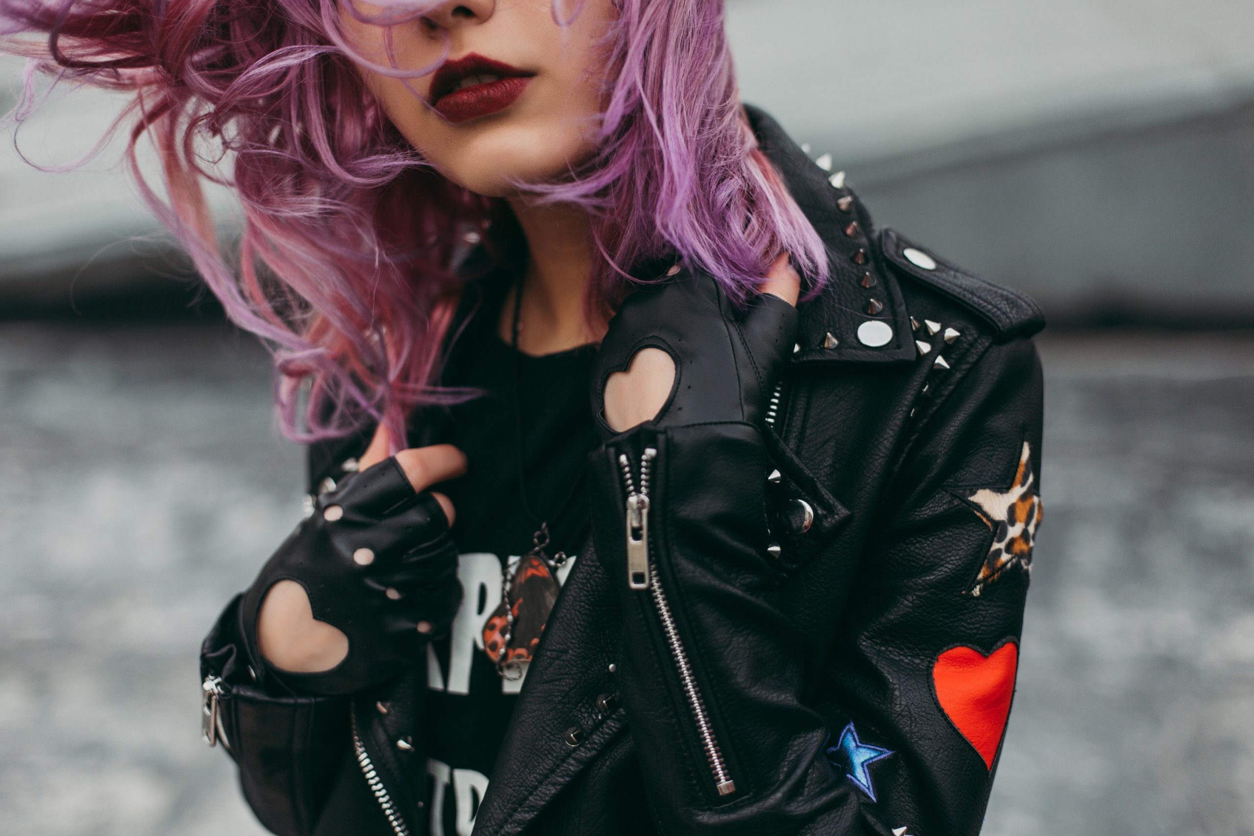
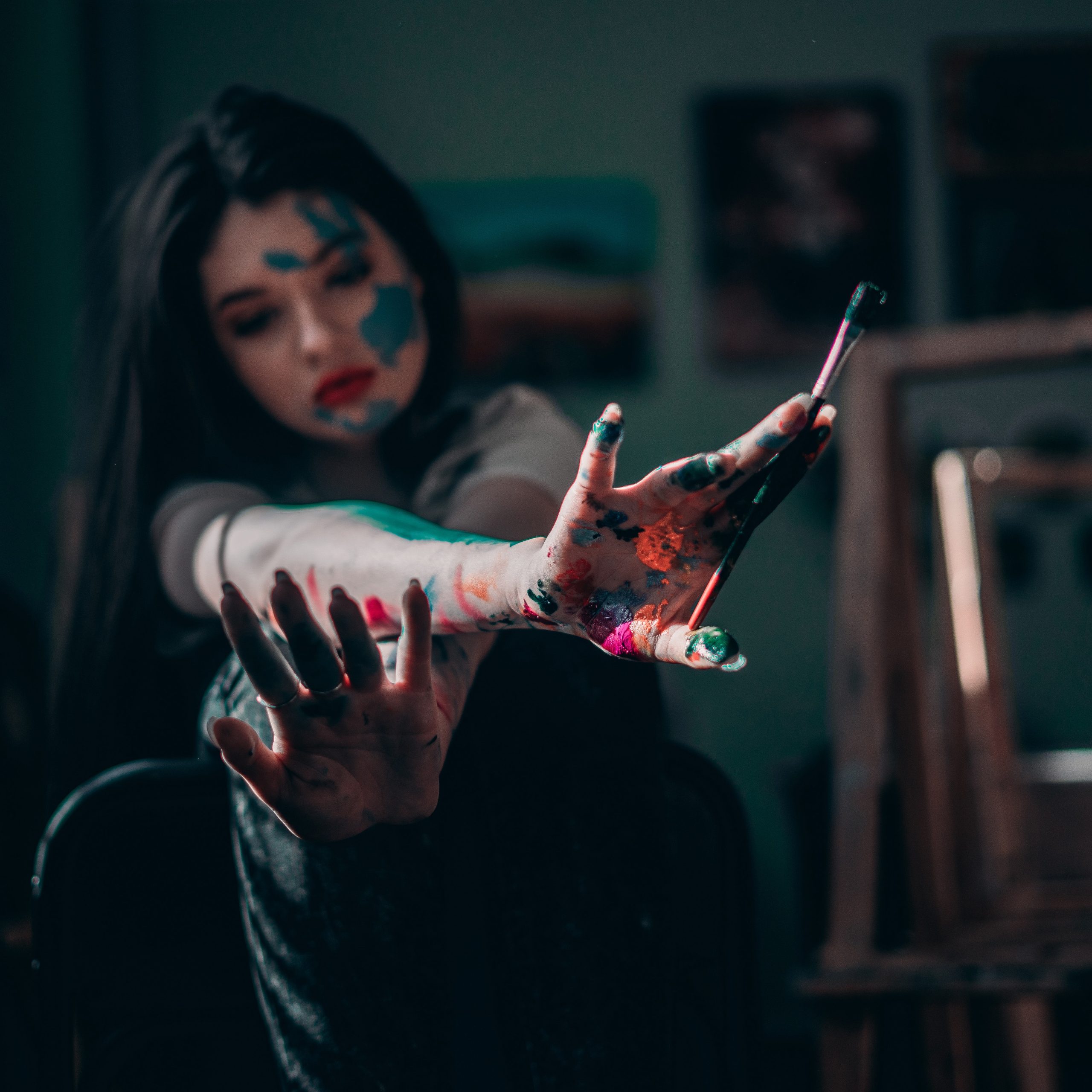
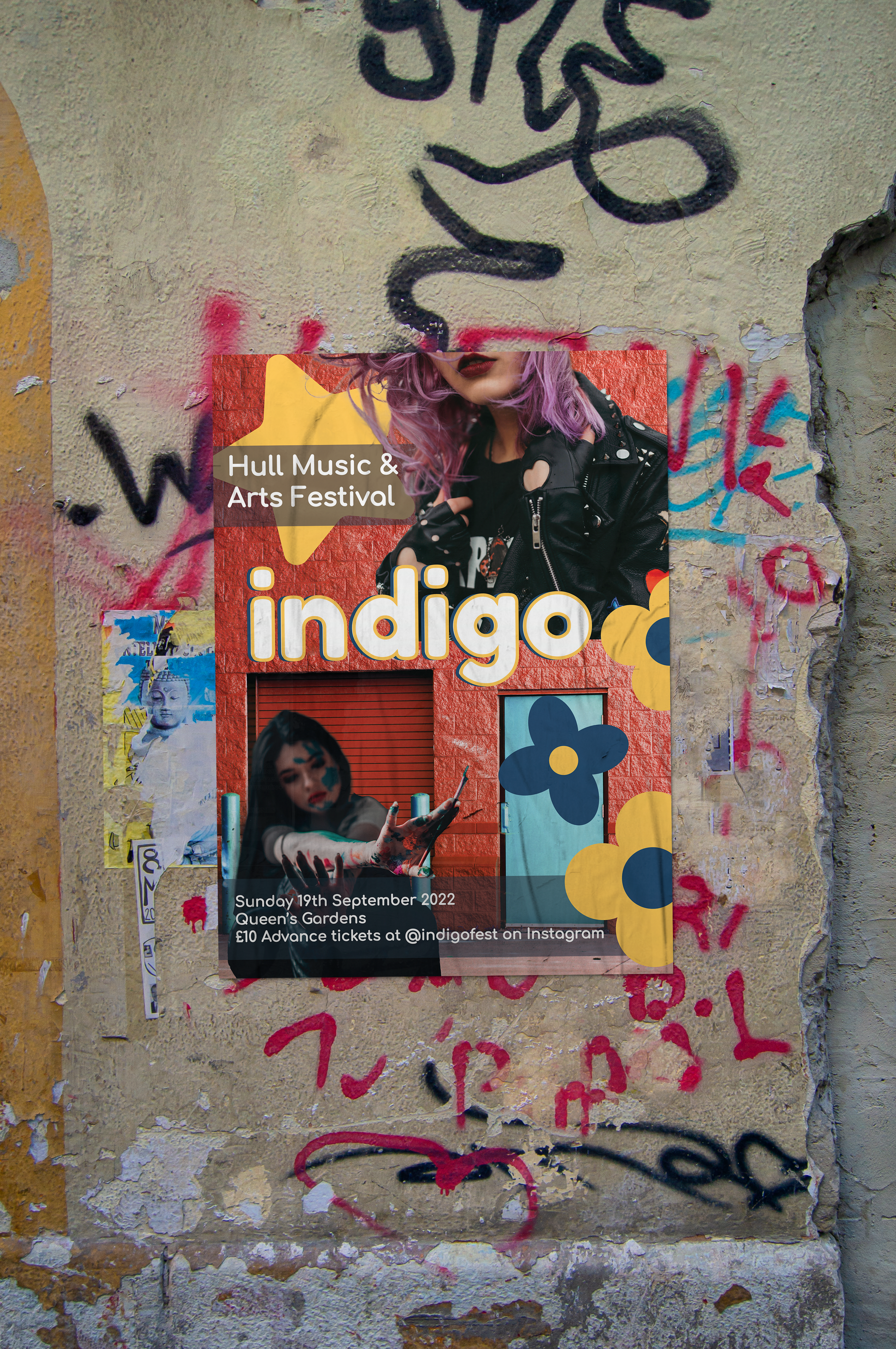
For this second design I had a much better idea of how my designs were going to be formatted from working on design 1. I first began with taking some of my stock images from my collection again and selecting 3 that I wanted to use on this second poster and thought would fit the best together. I chose one image for the background portion of the poster and two for foreground elements to layer with the graphics and text.
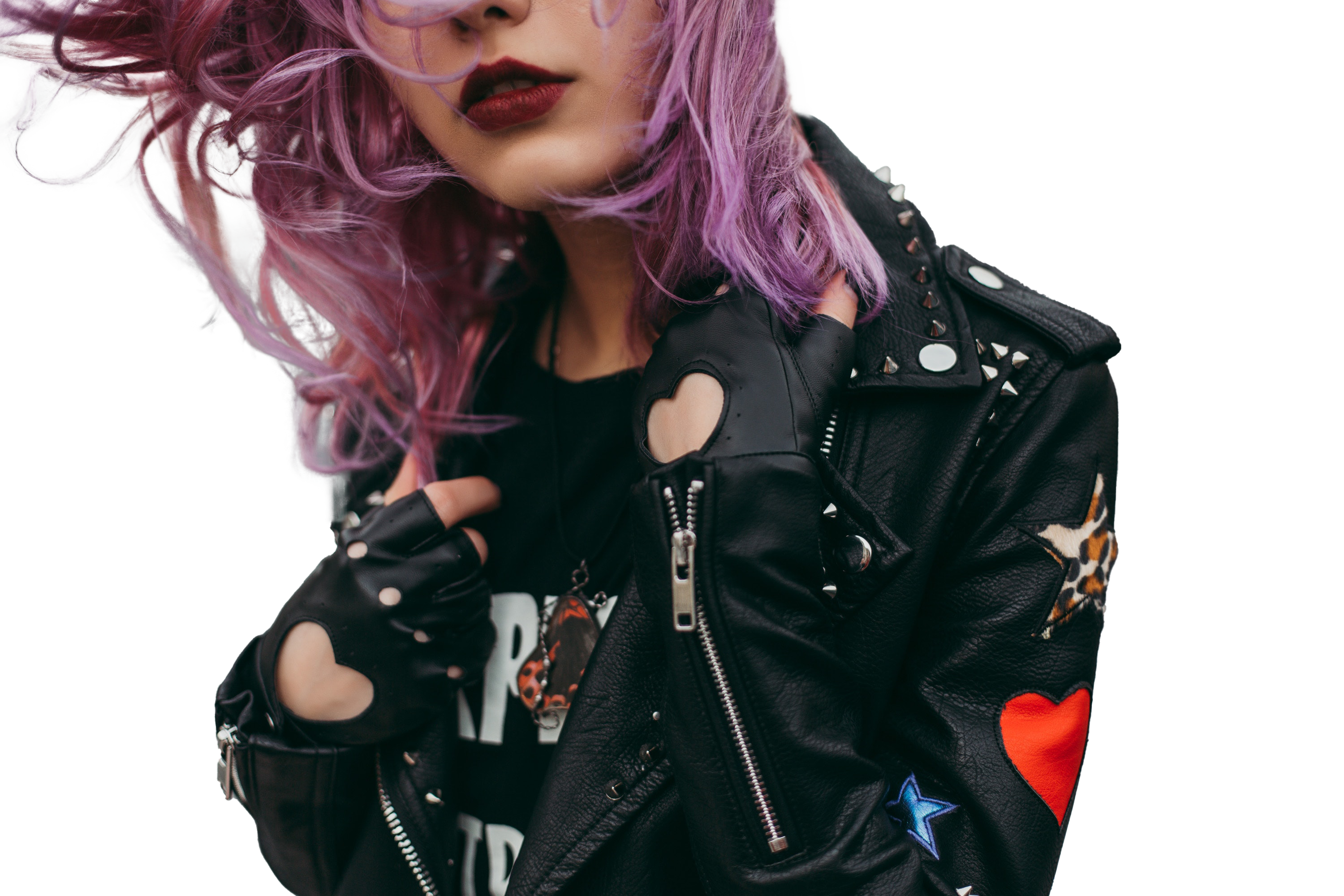
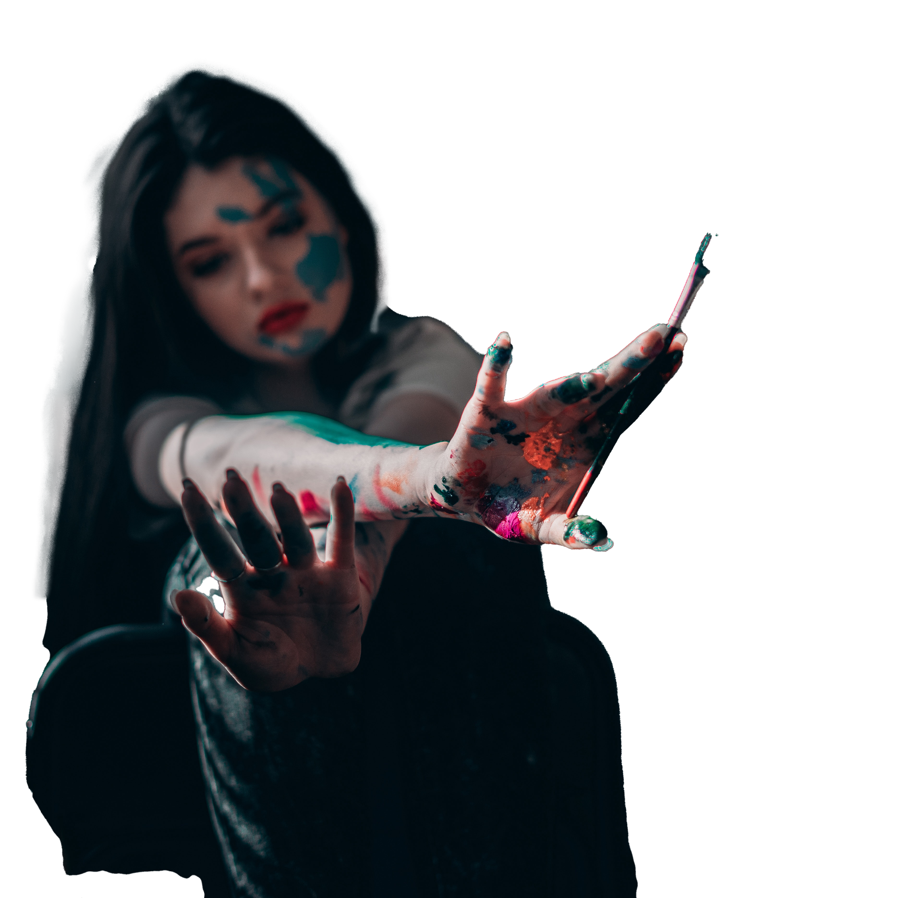
I then set to editing these images to remove undesirable elements and tweak colours etc to make them fit better into my overall designs. I first started with the foreground images so that I could work on perfecting them. I began removing the backgrounds on these images using the selection tool and manually selecting the places I wanted to keep, I then reversed this selection and masked the unwanted area so I could tweak it further if needed. I then used the mask in Photoshop to perfect the edges of my selections to make them clean. Once this was done I again, as in the first design, edited the colours a bit to brighten the images to make them clearer overall.
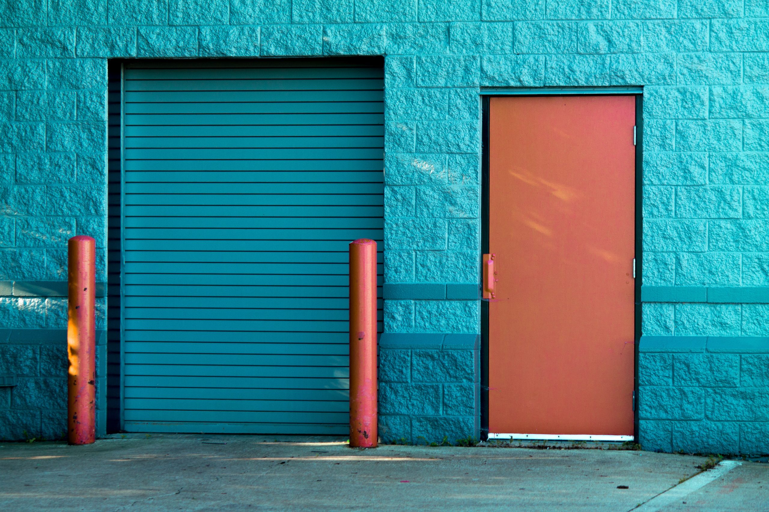
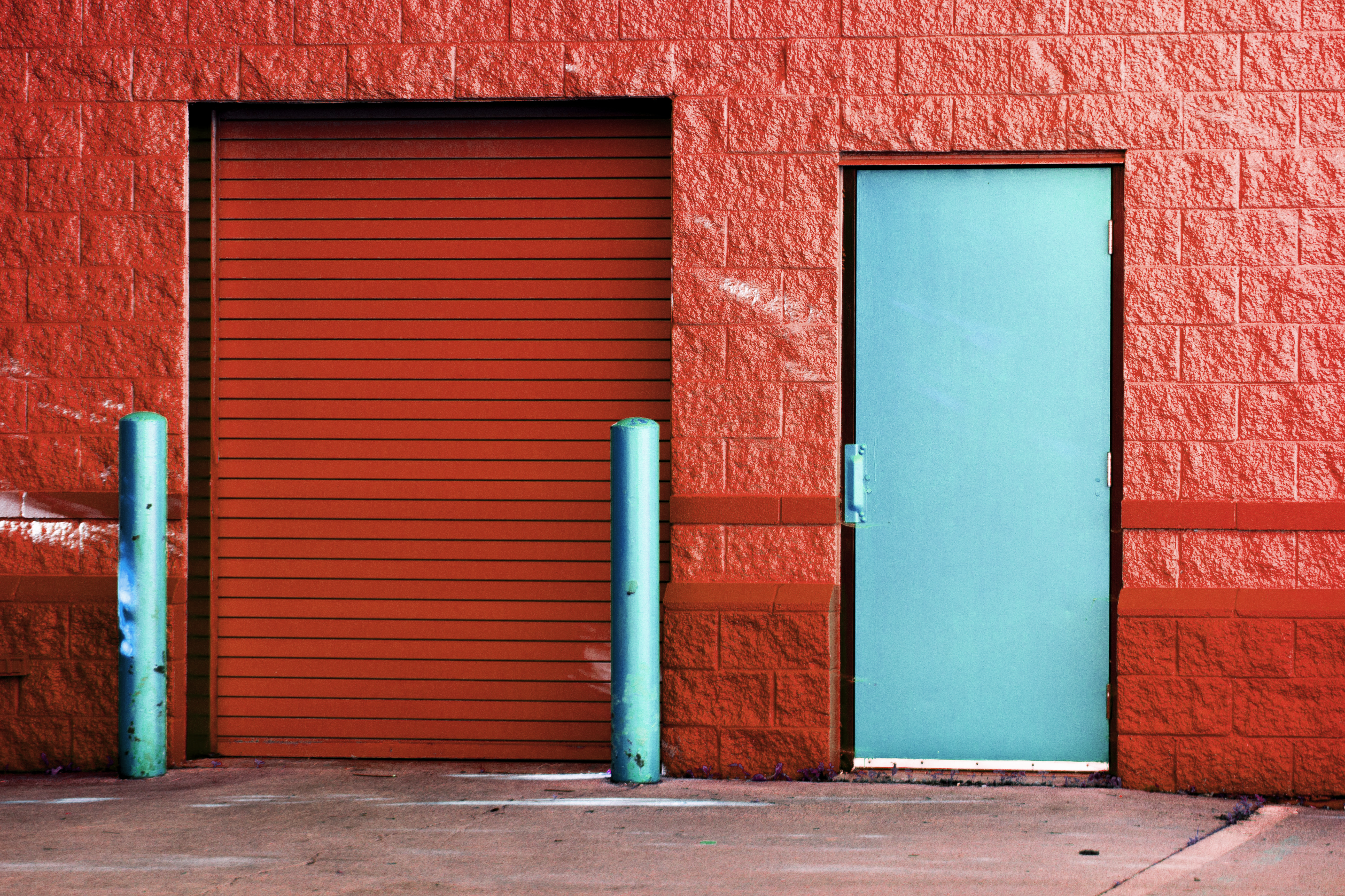
I then set to editing my background image which needed the most work to be closer to what I wanted for my design. I first actually worked on the colours of the image. I wanted to actually reverse them as my chosen foreground images were more warm toned with small hints of blue so I wanted the background to reflect this colour scheme. I used the hue and saturation tools to play with the image till I found a tone that changed the wall colour to a more orangey tone. I then took the image and masked off the door and post from within them and again used the hue settings to apply a blue tone to only these areas to essentially flip the colours of the image around. I think that the image looks a lot better with the colours being flipped over as it looks more warm and natural than the blue walls and it looks more in tune with my other design elements.
As I was editing the image to change the colours within it I didn’t like the actual size of the image and realised I wold probably have to zoom in in quite far to even get it to fill my poster size so I had to edit the image some more to extend it to make it easier to work with. I first extended the Photoshop canvas and then used the patch and clone stamp tools to add more of the wall texture to the space. It is not perfect but as it was to be a background image, some imperfections in the texture or repeating sections would not be noticed. I made the image big enough so that I had a lot of surface area to play with when finally making my designs.
Once the background was done I set to assembling the content together to make my poster design. I first added the background onto the poster size canvas and added in the foreground images. By doing this I could see where I wanted the images to go and where best the edges lined up. I decided that the purple haired girl looked best at the top and the other at the bottom at opposing edges to draw the eye through the design. I then referred to my colour scheme to pick the two colours I wanted to be my accents for the design. I ended up choosing yellow to contrast with the design and dark blue from my palette to match the blue elements present.
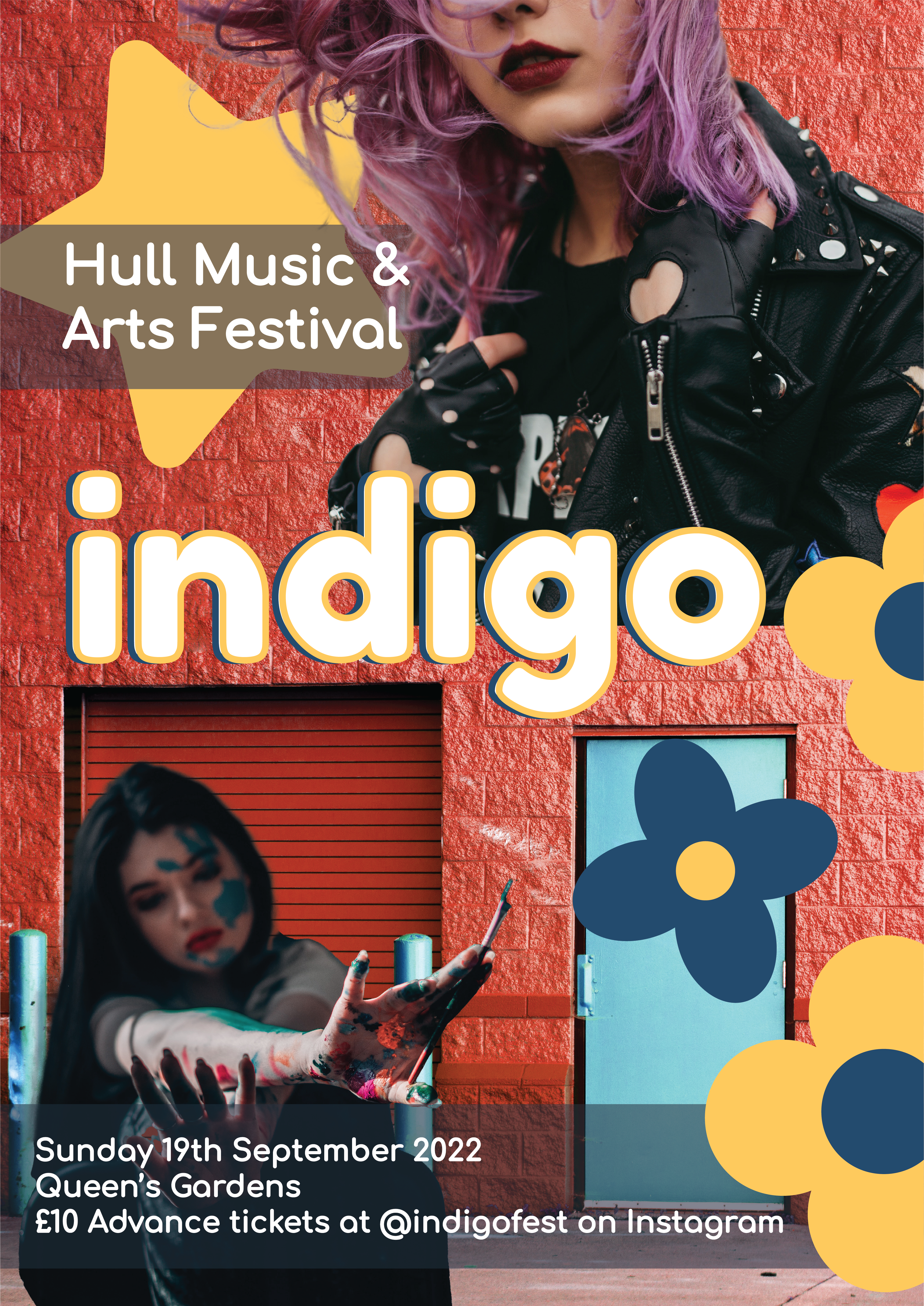
I chose to again add flowers to this poster design, but I added two different kinds to add variation to the poster and create a pattern to draw the eye to the poster. I added the sub text from my previous poster to this one, as I wanted all of the variations to have the same text and placed the larger text at the top and the smaller information at the bottom. Behind the top text it felt a little empty so I placed a star graphic there that I hadn’t used before which I think filled this blank wall space well and added to the design a lot layering with the girl at the top.
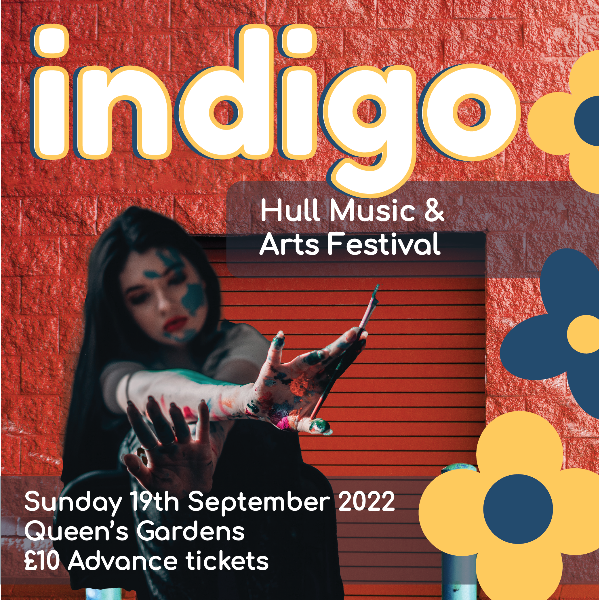
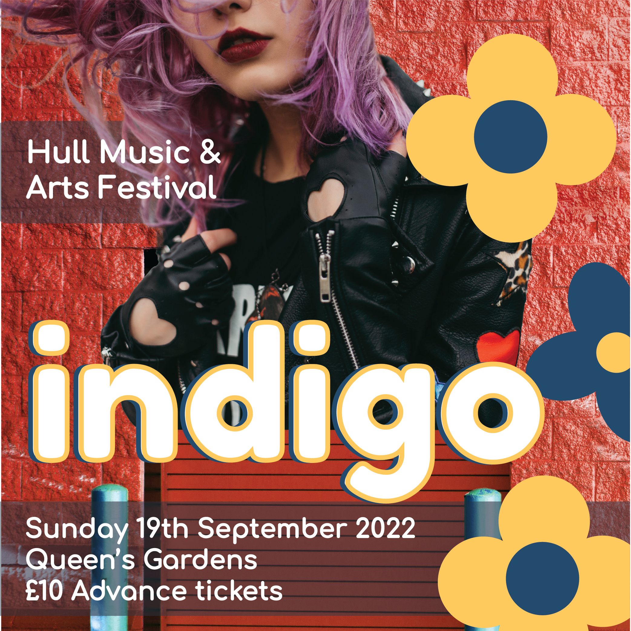
For the subsequent instagram variants of the poster I chose to make these advertisements using the foreground images individually to really draw attention to them and have 2 variants of these instagram post sized advertisements. I kept all the same graphic elements, text and background but tweaked the placement to fit with each of the foreground images. I really like both of them and think that the similar placement of the flowers in each, with everything else contrasting, gives a memorable look to these designs and ties them together whilst letting the designs be unique.
Finally I created the story advertisement. this one I took inspiration from the poster for and tweaked some of the placements to fit the aspect ratio of a Social Media story. Allowing the story advertisements to look similar to the actual posters helps create a connection with the audience as they will see both in different situations and relate them together.
Image References:
Lobanovskaya. A, 2018. Woman Wears Black Leather Zip-up Jacket. [online] Available at: https://www.pexels.com/photo/woman-wears-black-leather-zip-up-jacket-1035685/ [Accessed 25 March 2022].
O’Donnel. E, 2019. Woman Covered In Paint Holding Paint Brush. [online] Available at: https://www.pexels.com/photo/woman-covered-in-paint-holding-paint-brush-3894557/ [Accessed 25 March 2022].
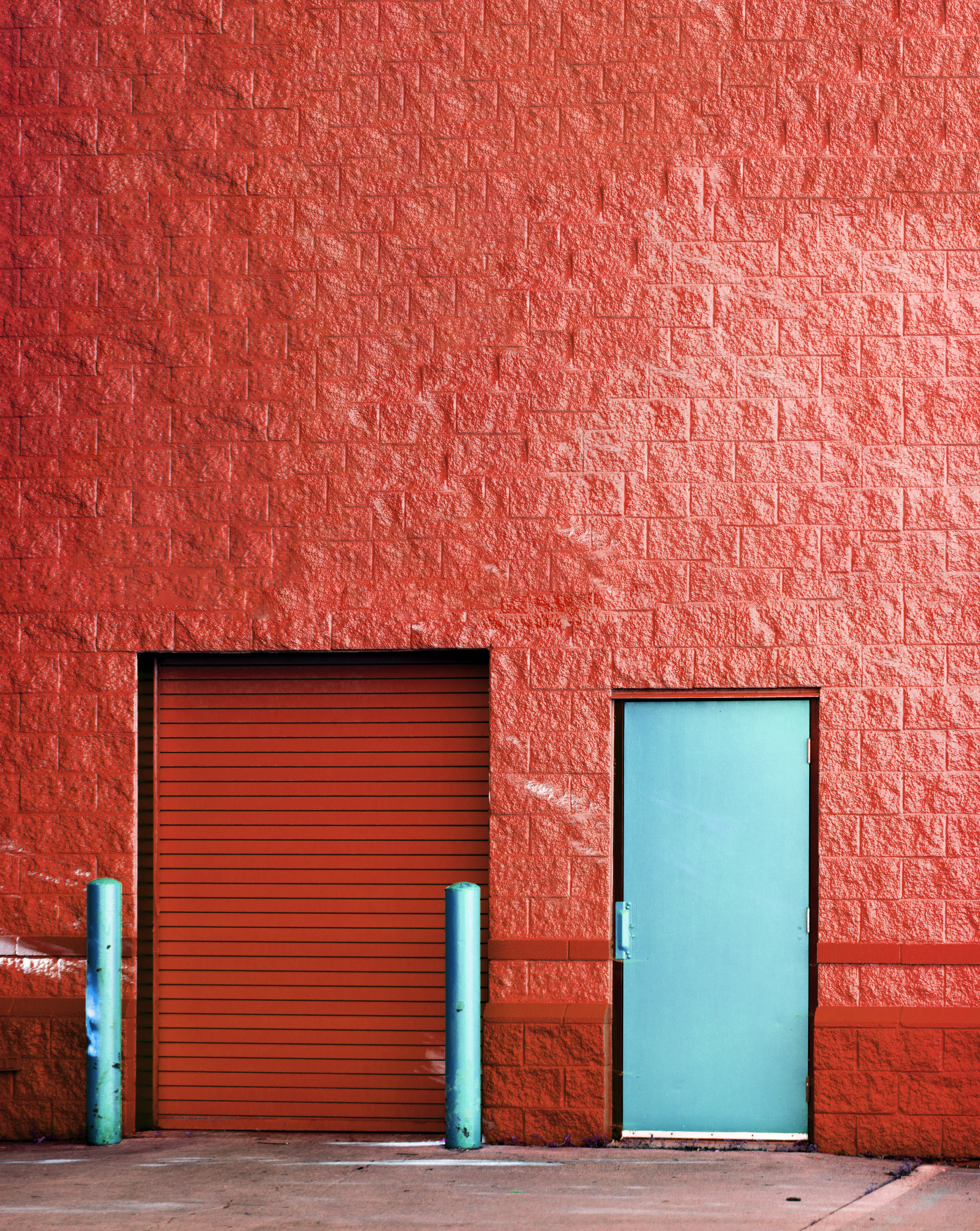
Johnson. S, 2015. Brown Panel Door Near Roll-up Gate. [online] Available at: https://www.pexels.com/photo/brown-panel-door-near-roll-up-gate-845242/ [Accessed 25 March 2022].
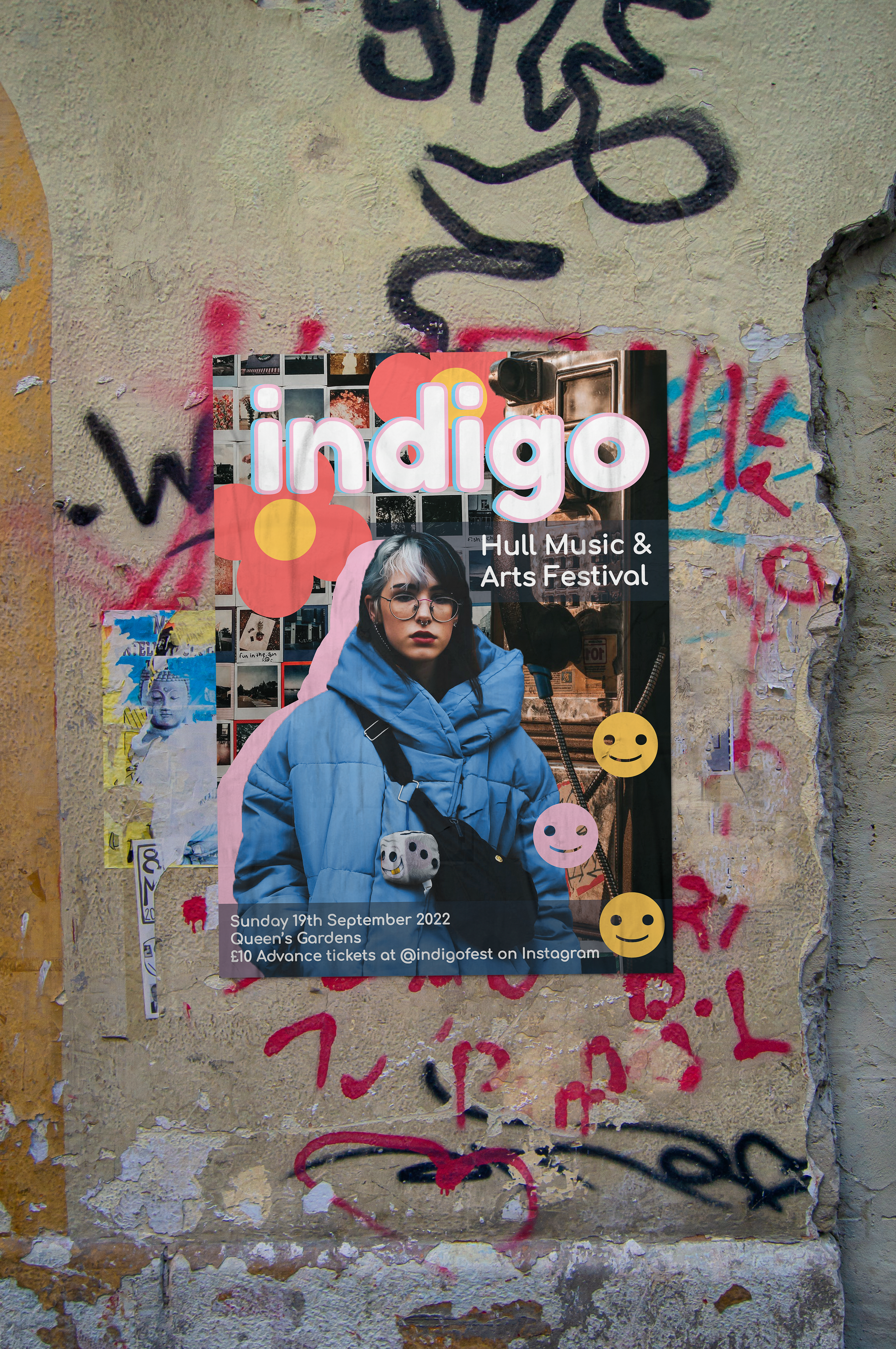
To start off the development of this project I first refreshed my understanding of the first part of the project I created, going through all the research and planning that I had undertaken to have the design style I wanted to work for in my mind. Using the fonts that I found, the graphic colour palette I had chosen and the graphic vectors I had been working on to use within any designs I began trying to create my first design. At the beginning of this project I gathered a large amount of free use stock images that I thought were interesting or cool and I used this store of images within my work. I looked through all of the images that I had amassed and saved the ones that I was feeling most drawn to and which I thought would combine well together. Once I had these few images selected I began to start editing them, this process is documented below.
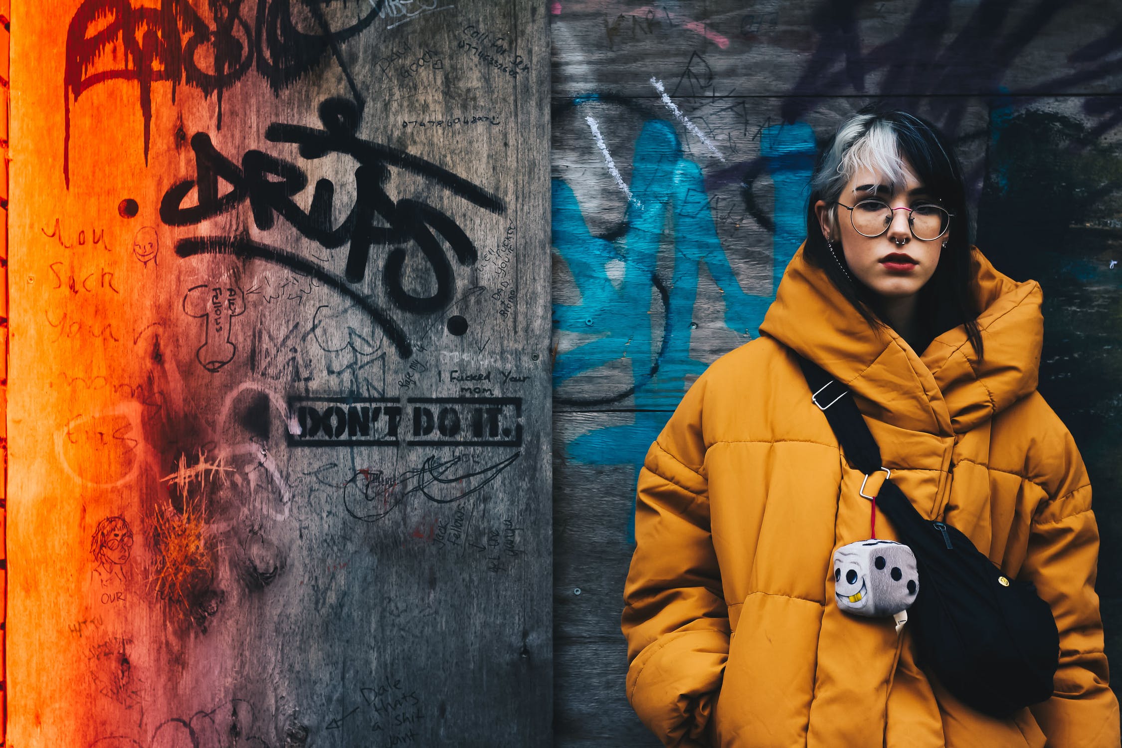
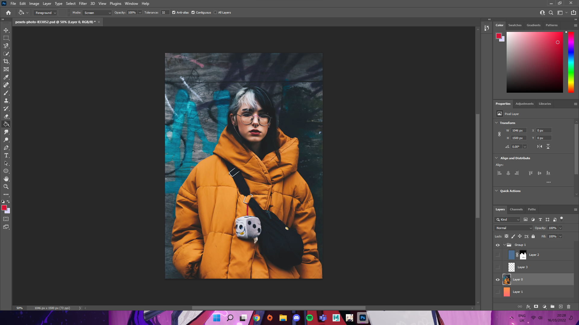
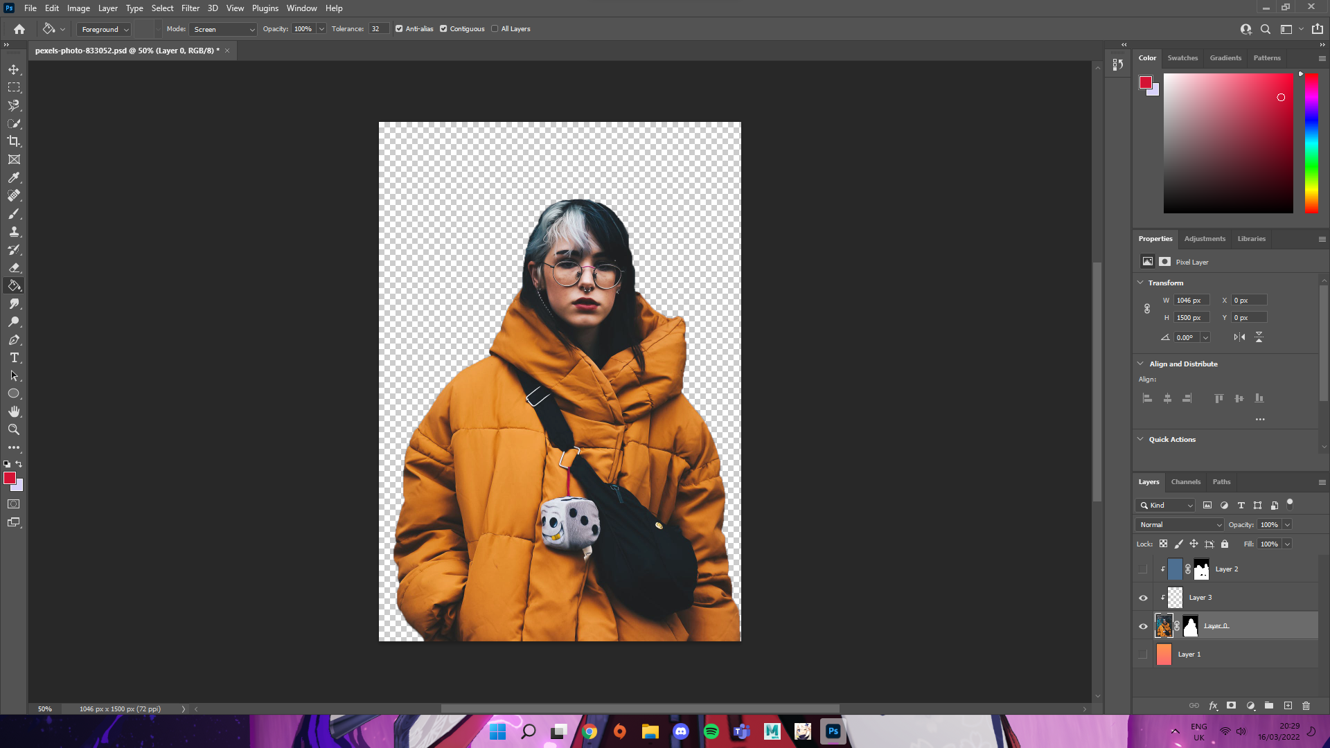
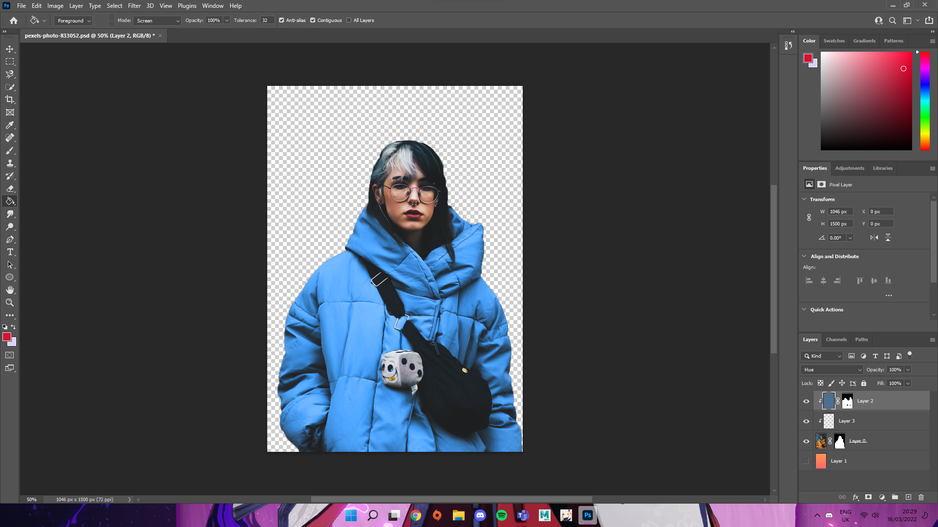
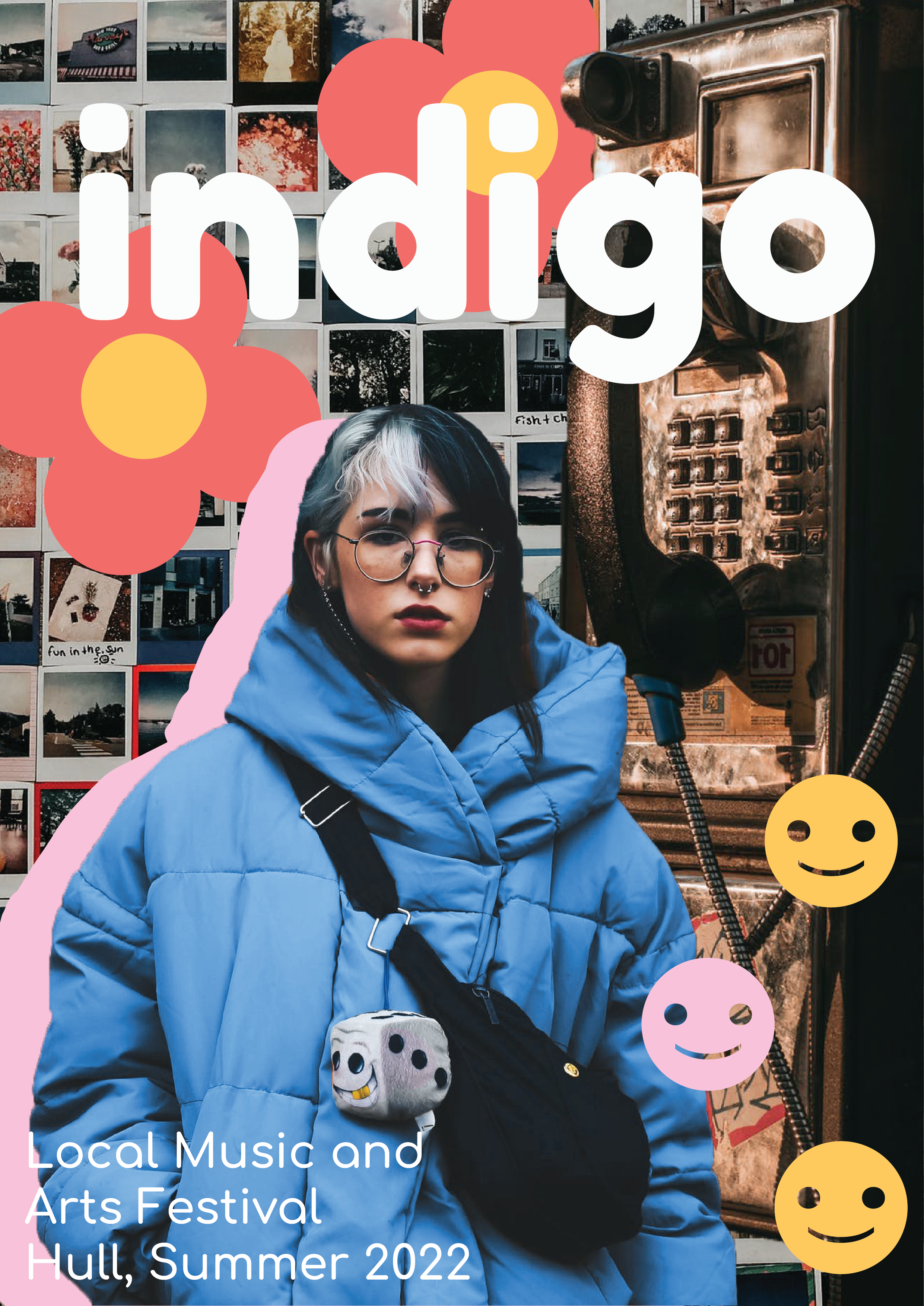
This image is the first one I started to edit and the image I wanted to be the focus of my design so I spent the most time on it. I first took the image into photoshop and cropped out the extra background I did not want to use. Once I had done this I then took the quick selection tool and started to select the parts of the image I wanted, removing and adding to the selection to get a clean selection around the figure in the image. After I had my selection correct, I inverted this selection and made a mask to hide the unwanted background. Once I had done this I played with the brightness and contrast a little to get the image to look more like I wanted. As I was looking at the original image and the one without the background I decided I really liked the use of blue in the background and I wanted to bring this to the figure in the image. Using a mask and a fill layer I used a blue colour and coloured over only the jacket within the image, I then set this layer to Hue and left the opacity on full. This gave the jacket the look of being blue instead of yellow and I liked this a lot better for what I had in mind.
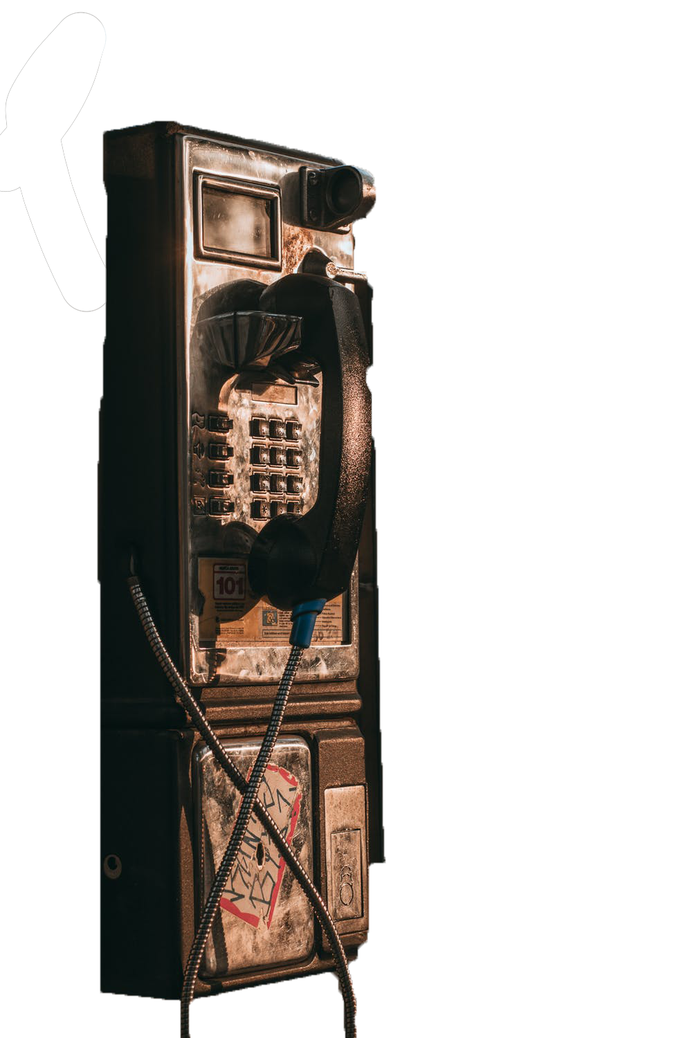
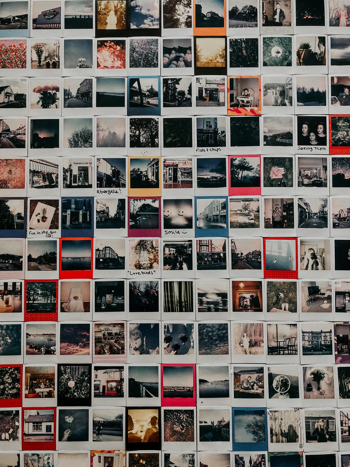
I then proceeded to edit the telephone box image that I also had. I did the same thing with masking the layers and removing the background elements I didn’t want within the image. The final image I chose was a wall of polaroids that I didn’t edit at all as it was going to be the background that all my other images were layered on top of. I really love how all of my image editing turned out and think that my choice to really play with colour on the figure that was to be the lead of the collage helped to really give the design some life and cohesiveness.
Now that all my assets were prepared I started to play with them all and move things around, experimenting with the sticker vector graphics I created and with the font that I had chosen. I kept referring to my colour palette for colours to use on the piece. I chose pink, yellow and the orange tone to be the accent colours of this design for all of the stickers. I chose these as I felt it tied in with the warmness of the background images whilst also contrasting really well with the foreground image of the woman that I had edited. I think the blue in the image really feels like a statement and draws the eye to the design really effectively. Below I was experimenting with the font stroke and how the bottom text could be layered with shapes to provide more visibility. As this was all experimentation it really helped me to see what would work and what wouldn’t for my designs.
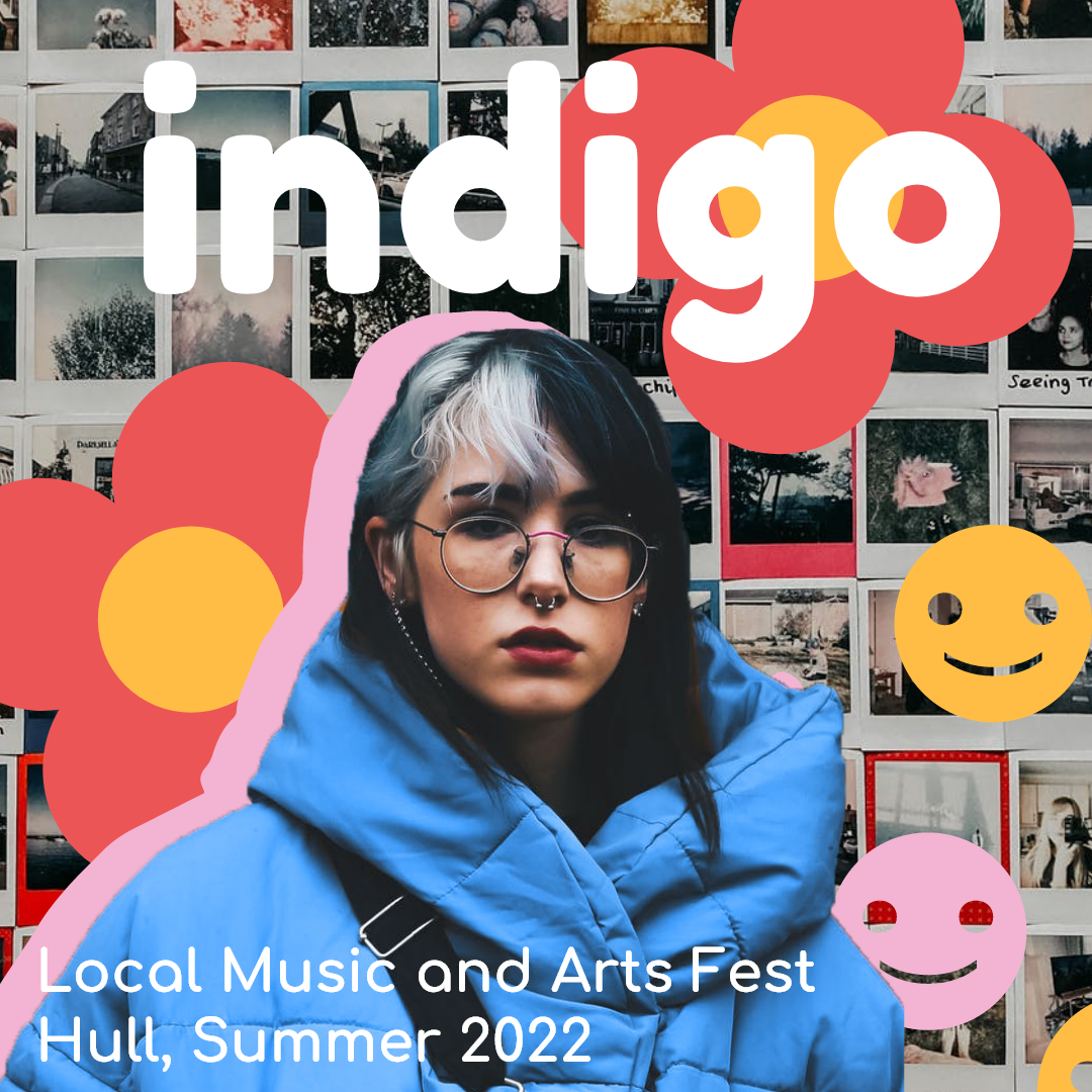
Below is some more experimentation based on my first poster attempt above. These are experiments I created for an Instagram post and an Instagram story respectively. I wanted to see how my design choices would scale to different mediums rather than just poster designs to really see how effective the design was and if it would be able to translate through well without compromising information.
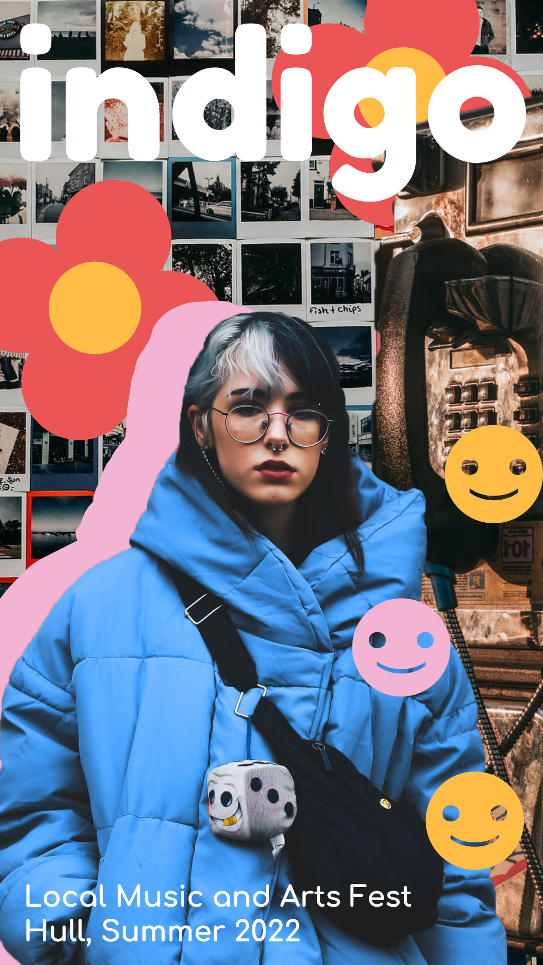
Once I had really had the chance to make these first attempts at posters and designs I decided it would be good to go back and rework them and refine the designs with more information and to be more finalised. Below are the reworked designs that I have created. I think these are worthy of being the finals for this first design. I made 2 instagram post advertisements, a story advertisement and then a poster. These all have the full information on them and are correctly formatted to the social media. The instagram post adverts can also be used cross platform as they are scaled properly to fit a standard post on all social media sites. I really love how this design turned out, I think the use of the blue and pink strokes on the text really ties all of the images and stickers together and really makes the design feel whole. I decided that the finalised text and information on the poster would have a dark blue transparent background to them , the colour taken from my colour scheme, so that the white text would stand out starkly against the background and be clear and easy to read.
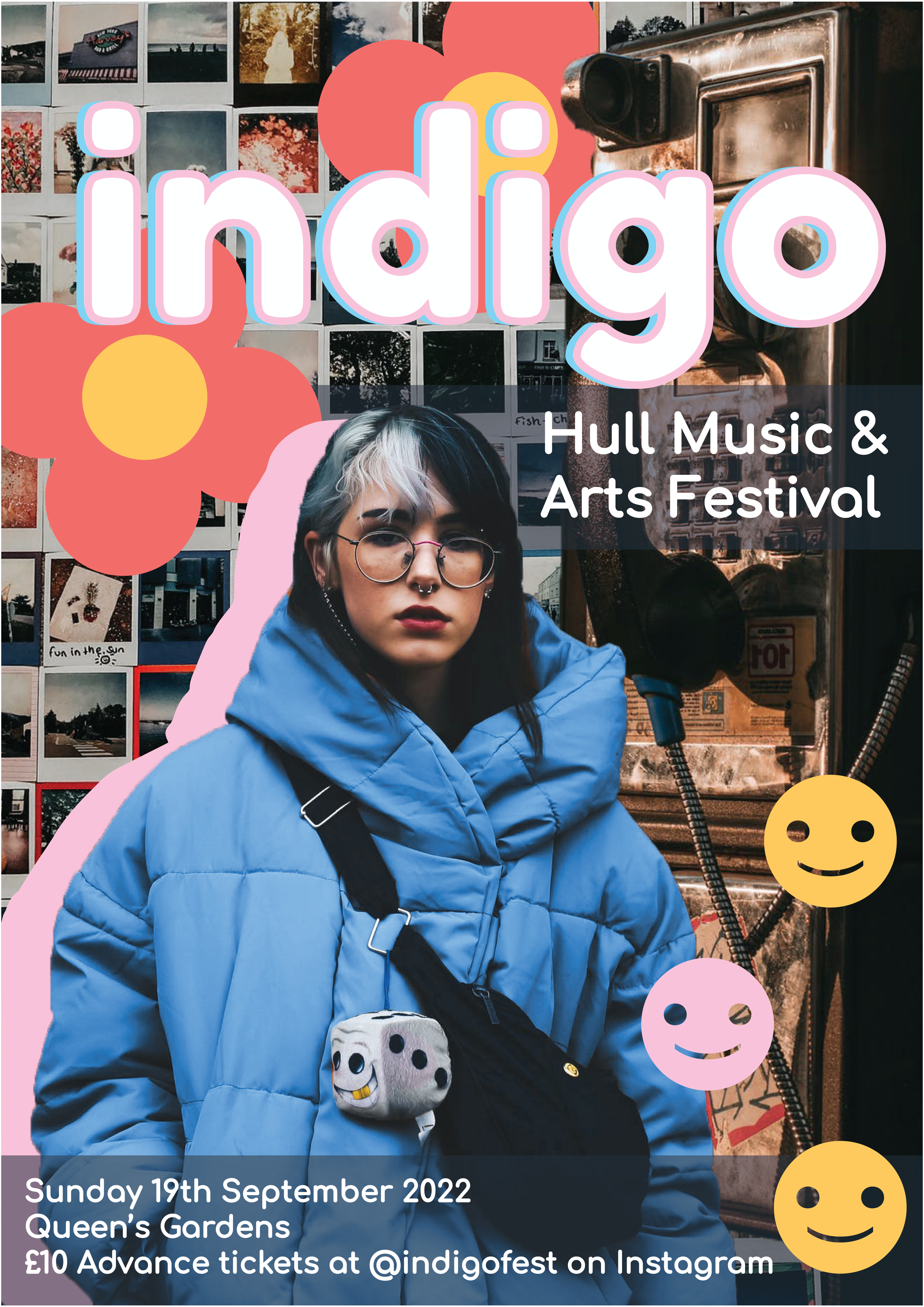
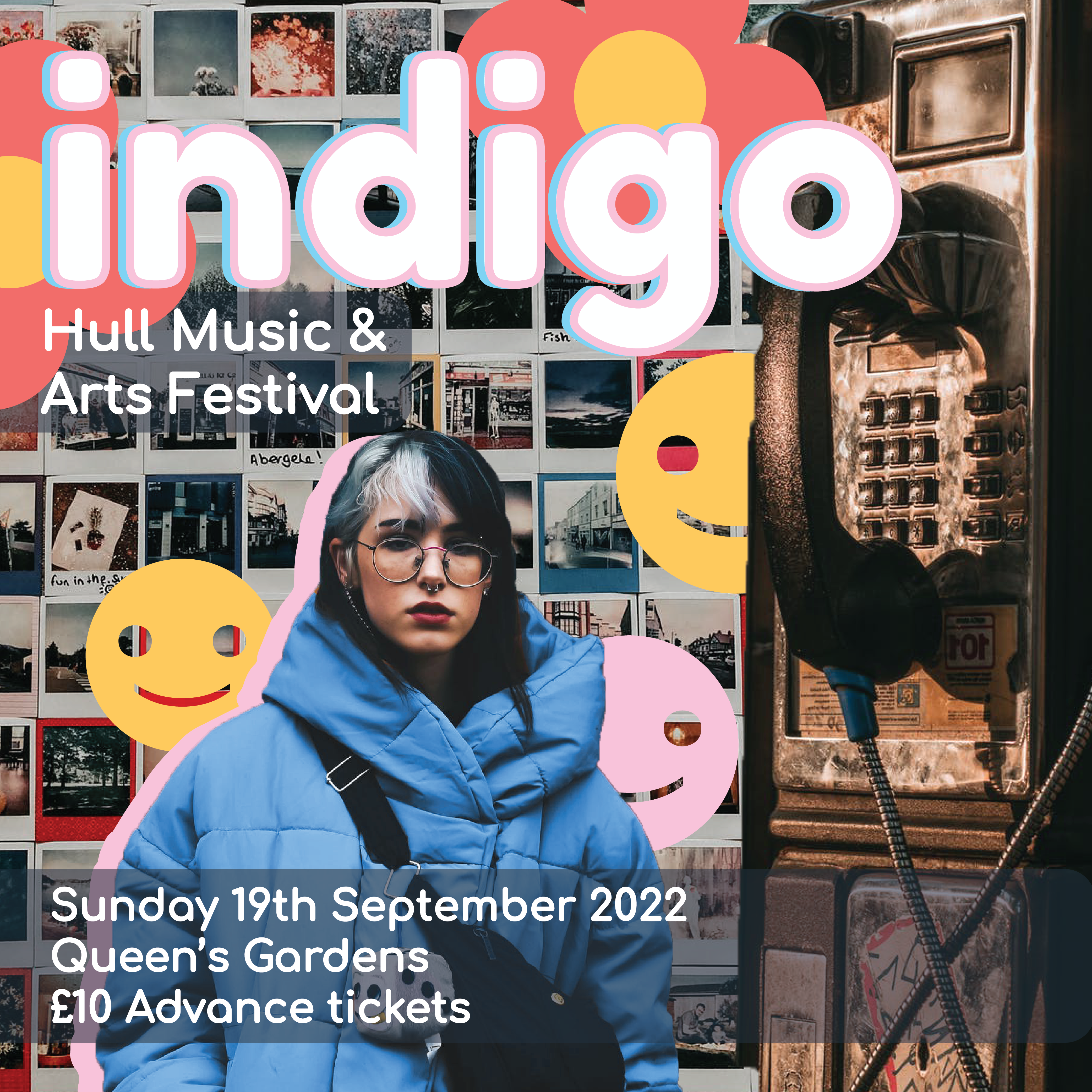
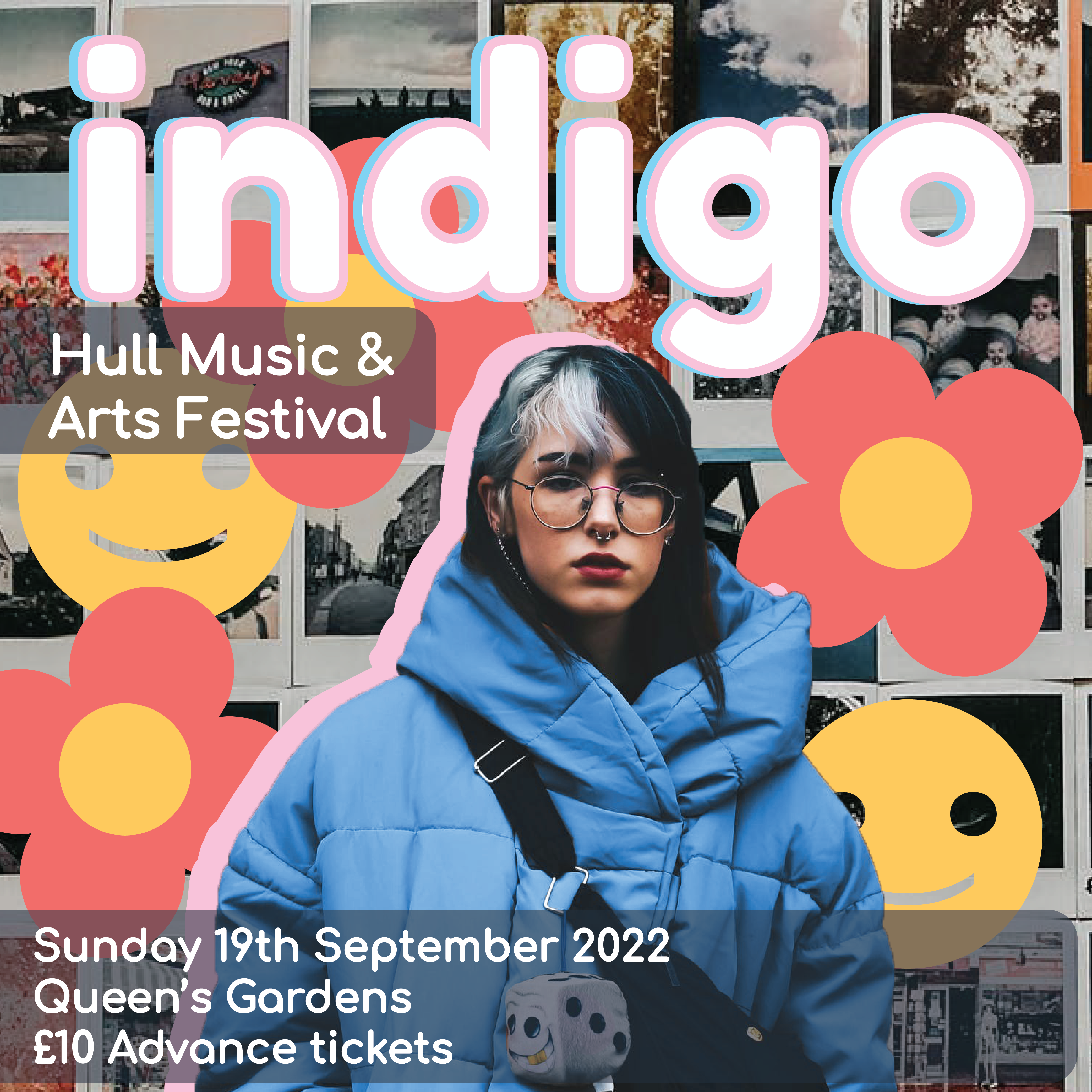
Image References:
Adesina. D, 2018. Woman in Yellow Coat With Black Crossbody Bag Closing Her Eyes. [online] Available at: https://www.pexels.com/photo/woman-in-yellow-coat-with-black-crossbody-bag-closing-her-eyes-833052/ [Accessed 18 March 2022].
Quintero. L, 2019. Black and Gray Telephone Booth. [online] Available at: https://www.pexels.com/photo/black-and-gray-telephone-booth-2111759/ [Accessed 18 March 2022].
Fotios. L, 2020. Collection of old instant photos with trips. [online] Available at: https://www.pexels.com/photo/collection-of-old-instant-photos-with-trips-5653734/ [Accessed 18 March 2022].
Refined Sketches & Assets
Below are some detailed sketches that I created vs some of the coloured in ones that I decided to draw properly. I wanted to take some of my sketches from my finished storyboards and colourise them and make them into final illustrations. I wanted to do this so that I’d have a full idea of what my finished project would look like in the art style I was trying to create and also an idea of the style of colouring to use on the assignment as a whole. I decided that my art style for the comic would be very deep in tone and be very realistic in colour whilst still keeping with the comic style. I wanted there to be not much line art within the pieces and the backgrounds and characters to really bring attention to the most interesting parts of the image. The characters or most important part of the scene will be the centre of attention to the viewer by using the line art within these areas, it will really add definition to these places and add interest.
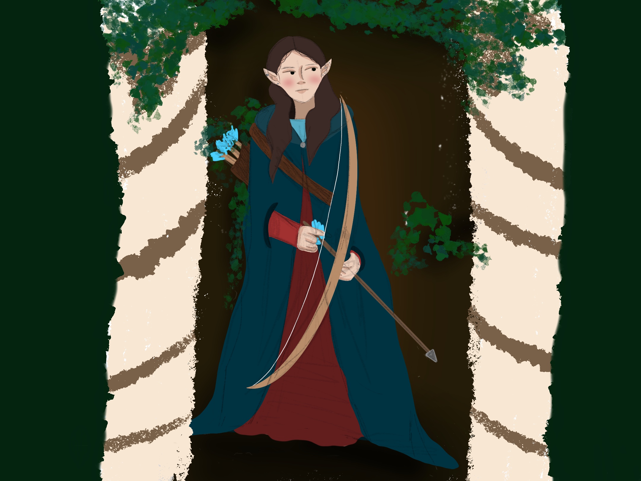
When creating the coloured versions of these sketches and finalising them into pieces that I can add to pages I wanted to make sure that there was consistency within the pieces themselves and the art style used. I used the same brushes for each one and wanted the backgrounds to be quite sketchy and colourful whilst still adding to the atmosphere of the piece. I used a textured brush for a lot of the background elements and a brush I found that replicated an ivy like pattern to add some depth and dimension to the pieces. I kept the characters quite sharp with their sketchy line art to really add some personality to the character within the scene and make her stand out. I think these colours and drawing styles really work together to make some professional looking artwork which will really work within my webcomic pages and really will lead to an interesting final piece.
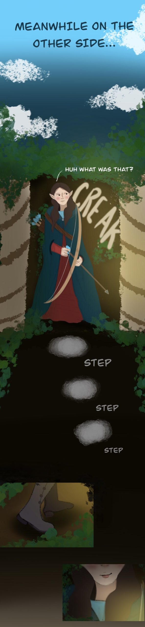
Page Style
Below is an example of the style that my final piece will be in and how I want the project as a whole to look. I really wanted to take one of my sketched pages and create something like this so I could conclusively see how the piece would look when the art is finished for the final project and the text is properly added onto the piece. I took the artwork that I made in the above section to try out my colouring style for the comic and added it to a page that I was creating. This is one of the final pages, I really wanted to play around with how all of the sections and art pieces would interact together and connect to each other. I wanted to follow quite a traditional webcomic style and have the pieces merge together into one long running page for each section. I found a font within Procreate that I think worked really well and added the text onto the page that I created, I wanted the text to be all in capitals and quite bold so it would stand out regardless of the background used. I ended up using a lot of gradients for the joins within the images and used the ivy brush that I used on the artwork to really blend everything together. I think I was really able to emulate the layout of a webcomic properly and make it look really authentic and put together. I really love how it turned out and will be using the colour palette and fonts etc as a guide for my other pages for this project.
List of Assets I Want to Create
This is a list of assets that I am creating for this assignment that can be reused or combined into different assets to allow consistency throughout the piece. Making this list really allowed me to see the parts that I needed to create for the sketches and the pages themselves and where they needed to be used. It also allowed me to work on my time management by seeing how many pieces I theoretically have to make for my assignment and plan out how long it will take to have all of it done. I suspect it will take me a week or two to create each section of the comic from the sketches I have created into the full colour designs. I am basing this of the time it took me to create the page above and the artworks used within it. Having a set amount of environments for within the story means that my backgrounds can be reused to make the pages look coherent together.
| Asset Name | Variations | Type | Used In |
| Character 1 | Front, Close Up, Back | Character | All |
| Character 2 | Front, Close Up, Back | Charcter | All |
| Sword | Full, Close Up | Items | End |
| Ruined Church | Full, Close Up, Zoomed sections | Environment | End |
| Forest | Full, Close Up, Zoomed sections, Ivy variation | Environment | Middle |
| Bridge | Full, Close Up, Zoomed sections, broken bridge | Environment | Middle |
| Castle Nation 1 | Full, Close Up, Zoomed sections | Environment | Beginning |
| Castle Nation 2 | Full, Close Up, Zoomed sections | Environment | Beginning |
Character Creation
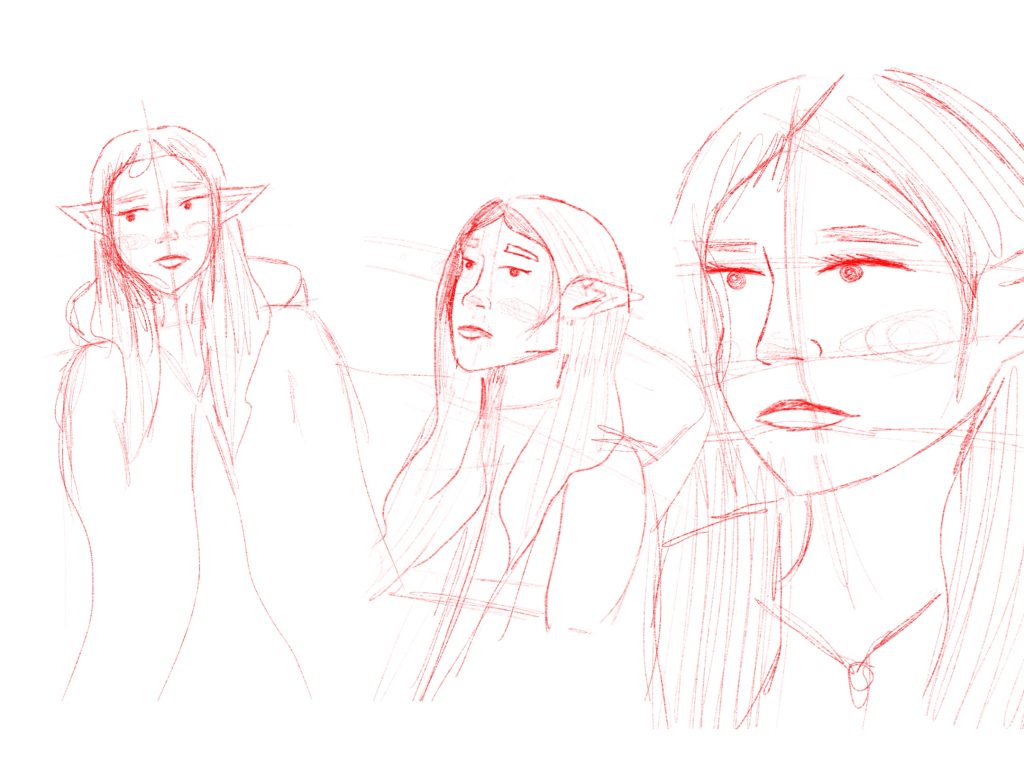
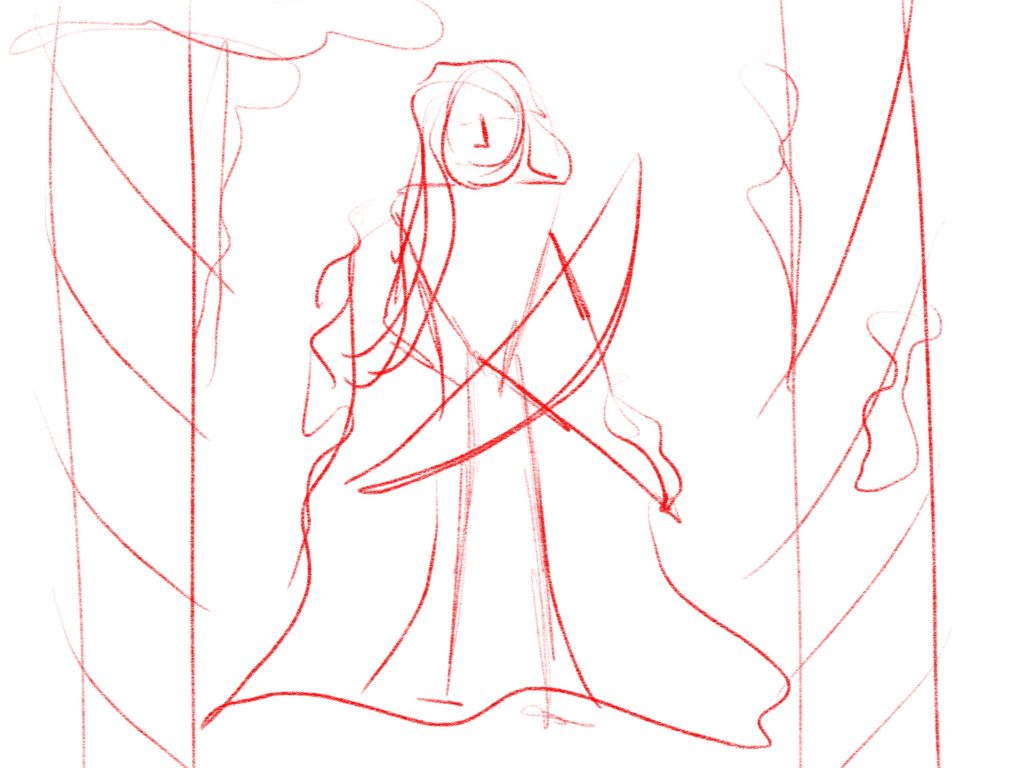
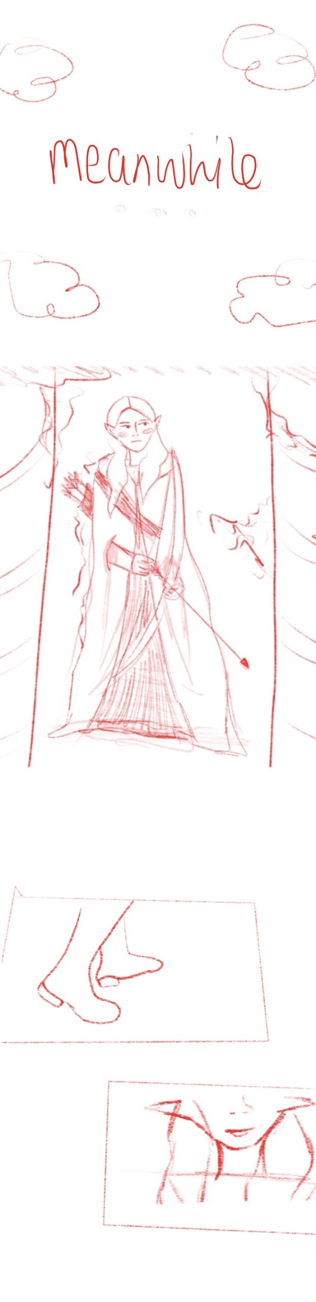
To start creating my characters I began with referring to my earlier research and looked at the photos I had gathered on my Pinterest board. I didn’t want to directly copy any of the images I had seen on my board for my characters and wanted to just draw from the style I was going for. I decided earlier on that I wanted one of my characters to be an elf so I decided that the first character I drew would fit this description. I started by just sketching the character, giving her the pointed ears and long hair with a cape to really visualise the character I wanted her to be. I created the 3 sketches below showing the character from different angles and from close up so that I could really play with the style and see how I wanted her to look. I decided that the style that I was drawing in would have quite simplistic faces and not lean into realism and instead go for a more cartoony look. I think this was actually really effective and makes the character look really cute, I like her design a lot. As the characters in my story won’t be named as I want the whole story to have an heir of mystery I will be referring to this character as character A. She will have brown hair and dark eyes and I imaging she will wear a red dress with a deep blue cape. Blue will be her accent colour as I think these rich royal tones will work really well together.
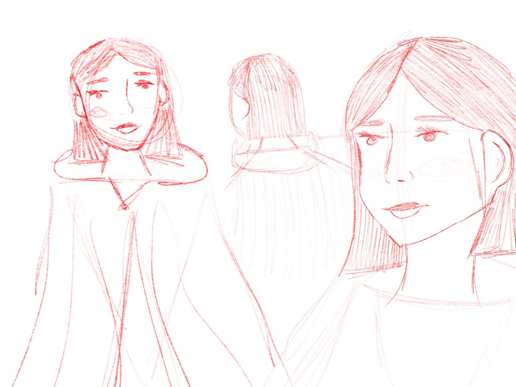
Character B in comparison will be a human character. I imagine her to be almost an opposite of the first character and have orange toned hair and a deeper skin tone than character A. Having the characters look distinct from each other will help with any close up panels within the comic and make it each to differentiate them. With this in mind I began sketching a character that was different than the first one I created but still fit within the same style. I tried to create sketches from the same kind of angles to show the comparisons between the two and how they look. I also really wanted this character to have a shorter haircut than character A, this was another way to really distinguish them from each other and not have them look too similar. I wanted to also draw the back of character B because I really liked the hairstyle that I drew her and wanted to experiment with the back view of the character.
Initial Sketches For Scenes
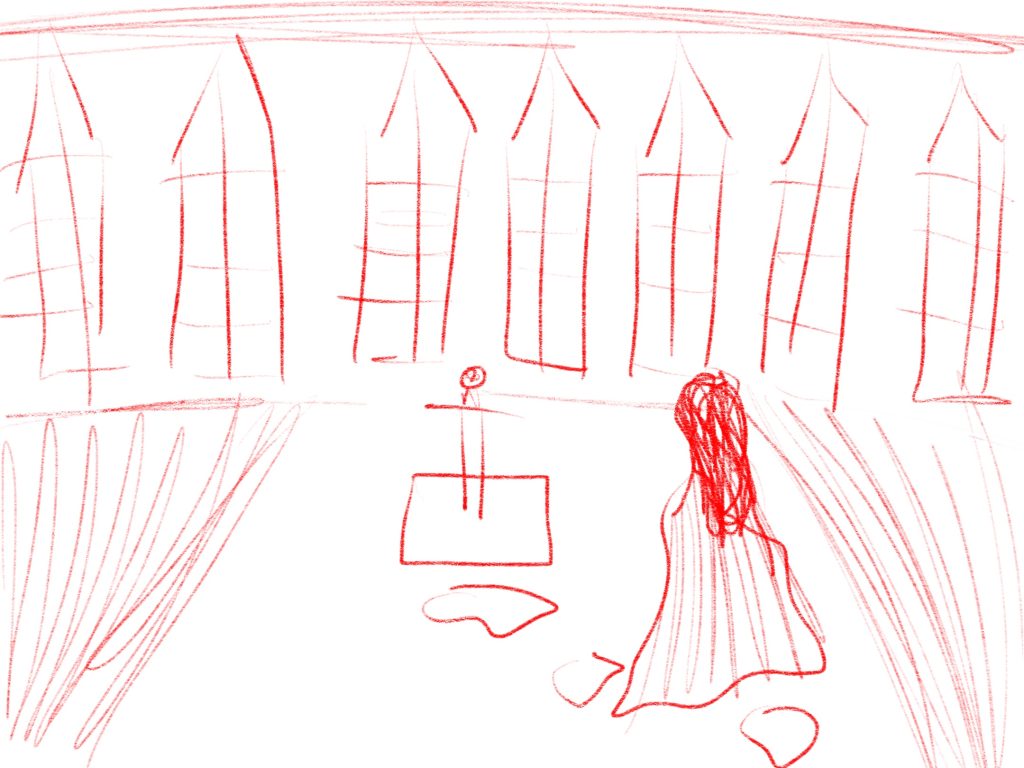
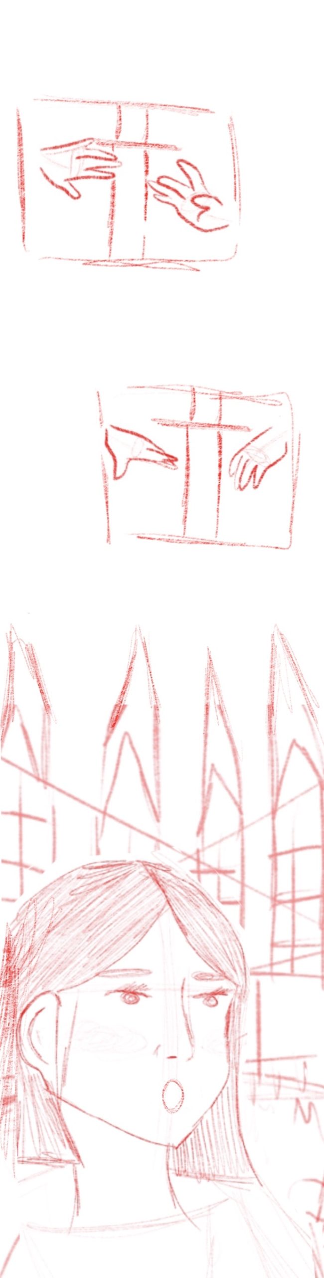
Before I made any storyboards I actually wanted to draw out some of the scenes and things I could use within my storyboards. I wanted to do this so that I’d have some clear visualisations of scenes and areas before I started to make an actual storyboard. I started with some scenes of character A that I felt would place well within the end arc of the story. I drew these scenes as she was entering the room with the sword and discovering it for the first time. I wanted the areas to have columns and pointed windows and overall look quite grand. These initial sketches however were really just to get the layout and visuals down before I created anything more detailed and are not meant to be anything interesting to look at, just a way for me to play with different layouts for further sketches and scenes.
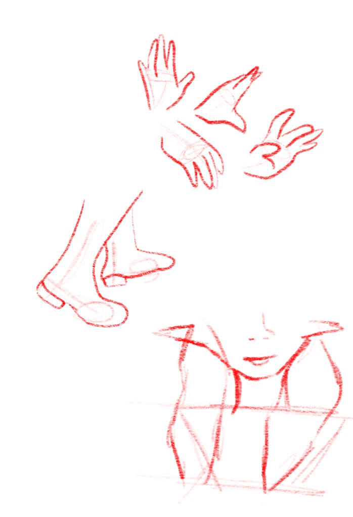
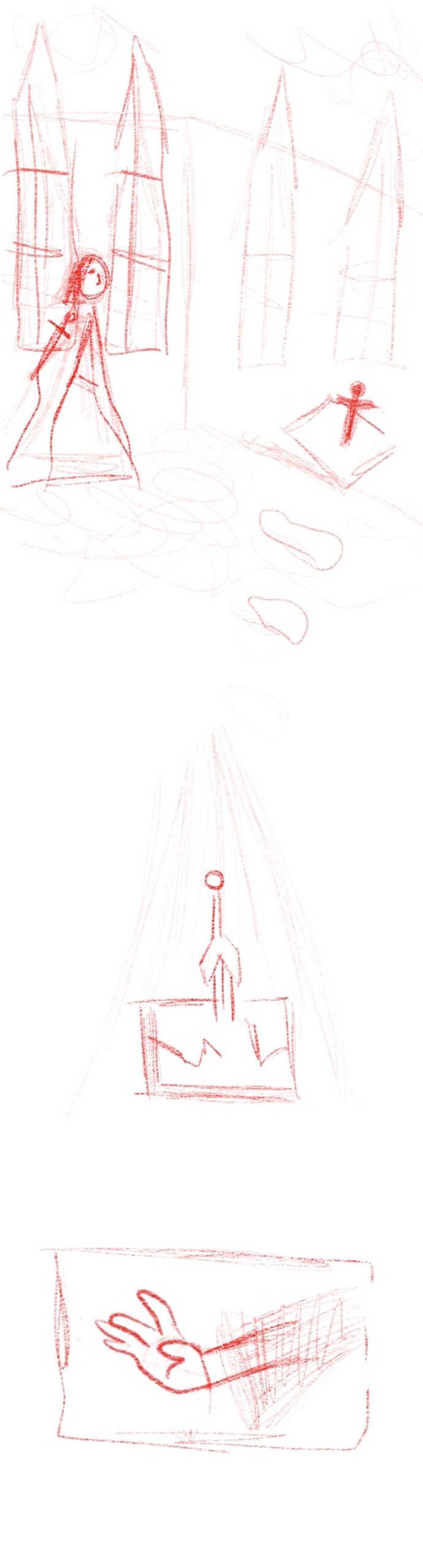
I also created some basic sketches like hands and feet that I knew would be used often within the comic as a reference sheet so that I could save some time drawing these different poses. This I think was a good idea as it will allow me to save time drawing things complicated like hands and have some that I can reuse to improve consistency within panels and pages of the comic. I also drew some shoes to use as a close up panel within scenes of the comic and a close up of character A that can also be used within different situations and panels by changing any background present and the expression on the half of her face which is pictured. This sketch as it is quite basic can also be turned into character B for any scenes that need a similar image.
Panel Storyboards
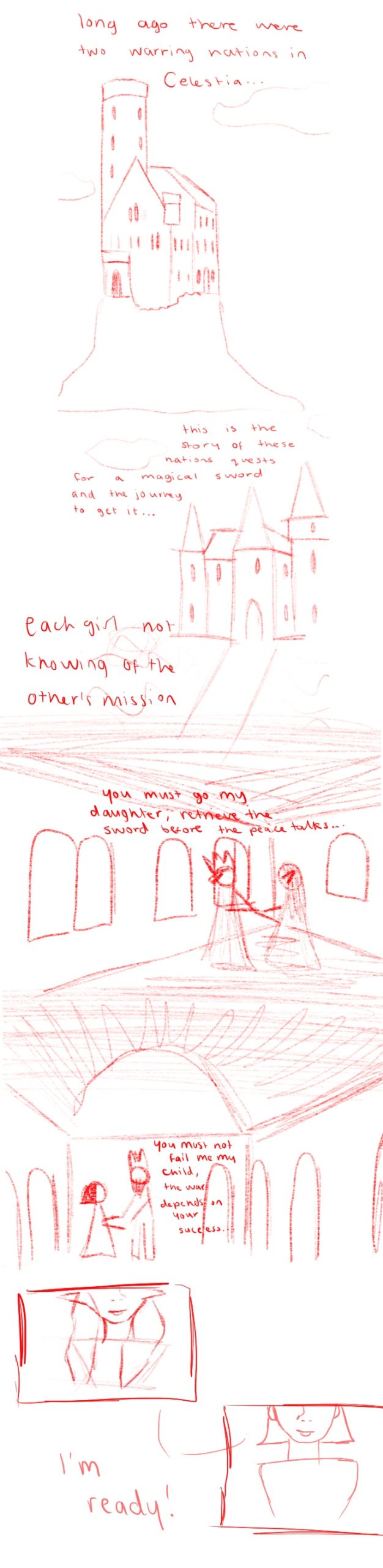
Beginning
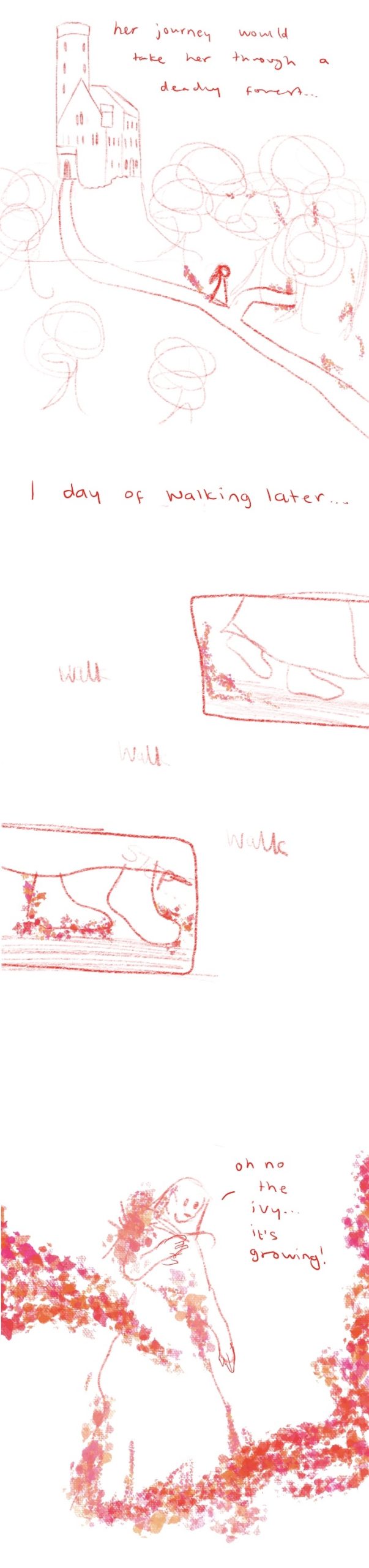
For my comic I wanted the pages to be able to convey a lot of information within a relatively small space. I chose for my storyboards for my webcomic to be half the length of a normal webcomic to allow for a more compact look to the design. Below is my storyboard for the beginning of the story. This beginning page will be to establish the story relying mostly on the omniscient narrator to tell the information through text based communication and illustrations of the areas within the story. The country the story takes place in I decided would be called Celestia, and both of the nations would be within this country. I drew 2 different castles for this beginning page to establish the setting of the story and show off the environment it takes place in. I wanted each castle to look different so that it felt as if it truly was 2 different societies.
After this exposition half of the page I added two scenes. One from each of the girls stories, showing the end of some outside conversations telling them the mission they are to go on. I added parental figures to each of these characters who would be giving dialogue about the mission they are being sent on and also establish that both of these main girls in the story are actually royalty. After these scenes within each respective castle, showing the appearance of each girl for the first time, there are two zoomed shots of each of the girls smiling looking prepared and establishing confidence for their characters, they both say ‘I’m ready’ and the next part of the story will continue from the start of their journeys. The next part of the story will be some more establishing shots walking through forest and lake areas within the land of Celestia and each of the characters will come across their issue within the story they have to overcome to get to the sword goal.
Middle
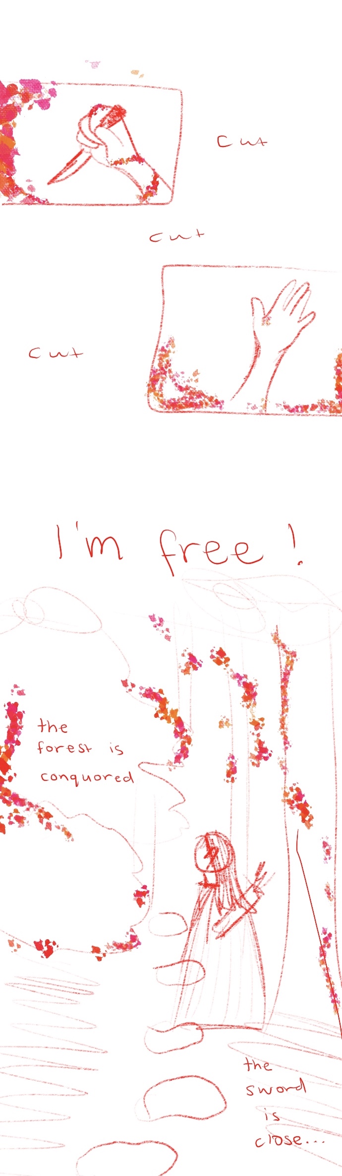
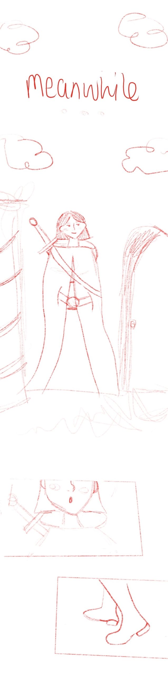
For the middle of the story I decided that there would be a total of 4 pages, 2 for each of the characters, their journey and their struggle within the story. Character A has to take her journey through a deadly forest, the artwork showing her walking the long path from the castle towards the forest. The character would be suggested to have been walking for a whole day before the events of the next scene. This will be done with text between the two parts of the artwork showing the passage of time. As the character is walking through the forest after this time the ivy will start to creep up around her feet and end up entangling her completely as it is magical/enchanted. The character will then cut herself out of the ivy with a knife she is carrying on the next page and once she is free the forest will be conquered and she will be through the forest.
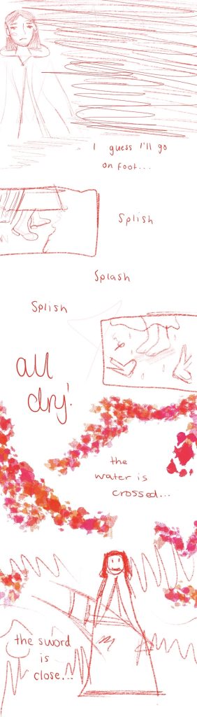
The next two pages will be a similar story from the view of Character B and will start with a meanwhile subheading to show that it is happening at a similar time to the other character. It will again start from her travelling through the area near her castle and after some time finally reaching a bridge. This was supposed to be the bridge that she used to get to the location of the sword but the bridge is actually broken to pieces. The character will have to find a way to cross this bridge in the open place. On the second page they will find the solution to this and be able to conquer her own path towards the sword as Character A has done before her.
End
For the end of the comic there will be a total of 6 pages. These pages will show the story of the two characters entering the ruins where the sword is housed and going to grab it. The first character will enter in the first 2 pages of this part and the second character will enter in the subsequent pages.
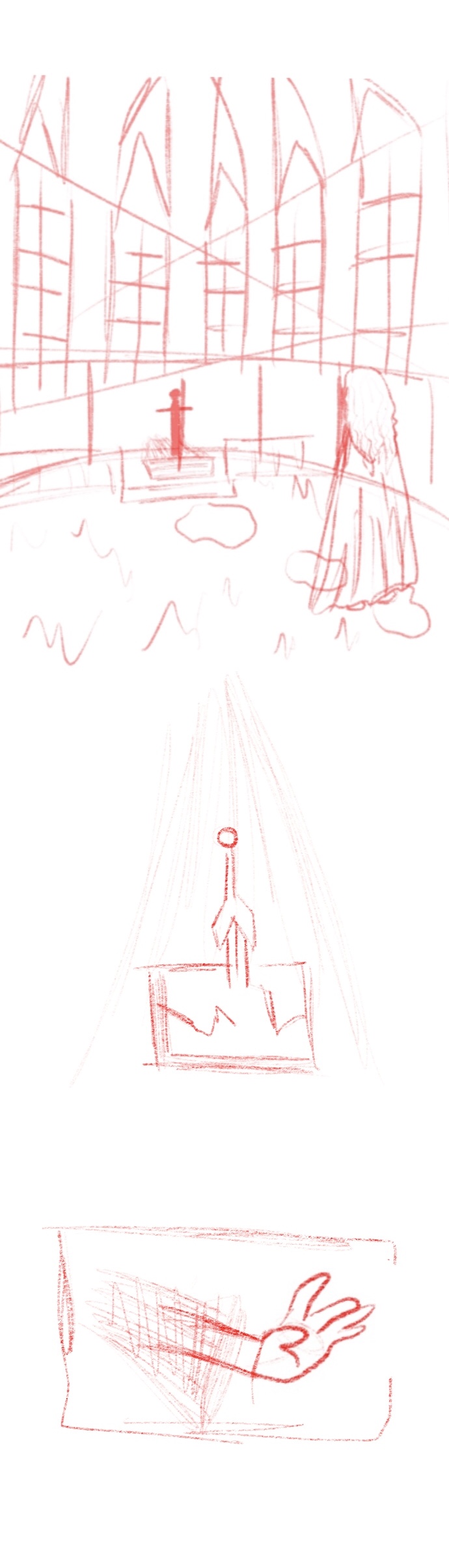
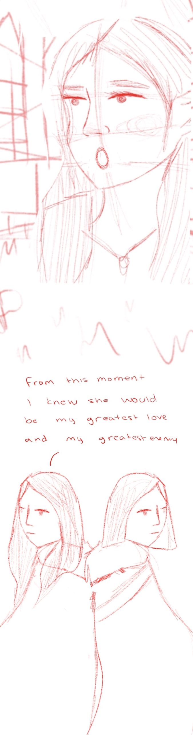
For the final two pages, as the characters own sections ended in them both reaching for the sword, this next page will have both of them reaching in the same panel, stopping and realising that someone else is actually there at the same time. There will be two large portraits of the characters taking up most of these two pages, showing their reactions and them properly within the background. The final panel on the final page will be an illustration of both of the characters back to back ,this will signify their closeness and how they may become enemies in the future as they aren’t looking at each other. The text above this illustration will tell the reader that the story has been told from the POV of Character A being the narrator the entire time by showing the text coming from her in this final illustration. The characters finally meeting up will be a tense moment so I didn’t want much text to be on these pages or really any dialogue between them both except some ‘oh’ sound effects etc, as I felt it may take away from the pages themselves. The full page colour illustrations will really add to the comic and make the ending very beautiful and wrap up the story completely as the characters stories are merged and are brought together into one ending.