
For this task, we had to experiment with Adobe Colour, a tool for generating colour palettes. For this, I took the magazine layout I previously created in XD and remade it in Adobe Illustrator. This time I made sure to improve the design and fix the small issues/mistakes in my first go.
Things I did include: making sure my photos lined up properly, using rulers to make sure that spacing was equal and uniform, using the justified text for the columns, and making sure any shapes in the background didn’t overlap lines of text. I think that the general design of the magazine looks improved and I found it easier to create in Illustrator due to features such as the column options on text boxes and the rulers.
Once I had remade the design I went to the Adobe Colour website and took the blue shade that I used in the original design’s hex code and used this for the base colour for the palettes. I experimented with Analogous, Monochromatic and Triad colour combinations and implemented them into my designs. Below is the magazine influenced by adobe colour:
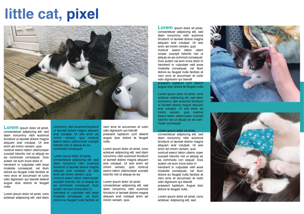
Analogous
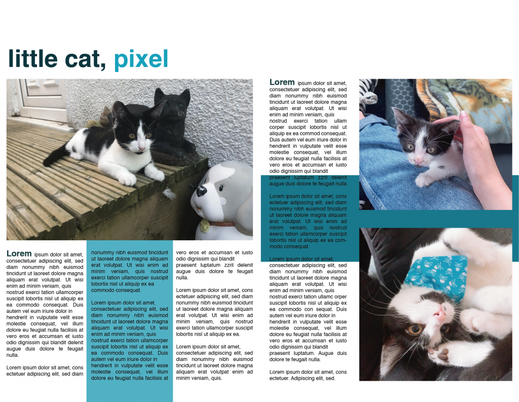
Monochromatic
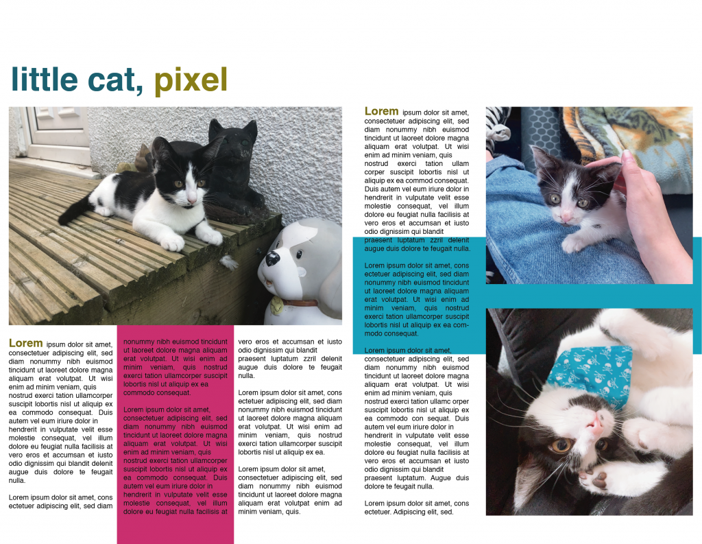
Triad