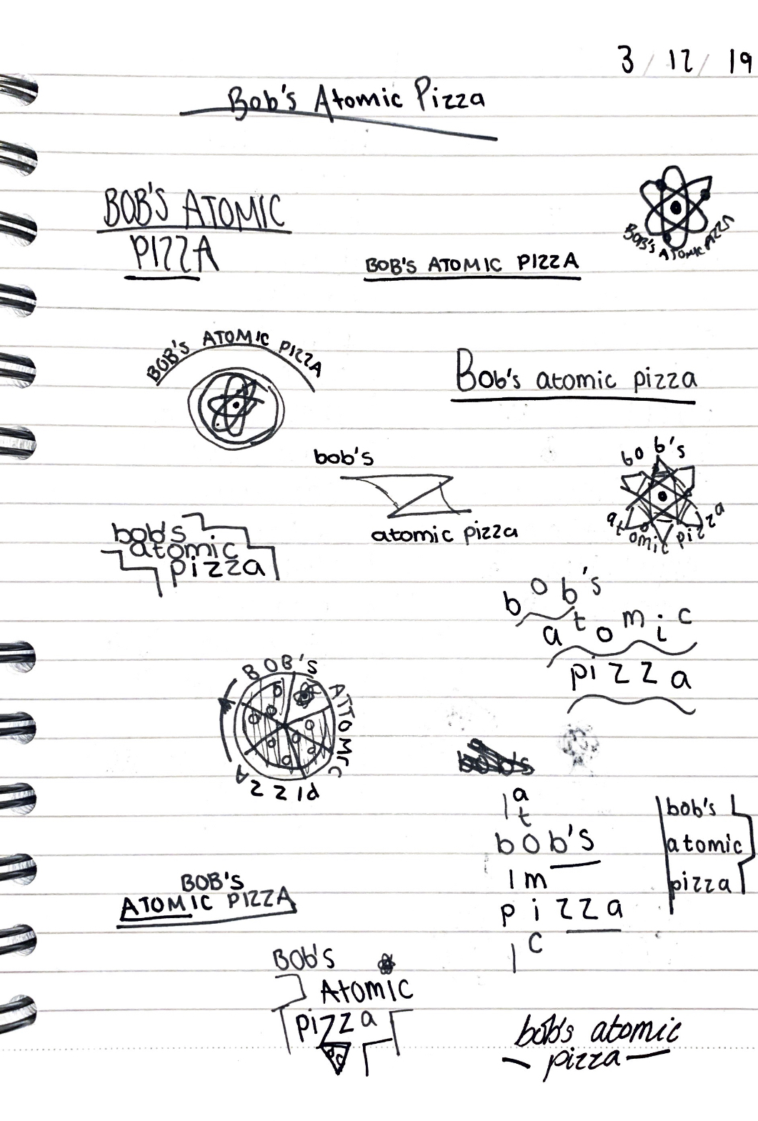
In the lecture this week the task was to come up with a logo design for a fictional company ‘Bob’s Atomic Pizza’. To do this the first step was to play with the words, their orientation, positioning and case etc. The first page in my notebook was dedicated to this step. I took the words and started to scribble down some different ways I imagined the typography, along with some random ideas I had related to the words. This was really helpful as it helped me to see what way the words looked best.
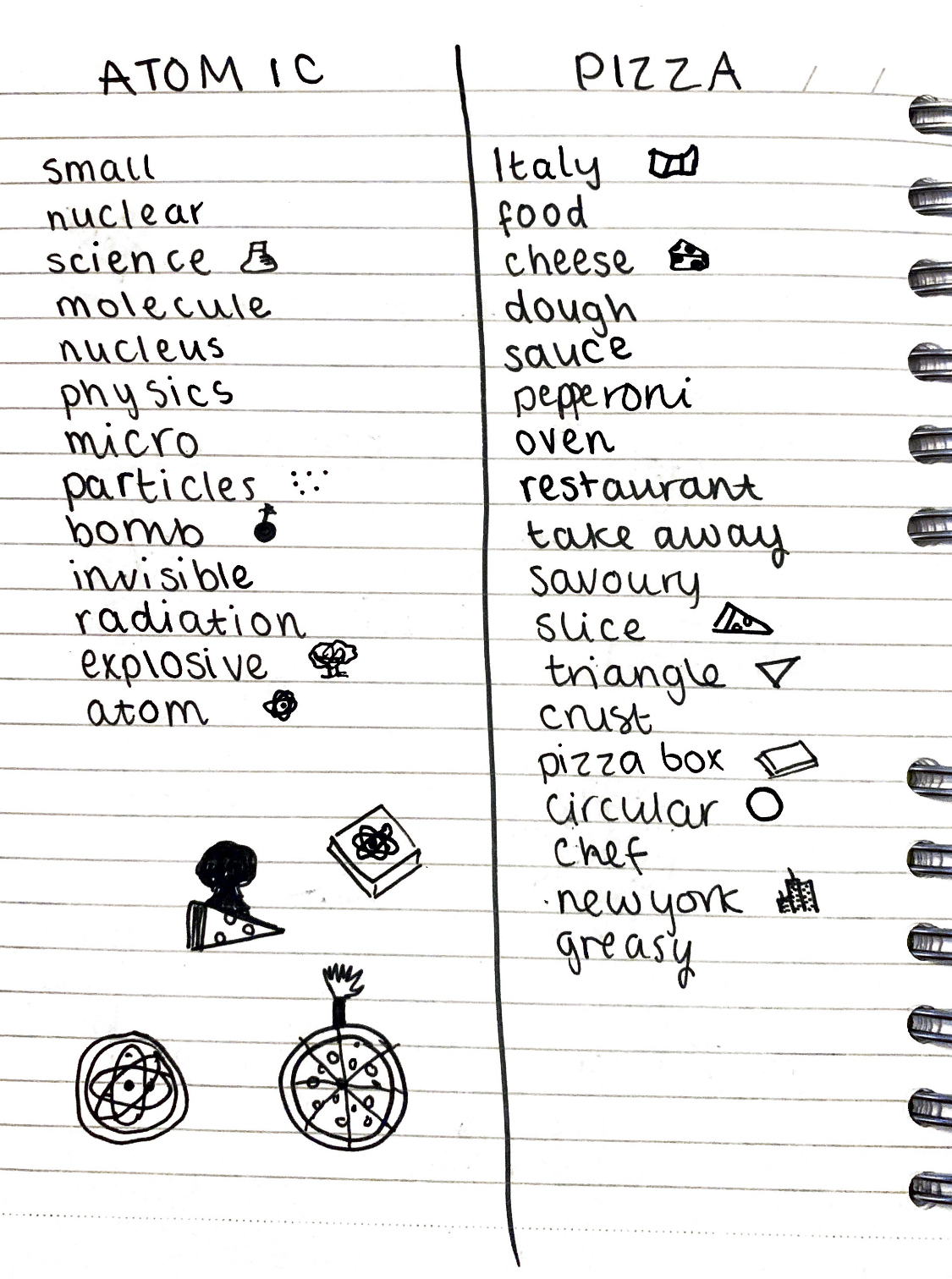
The second step, shown on my 2nd page, was to take the two main words (being Atomic and Pizza in this instance) and writing down any words that came to mind associated with these 2 words. We went around the class after establishing these lists and shared ideas to come up with more words, this was particularly helpful as people came up with things that I hadn’t even thought of and vice versa.
The next step was to draw some small icons next to the words to represent them, this was really helpful as it made me consider what other things I could add to a logo for the pizza place. Once I had these small icons drawn I used the bottom of my page to combine some of them together to make some sort of conceptual ideas. My favourite two are the pizza with the bomb explosion at the top and the pizza with the atom icon on it, becoming part of the cheese.
In the lab I then took these ideas that I made from all the stages of the exercise from the lecture and started to create them in illustrator. I played around with different typography and concepts and I think I came up with some that are visually appealing. For the font I used Futura, I chose this font as it is obviously a really modern and futuristic font and I feel like after making the list of words for Atom, I got a very scientific and futuristic vibe.
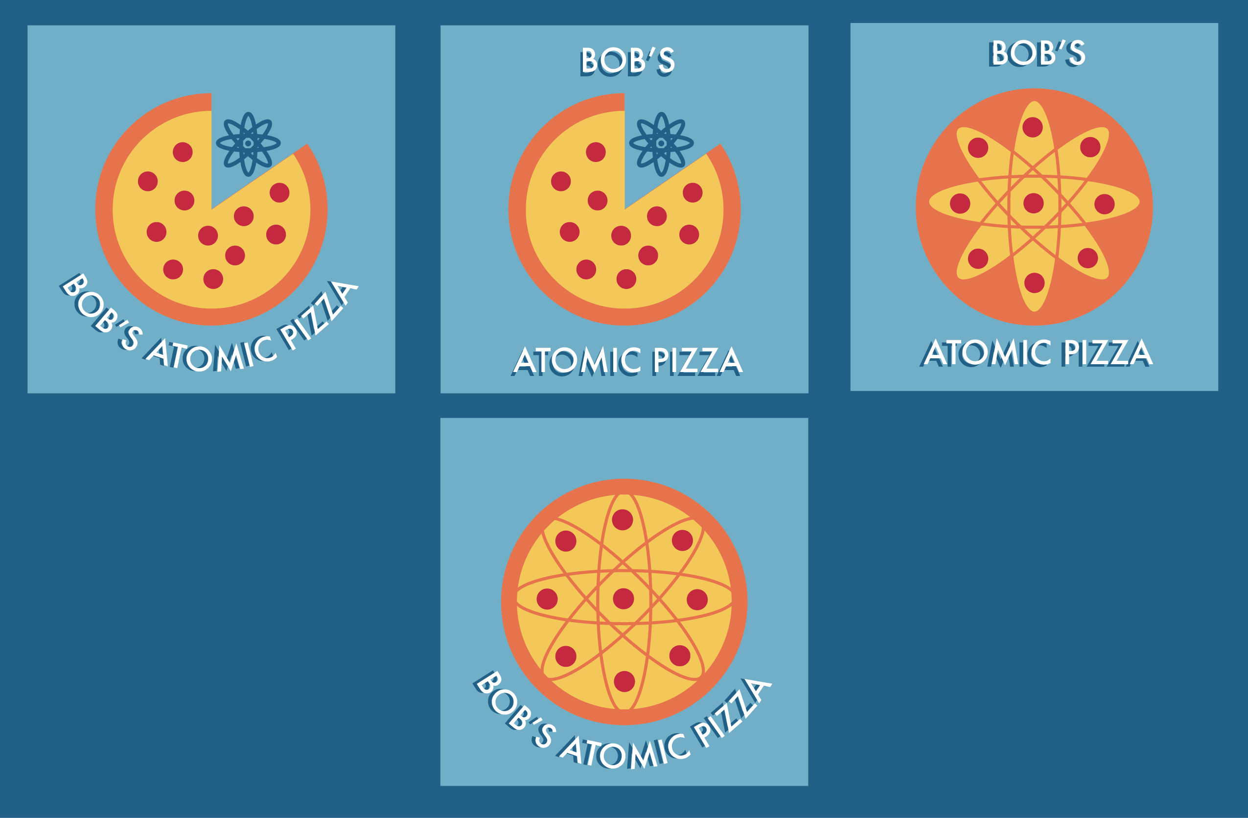
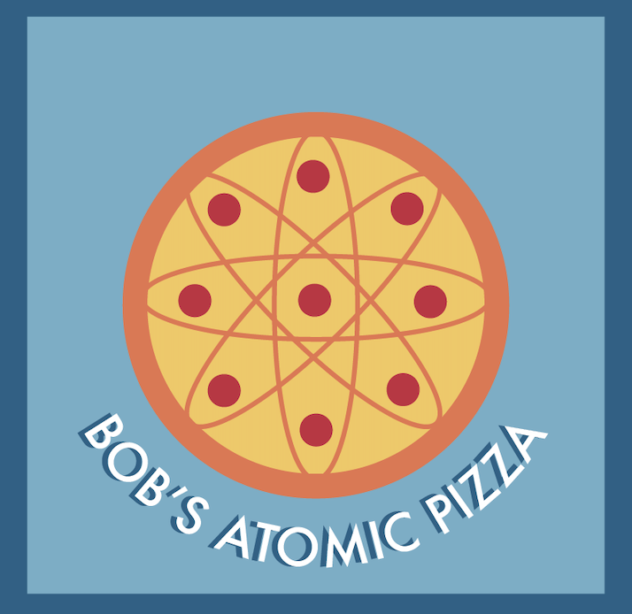
I think the design below is the best one out of the four examples that I made, I think it is my favourite as it really combines two ideas well and is a good conceptual design. The cheese has some missing parts in it to create an atom outline and the pepperoni on the pizza almost becomes atomic particles within the atom icon. I think this one is a really good idea and is an interesting take on the concept. I don’t think I would have been able to come up with this idea without doing the exercise in the lab first, and I think it was a particularly effective way of idea generation.
For the typography I chose one of the sketches that I made in step one when playing with the words and placed the words on a curve using the area type tool in Illustrator. I think this works well as it is curved like the pizza and really adds to the whole look. For the colour palette I used complementing colours and kind of muted hues to create a cohesive look for the design, with the blue almost contrasting the pizza in the middle yet matching with the yellow very nicely.