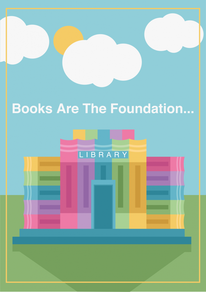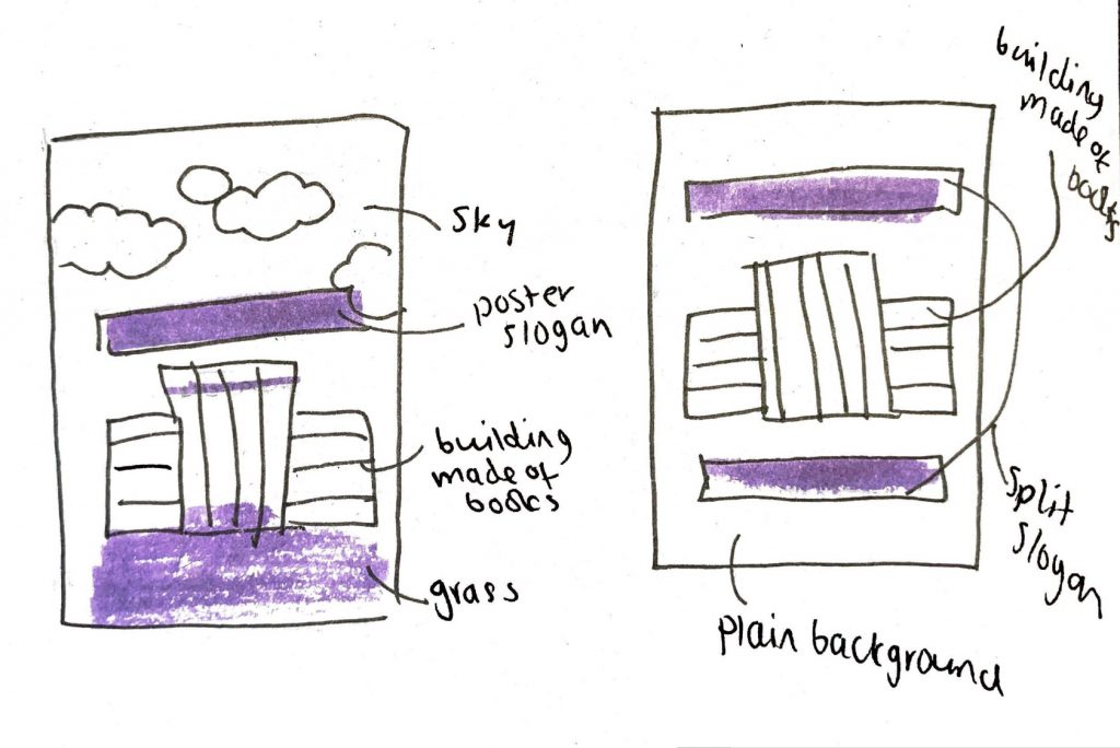
This is the poster that I created for the second half of this project. I am really proud of the outcome and I think it is suitable for my target audience and purpose that I chose earlier on in this project. My approach to this poster was to first start off with making some sketches of the design elements I had thought of and the placements they could have on a poster. I came up with 2 designs for this poster using my idea of making a building out of books.
The sketch on the right was the first idea that I had. I initially thought that I would make the building out of books and then place it onto a plain colour background. I would then use the slogan title of the poster to go above and below the library in the middle of the page. I think this would have been a nice effective design but I worried that it wouldn’t show off that it was a building made of books if it wasn’t in an environment. From this I then created the sketch on the left.
This sketch on the left xhad the same basic idea of having the library central to the design but I added a sky with some clouds and some grass at the bottom below the building. This I think really cuts the poster into sections and uses the rule of thirds to proportion things out on the poster. I think it looks better having an environment around it too as it is more clear what I was going for and what the design is meant to be. I think that it also adds more of a childlike element to it as it is similar to children’s picture books in its design.

To create the poster itself I first searched for the proportions of an A1 poster for screens. I then took these pixel measurements and set up my Illustrator document. I also played with adobe colour online to get a colour scheme that I wanted to use for my poster. I felt that working from a colour scheme would be helpful in picking colours that matched well together and looked uniform. Below is the basic colour scheme that I came up with for my poster. I decided to go for colours that were more childlike in appearance and were light and bright. I then took these initial colours and made extra swatches in illustrator of some darker and lighter tones of them all that I could use in my final poster for depth and dimension.

Once I had decided on colours to use and a general layout of my poster from my sketches, I then began to create my poster. I started with creating a book. I created this using the rectangular shape tool and also the minus/subtract pathfinder tool. To create the basic book I just layered some rectangles together in differing shades of one colour. To create the circular end I took a circle shape and subtracted it from the book. It then left me with a circular top edge of the book which gave it a more 3D appearance.
After I had created this initial book I then duplicated it so I had 5 of them and used the swatches that I made earlier on to change the colours of them so I had 5 different coloured books. I took these books after I was done changing the colours and individually grouped them together so that they were individual objects. From here I duplicated them some more and assembled the building out of books. Once I had done that I used the pathfinder tools to merge some circles together to make a cloud and added the sun and the shadow on the grass at the bottom. After this was done I added the text onto the poster, with a little text that said library on the building and added the yellow barrier around the outside to add a little more interest to the outside of the poster.
Once I had finished creating the poster I saved it and went to upload it to my blog however WordPress doesn’t support photos that are that large so I scaled it down by 50% for WordPress to be able to display it.
Overall I am really happy with how my poster came out and how it looks. I think that it fits the criteria of the project well and is an effective conceptual design. I like how it does look childlike and the colours I chose ended up working for the scenery too as it ties the whole thing together and looks very coordinated. I think that doing the earlier blog posts really helped me to get my ideas together and helped me gradually come to a suitable solution to the brief.
