
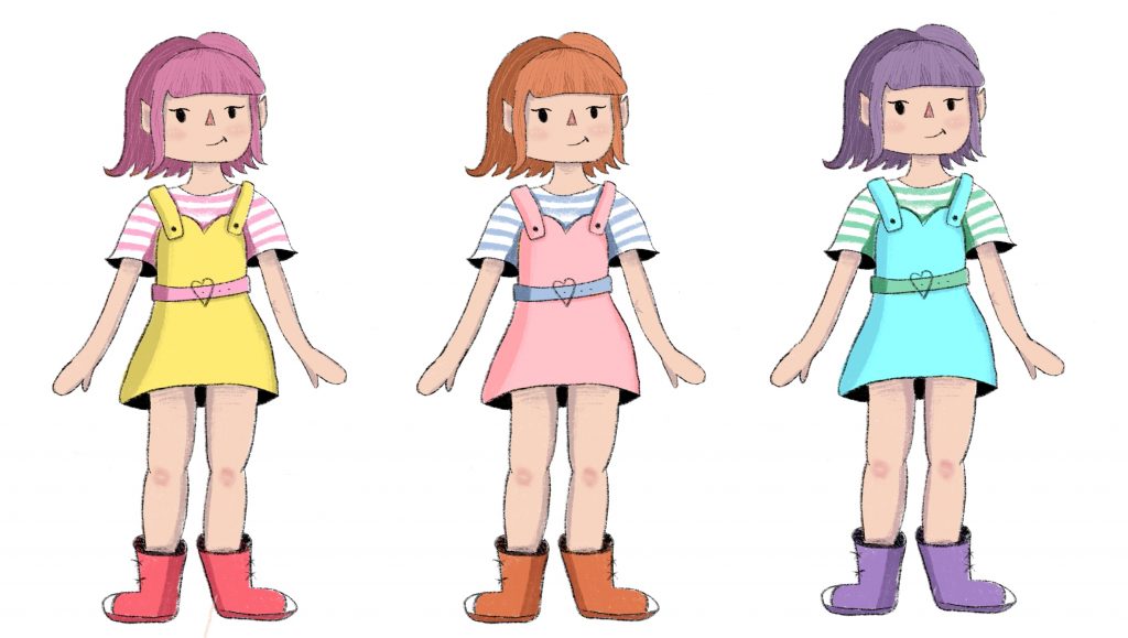
When I was creating the design for my character, colour is something I carefully considered as I wanted my design to look really coordinated and that the colours went really well together. I took my artwork of my character and changed the colours of it to see how different combinations would look together. I knew that I wanted some elements of the design to match others to make the colours look more cohesive so I decided on the shoes and hair being similar in colour and the shirt stripes and belt being the same. I think this helps with cohesion of the design and also makes the main dress in the design stand out. Below are three of the colour schemes I tried out. I wanted to try varying colour schemes to make sure I was picking what I liked best. The pink and yellow design was my first attempt at colouring the design and even though I liked this I thought it was far too strong all together for what I wanted and I tried some other combinations. The blue and purple design I created just to try some colours I hadn’t before on the sketch but I did not like this one at all as the dress and shirt looked too similar and too neon together as well as the purple looking too dark. The middle artwork is the one I tried last and really loved. The colours are bright pastel shades and I think there is a really nice cohesion between the colours yet they stand out and look really good together in my opinion.
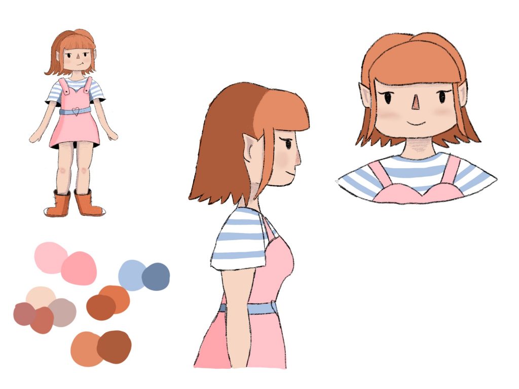
Above is the further sketches I made of the front and side view of my character for my own reference. I took this as an opportunity to solidify my choice of colour scheme. The hair will of course be one solid shade of orange, but for the sketches I wanted to add some shading to the designs so used darkened versions of the colours I chose to make the artwork look more interesting. The colours I used for the design can be seen at the lower left of the sketches as I needed a palette to reference. I really like the contrast between the blue shirt and the pink dress, I think that contrasting colours can be really important in a design and to help it stand out and allow people to remember the character. I also really like how the pink ties in with the orange hair and boots as it is a similar tone so it ties the palette together and makes it look cohesive literally from head to toe.