
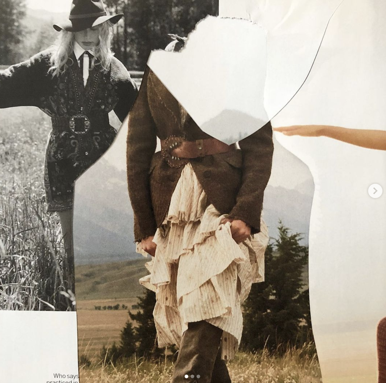
To help inspire me and look at existing examples of modern collage, I decided to find some artists that I thought were interesting and creating work in a similar style and for a similar purpose. Below is a collage artist that I discovered, Martin Vallin, who works primarily in creating unique and interesting advertising campaigns for designer brands. I was particularly drawn to the work produced by Vallin as I think looking at relevant advertising campaigns is important, to see how things are being done by professionals in the industry of promotion and advertisement.
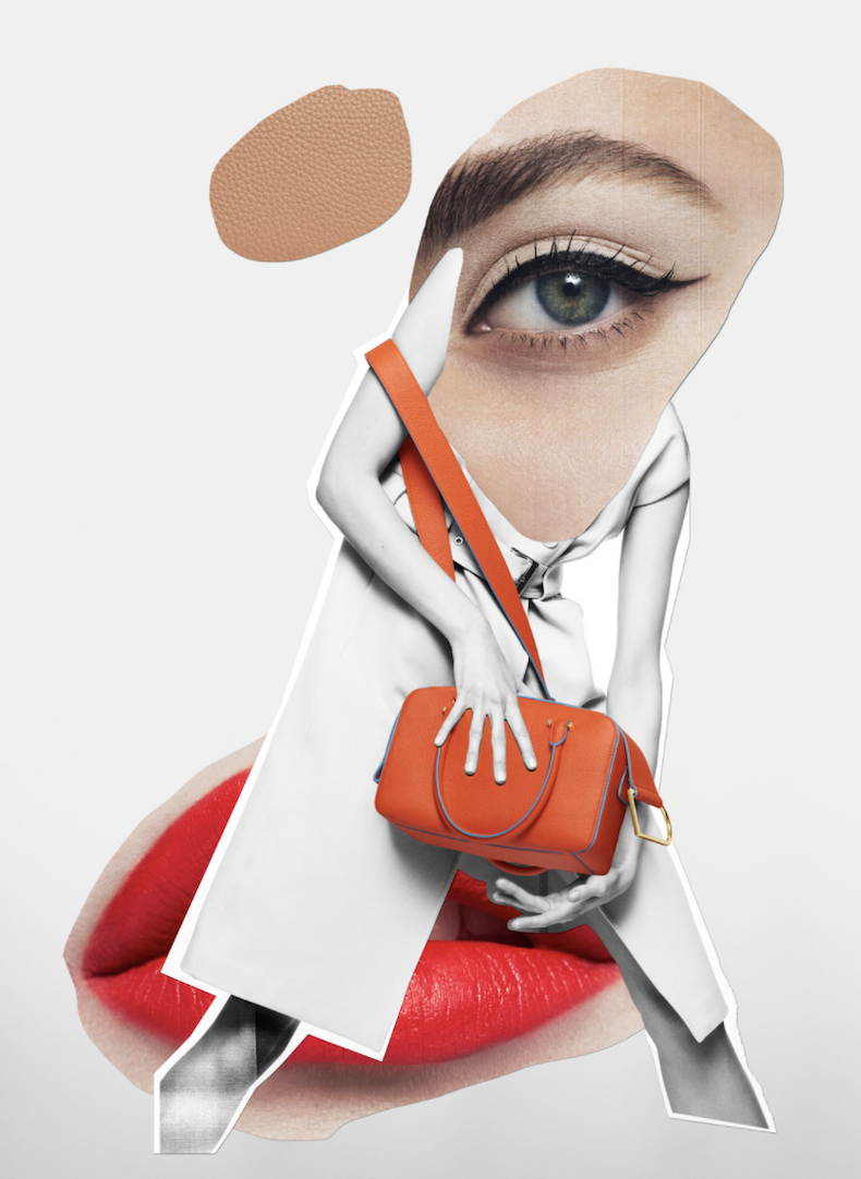
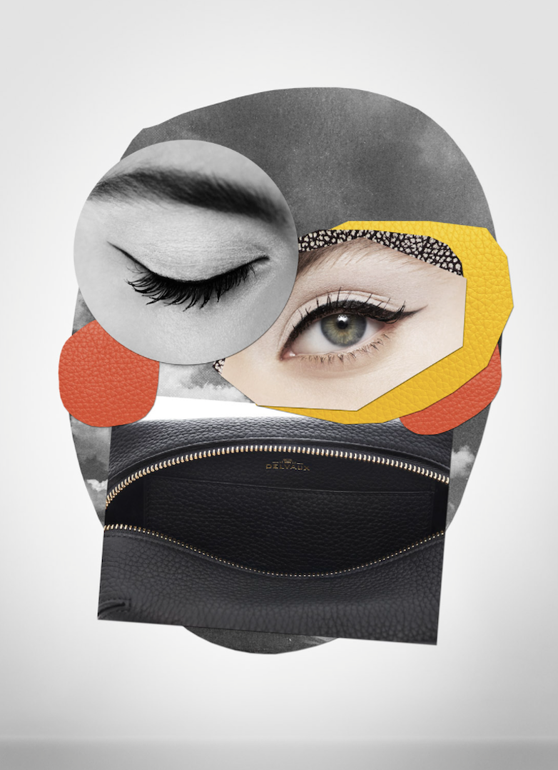
I was most drawn to the use of multiple layers of images with the differing in colour vs black and white within a lot of the work. I think it really helps the feature elements to stand out. I also am inspired by how centralised the designs are in the middle of the advertisements, it is really striking in contrast to the plain backgrounds and I could see something similar being a technique I use. I think creating some of my poster marketing to be inspired by this style of collage would lend well to my project as there is a lot of room at the edges to add textual information to the piece whilst not compromising the collage.
I really like how Vallin plays with the size of items and how the images are cut together. The differing sizes and shapes give a surreal feeling to the advertisements and make them stand out a lot. You could spend a lot of time looking at them and finding new elements every time, making the audience want to come back multiple times just to investigate the images.
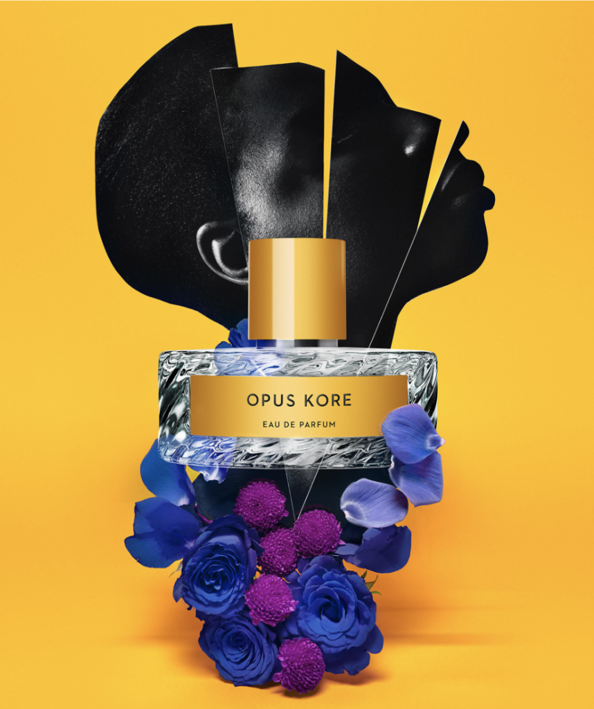
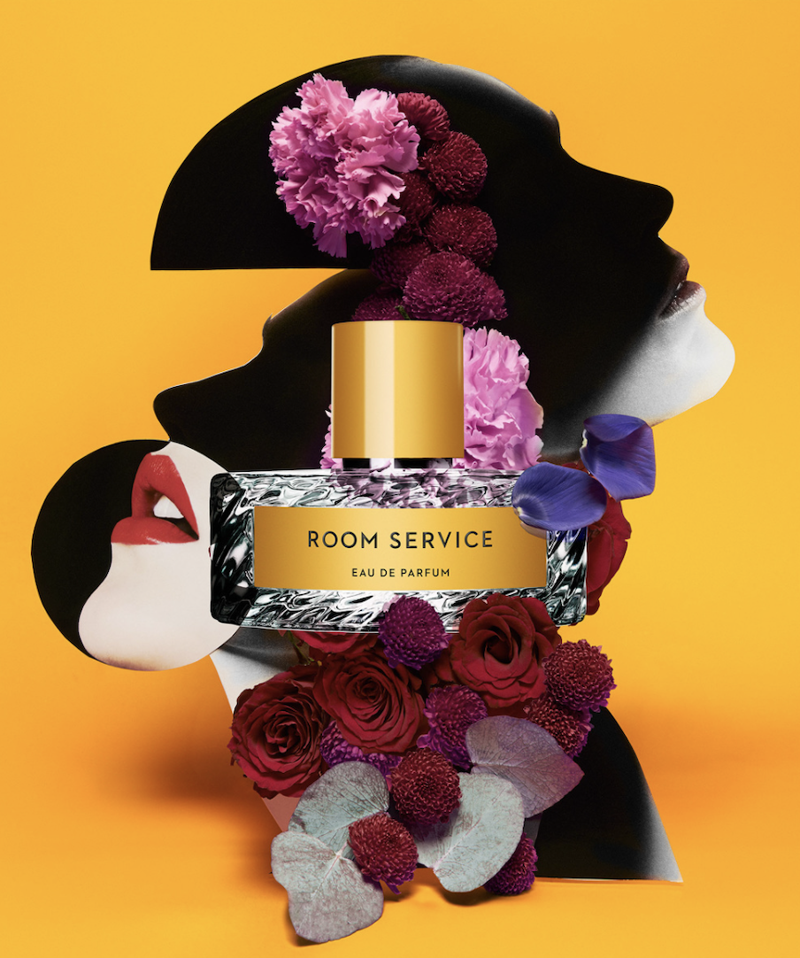
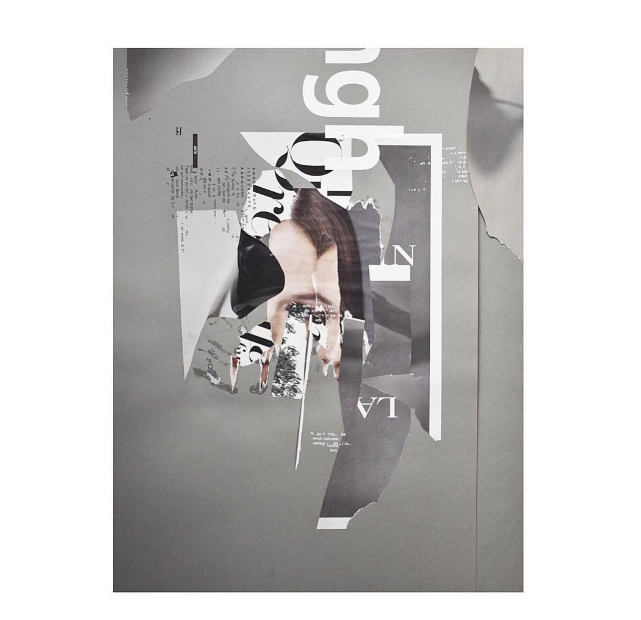
I decided that a good place to look for more interesting modern collage artists would be Instagram. A lot of artists enjoy using platforms like this for their portfolio’s. The first artist I discovered that I loved the style of was Marcos Coelho. Coelho uses digital collage techniques to make interesting, colourful designs, incorporating photography, drawings and graphical elements with text to create unique pieces. These pieces that I have included in my post were the ones that struck me the most and I found most interesting and similar to the style I have thought about for my own pieces.
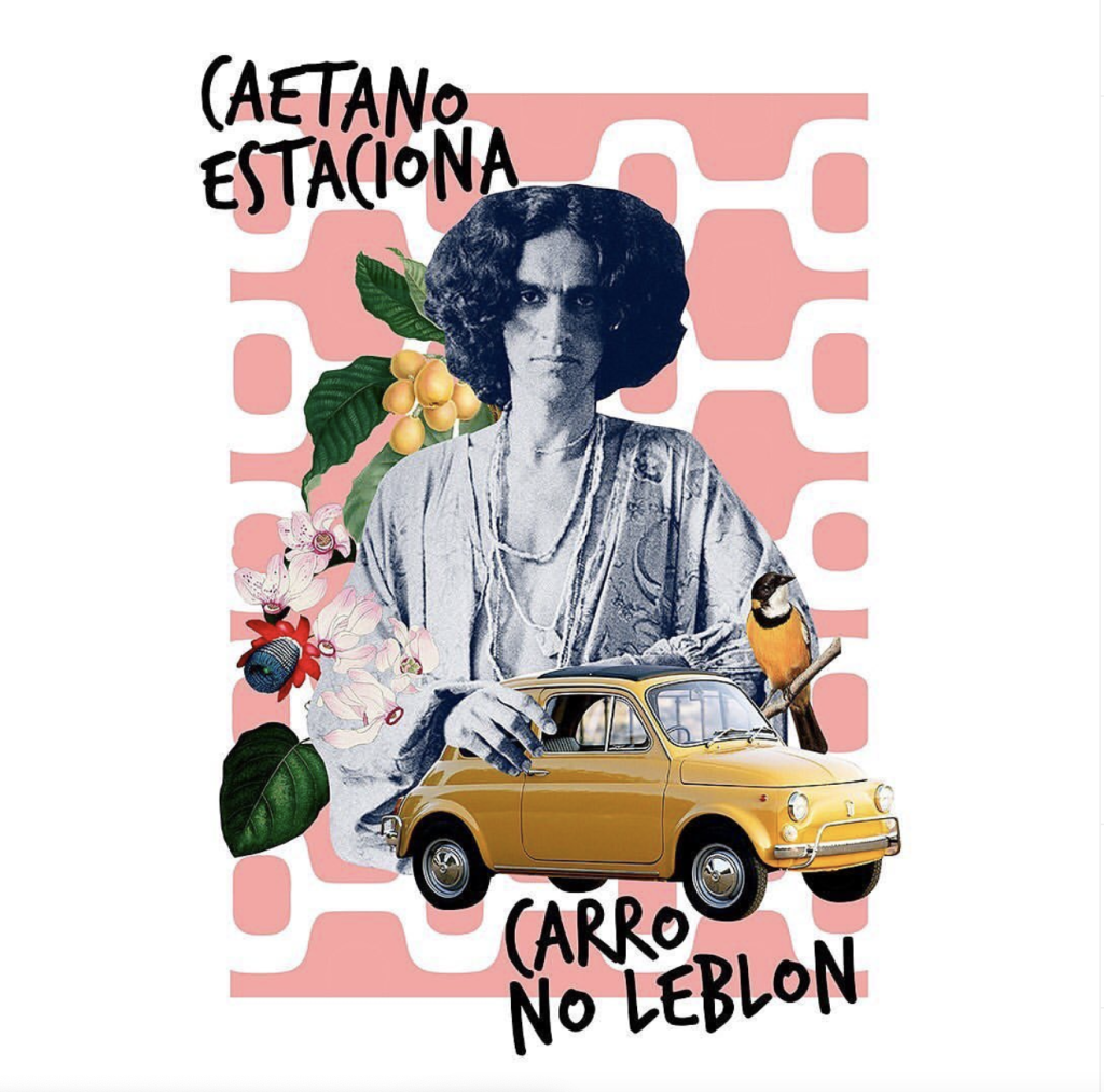
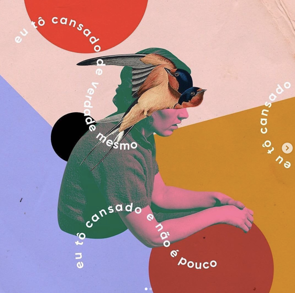
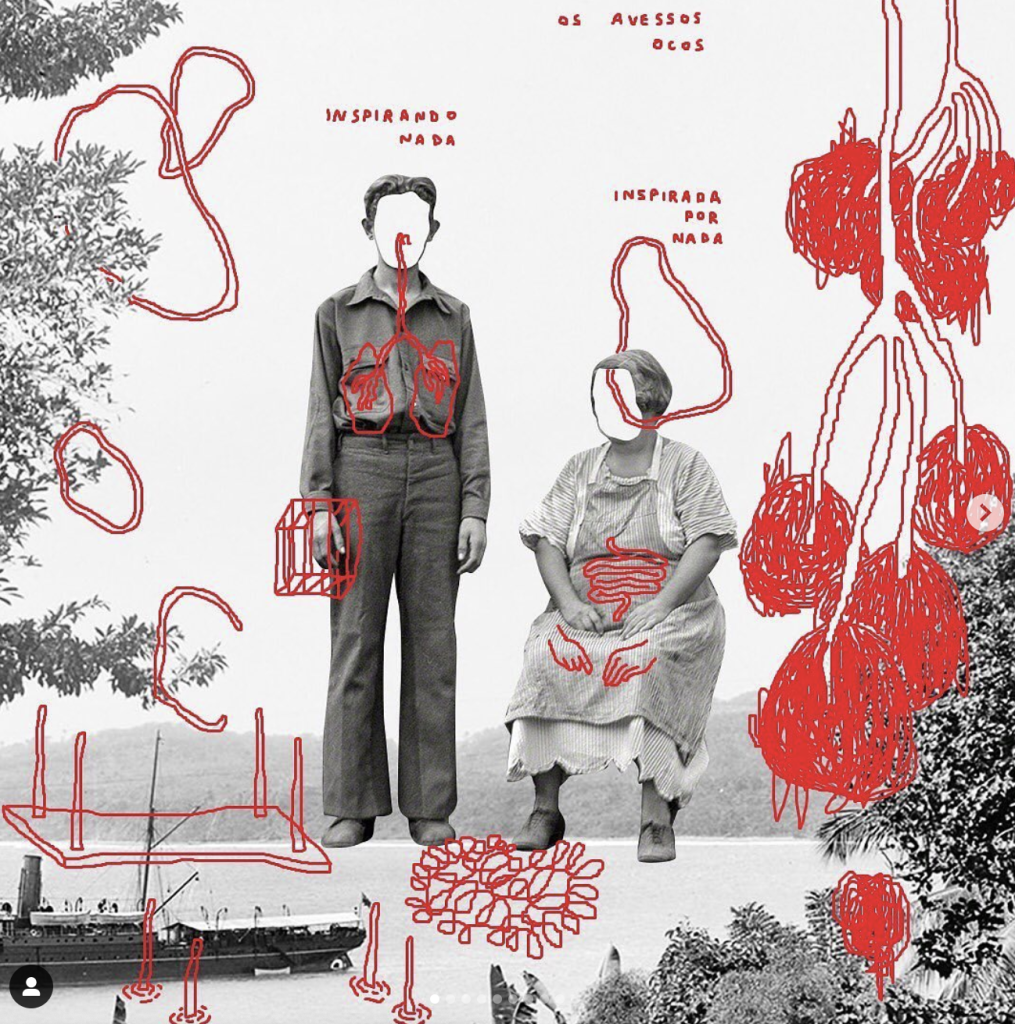
I really enjoy the interesting combinations of images with the shapes and colours of the graphic backgrounds. I think it’s really striking and adds an interesting brightness to the pieces. The use of different techniques and digital materials adds depth to each piece and really shows off the layers between each element. I particularly like the top right image as I think the contrasting edited colours of the image compared to the background really draw the eye and that the curved text is a unique addition that relates the text to the background patterns and adds purpose. Additionally I really enjoy the bottom left image. The photo collage aspect is minimal but the drawing on top adds an extra layer to the design and is similar to what I was considering creating for my promotional materials. I think the drawings on top add a personal touch to the designs and really elevate the piece, offering depth and an insight into the artists thoughts as each additional drawing is purposeful to the design.
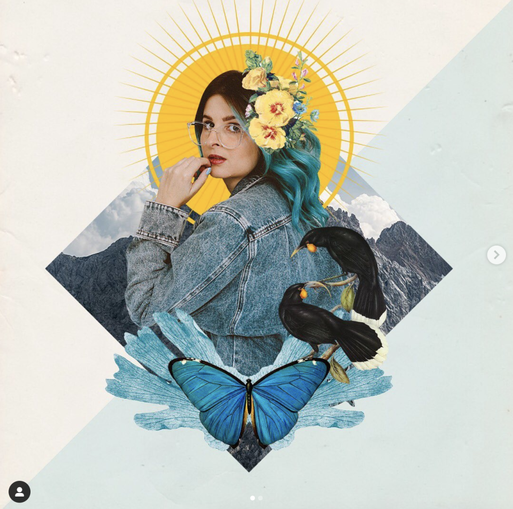
The final artist I found to study the work of is J. Nathan Dziedzic also from Instagram. His style is very editorial in my opinion and even though he uses colour sparingly I think he is able to use it very effectively. From reading his captions, Dziedzic uses digital and physical collage techniques and is a fan of screen printing to create his pieces. Most of the imagery used is found content from magazines and such. I really like the texture and jaggedness of this artist and I think that his collage work is really striking.
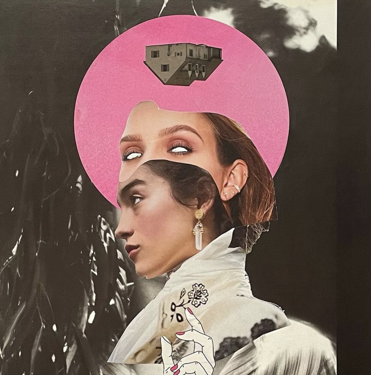
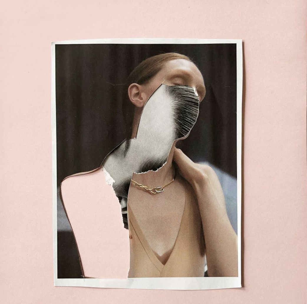
Each of the pieces I have added to this post feels very distinctive and the images used give a really professional feel to them. The colour pink was used a lot in a lot of the pieces I saw and I think it is a great contrast to the images used within them. Elements of graphic shapes are used in quite a lot of the pieces I saw along with some typography which I think adds a lot of depth. The fact the artist uses physical collage techniques in some of his pieces is really evident from the jagged textures on the edges of some images and adds an organic look. Printing images to then destroy physically and scan back in to assemble may be something that I end up doing as I think it looks much more natural than anything that could be created using digital erasing brushes or textures. I really like the top 2 images here the most, they have less collage elements than some of the other pieces but I think the minimal aspect of them adds to the pieces and makes the collage elements that are there more interesting to pick apart with your eyes and view the layers.
Additionally I also created this Pinterest board that I am actively adding to and using to amass different collage artwork from different artists around the Internet. I spent some time trying to find some images which were inspiring to me and had elements that I want to include in my designs. I am still particularly drawn to the ‘vintage’ early 00’s style posters as can often be seen in this Pinterest board. I think that the nostalgia of the editing style and the collage techniques together will be really relevant to the young adult/ early 20’s target audience which I want to cater to. The use of doodles and other small graphic artworks layered with the images and the addition of text, I think is very visually appealing. Paired with the bright colours, I think it would fit really well with the art and fashion festival that I have in mind to create. I really enjoy how purposely imperfect a lot of the images I’ve gathered look and I like the use of ripped looking images, to call back to old collage techniques.
Looking at an artist’s portfolio who makes graphic work similar to the brief of my project and also creating the Pinterest board to more broadly gather a mood board of the styles and aesthetics that I am interested in I think has been a useful exercise. I think it has helped me to see the vision that I want to create and show the artistic direction that I have been thinking about taking.
References:
Coelho. M, 2021. Marcus Coelho (@_mrczz). [online] Available at: https://www.instagram.com/_mrczz/. [Accessed 22/11/21]
MilyKadz, 2021. Martin Vallin Photographer & Director. [online] Available at:
http://www.milykadz.com/index.php/artists/martinvallin .[Accessed 6/10/21].
Nathan Dziedzic. J, 2021. J. Nathan Dziedzic (@formandtype). [online] Available at: https://www.instagram.com/formandtype/. [Accessed 20/11/21]
Pinterest, 2021. Collage Inspo. [online] Available at: https://www.pinterest.co.uk/victorialouuu/collage-inspo/. [Accessed 6/10/21]