
For this project I knew I wanted to create some illustrations to fill a gap in my portfolio and to tie it into my first assignment I wanted to produce movie based ones thereby the content of this project being based around Coraline. I wanted to create something that encapsulated the changing tones of the movie and things that could make interesting illustrated pieces and show my understanding of the concepts.
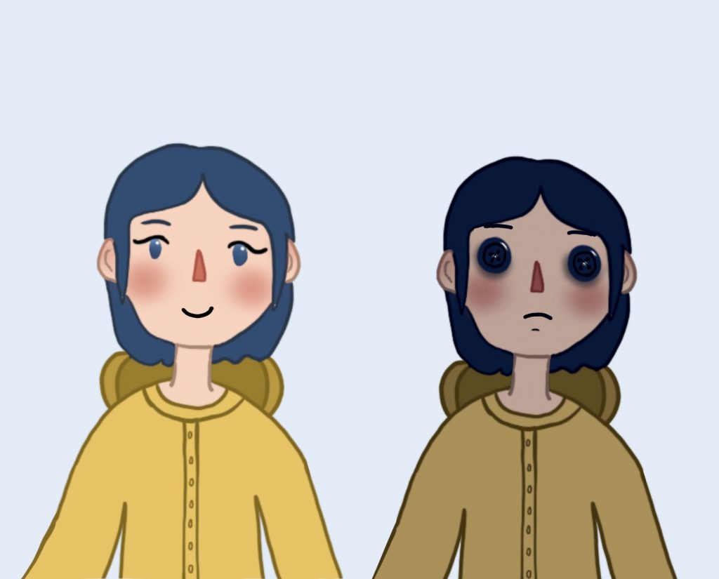
For the use of colour I chose to do a character study of one of the characters who would appear in my final graphic. I experimented with how colour changes tone and mood and used straight forward colours to show off these elements. Darker shades are mostly associated with evil and sad things whereas lighter shades are associated with positivity and good. The raincoat is yellow as this is how a lot of people will picture one as it is an iconic colour and represents happiness. The black eyes on the right character design show sadness and deep emotion and are able to convey these feelings with only the deep colour used. These illustrations clearly show together the considered use of colour and show how colour can convey meaning and association and speak for itself.