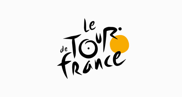
For this blogpost it took me a little while to find some good examples of conceptual design. I ended up finding some by searching terms like “logos with hidden meanings” and “hidden designs”. I felt this was the best way to find work that had two design ideas together that created a different yet effective outcome. A lot of these were logo designs so the first one I will talk about is the logo for the Tour De France.
This design is the logo for the cycling event. The font used in this logo is very unique and looks hand written almost, it makes it look very free and natural. The hidden part of the design is the “OUR” in “Tour” actually being a person riding a bike. The yellow circle behind the text is actually the front wheel of the bicycle. This works as the event is obviously about cycling and it adds some depth to the logo and the meaning behind it.
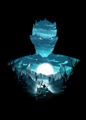
Below is another, yet different design I found of The Night King from Game of Thrones. I saw many posters and art pieces like this whilst researching and it is a very popular concept. This one has a design in the centre of a key scene from the series which is pretty much monochrome and is really nice artwork. This scene however is actually shaped like the character the poster is about, using negative space to create a sort of silhouette of their outline. When you look at this more you notice in the scenery in the background that the mountains make up the collar of the characters clothing, the birds place the eyes and the moon in the middle actually highlights where the original character has a crest on his outfit. The more you look at it the more you notice different elements of each design separately and see that they work on 2 levels and combine to create an interesting poster.