
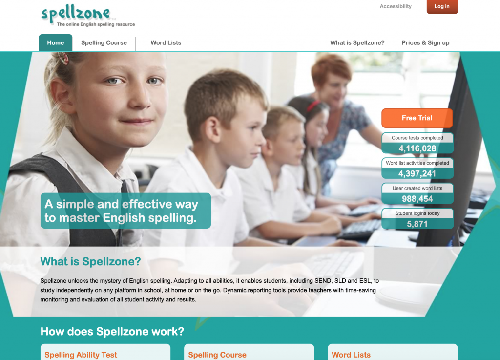
Within a lecture for UI/UX we were given a task to simplify the above site, spellzone.com. The Task was to redesign the introductory screens and the on-boarding section of the website. We were also tasked to use UI Kits and wireframes to achieve this. This was a task meant to get us more used to using XD and to use a UI Kit for the first time. For this task I first visited the Spellzone site, looking at the original site was essential to redesigning it as I wanted to see what had already been done and how I could take a simpler approach to it. I think this was a good task for a lab as it helped me to think more about what I was going to do for my main project and how I was going to approach that. I also got to look more at UI kits and see all of the possible elements that I could use for an app and also how simple it was to put something together.
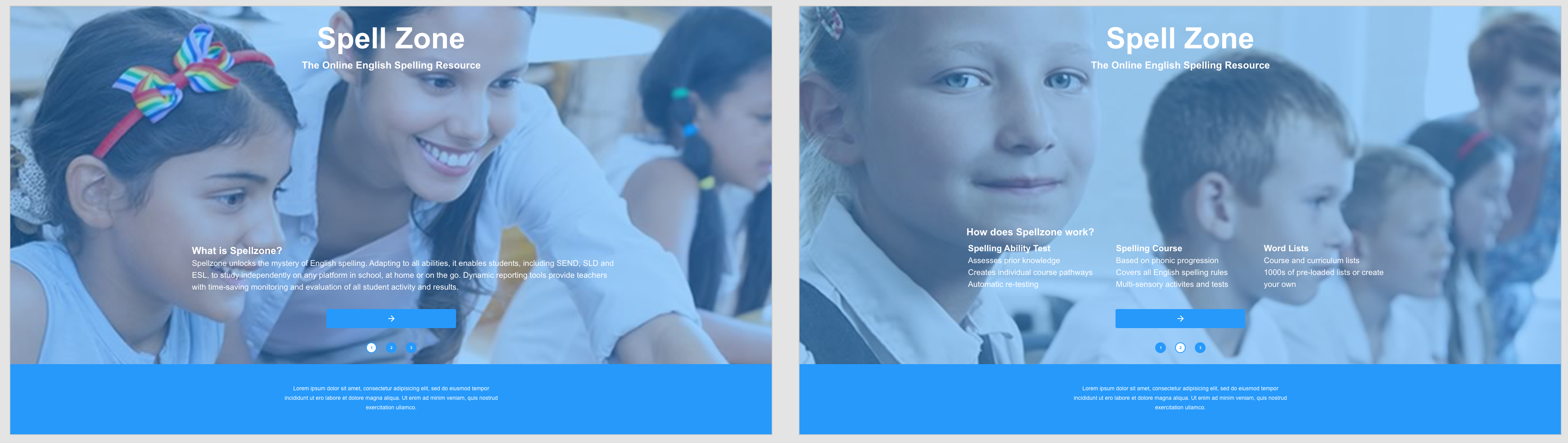
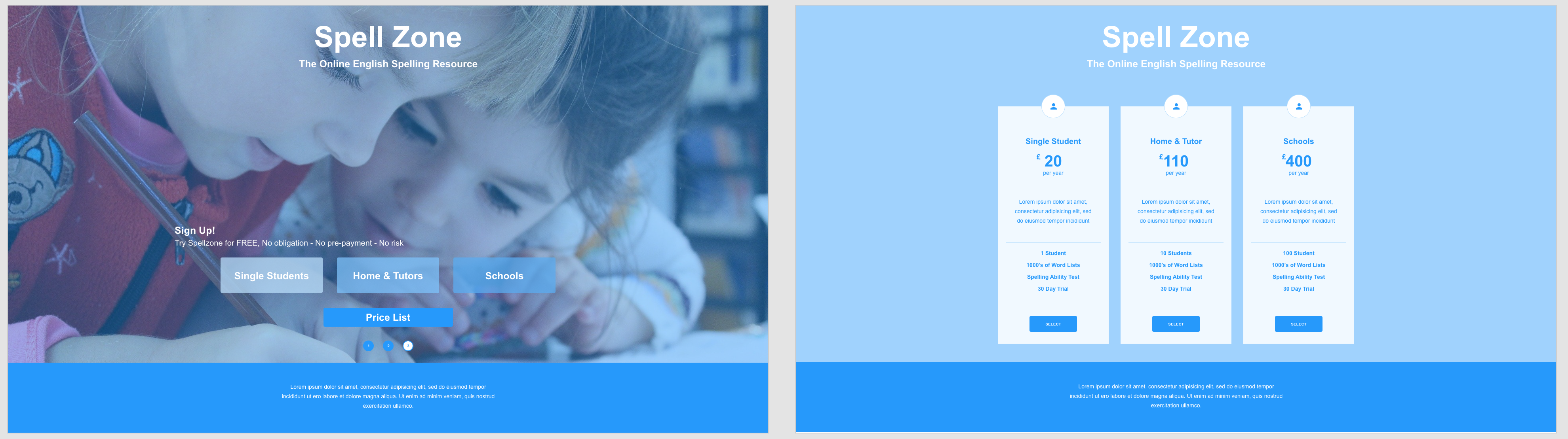
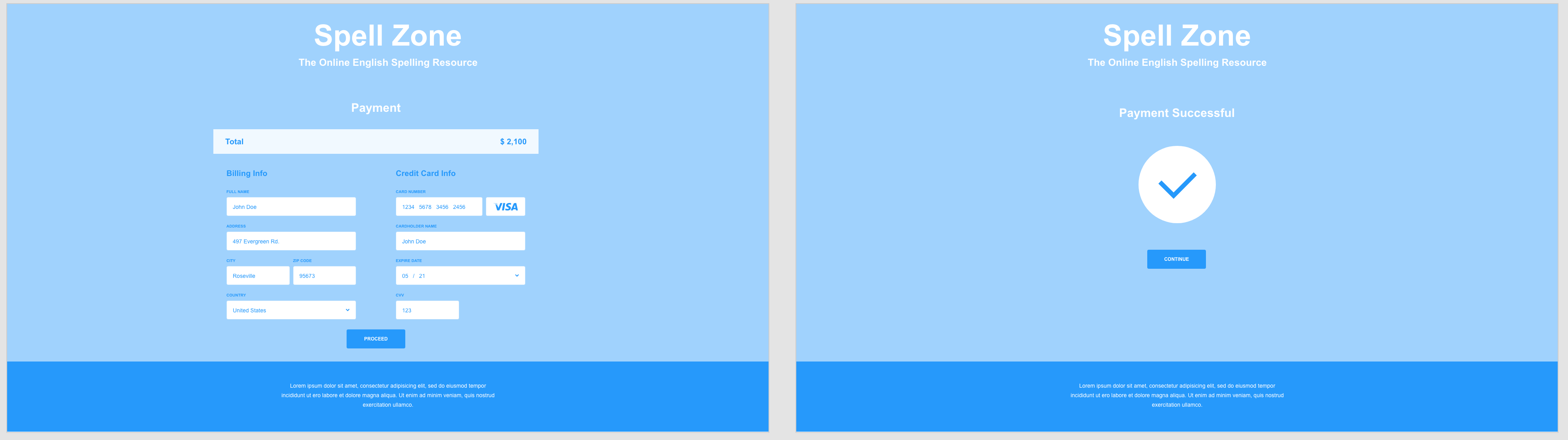
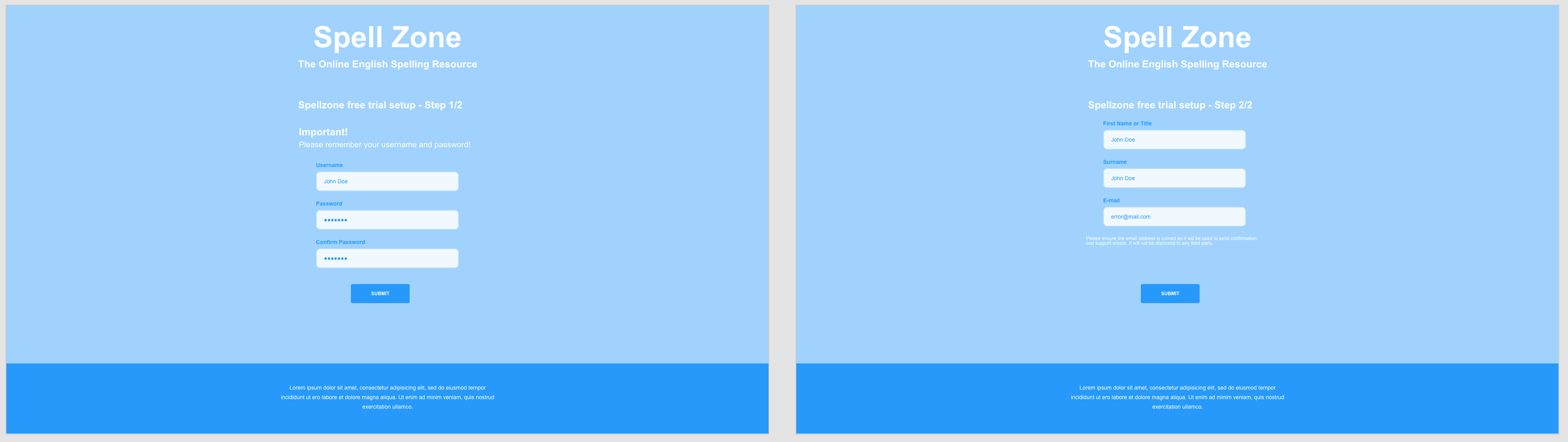
To redesign spellzone, once I had looked at the original site, I actually went and saved some of the images off this site. I wanted to use existing images in my attempt at a redesign as I felt like it would keep it consistent with the original. I was thinking as I was designing the first 3 screens that I wanted the images to be the background of the site as I felt that it would look good and reduce the amount of useable space, allowing me to simplify the site. I found this quite effective and limited the amount of text and possible buttons on these screens to simplify the process of gaining the relevant information. I decided to focus on the text and what the site does on these first pages as a way of introducing the site to new users. On a full version I would have a log in button in the top right corner for existing users to bypass all of the on-boarding from the site. After these initial explanation screens there a re two routes that a user can take, one to a price list and a payment screen and the other to sign up to a free trial for the site. I felt these were 2 of the obvious paths for the site to take after the initial information and it was enough time for the user to get to know the site, what it does and chose the next steps.
I think that creating this simplified version of spellzone was a really useful task to do and it helped me to think more about all of the screens and steps involved in creating a website or app. As I was making this I kept thinking of more and more screens that I wanted to produce and just how many are required to get the points and parts across that I wanted to. Redesigning the on-boarding of spellzone I wasn’t sure when to stop as I kept wanting to make more pages and really visualise the site as a whole. There are many steps and screens that you don’t really consider till you make something yourself and this was really useful to my final assignment.