In this blog post I will be talking through the layout sketches that I created that show the idea I have for the app. I felt it was necessary to first get my ideas visualised and down on paper before I started to work in XD as this would lead to less mistakes in the long run and make it easier to create the prototype itself.
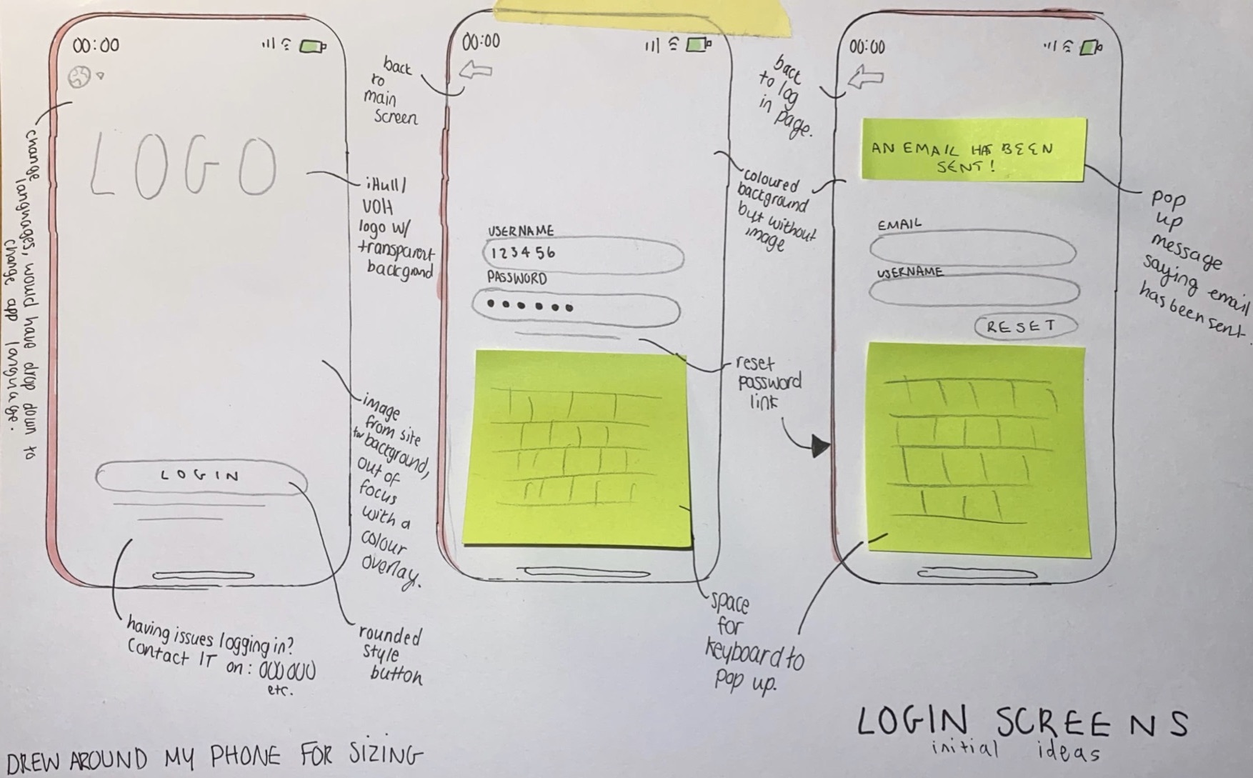
Below is the idea and sketches I had for the log in screen of the app. I wanted something minimal and that was easy to navigate. Having less options on a screen like this simplifies and streamlines the user experience and makes it a lot more simple. At the top of the main page I have added a globe symbol, this would lead to a drop down with the available app languages so that it is easy to change the language of the app to accommodate international students. I chose to use a symbol as I thought this would be easier than using the word as this will be clearer for people to understand. I added text underneath of the log in button and on the subsequent pages for if students are having trouble with the provided log in details and a way to reset the password. I think that these designs are nice and simple and I will be using this kind of principle throughout my app to add consistency and make a smooth experience. I have chosen to use a rounded button style as I think this is the most aesthetically pleasing and will look nice with the idea that I have for the app overall. The colour scheme I’m planning to use as default is the same pink colour that can be seen on the Hull University website, there will be other options able to be chosen from the settings within the app that will also pull from colours on this website to add some uniformity between the university’s services.
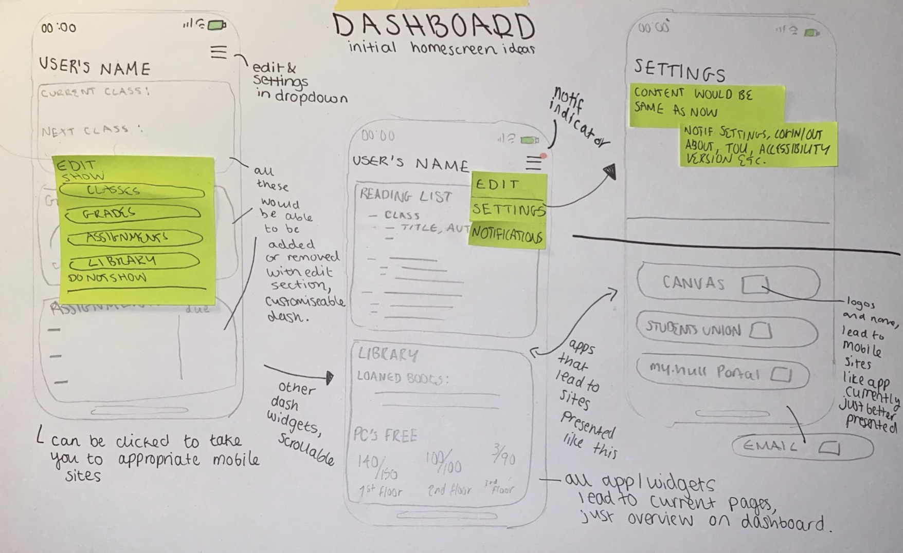
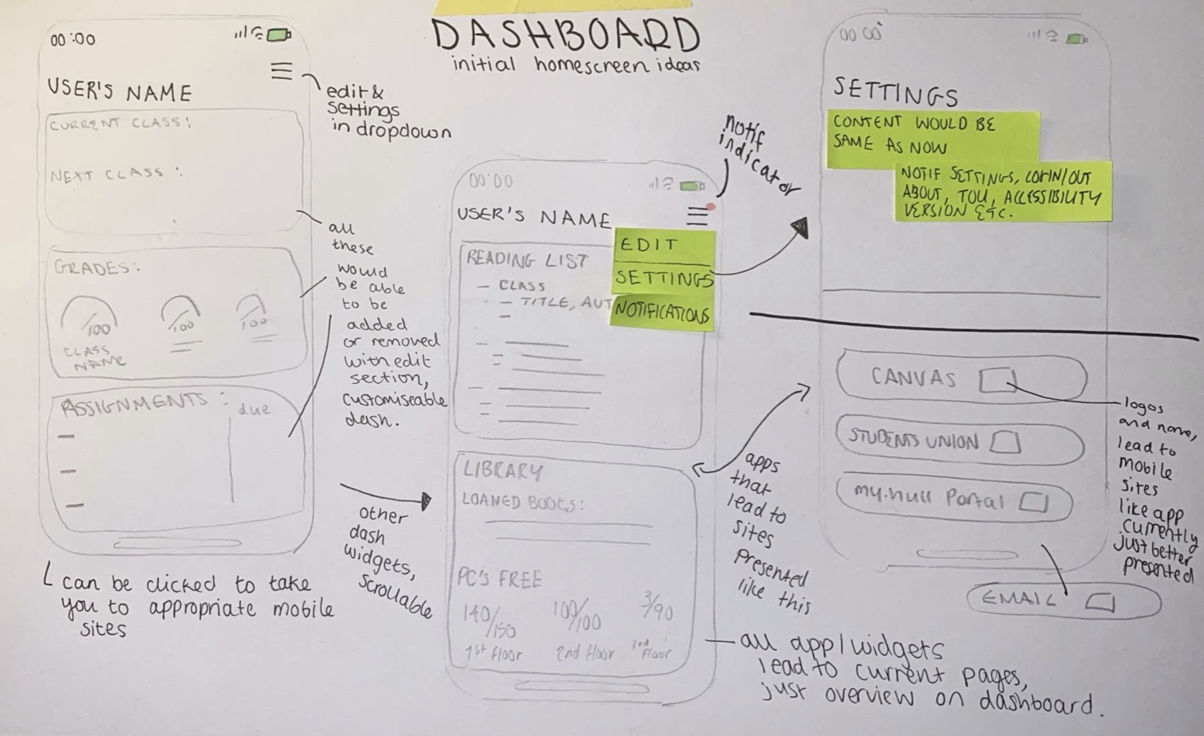
Below are the layout sketches for the main dashboard of the app, one showing a pop up and one without to show the design underneath. I was inspired by the widget sections on a lot of phones with my design and tried to come up with something that would enable people to chose which parts of the app they wanted to see. I unfortunately do not know how to actually implement this into the prototype itself so I will be showing off the sections of the app as if the student had the majority of them selected on their dashboard as I am unsure on how to switch them out on command.
I wanted to keep all of the sections on the dashboard clear and easy to understand and mostly rely on visuals if I could, I wanted to do this to make it easier to get the information needed within the app and make the process quicker. I have annotated these layouts so further information about my ideas as I was creating them can be seen below.
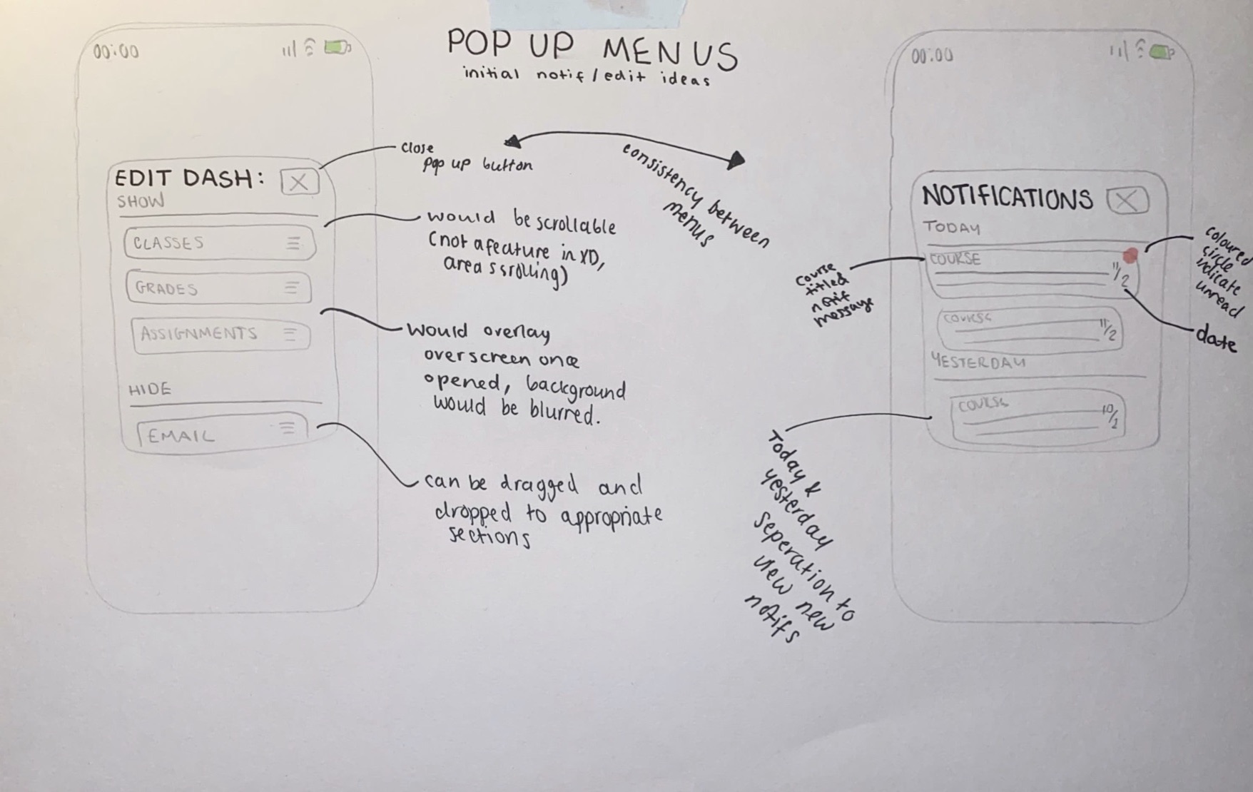
Below is what the pop up menus would look like on my app, the background would be blurred on the app itself to make the pop up the centre of the design and make it clear to read.