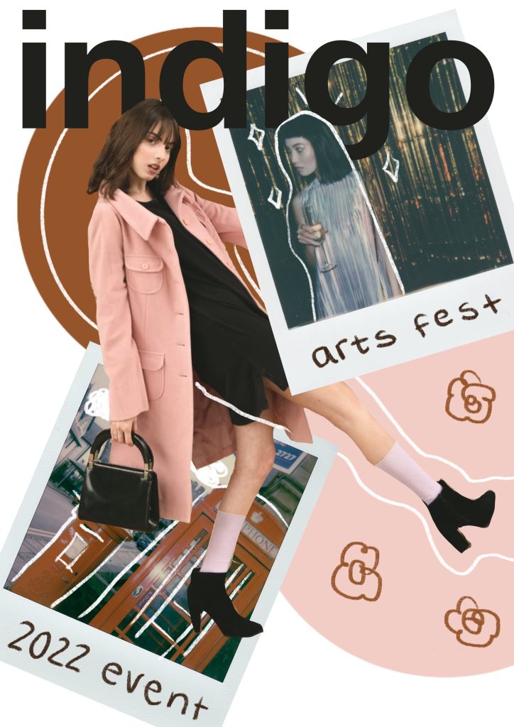
I really wanted to create some sketches and plans for the look I was going for in this project. I created the below visuals to really show the style and layering I want to achieve within the project.
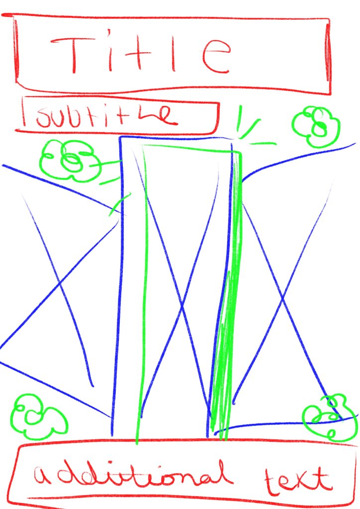
Below is the first one I created. I created my design on the app Procreate on my iPad so I could draw all the elements and edit precisely. I started by sketching out a layout of the design, using different coloured pencils to indicate the different layers and how the design would go together. The blue parts would be the places of images to go and the green would be the layering of hand drawn doodles and elements over the top of the design. Once I had this sketch I then decided that I would realise it a bit more and add some real images and text to the piece to make a strong example of the visual style and outcomes I am attempting to create.
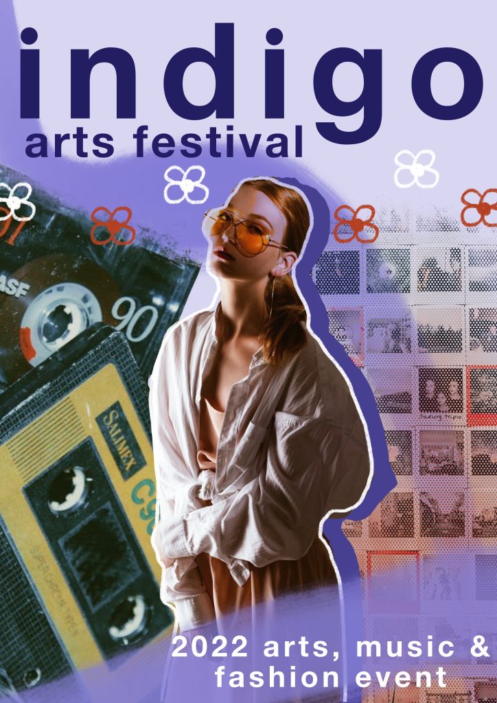
To make the version on the right I first used my sketch as a base layer to build on. I came up with the name Indigo to use as a placeholder (though I really like how it sounds for the festival and may carry it forward). I used the font Helvetica Neue for the text in bold as I felt it was really striking and eye catching. I also decided to use only lowercase text on the piece as that aligns with the common writing style of my target audience. I then added some paint strokes in the background and behind the bottom text. Next I decided to use some free use stock images and found 3 I wanted to use that gave the vibe I was going for. I edited these images and took away background and pieces I didn’t want. I also changed the colours on the main image of the woman to make it fit the colour scheme my piece was evolving to have. I then layered these images and used varying eraser brushes to add texture to them. I finally finished by adding the shadow to the main image along with the doodled outline and then drew the flowers. I really love how this visual turned out and I think it really shows what I’m going for.
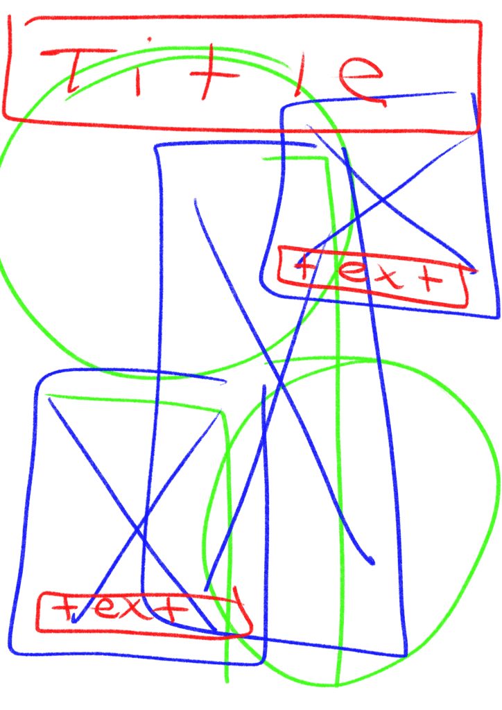
This above is the second visual I have created for this project. I wanted to have some varying designs but with the same visual style to show the different possibilities with the theme I have chosen. This image I first started by creating the sketch design on the left. I created this sketch using colour coding again to show the different layers on the image and how these would interact together, red for text, blue for images and then green for any additional graphics or illustrations I wanted to add to the piece. Creating these base sketches to work from really helps me to get a sense of how layers of the collage are going to interact with each other and what I want to be where on the image. To create the version on the right I again started with some stock images I found on a free image site and found some that I liked and wanted to use. I really liked the Polaroid style images so I had to use them in this piece. I started by creating the background circles I wanted in the design, pulling colours from the images within the file, once I had a good base I then edited the middle image to have no background. I then placed this where I wanted it and layered in the polaroid photos. I wanted things to be on different layers and images to interact and overlap each other. Once I had the images in the place I liked I added the title text, taking time to erase parts around the images so things overlapped with each other and added more dimension to the collage aspect. I then decided to write the sub text on the Polaroids to add more of that hand drawn doodle style to the piece, I think it adds an interesting element. Finally I took a white pencil brush and added in some lines and doodles along with some flowers to tie back to the other example visual.
Creating these visuals I think is able to show well the direction I want to go with my project and how I want to approach the promotional materials that I am creating. I think that I will be using some found stock images and trying to mix in some images of my own into the project to add elements of found and original content, which I feel sticks true to the collage art form. I may also print some images to be able to create jagged ripped edges on some of the pieces which I wasn’t able to create digitally. I think it would add a nice physical element to the digital pieces.
References:
Athena, 2019. Woman Wearing Pink Overcoat and Black Inner Top [online]. Available at: https://www.pexels.com/photo/woman-wearing-pink-overcoat-and-black-inner-top-2043590/ [Accessed 22 Nov 2021].
Balbarde. L, 2020. Pile of Cassette Tapes [online]. Available at: https://www.pexels.com/photo/pile-of-cassette-tapes-3642350/ [Accessed 22 Nov 2021].
Lisa, 2020. Collection of old instant photos with trips [online]. Available at: https://www.pexels.com/photo/collection-of-old-instant-photos-with-trips-5653734/ [Accessed 22 Nov 2021].
Lisa, 2020. Vintage Red Telephone Booth on Street [online]. Available at: https://www.pexels.com/photo/vintage-red-telephone-booth-on-street-3704052/ [Accessed 22 Nov 2021].
Mishchenko. K, 2019.Woman Standing Indoor [online]. Available at: https://www.pexels.com/photo/woman-standing-indoor-1926769/ [Accessed 22 Nov 2021].
Seliverstova. I, 2020. Woman In Silver Dress [online]. Available at: https://www.pexels.com/photo/woman-in-silver-dress-3550243/ [Accessed 22 Nov 2021].
