To find fonts that I wanted to use for my project I started by navigating to Google Fonts. I decided that this would be the best place to get high quality free fonts that I could use in a commercial setting. I started by looking through all of the sans serif fonts as I knew I wanted my designs to have clear text that was modern and stood out against the collage background of the content. I found the below 6 fonts that I really liked the look of and set to creating some design sheets to look at my options and how they would work with the text I wanted to incorporate into what I am creating. I took these fonts that I chose and applied the colours from my colour palette onto them to see how they would look within the scheme that I created.
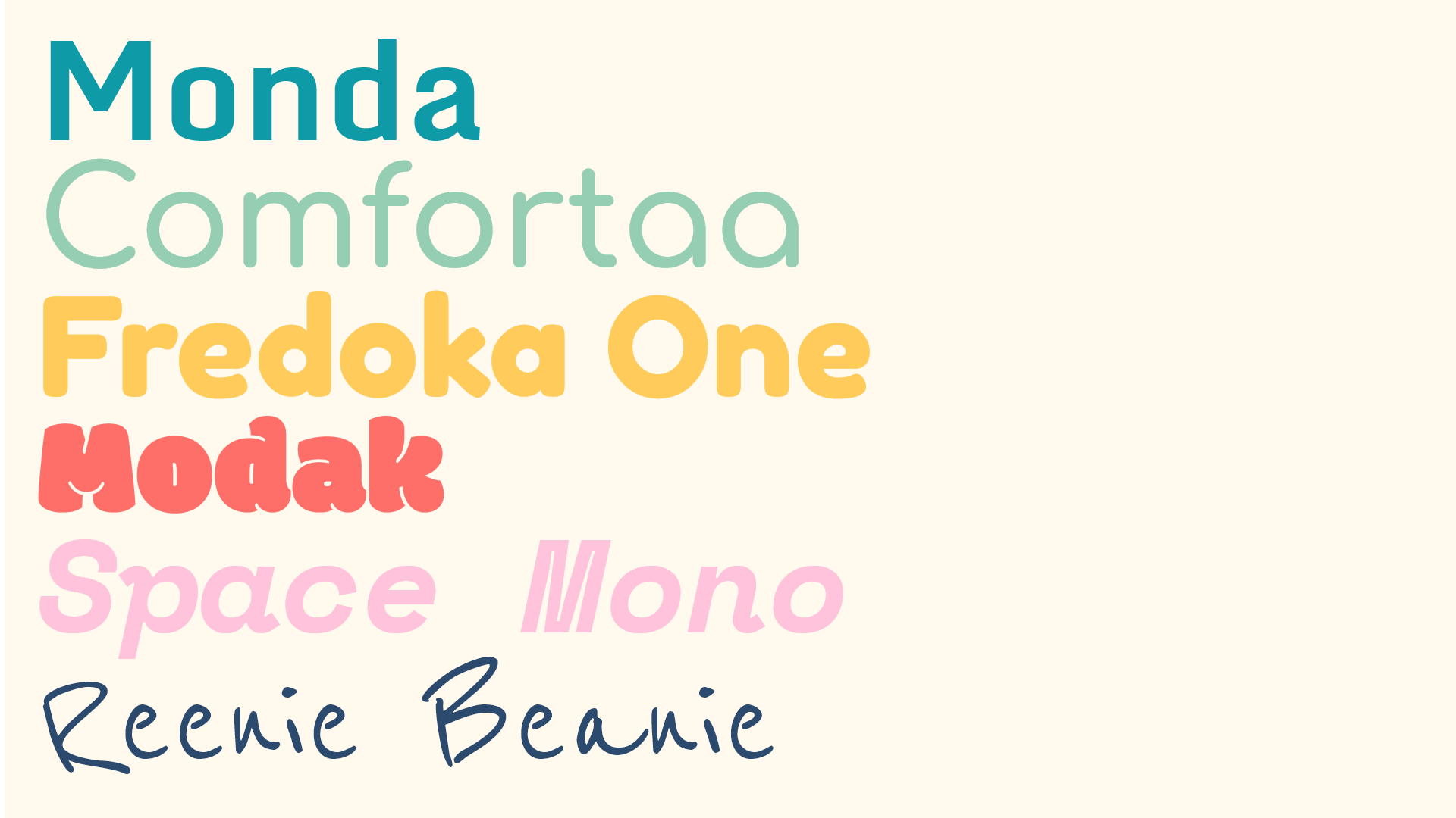
I tried to get a range of fonts to see how different styles would look and play with the boldness and italics of the text. I liked how the Comfortaa font looked as it was very smooth and round and quite modern, whilst also having a sort of vintage feel to it with the round lines of the text and felt this one would be the best for any body text on the designs. I also really liked the Fredoka One font that I found as a title text as it felt really bold and like it would stand out well against any collage backgrounds within my designs. I did like the font Modak a lot for the Indigo title text but I felt it was a bit too complex and would distract from the designs that I was creating too much so I decided that I would go with the Fredoka One font.
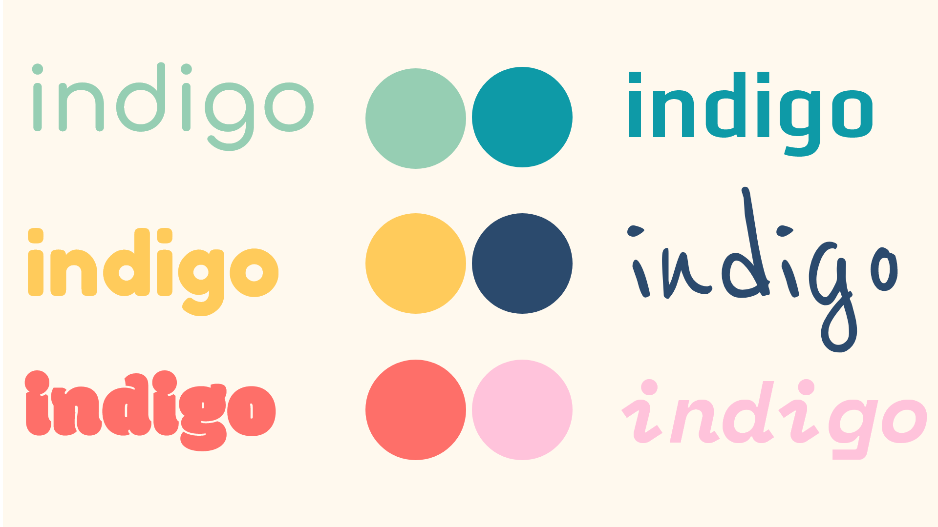
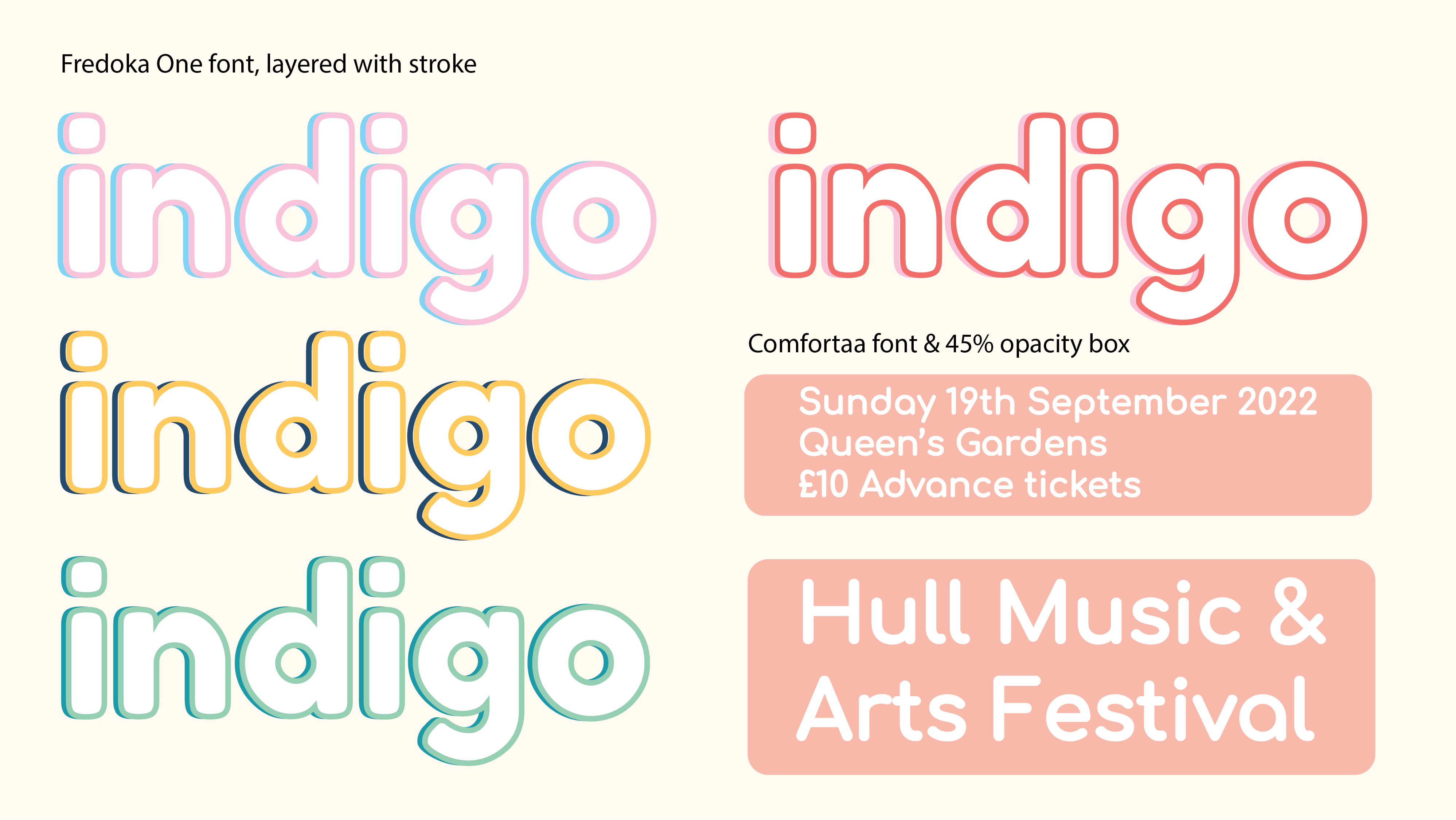
For the Indigo font I decided that even though the Fredoka One font was the best I was going to play with the stroke and colour to make it look a bit more interesting within the designs. I did this by layering 2 copies of the text over each other and adding a stroke to both of them. This allowed me to add an almost 3D look to the text and make it look more complex and use more colours on it. I decided that white text would be the best for the project to make it bold and stand out, for the body and the title text, and that the stroke colour of the title was the best way to play with colours and incorporate it into the design and make it feel personal to that specific poster.