
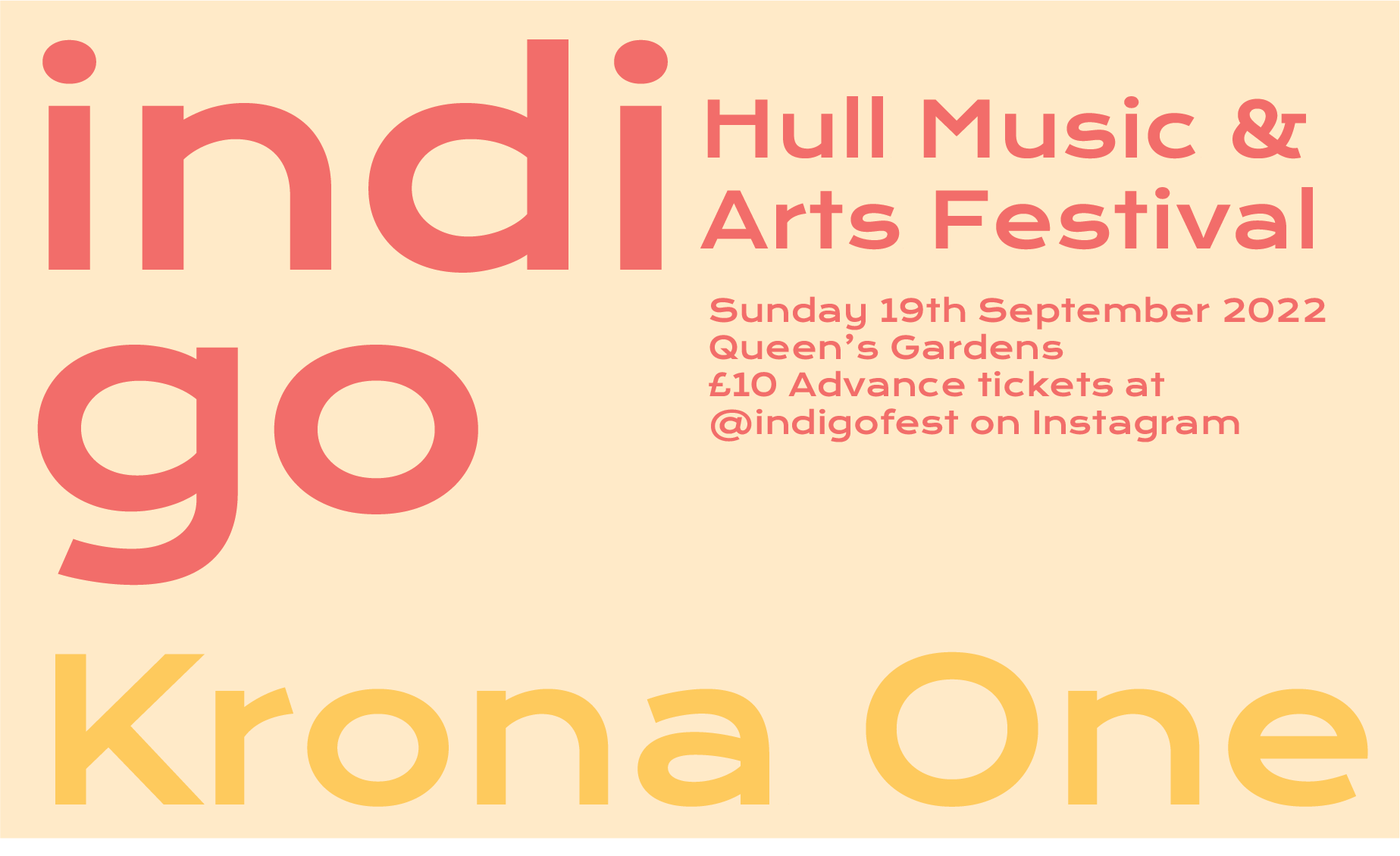
Even though I had the fonts for my project chosen, I wanted to try something a bit different just to see where this would take me. I used the font Krona One for this font experiment on my poster and took my initial design and applied this font to it in a different way. All of my previous font choices were very round and soft looking and fit with my theme really well, but I wanted to try this font as it is more square and sharp than my previous choices so very opposite.
I decided that as I was making an experimentation piece for one of my posters I decided to do something really different with the text placement. I took the title of the festival and split it into two lines, calling back to the origin of the festival name being a combination of indie and go, and made the font large and take up a large portion of the design. I chose a stark white colour for all of the text with no stroke or background grounding shapes as I felt the contrast between my rounded soft shapes and the sharp rectangular letters was enough of a contrast to make the text distinct and legible. I used the same font for the sub text on the poster and left the positioning pretty similar to my original designs. I moved some of the image elements around and placed the smiley face stickers behind the letters to add some interest and something different to the design.

After doing this I think I made quite an interesting outcome. I like the boldness of the font and how it looks but I think it doesn’t actually fit very well with my overall themes and the styles I want to include in my posters .The font leaves the image very open and clean looking and quite empty compared to the layered collage style I am going for overall. However I think this was a useful exercise for me to partake in as it allowed me to see a different way my designs could have gone and solidifies my choice for a softer font as I have seen the alternative.