
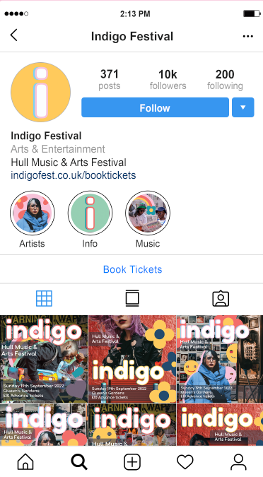
I decided that a good next step with my 3 final designs and their social media variants would be to place these in situation to really get the full effect of the digital presence they would have. Before starting this however I decided that I should make some icons use within the Instagram mockups I was creating. I created these in a square size to make them universally useable for anything I may have needed. I created 4 variants for this, two with just the letter I for Indigo on them and 2 others with images similar to those of the posters. I really like all 3 of the icons I created using my colour scheme, font, graphics and photographic assets and I think all of them turned out really well. I do however like the yellow I design and the first one with the rainbow the most as I think both are striking in their own ways and can be used in many ways.
Once I had these images created, I set to editing a screenshot of the Instagram app to resemble an account for the festival. I used photoshop to construct this mock up of an instagram profile for the festival and tried to make it look as realistic as possible. I used the yellow icon for the profile photo and ended up using the other 3 for highlight reels with more information accessible about the festival for the audience. I kept the description simple and added the link as mentioned on my posters so that the profile looked complete, from here I added in my instagram sized design assets and placed them as posts on the feed, I think this looks like a convincing instagram profile and is really able to capture the essence of the festival I was trying to go for in my research.
Below are the post mock ups that I created for the festival, showing off the designs I have made and how they would be used in context of advertising the festival to the intended target audience from my research. I really do think this was an important further step in my design process so I could see how the advertisements and their information come through in a real situation that they would be viewed. I created 6 of these design mock ups to show how each of my designs would look in the context and I think all 3 of my design themes are very effective and the colours are striking and eye catching, matching together into a cohesive advertising brand whilst also staying individual and memorable to themselves. I think the use of an ongoing colour palette used throughout the designs and the consistency of the sticker graphics, it really pulls all the designs together.
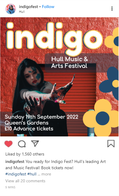
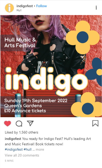
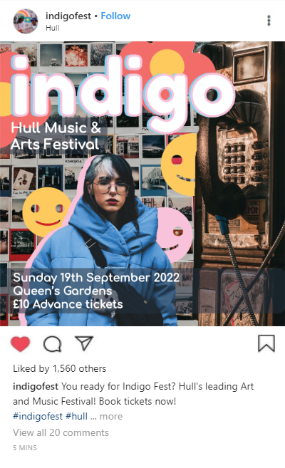
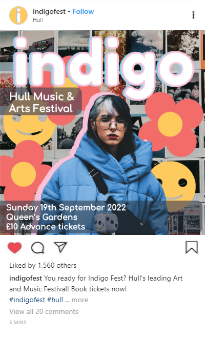
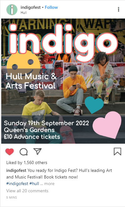
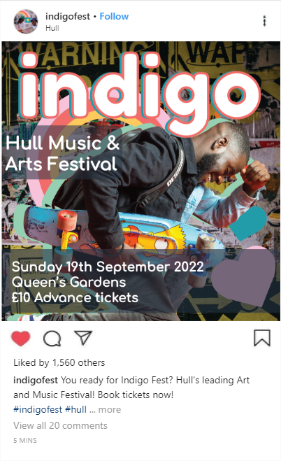
Image References:
Adesina. D, 2018. Woman in Yellow Coat With Black Crossbody Bag Closing Her Eyes. [online] Available at: https://www.pexels.com/photo/woman-in-yellow-coat-with-black-crossbody-bag-closing-her-eyes-833052/ [Accessed 8 April 2022].
uncoveredlens, 2019. Photo Of Man Bringing Radio. [online] Available at: https://www.pexels.com/photo/photo-of-man-bringing-radio-3620411/ [Accessed 9 April 2022].