
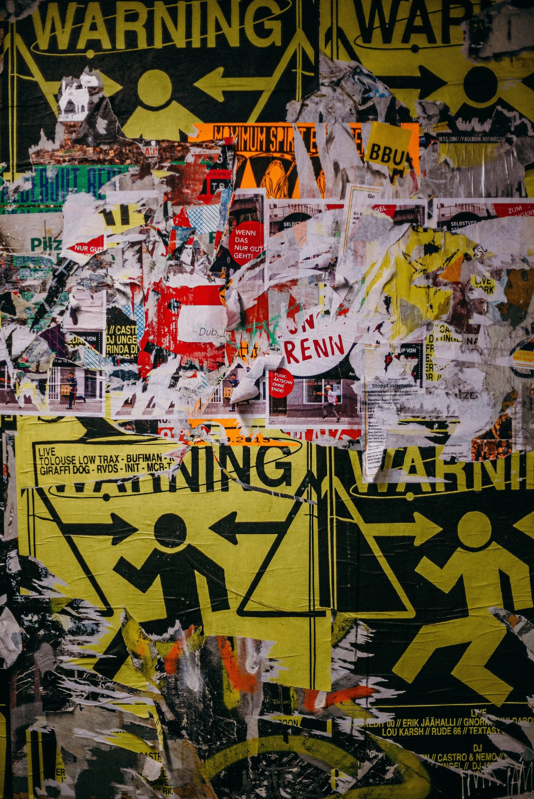
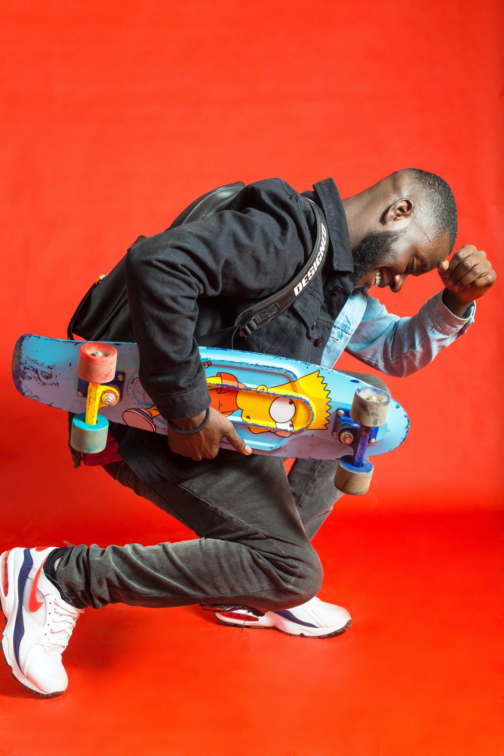
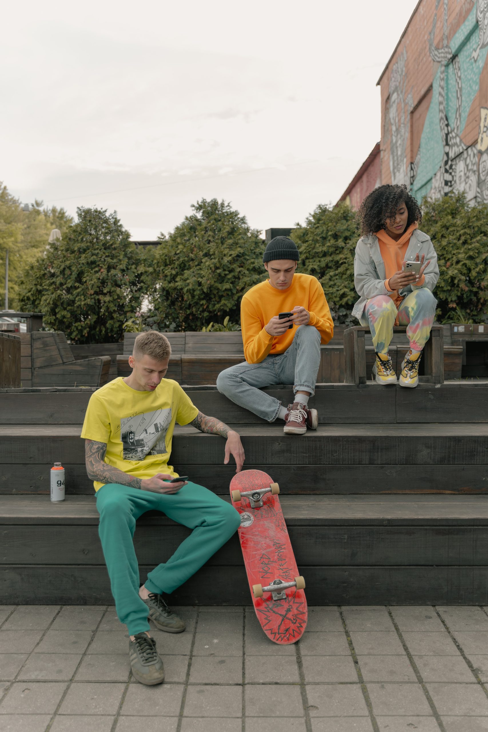
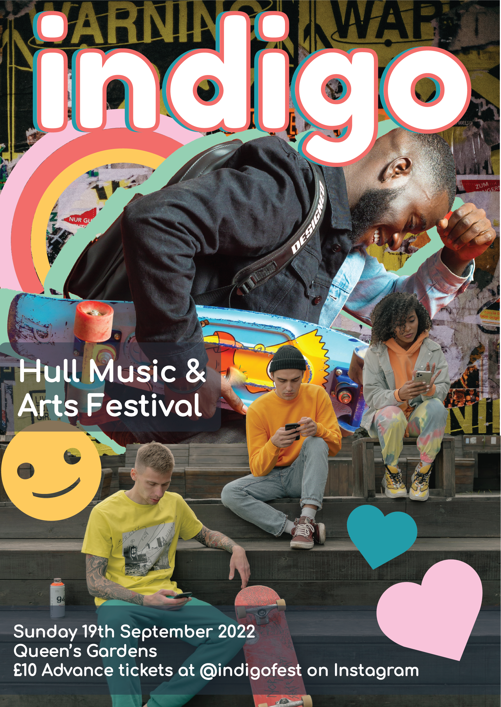
For my 3rd and final design for the festival’s promotional materials I first started by choosing my images that I wanted to use and liked the look of. I chose some images with skateboards in to tie them in together. All of the images I chose for each of these designs was carefully selected as I wanted the modern style vibes of each image and the right aesthetic for my overall target audience to appreciate. Once I had my three images chosen, one for the background and two others for the foreground layering elements I set to editing these last 2 images so I could start making my poster design.
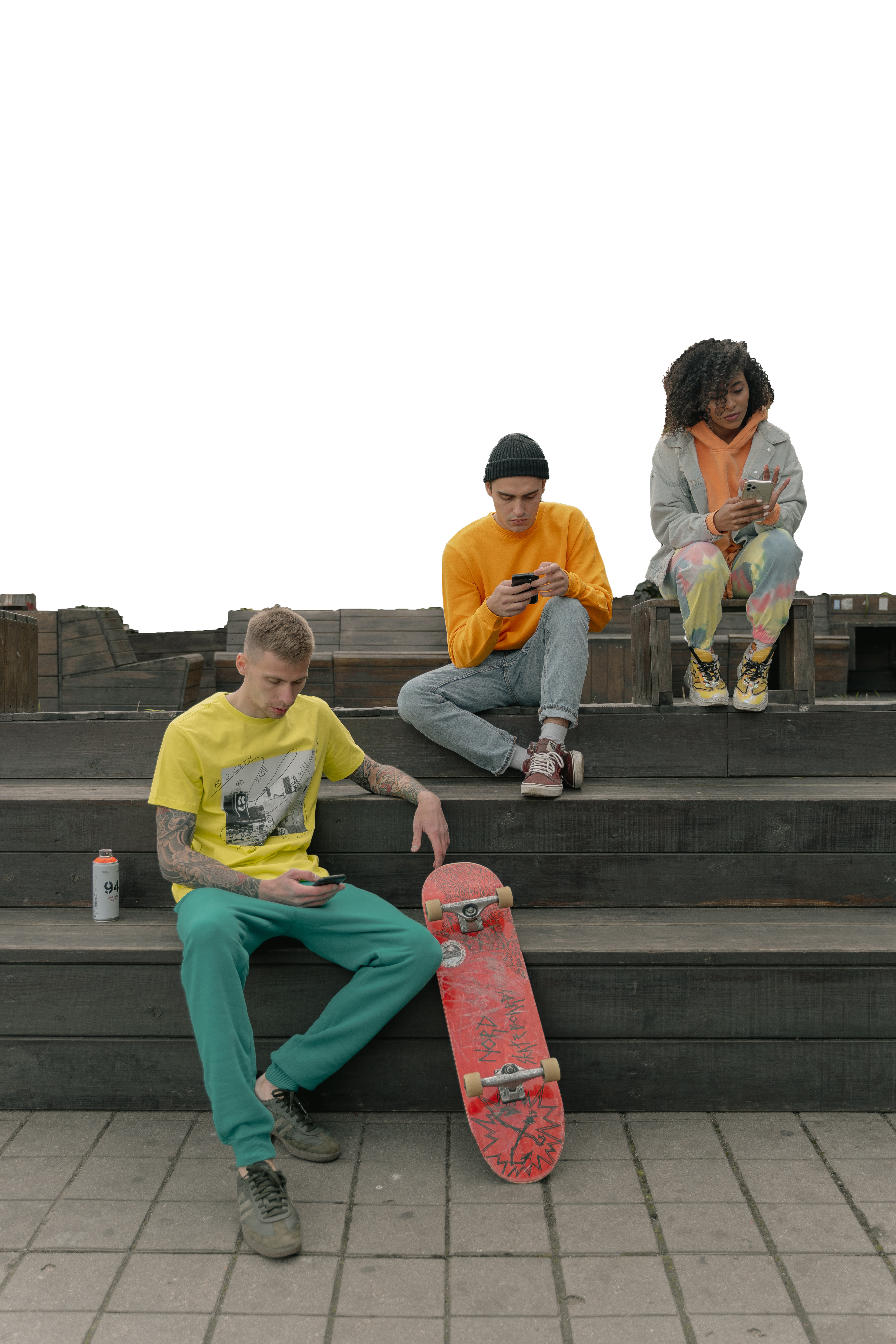
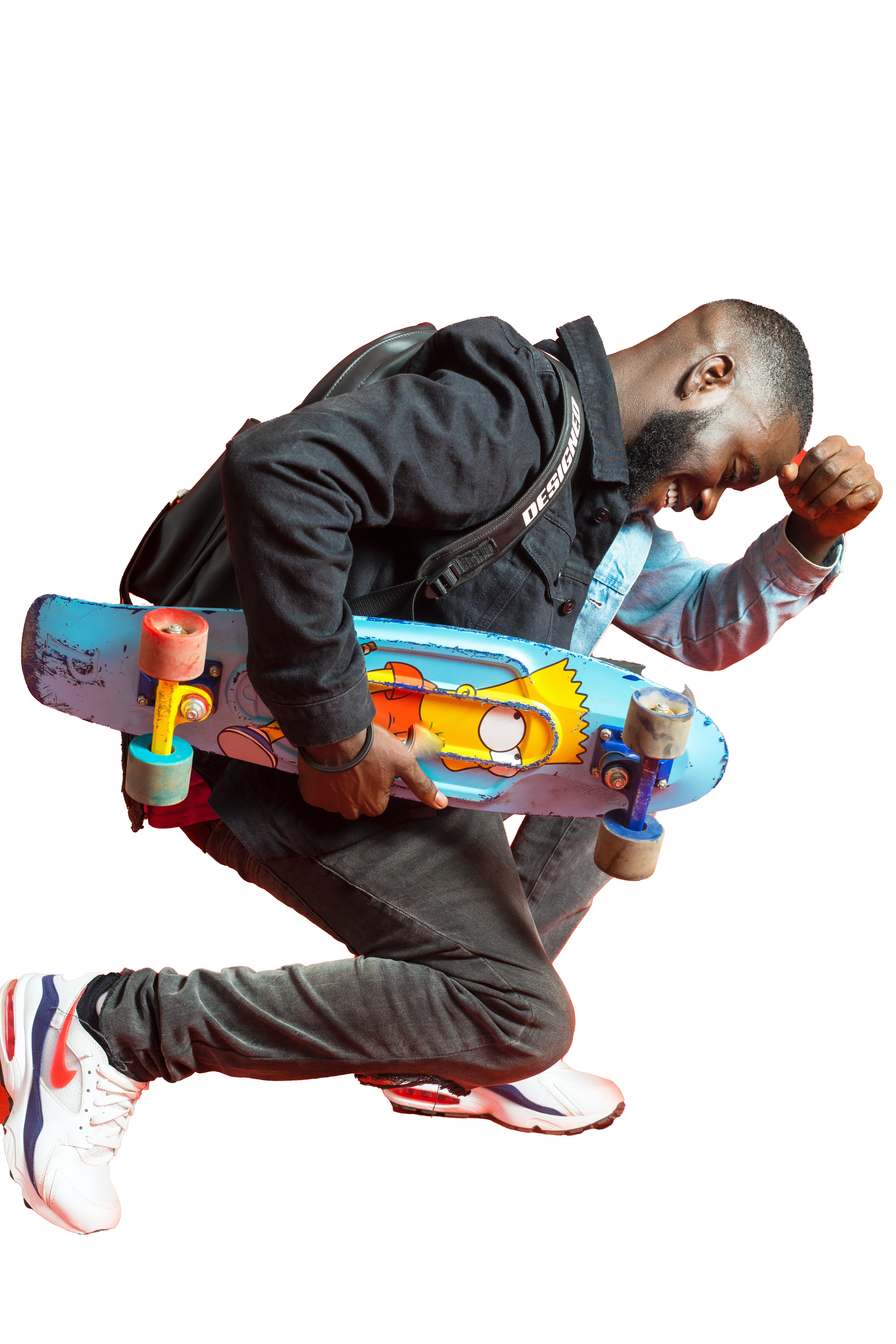
To edit the two images I took them both into photoshop and used the selection tool to select the elements of the background that I didn’t want within my design. Removing the backgrounds was an easy process as I used the techniques I had previously used in my other designs. For the image with the Simpsons skateboard, this was quite hard to edit with the background being red and reflecting onto the subject making it difficult to cleanly select the image so I had to make some adjustments with the eraser tool to make sure the image was clean and looked professional. For the other image I decided not to remove the flooring and the steps from the image, only the top portion of the background. I felt this would give a cleaner overall design and allow for more dynamic layering within my design piece.
Now that I had all my images prepared to create the collage I took these into illustrator and started to play around with all the different images together to see how they looked best. I decided on making the image with the people on the steps the foreground images and then the other figure the middle centre of the image to draw the most attention. I then added in the logo on top of the guy layering it in front of him as I really liked how the curve of the G in the logo fits within the image, I chose the blue and an orange for the title as I hadn’t used this combination yet on any of my other poster designs. Once I added the title and the bottom text from the other posters so it would match, I then referred back to my sticker document and chose some smiley faces and hearts to put into the document. I felt this was looking a bit plain at first so pulled the idea of an outline of the figure from my first document and applied it to the main figure in this poster design, I decided to use the green from my colour palette as I didn’t really find another place to fit it and I think it has a fun contrast to the piece whilst matching with all of the blue and yellow tones. I also decided to add in the rainbow sticker decal as well to balance out the poster and fill the empty space, adding to the collage effect.
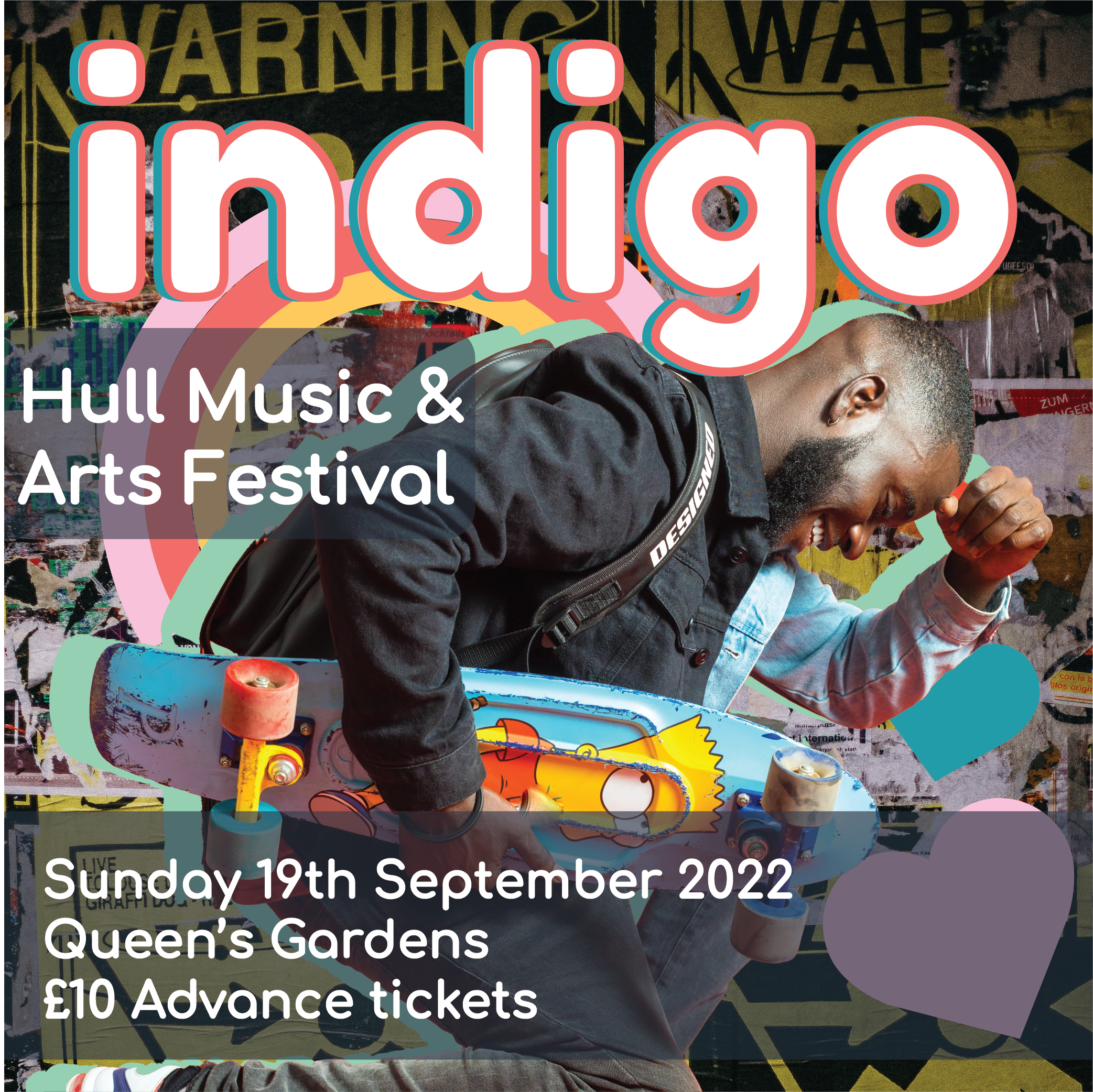
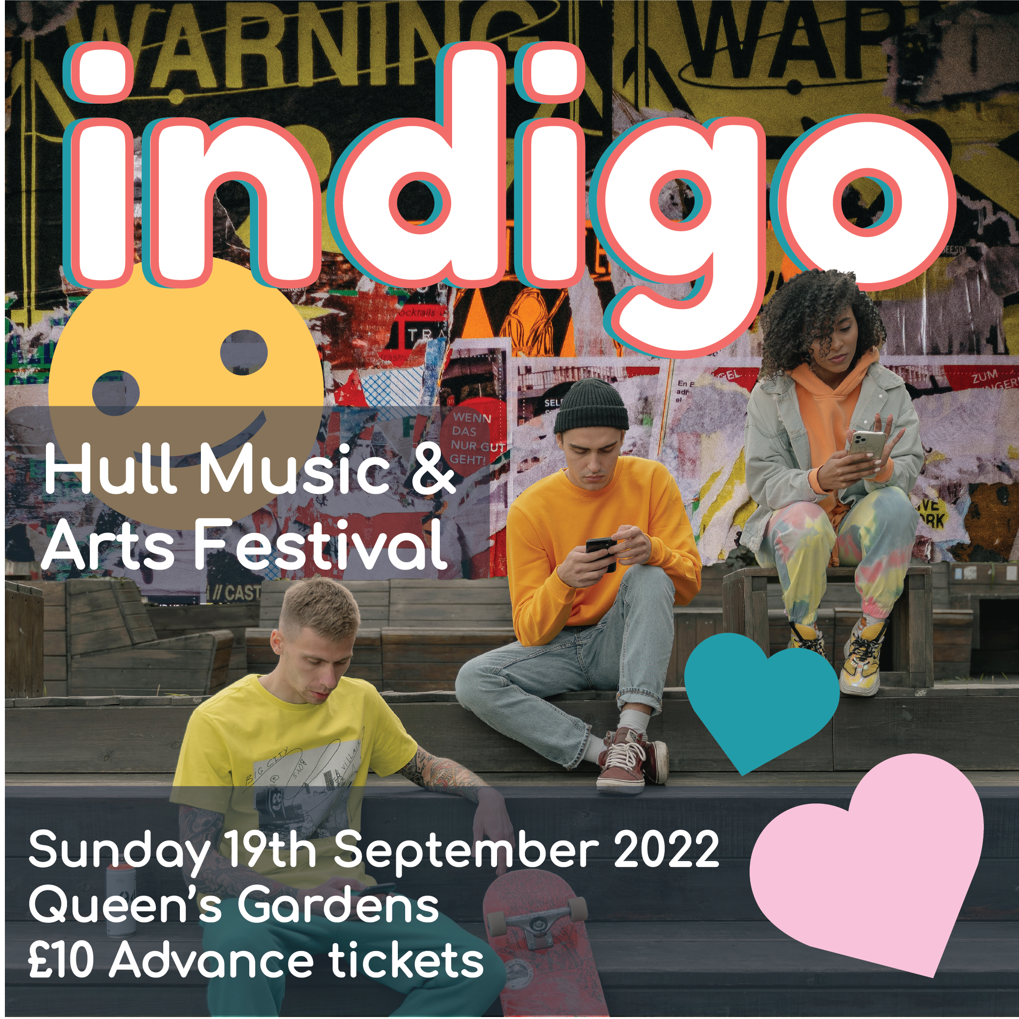
Once I had this main poster made and all the additional elements in place I was happy with the outcome and proceeded to create the instagram/social media sized digital materials. I created these in a similar way to how I made the ones for design 2. I decided that each one would have one of the foreground images on it so that they could really be the focus individually to show off the design elements. I created these with the same text as the previous designs and added one image onto each ad. I think that these look really effective and interesting and draw the users eye to them in their own ways with the fun bright colours and cool stickers.
After these two social media sized designs were complete I set to making the wider social media story style advertisement. I again used my previous designs as reference and the assets from my existing design 3 pieces. I actually layered these very similarly to my initial poster as I did really enjoy the layout and felt it was the most effective way to display the images and information. Overall I think that I enjoy design 3 the most out of my 3 designs and their assets. I think that this 3rd one really combines the things I like out of the others and is really one of the strongest design sets, making use of my whole colour palette and having the most visually striking images of the 3 posters that I created.
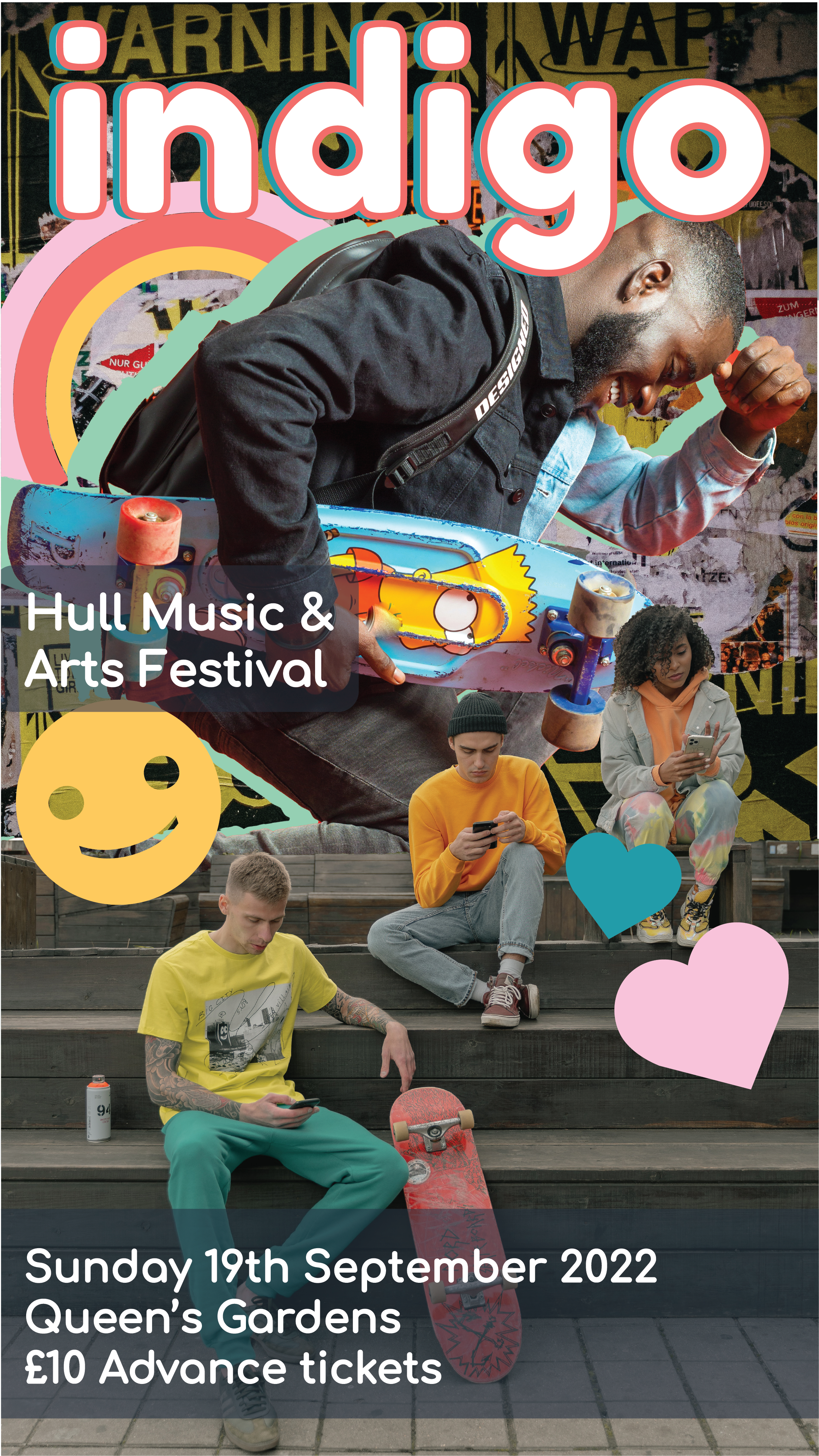
Image References:
cottonbbro, 2019. Yellow Black and White Batman Logo [online] Available at: https://www.pexels.com/photo/yellow-black-and-white-batman-logo-4547587/[Accessed 6 April 2022].
Boakye. P, 2018. Men’s Black Leather Jacket. [online] Available at: https://www.pexels.com/photo/men-s-black-leather-jacket-1813947/ [Accessed 6 April 2022].
Miroshnichenko. T, 2020. A Group of People Sitting on Wooden Bleachers Holding Smartphones. [online] Available at: https://www.pexels.com/photo/a-group-of-people-sitting-on-wooden-bleachers-holding-smartphones-5560297/ [Accessed 6 April 2022].