
Before starting work on my own redesign for the iHull app, I actually wanted to look at the existing one and see what this app manages to do well and what I think it does poorly in its design. I decided to look at the app myself first and give my own opinion on it, as I was doing this I also decided that I was going to have an unfamiliar user, one of my friends, look at the app to get a different view point and will write this into a later post. I think getting 2 viewpoints and ideas will be useful and help me to better design a new app.
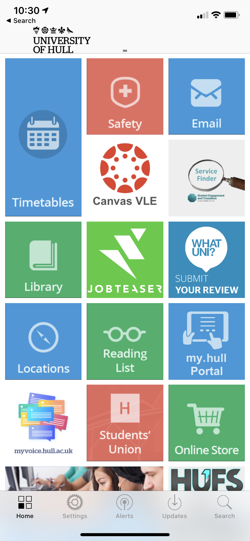
Below are some screenshots of the iHull app, the main page, the tabs at the bottom and what some of the tiles on the main page lead to. A lot of the tiles on the main page lead to websites and other things outside of the app and are useful in itself but in my opinion they are better designed than the ones that lead to in app pages and this makes it jarring to look at these pages as there is not enough modernisation on the current app. The transition from current recently designed web pages and the in app pages is quite apparent and makes the app look quite old. When I first got the app when I first joined the University I could tell really quickly that the app had not been updated in a long time and felt that the design looked really plain and simple and not very exciting. I actually at first thought the app had not been optimised for newer iOS systems as it looked quite old fashioned in design from apps I’m used to using. It was also really apparent that the current design and branding and colour scheme of the Hull University had not been brought over.
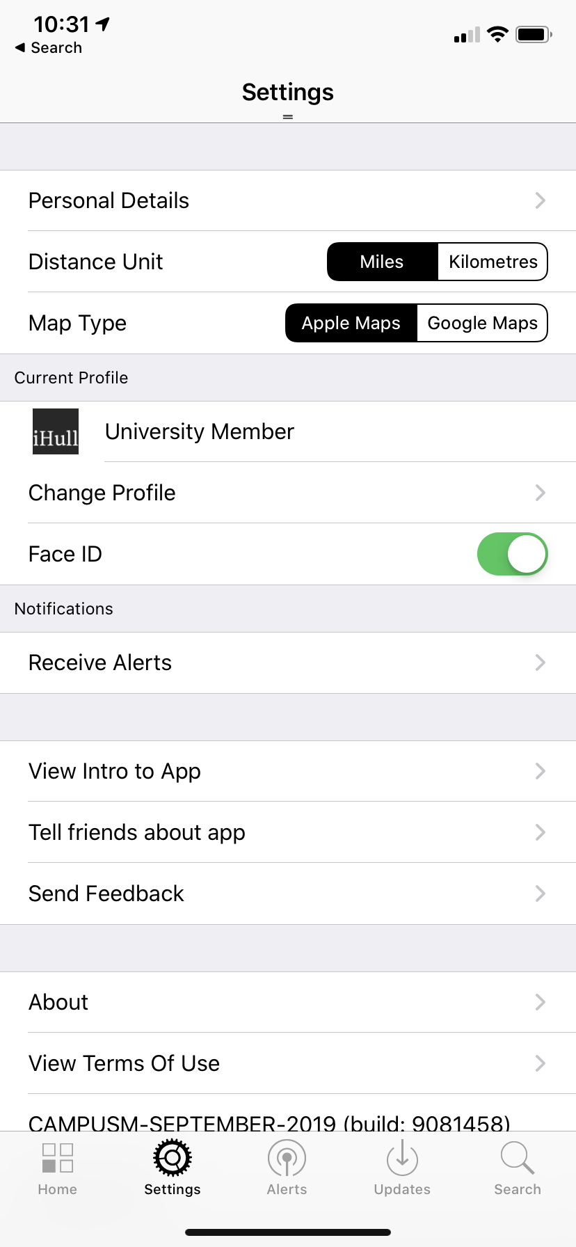
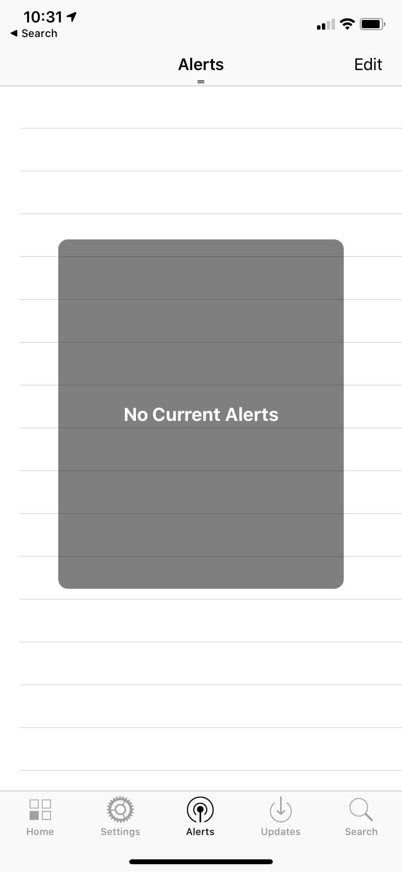
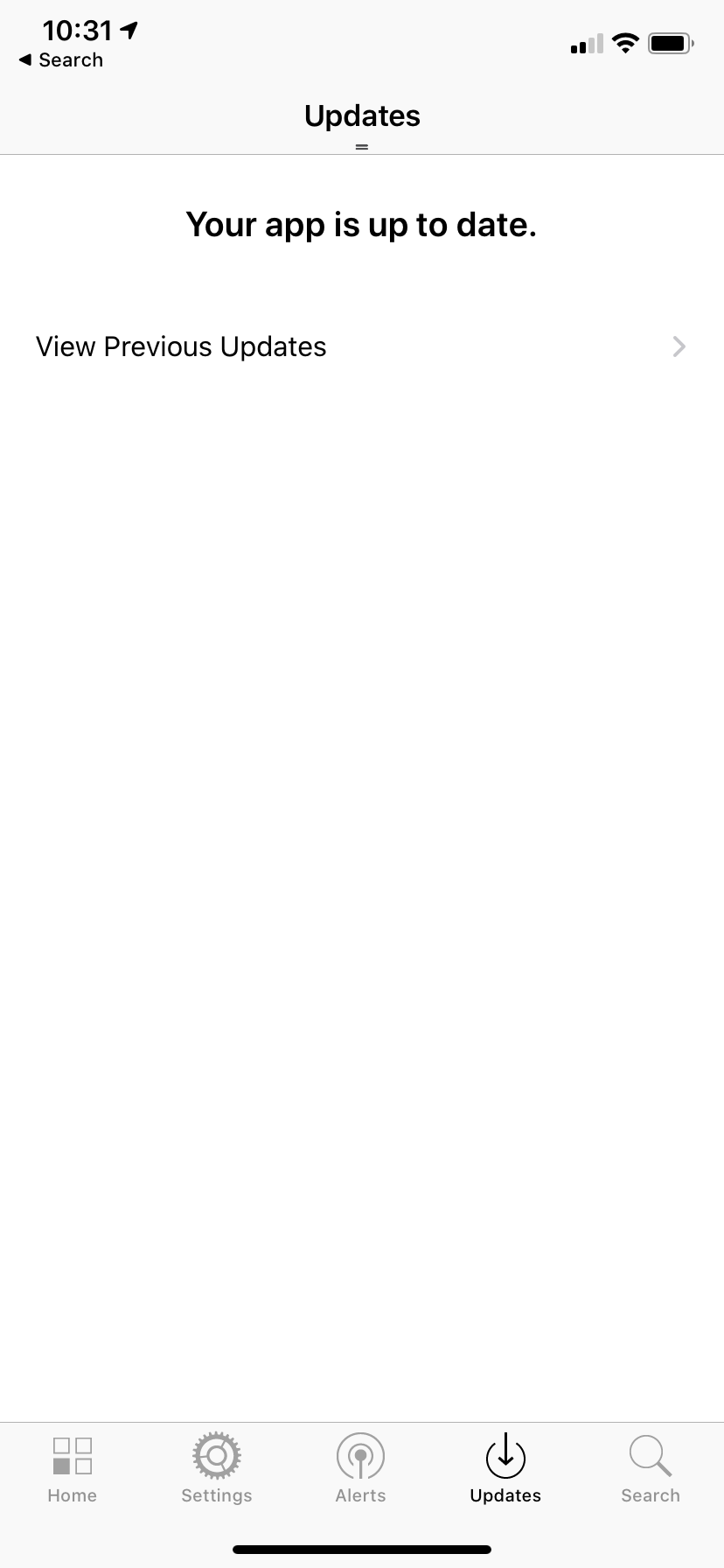
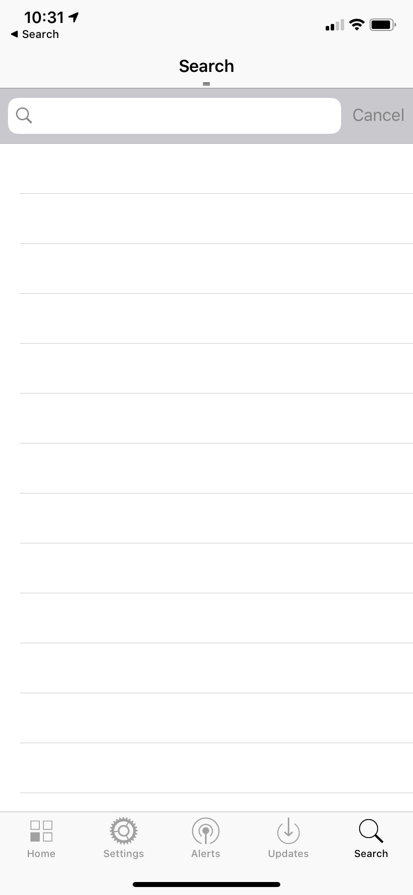
The app is quite easy to find your way around however I do not think all of the parts are necessary, especially to be on the main page. I only find myself using the timetables part of the iHull app as Canvas and email (the other 2 parts I may use) already have their own more effective apps and work better from there than from the websites generated from clicking the tiles in the iHull app. I only really explored the rest of the app for this task and taking the screenshots below. I never used the tabs at the bottom and I think a lot of them are pointless, especially the Updates tab. I’m not sure what the purpose of this tab is as it seems to be a place for patch notes for the app, but this for one isn’t essential information and also if it was needed it is on the app store on the app download page. It seems like an odd thing to have within the app itself.
The fact I am not using all of the elements of the app got me thinking about how I could customise the app to each user and have an option to pick the parts that they want on their home screen like a dashboard of essentials. Different users would use different things within the app and it would be a good idea to keep all of the elements and filter them like this rather than cutting away any parts of the home screen that people may find themselves using.
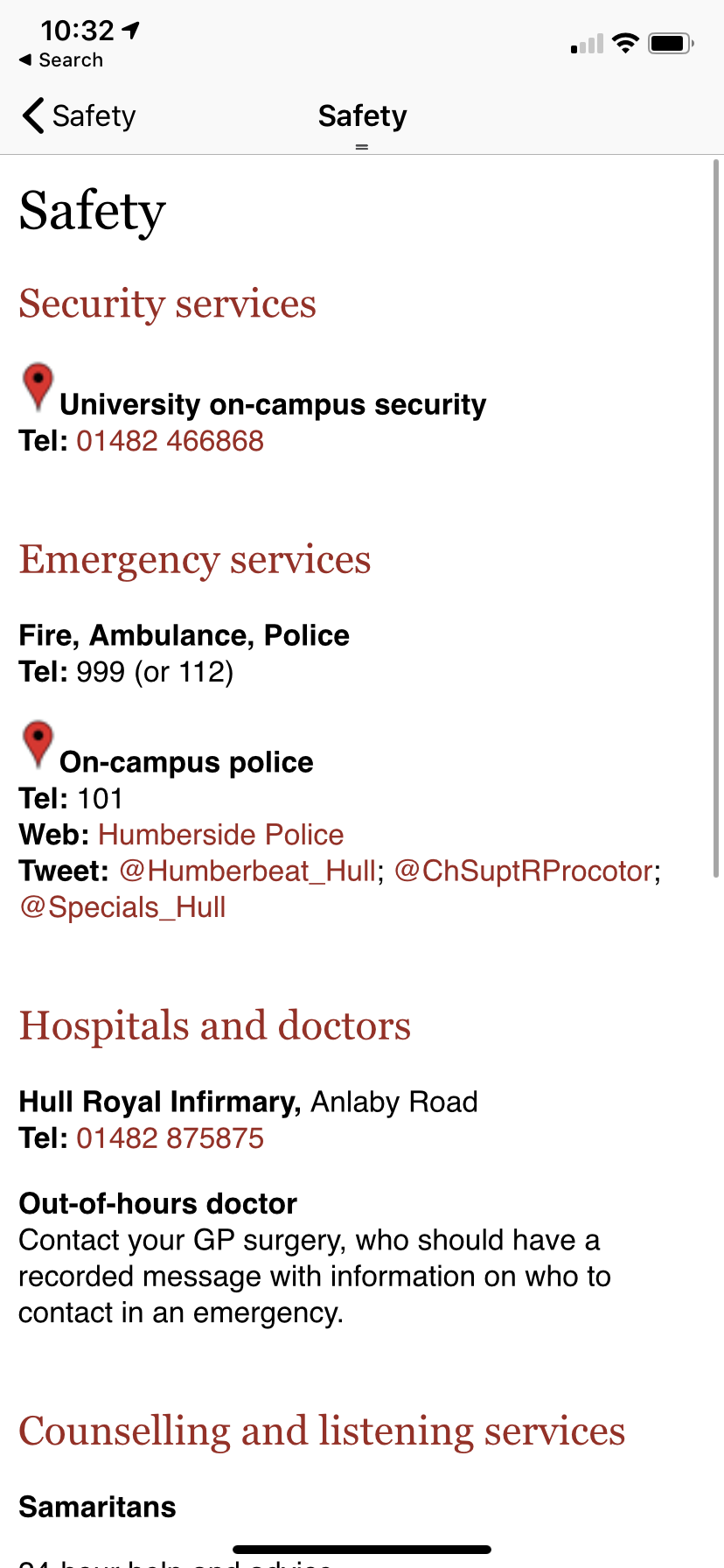
Another tab that I haven’t found myself using is the search tab as everything on the app can be found really easily from the tiles on the home page and searching isn’t really necessary with how the app is built. It also could have just been a search button at the top of the screen on the white bar instead of being its own tab on the app. My main issue with the app itself is that a lot of the tiles on the windows phone esque homepage just lead to simple white pages with typed text on them. For example the Safety page does this. This page just leads to a list of text, I think it would be a lot more useful if these were clickable links and useable phone numbers so that the relevant information could be accessed from inside the app rather than taking this information and transferring it to a web browser to search for these sites etc.
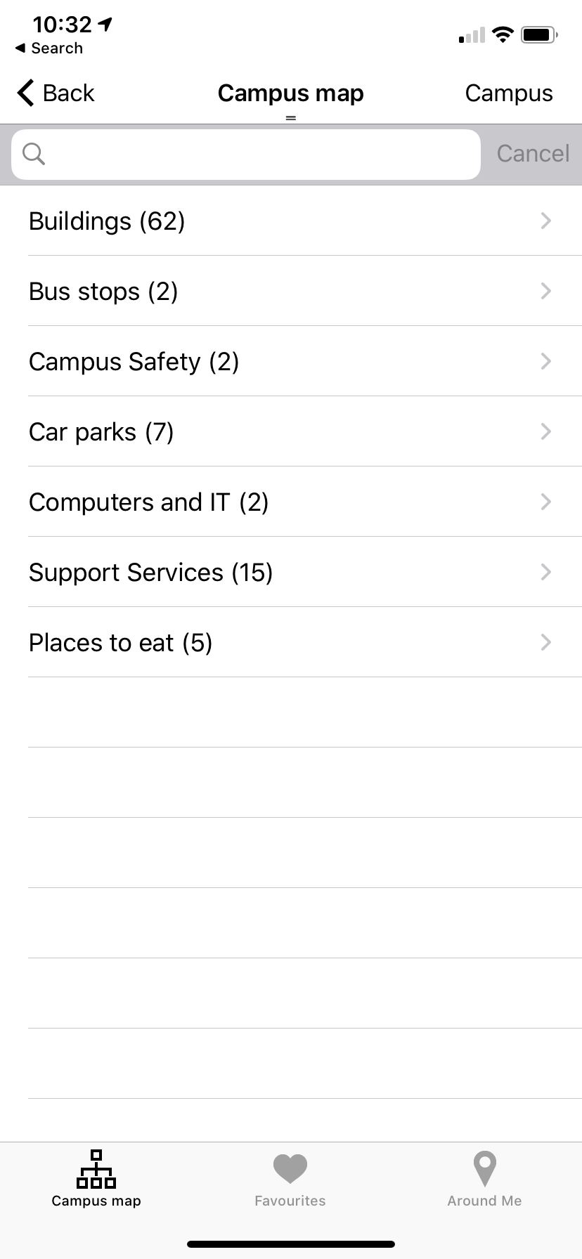
Another tile I do not like within this app is the Campus Map. When I first clicked on the locations tile I was expecting an interactive map of the campus or at least an image of the map however what greeted me was a list of places, within these another list, and finally once I clicked a location it showed me a pin on google maps and a grainy picture. There was an option for directions but you have to put in your own locations once this is clicked so t is not an effective system for locating buildings. An interactive map would be much more useful for this as currently you cannot see your current location, the exact buildings on a map (only a bunch of pins once you press campus) or even a clear image. It would be useful to see yourself on the map and almost essential to new students and users to find their way around the campus.
Overall there are actually more features that I do not like than the ones that I like. I will take all of these observations on board and compare them with my friend who is not a student to see how these differ and are similar and see if this helps me with planning out my app. I think there are a lot of things I want to change but some things that I do like, such as the fact not everything leads to outside apps and is native to the iHull app and the tile interface is quite nice however the style of it within the app itself does make it look dated. I will consider everything I have thought about whilst looking at the existing app and use this within my own designs.
Edit: Due to the current pandemic, I was not able to get together with a friend to have them test the app on my iPhone, I do still think that this would have been a useful exercise to undertake. I have chosen to leave this part in my blogpost as it is still part of my planning for this project .