
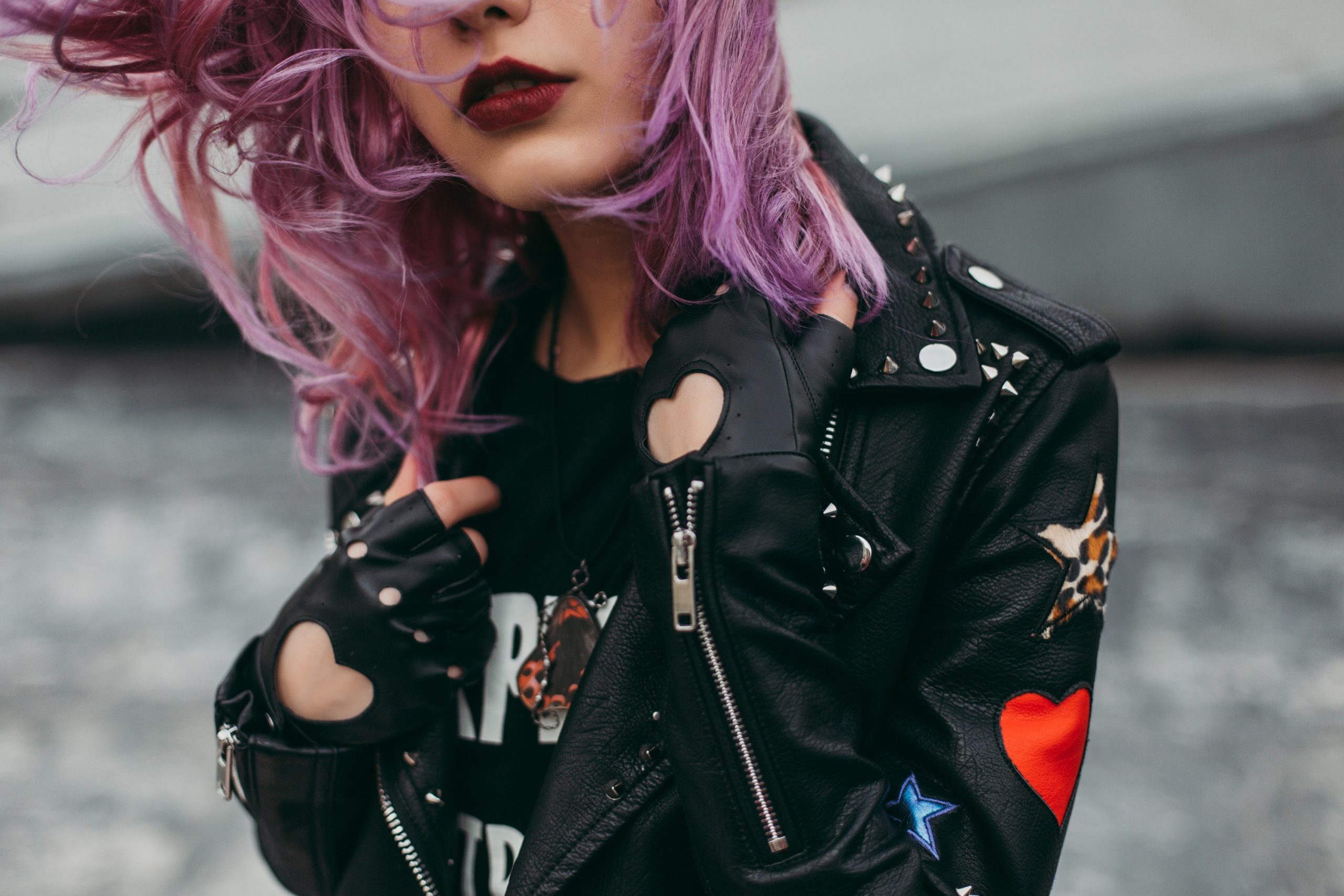
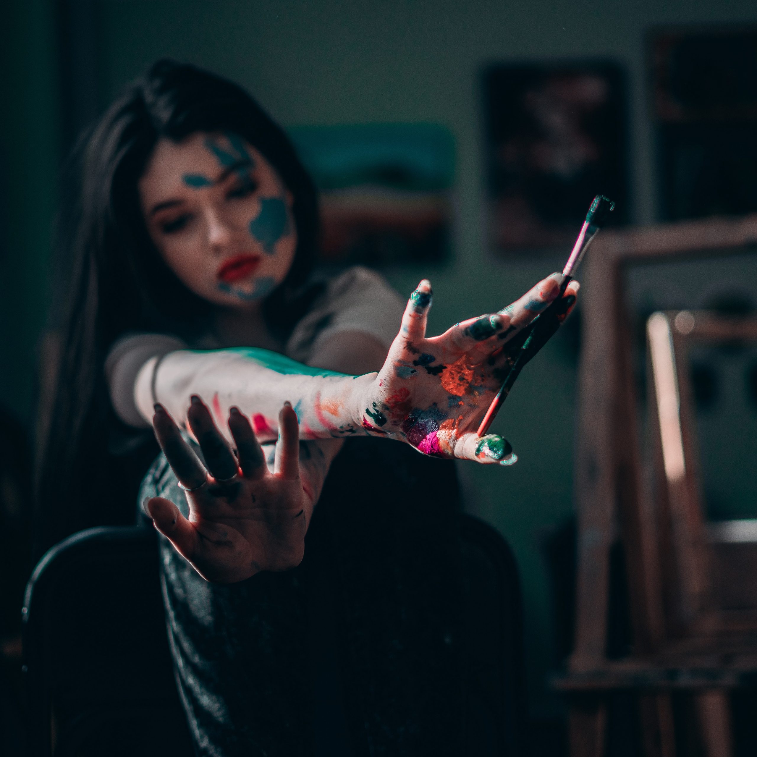
For this second design I had a much better idea of how my designs were going to be formatted from working on design 1. I first began with taking some of my stock images from my collection again and selecting 3 that I wanted to use on this second poster and thought would fit the best together. I chose one image for the background portion of the poster and two for foreground elements to layer with the graphics and text.
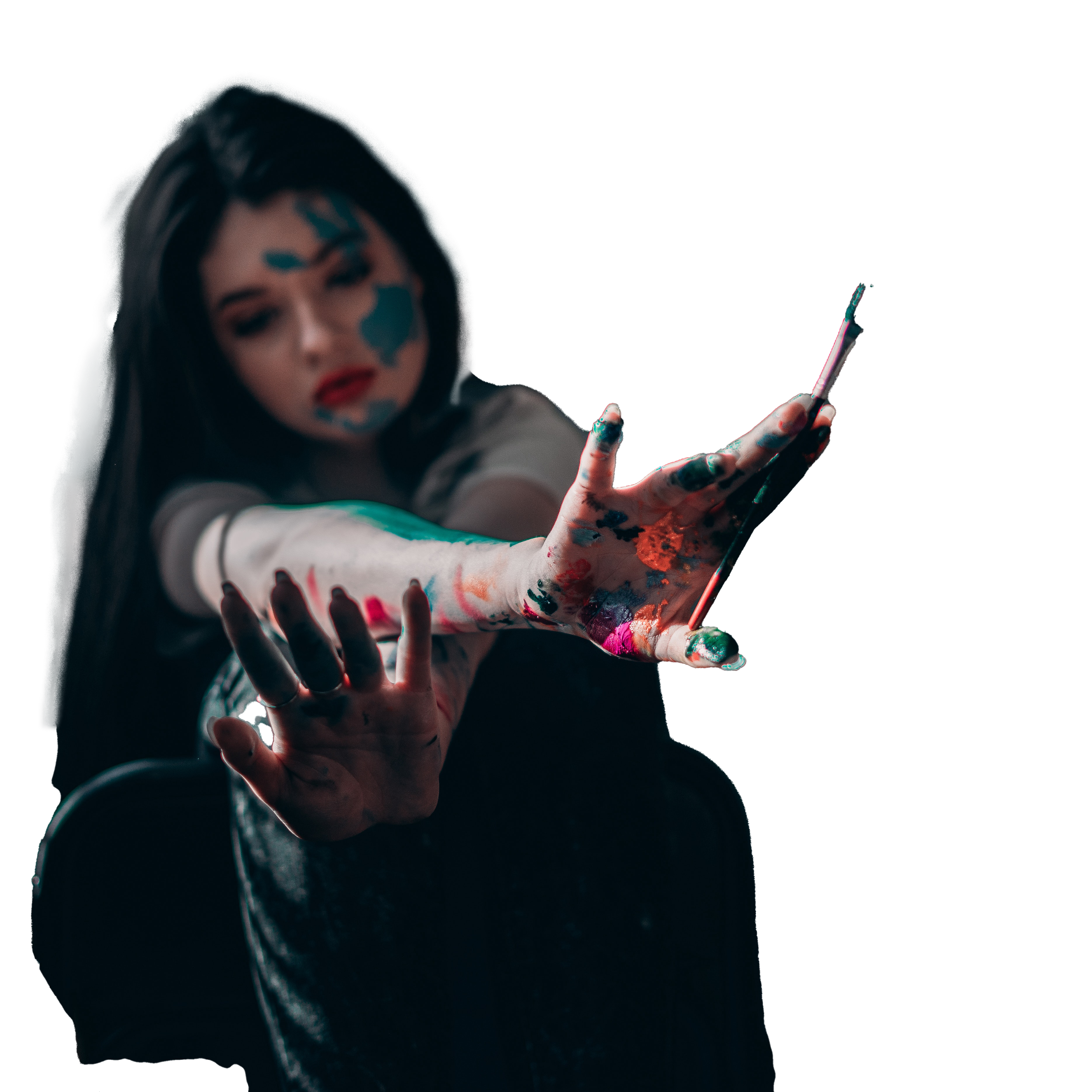
I then set to editing these images to remove undesirable elements and tweak colours etc to make them fit better into my overall designs. I first started with the foreground images so that I could work on perfecting them. I began removing the backgrounds on these images using the selection tool and manually selecting the places I wanted to keep, I then reversed this selection and masked the unwanted area so I could tweak it further if needed. I then used the mask in Photoshop to perfect the edges of my selections to make them clean. Once this was done I again, as in the first design, edited the colours a bit to brighten the images to make them clearer overall.
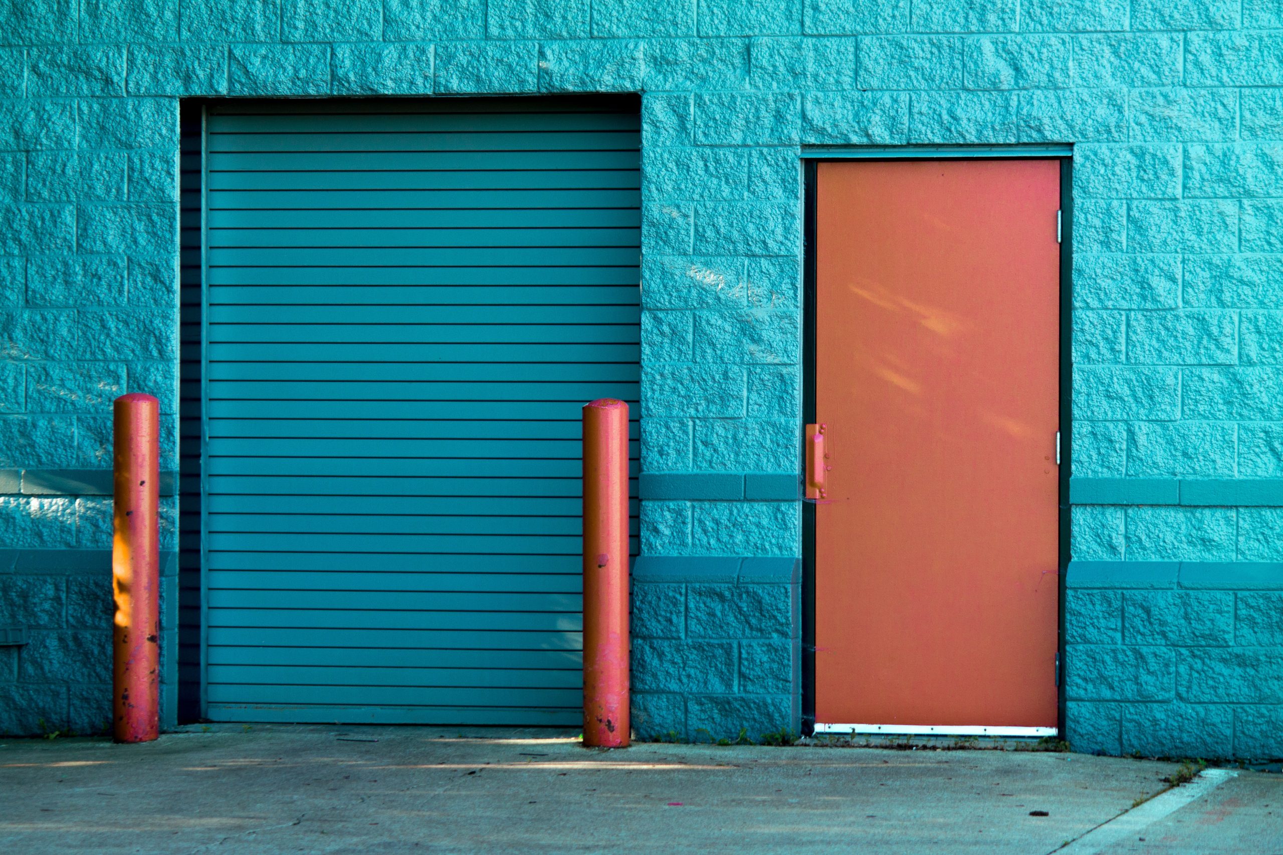
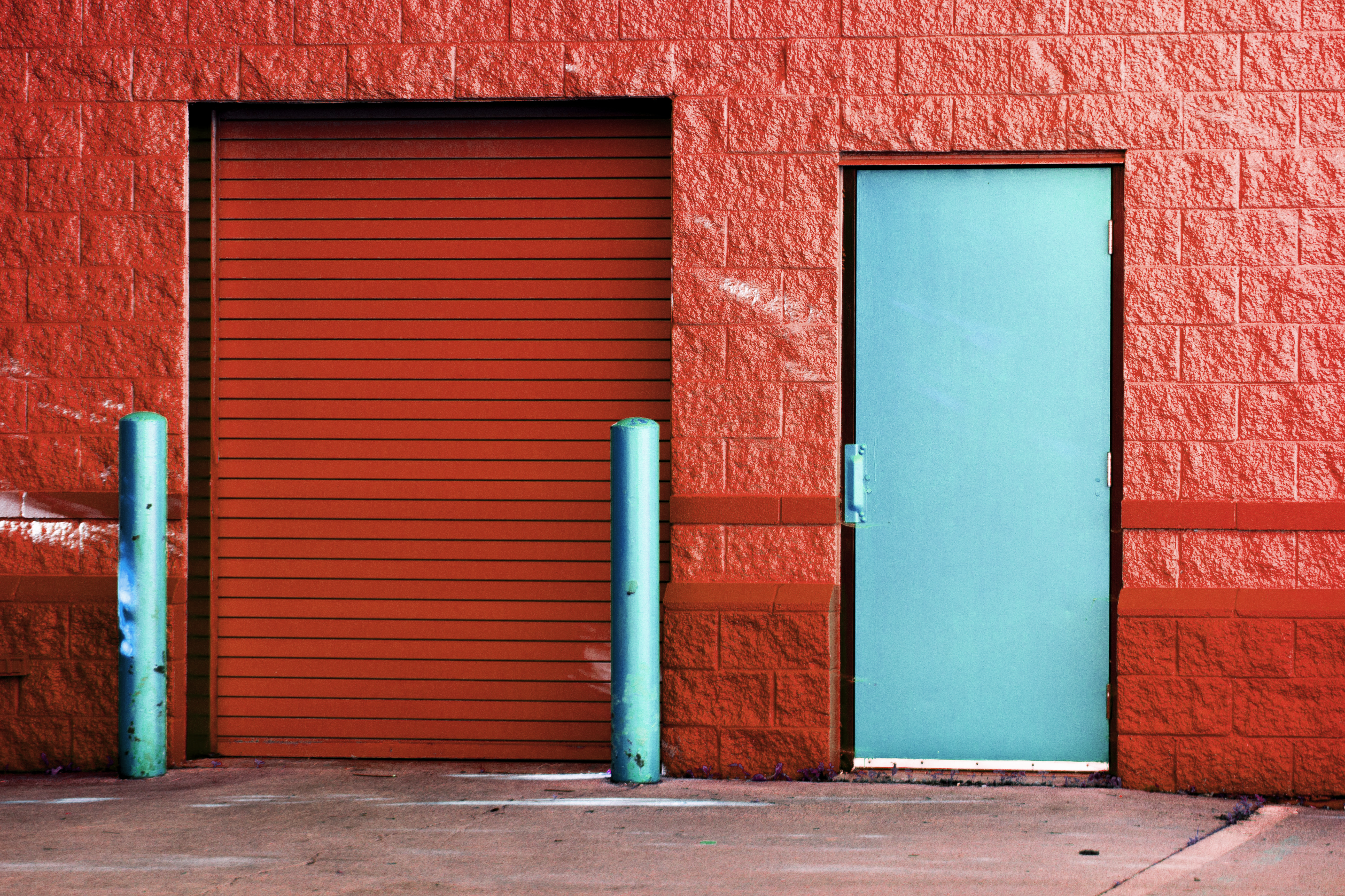
I then set to editing my background image which needed the most work to be closer to what I wanted for my design. I first actually worked on the colours of the image. I wanted to actually reverse them as my chosen foreground images were more warm toned with small hints of blue so I wanted the background to reflect this colour scheme. I used the hue and saturation tools to play with the image till I found a tone that changed the wall colour to a more orangey tone. I then took the image and masked off the door and post from within them and again used the hue settings to apply a blue tone to only these areas to essentially flip the colours of the image around. I think that the image looks a lot better with the colours being flipped over as it looks more warm and natural than the blue walls and it looks more in tune with my other design elements.
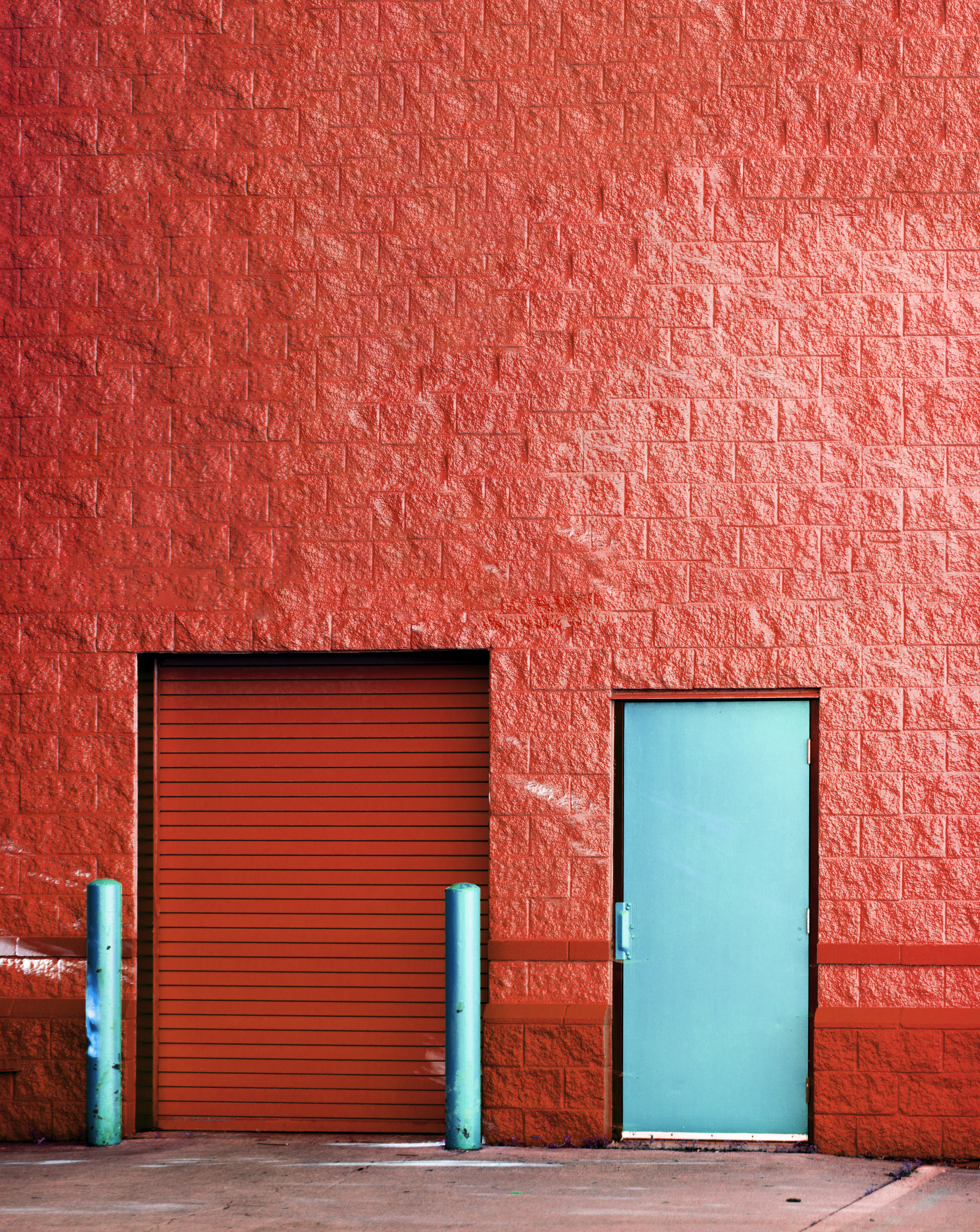
As I was editing the image to change the colours within it I didn’t like the actual size of the image and realised I wold probably have to zoom in in quite far to even get it to fill my poster size so I had to edit the image some more to extend it to make it easier to work with. I first extended the Photoshop canvas and then used the patch and clone stamp tools to add more of the wall texture to the space. It is not perfect but as it was to be a background image, some imperfections in the texture or repeating sections would not be noticed. I made the image big enough so that I had a lot of surface area to play with when finally making my designs.
Once the background was done I set to assembling the content together to make my poster design. I first added the background onto the poster size canvas and added in the foreground images. By doing this I could see where I wanted the images to go and where best the edges lined up. I decided that the purple haired girl looked best at the top and the other at the bottom at opposing edges to draw the eye through the design. I then referred to my colour scheme to pick the two colours I wanted to be my accents for the design. I ended up choosing yellow to contrast with the design and dark blue from my palette to match the blue elements present.
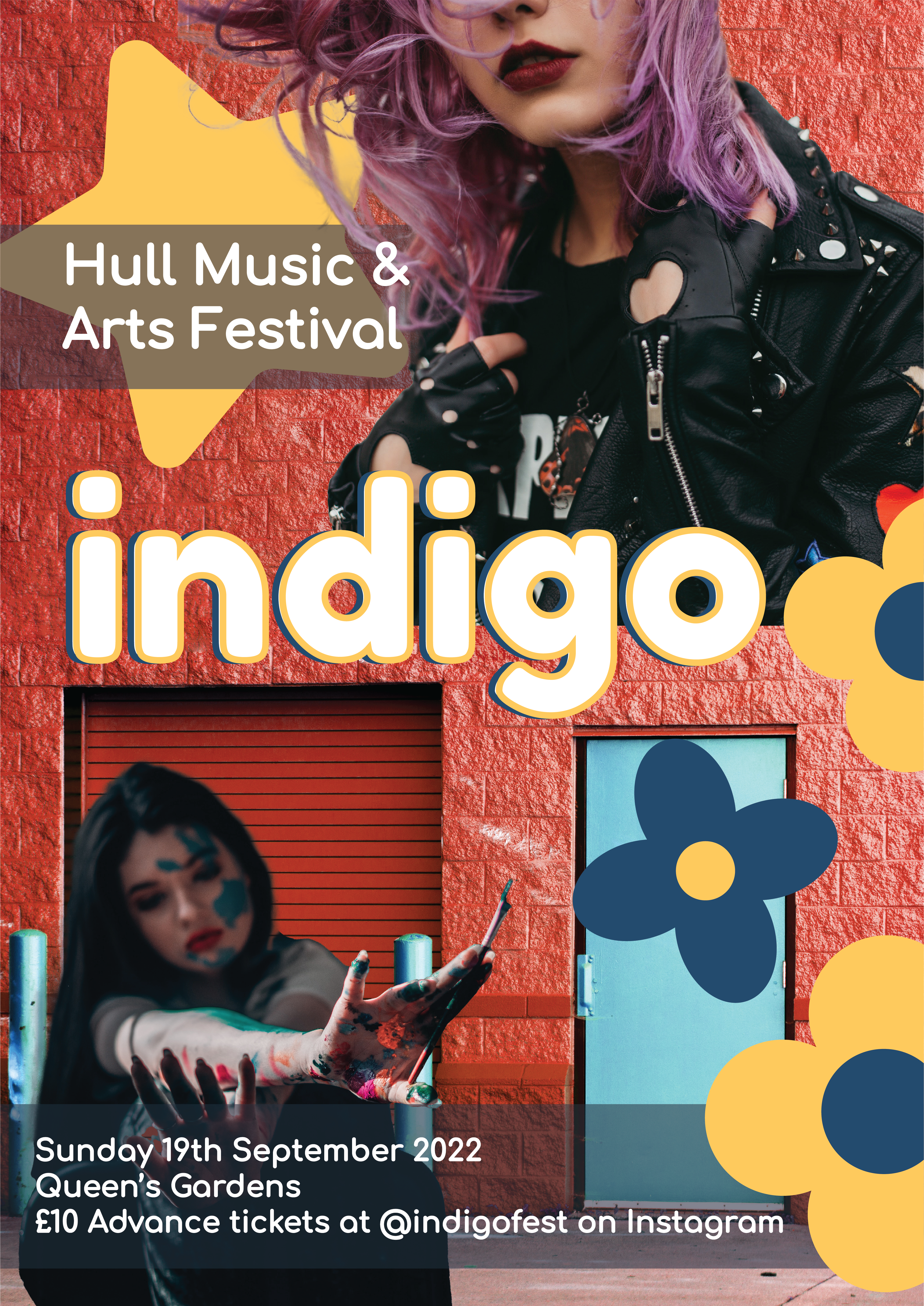
I chose to again add flowers to this poster design, but I added two different kinds to add variation to the poster and create a pattern to draw the eye to the poster. I added the sub text from my previous poster to this one, as I wanted all of the variations to have the same text and placed the larger text at the top and the smaller information at the bottom. Behind the top text it felt a little empty so I placed a star graphic there that I hadn’t used before which I think filled this blank wall space well and added to the design a lot layering with the girl at the top.
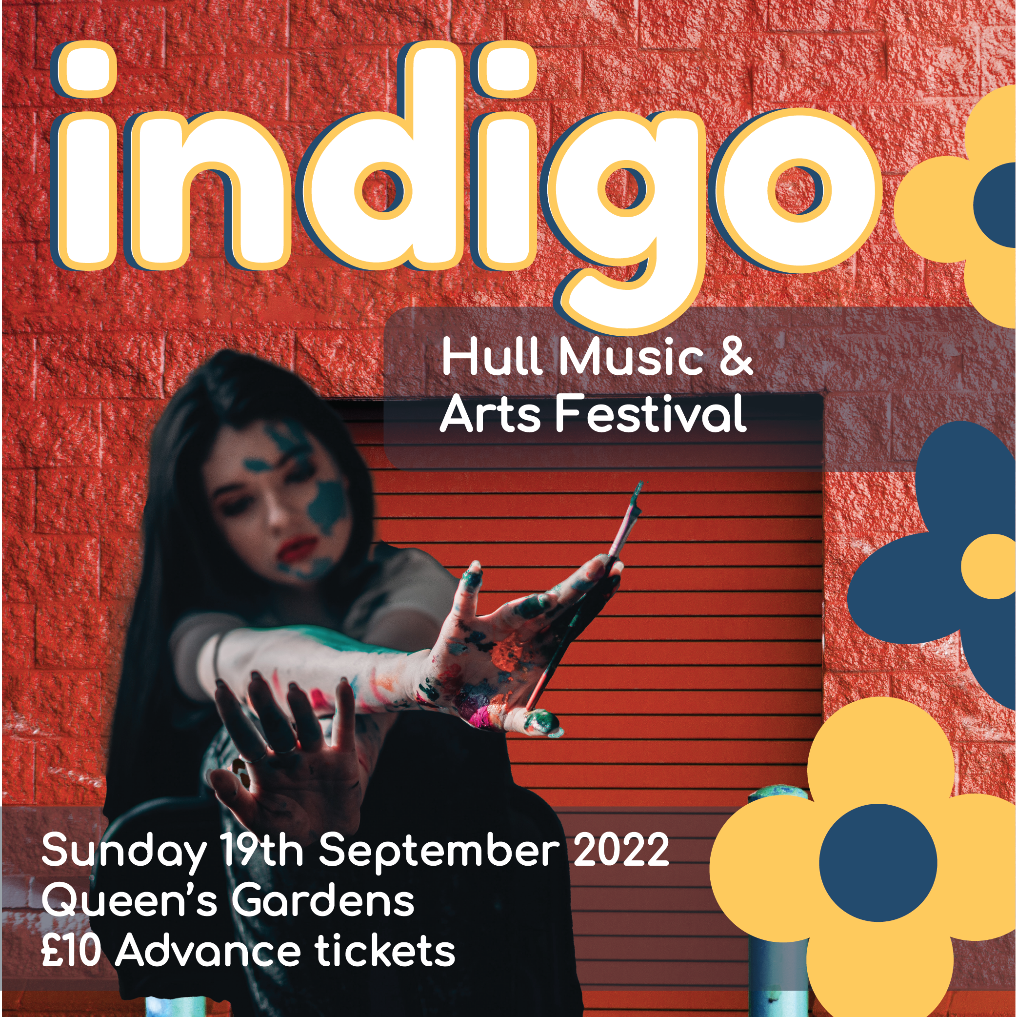
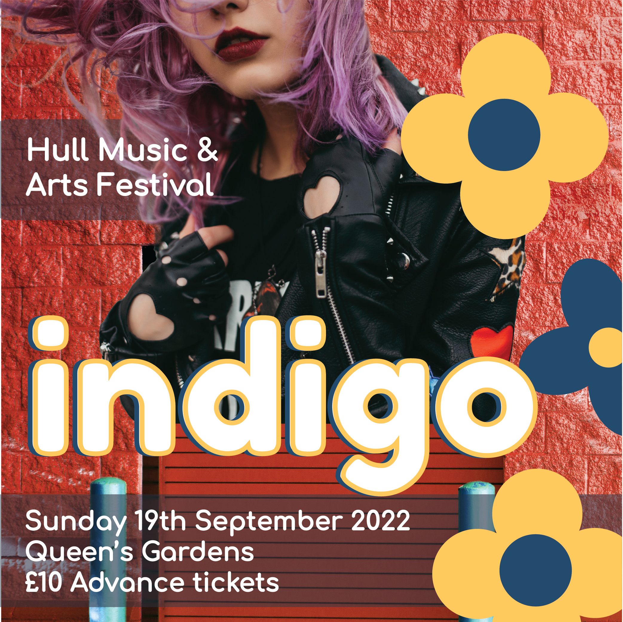
For the subsequent instagram variants of the poster I chose to make these advertisements using the foreground images individually to really draw attention to them and have 2 variants of these instagram post sized advertisements. I kept all the same graphic elements, text and background but tweaked the placement to fit with each of the foreground images. I really like both of them and think that the similar placement of the flowers in each, with everything else contrasting, gives a memorable look to these designs and ties them together whilst letting the designs be unique.
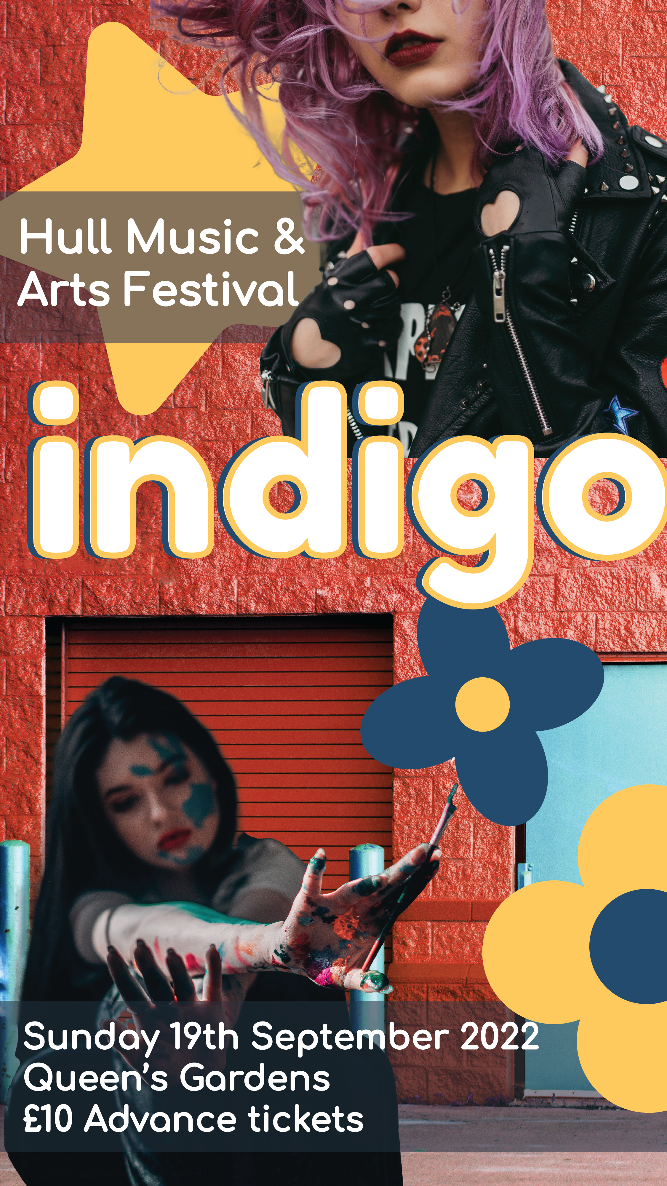
Finally I created the story advertisement. this one I took inspiration from the poster for and tweaked some of the placements to fit the aspect ratio of a Social Media story. Allowing the story advertisements to look similar to the actual posters helps create a connection with the audience as they will see both in different situations and relate them together.
Image References:
Lobanovskaya. A, 2018. Woman Wears Black Leather Zip-up Jacket. [online] Available at: https://www.pexels.com/photo/woman-wears-black-leather-zip-up-jacket-1035685/ [Accessed 25 March 2022].
O’Donnel. E, 2019. Woman Covered In Paint Holding Paint Brush. [online] Available at: https://www.pexels.com/photo/woman-covered-in-paint-holding-paint-brush-3894557/ [Accessed 25 March 2022].
Johnson. S, 2015. Brown Panel Door Near Roll-up Gate. [online] Available at: https://www.pexels.com/photo/brown-panel-door-near-roll-up-gate-845242/ [Accessed 25 March 2022].