Task 1 – Traditional to Digital Animation

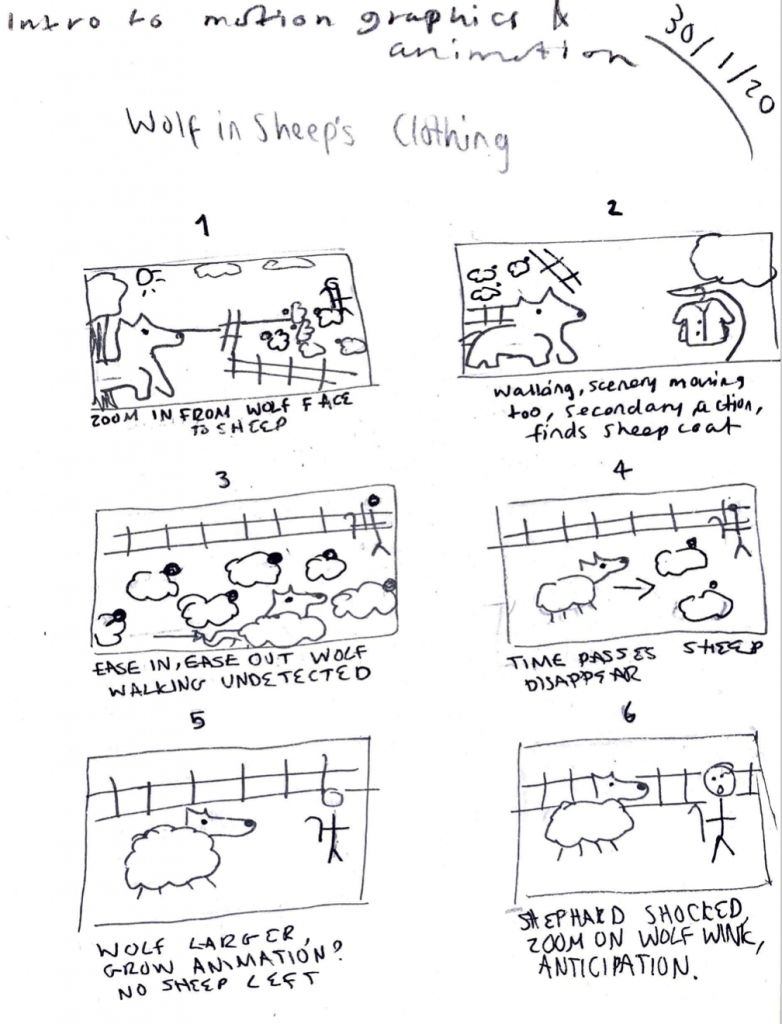
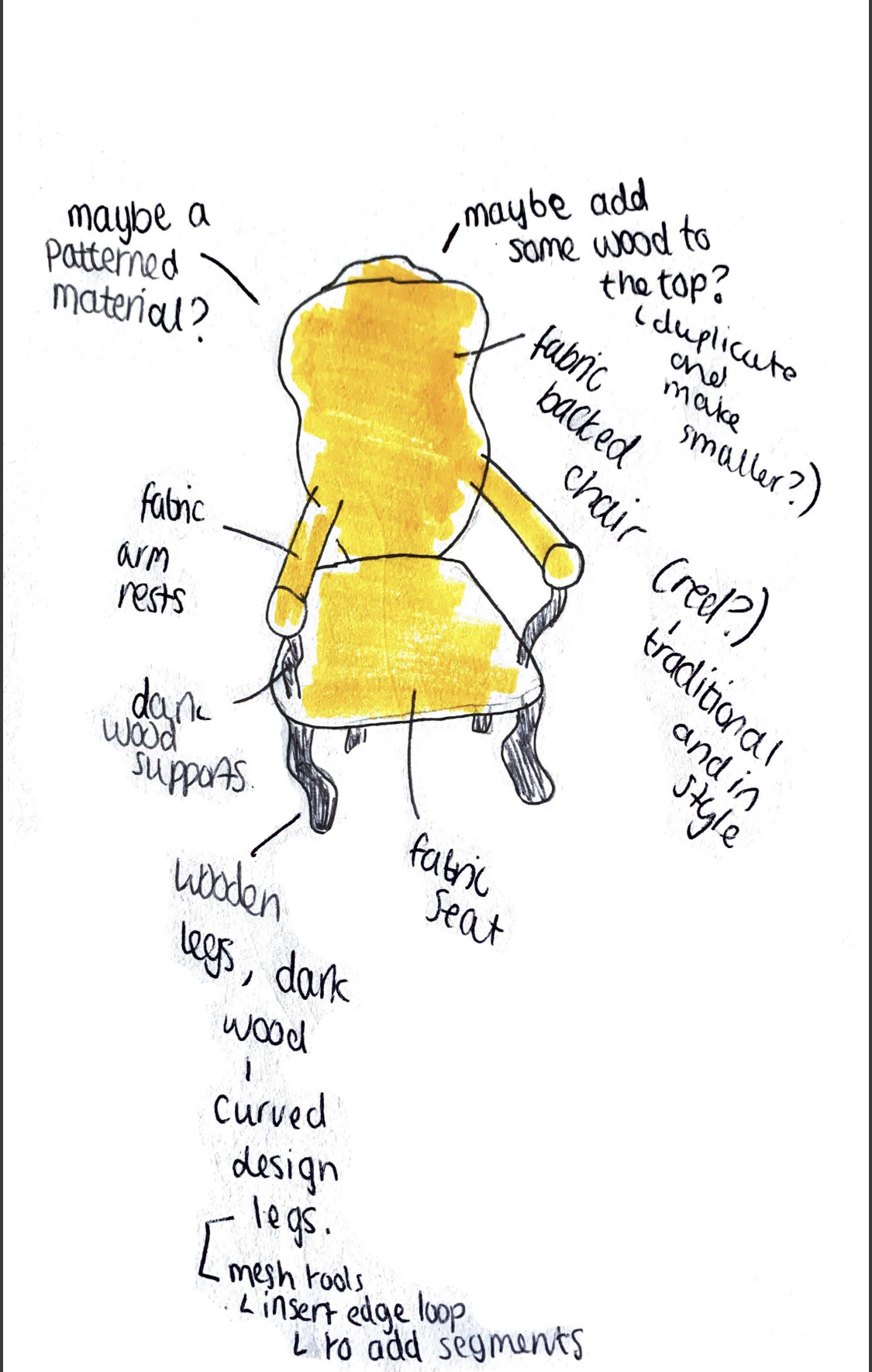
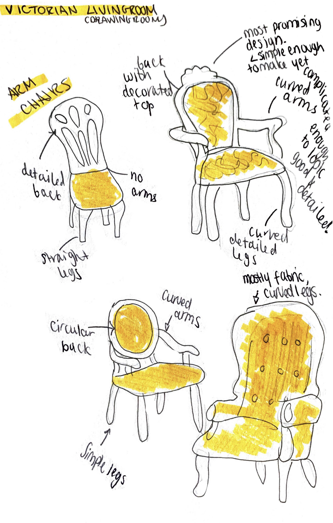
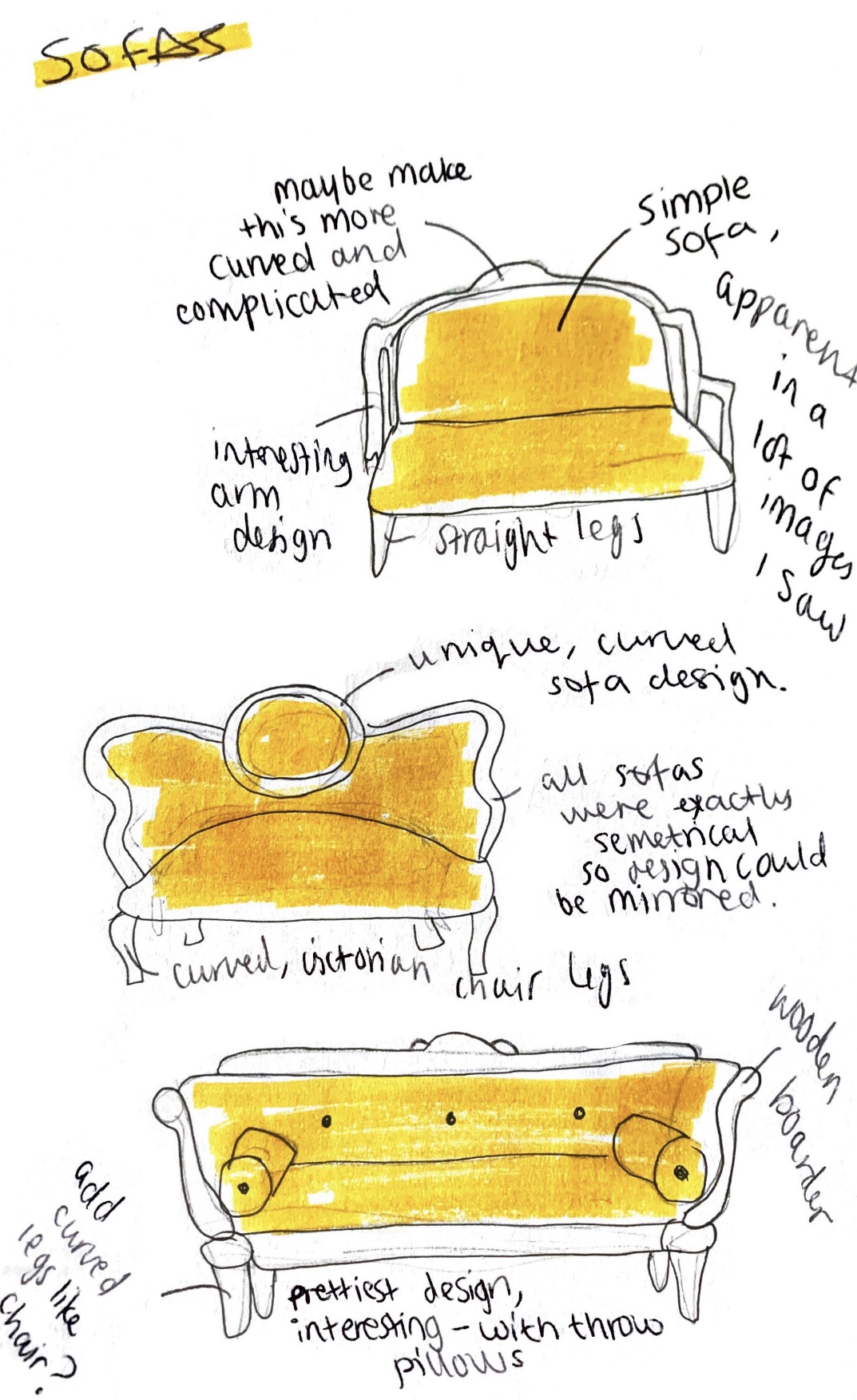
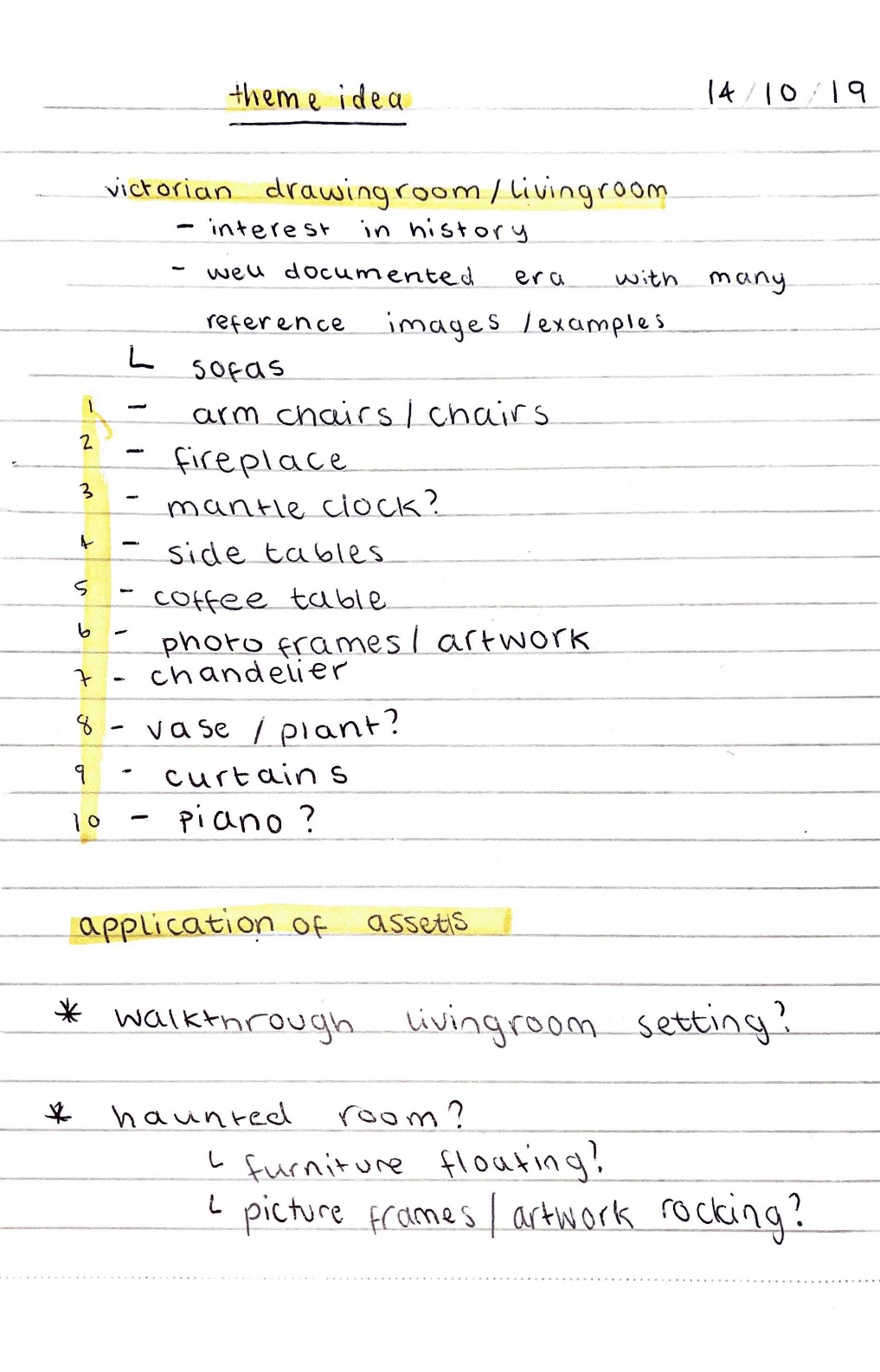
This is the animation of a scene that I created. I produced this in photoshop. I had never really made animations before so I did keep it relatively simple but tried to use some of the principles of animation within my work. The principles that I used in this animation that I made include arcs (how the wolf travels across the screen from right to left) and ease in (how the wolf slowly moves in from the left of the screen at the beginning).

I’d say my animation is closest in style to a cel animation but also could be close to stop motion in a way. I would say this because the background itself is stationary and used within every single frame of the animation and is on a separate layer. The wolf, the clouds and the sheep are then on individual layers placed on top of the scenery This is similar to cel animation as these foreground layers are placed on top of the background layers and are able to be moved separately and are mostly transparent so the underneath layers are not effected by their addition or subtraction. It is however quite similar to stop motion however as not every single frame is redrawn they are simply shifted along as you would move things in stop motion.

I think that this animation, despite the look of it being simple looks okay for a first attempt at a more traditional looking animation technique.

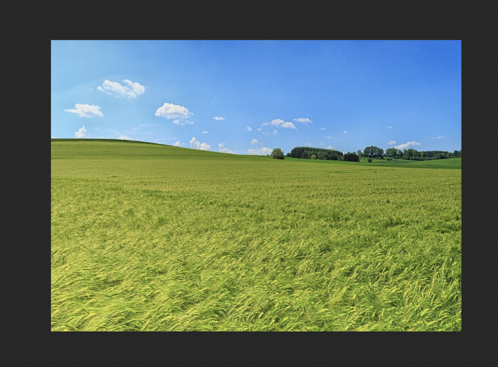
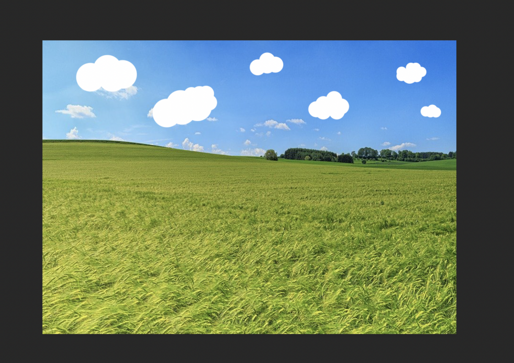
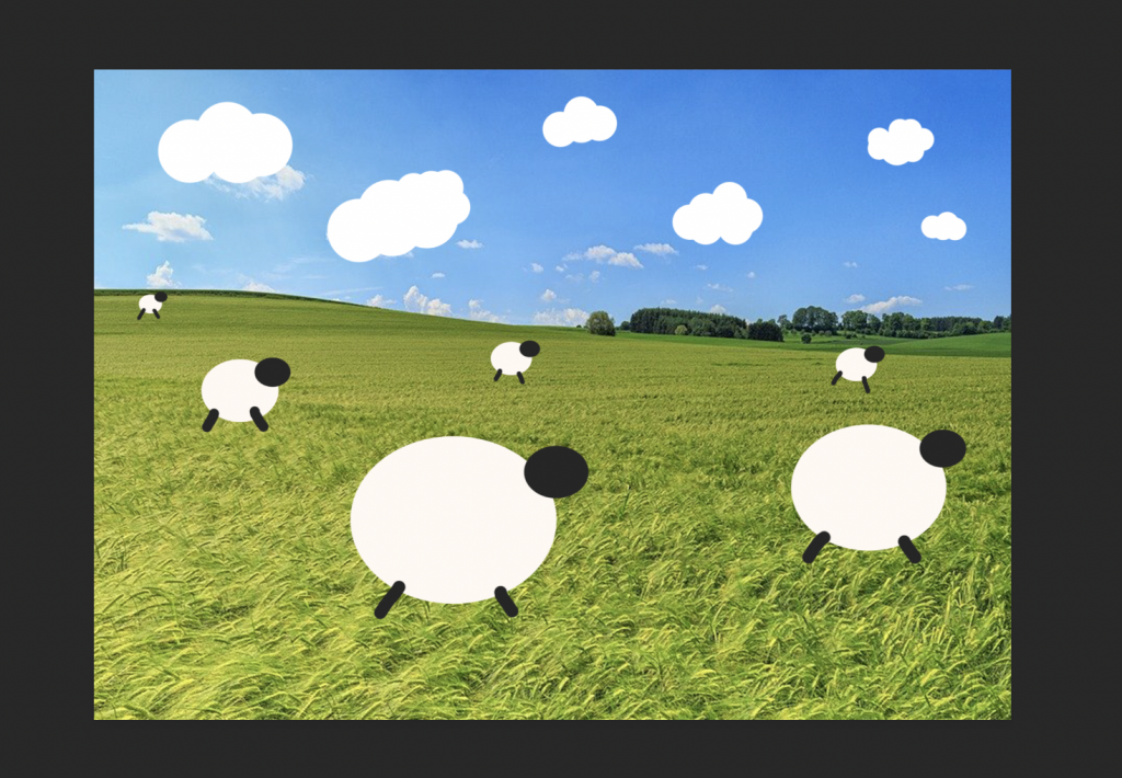
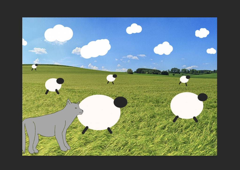
Above are screenshots of how I layered all my pieces together to make the scene. This is how all my layers worked together in photoshop. I created everything on separate layers so I could move things at their own speeds and make things flow how I wanted them too. I wasn’t sure how to make a complicated animation so I wanted to do something simple such as objects just moving across the screen showing some animation principles.

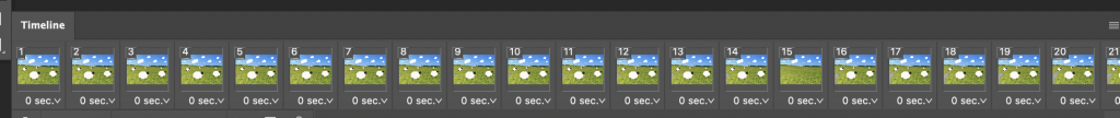
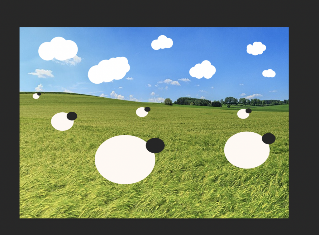
Below is a screenshot of my timeline in photoshop showing some of my frames and how the ones next to each other are quite similar as some objects moved more and some less than others.

Simplifying Spellzone.com

Within a lecture for UI/UX we were given a task to simplify the above site, spellzone.com. The Task was to redesign the introductory screens and the on-boarding section of the website. We were also tasked to use UI Kits and wireframes to achieve this. This was a task meant to get us more used to using XD and to use a UI Kit for the first time. For this task I first visited the Spellzone site, looking at the original site was essential to redesigning it as I wanted to see what had already been done and how I could take a simpler approach to it. I think this was a good task for a lab as it helped me to think more about what I was going to do for my main project and how I was going to approach that. I also got to look more at UI kits and see all of the possible elements that I could use for an app and also how simple it was to put something together.

To redesign spellzone, once I had looked at the original site, I actually went and saved some of the images off this site. I wanted to use existing images in my attempt at a redesign as I felt like it would keep it consistent with the original. I was thinking as I was designing the first 3 screens that I wanted the images to be the background of the site as I felt that it would look good and reduce the amount of useable space, allowing me to simplify the site. I found this quite effective and limited the amount of text and possible buttons on these screens to simplify the process of gaining the relevant information. I decided to focus on the text and what the site does on these first pages as a way of introducing the site to new users. On a full version I would have a log in button in the top right corner for existing users to bypass all of the on-boarding from the site. After these initial explanation screens there a re two routes that a user can take, one to a price list and a payment screen and the other to sign up to a free trial for the site. I felt these were 2 of the obvious paths for the site to take after the initial information and it was enough time for the user to get to know the site, what it does and chose the next steps.

I think that creating this simplified version of spellzone was a really useful task to do and it helped me to think more about all of the screens and steps involved in creating a website or app. As I was making this I kept thinking of more and more screens that I wanted to produce and just how many are required to get the points and parts across that I wanted to. Redesigning the on-boarding of spellzone I wasn’t sure when to stop as I kept wanting to make more pages and really visualise the site as a whole. There are many steps and screens that you don’t really consider till you make something yourself and this was really useful to my final assignment.

UI/UX Articles from Medium.com

The first article I read was titled ‘The Evolution of UI/UX Designers Into Product Designers’. This article talks about how design has become the most important feature of creating a great product and how the term product has changed to be used in relation to digital products as well as physical products. The article then goes on to talk about the definitions of UI (how the product looks) and UX (how the product feels) . Then it talks about the term product designer, this paragraph goes into how a product designer is involved with the creation of the look and feel of a whole product and combines the design of UI and UX together. Many product designers think of themselves as ‘designers who design experiences’. The article also talks about how the term ‘product designer’ is used differently within companies however the general definition is a person who works to hit a user’s needs. This article was useful to read as it showed me more about the history of this industry and about terms used and how this relates to the current uses. It was really interesting to read about how design has become such an important feature in creating products.

The next article I looked at was called ‘UI/UX Design Trends for 2020’ . This article contains 20 predicted design trends for design within the coming year. The ones that stood out to me the most were ‘asymmetry & split screen’ . This part of the article talks about how with a lot of wide screen desktop displays in use the idea of blocks and split screens is a good use of space and helps combat things being too minimal. It also talks about how asymmetry, although not mainstream, can be visually appealing. Another section talked about ‘low-key gradients’. It talks about how less is more in modern design and subtlety in colours adds to the simplification of design. Softer gradients are predicted to be more popular as despite adding colour they still make things look less harsh. Another expected design trend is ‘harmonious colours’. This is talking about how colour palettes are expected to be more natural and toned down compared to previous years. It also talks about how that doesn’t mean that all colours should be the same palette just more uniform and less bold. It also suggests how a bright, sudden out of place colour within this harmonious scheme could help express meaning better within a design as it would stand out. This article was really interesting as a lot of the trends happened to be things that I was noticing in designs in my own time and aesthetics that i really liked. There were some trends that I did not know about that were really nice and things that I will further look into in my own time. The colour scheme trends are really interesting and cool to see evolve,I really like the idea of a harmonious colour scheme with one standout colour and may carry this forward into my design of the iHull app as it may help get important information across effectively to the users.

Aesop’s Fable Storyboard

For this exercise I decided to chose a fable that I already knew to make the process of creating a storyboard easier. I first went onto the website we were provided with with the fables on and selected ‘The Wolf in Sheep’s Clothing’ as my story. I then refreshed my memory and re read this fable. Once I had re read this I then took the key points and sketched up the storyboard below of the key events. I tried to add some short scene explanation underneath each one and to kind of list what my plan with that scene would be. I think this was a useful exercise as it helped me to think more about the 12 principles of animation and how I could use these in work that I produce.

Reference List #20

[1] Brights of Nettlebed, Early Victorian sofa in Gainsborough Chatsworth fabric. (2019)Available online: https://www.brightsofnettlebed.co.uk/early-victorian-sofa-in-gainsborough-fabric/reproduction-furniture/6704 [Accessed 23/12/19]

[2] Laurel Crown, Victorian Camelback Sofa. (2019) Available online: https://www.laurelcrown.com/victorian-campaign-three-seater-sofa [Accessed 23/12/19]

[3] Nadeau’s Auction Gallery (Live Auctioneers), Elijah Galusha Rosewood Victorian Armchair, New York. (2019) Available online: https://www.liveauctioneers.com/en-gb/item/68363959_elijah-galusha-rosewood-victorian-armchair-new-york [Accessed 23/12/19]

[4] Nimbus Antiques (Antiques Atlas), Victorian Armchair – Mahogany Armchair. (2019) Available online: https://www.antiques-atlas.com/antique/victorian_armchair_-_mahogany_armchair/as006a2718 [Accessed 23/12/19]

[5] Pamono, Victorian Inlaid Burr Walnut Side Table, 1850s. (2019) Available online: https://www.pamono.co.uk/victorian-inlaid-burr-walnut-side-table-1850s [Accessed 24/12/19]

[6] Pamono, Victorian Style Burr Walnut Coffee Table 1950s. (2019) Available online: https://www.pamono.co.uk/victorian-style-burr-walnut-coffee-table-1950s [Accessed 24/12/19]

[7] Victorian Fireplace Store, GAL013 – Sovereign Cast Iron Insert Fireplace (37″) (Black/Full Polish). (2019) Available online: https://victorianfireplacestore.co.uk/product/sovereign-cast-iron-insert/ [Accessed 24/12/19]

Sketches #19

Below are the last 2 assets that I made sketches for. As I said I only felt like I needed to make sketches for assets that I was unsure about or that were more complicated. For example the vase that I wanted to create wasn’t a complicated asset but I wanted to sketch this one out to pick the kind of style that I wanted to make as there are many different types of vases that come to mind when I was thinking about this asset. I sketched out some different vases for this with different textures in mind. I ended up going for a marble design which was very simple and would look nice on a side table. I sketched out some taller ones or ones with alternating textures but I felt that a marble vase would look the best and also match the fireplace I was planning on creating.

The fireplace was one I also wanted to sketch out but because I wanted to sketch out some different widths to visualise how this would look. I drew a wider one and a narrower one as when looking for reference pictures I noticed this trend. I felt like these sketches were quite helpful to visualise how the fireplace I wanted to make looked and to chose which one I preferred. I ended up going with a wider fireplace rather than a tall skinny one as I felt that it would look better in the room and more proportional as I wasn’t planning on having high ceilings. I had planned on having wood textures or a dark wood look when I was making my sketches but when i was creating the asset itself I felt it would be better to have a plain brown material on the main body of the fireplace so that it didn’t clash with the marble and also so that it didn’t look like too much wood with everything else in the scene I was making.

Sketches #18

Above are some of the side table designs I was considering creating. i came up with pretty varied designs for this asset as I wasn’t sure how I wanted it to look. I drew some designs with one central leg and some with 4 legs as I felt these were all signature vintage designs. The 3 designs I drew on the right were the ones I created first in my sketchbook. At one point I was really leaning towards creating the bottom design on that page as I felt it looked really cool, however I wasn’t sure I’d be able to execute such a design so I created a more simple design as seen on the left. I ended up going with the design on the left as in the lectures we learned about using the revolve tool and I thought that this would be a perfect opportunity to use this.

Below are the three coffee table designs that I came up with. They are actually pretty similar in design as I was struggling with coming up with things that were distinct as I feel like coffee tables are usually pretty similar. The bottom design was a combination of the top 2 that I drew however I didn’t like this very much once I had drawn it as I felt it looked a little strange. The top design is the one that I ended up taking further and making in Maya. I chose this one over the middle one as I thought that it matched best with the side table design that I had chosen to make. I thought by making the designs sort of similar it would be more realistic as people usually buy matching furniture if they can. I felt the coffee table design that I chose would look the best in the scene and after I had created the sketches I proceeded to make it in Maya.

Sketches #17

Above are some of the sketches that I created after some google searching for inspiration. I was searching terms like ‘victorian chair’ and ‘1800’s armchair’ etc, the images I used for reference and inspiration can be seen in the appropriate blogposts. I didn’t create sketches for every asset as some of them were pretty straightforward or simple so I didn’t feel like it was necessary to create them for all. I did however create them for the more complex assets. The page on the right was the first 4 designs I came up with for the chair. I took inspiration from the images I found and made some interesting concepts. Once I had sketched out some in pencil I drew over them with fine liners, added some colour and added some annotations. I always like to annotate my sketches as it helps me solidify the ideas and makes them easier to refer back to. Once I had created these first 4 sketches I made the design on the left, I used the first 4 as inspiration before creating the design I wanted to use. Creating the first 4 and getting some ideas down made it easier to create the one on the left. I felt like this was a strong design and would be perfect to create in maya and it was the one that I ended up doing.

For the sofa I made the three sketches below. I used the images I found on google as inspiration when drawing them to get a more accurate design. With these sketches however I wasn’t sure which one I liked best so I actually decided once I got into maya and started making the sofa itself. I ended up making a variation of the bottom design. I ended up not adding the wooden boarder to the sofa to make it cleaner looking and so it would stand out more against my other assets. I made sure to make my sofa designs symmetrical when trying to come up with a design as then I could mirror the design to make it match up. This meant that it would be easier to create as I could copy paste elements and flip them. I really like how these sketches turned out and I think they were helpful to work off of.

Plans/ Ideas #16

Within this blog post are some of the plans and notes that I had taken down for this project. I liked to write out my ideas and have some to do lists etc of things I wanted to try to create, along with extra ideas. I think this was a useful thing to do to keep me on track with my work and to make sure that I didn’t forget anything. It also helped me to consolidate my ideas and develop them. I knew pretty early on what I wanted my theme to be and the general idea of why and what I wanted to be in it. Below are some scans of pages from my notebook:

Reference Pictures #15

(All pictures used for inspiration and reference in the subsequent blogposts are numbered and referenced in blog post #20)

These two photos above are the ones I used for the two tables I made, my designs ended up looking pretty similar to these photos but more rounded in my opinion. The side table I referenced had the general shape that I wanted my table to have so I used this picture as inspiration, I saw a lot like it when looking online for victorian side tables. My table however I went for a more simple approach using this reference as inspiration, I wanted to do this to match the coffee table that I planned to make. The coffee table above looks quite like mine did, I drew some sketches of ones inspired by this but always fell back to the same sort of design, the simple style shown above. I really liked how this looked as it is simple yet looks period accurate. All the tables I saw were obviously made of wood, I saw none that were painted, so when making my tables I went for a classic wood texture. Using references I think was effective in this case and was something I needed to do as a lot of victorian tables have nice curves and distinct detailing to them.

Above is the fireplace image I used as reference. I saw a lot of wood fireplaces online when i was looking, a lot of them had either tile patterned parts or marble textured pieces, I went for a marble look on my design as I wanted it to match in with the Vase and I wasn’t sure how to get a proper tile pattern onto my asset due to my lack of Maya experience. A lot of fireplaces I looked up were either really skinny or really wide, but then I found this reference picture of a replica victorian fireplace that I felt would look proportional to the room that I wanted to create. I used this as inspiration for my sketches. I did neglect to include the actual fire grate and leave it as an empty chimney in my design however as I was not sure how to go about creating this. It was helpful tho to have a reference image to look back on and my sketches to work off for the designs. I only used references for these 5 assets as I felt they were the only ones I needed a little help making correctly and accurately.