Story Planning & Outline

For my story I wanted to have a basic 3 part story structure using a beginning, middle and end. The beginning of a story usually is where the characters are introduced, the setting and world building is established and the goals for the characters are explained. The middle of a story is usually where something a character has to overcome happens or a conflict is introduced/ the character makes progress towards the goal. Finally the end is usually where the conflict of the story is resolved or the main plot points are wrapped up, though elements can be left untied to add to the idea of an open ending.

With all of this in mind I took my mind map I had made earlier and started to try to combine these elements into an actual story that I could create a webcomic for for the assignment. Below is some notes I created outlining the initial story that I had created and how I wanted it to progress. Writing down all my ideas for the story really helped me decide on the elements and see that I could fit them together into an interesting and cohesive dual perspective narrative.


Story Outline Creation

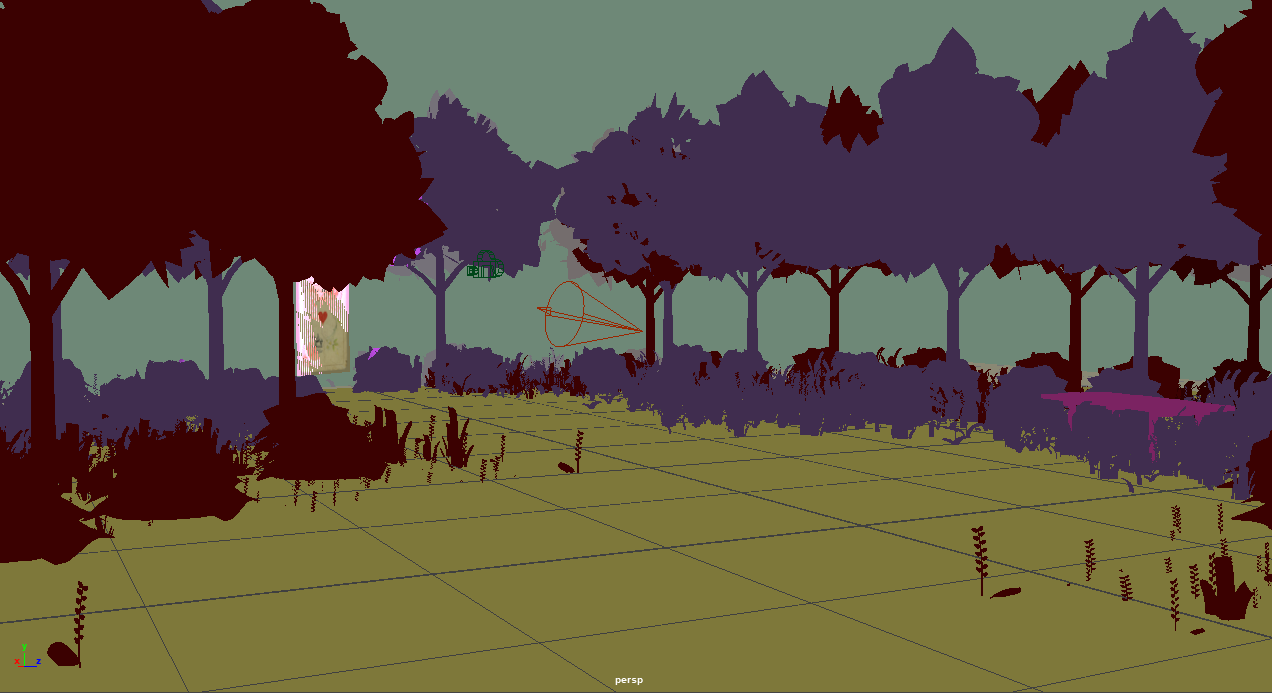
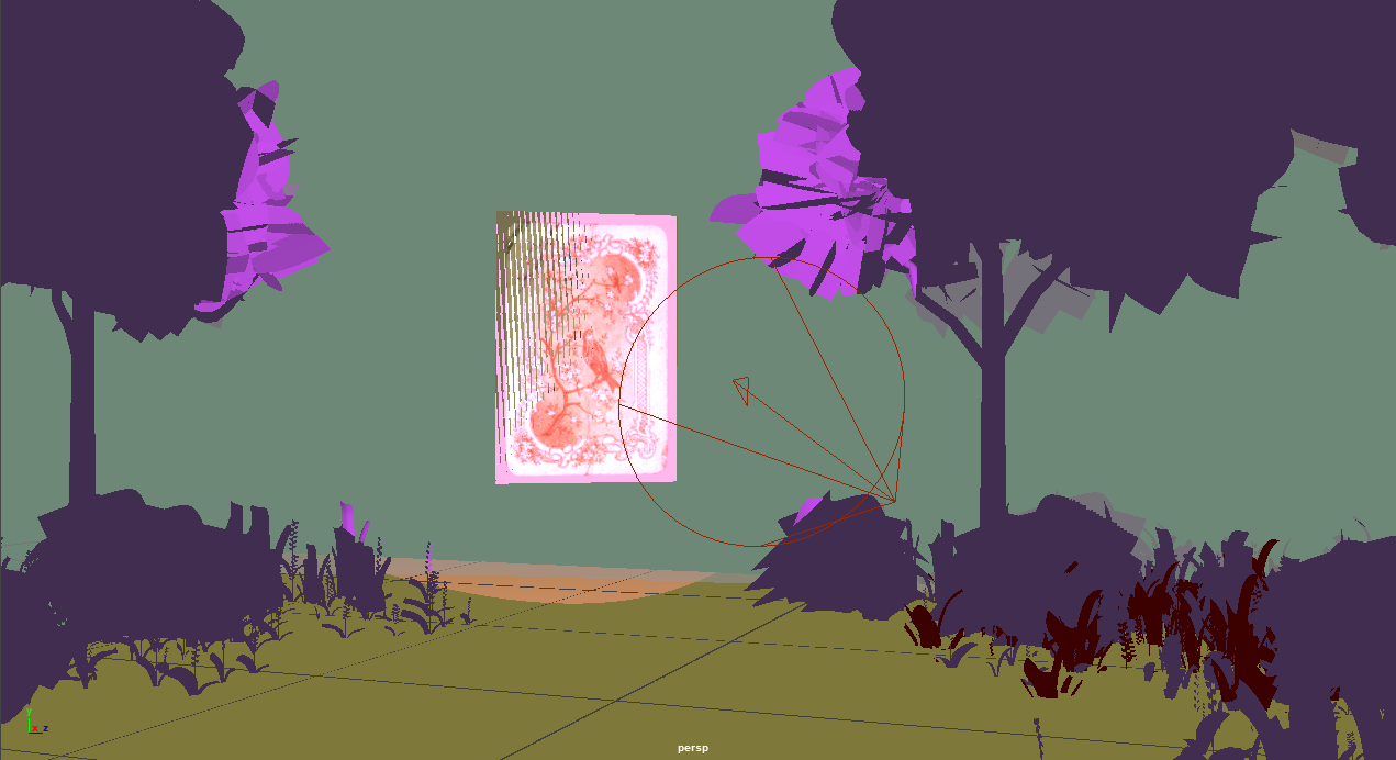
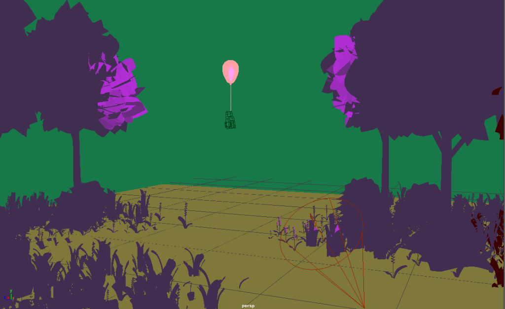
Once I had a written summary of my story using the mindmap I initially made, I had a really strong idea of what my idea was going to become and how I was going to turn it into a webcomic. I started by definitively mapping out the beginning, middle and end of my story into a proper outline. I started with my beginning section and created a part of the mindmap. I added a point for myself to each branch of the map to remind myself of the goals I wanted each part of the story to fulfil. The beginning part of the story would contain the bulk of the exposition and establish the plot and setting within the world by having a sort of omniscient mysterious narrator to the story. This invisible narrator would be telling the important information and key points to the audience that I feel either can’t be achieved using the visual medium efficiently or could not be told in a concise manner in any other way. The beginning of the story would also introduce the two point of view’s from the two main characters, the story will show each part of the journey from each girls point of view.

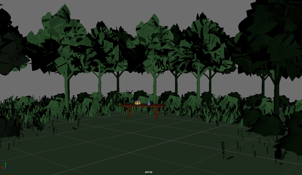
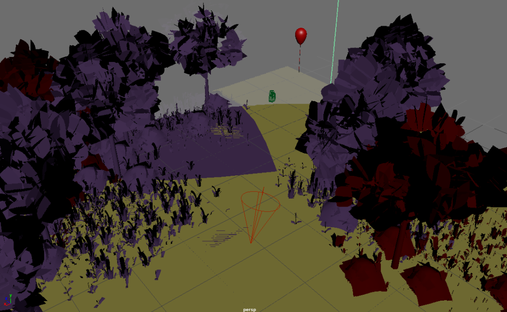
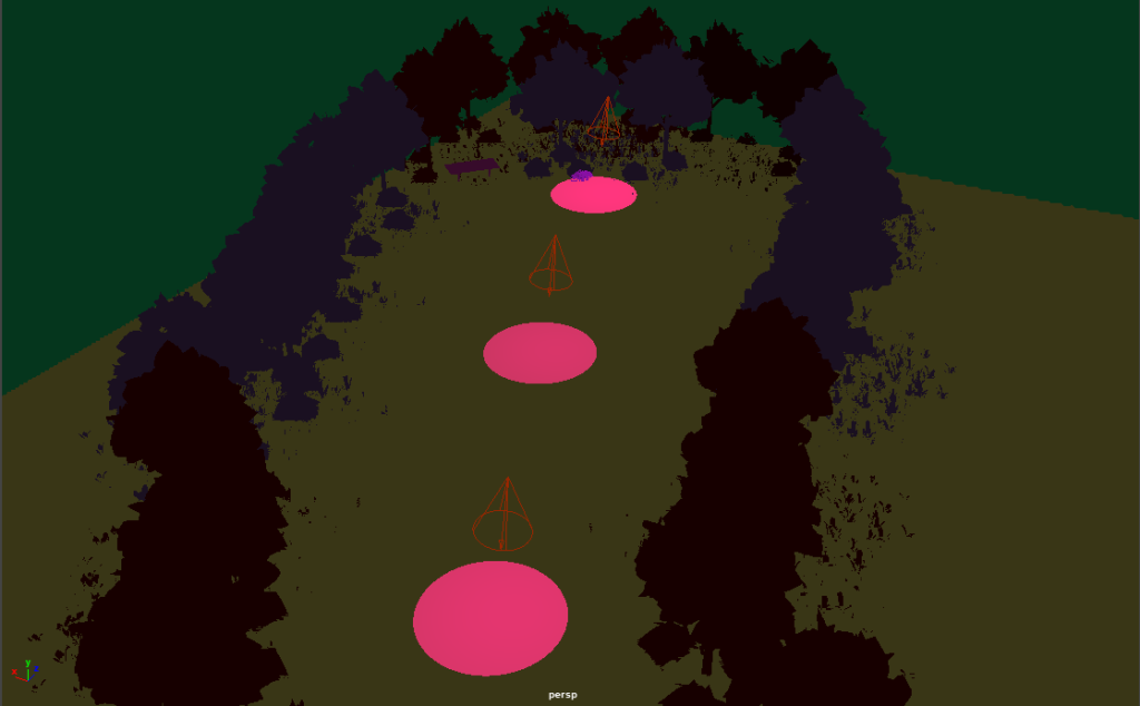
The middle of the story will be dedicated to the two hero’s journeys to the goal and the challenges that they have to overcome within this section of the narrative. They both will have to journey to the location of the sword within this arc and will have a minor task that they have to get past. One of these characters tasks will be being caught in deadly ivy and having to find a way out and the other character will have to cross a ruined bridge as their challenge. These parts of the story offer a roadblock in the journey which must be overcome by the protagonist and offer character development in the form of them becoming stronger by overcoming these tasks placed in front of them that hinder their journey progression before they are solved.

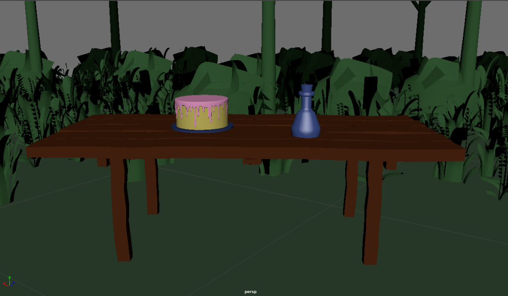
The final part of the narrative is where the two halves of the story as told by the 2 main character’s points of view are converged into one narrative. Each of the hero’s will finally reach the place that the magical sword is housed, within a ruin, and being in the same place their stories will naturally converge. They will both discover each others presence once they reach for the sword. This will imply the end of the journey as they have discovered the sword but also signify the start of a new journey together, in an open ended conclusion as they touch hands. It is implied with character narration that the omniscient narrator all along was one of these two main characters and that they know how the future of the story will turn out, with love and loss and war. This is an interesting twist to find out that the narration the whole time was one of the characters telling the story of the journey from both points of view, their own and their lovers.

Initial Research & Idea Creation

Idea Generation

To start this project I first decided to create a mindmap with a bunch of key elements of stories and ideas that I had for what to create for the assignment. This mindmap can be seen below. I wanted to do this first to explore a range of settings, genres, tones and general story ideas that I had come up with whilst thinking about this assignment. Looking through all of these elements allowed me to see what my options were and combine the elements that I enjoyed best to create a story outline that I would most enjoy. Within this mindmap I highlighted the elements I liked most in yellow and started to create my story from these points. This was a really useful exercise as it allowed me to just throw any ideas for each part of the idea (medium/format, setting, genre etc..) into a document without worrying about if these elements worked together or tied together well as this could be selected later on.


Mood Board

Once I had my main elements of the story chosen, I set out to create a mood board. I chose Pinterest to be the medium to create this with. The board I created added elements from each of the points I highlighted on the mindmap and allowed me to visualise the atmosphere and style I wanted to go for for the assignment itself. I decided to look for a lot of inspiration images for a fantasy and medieval setting to really help me visualise how the story would take place and be executed. I also looked at general images that could be inspiration for my 2 main characters and found that I was drawn to the styles and aesthetics I was finding to use in my work. I think this helped me with starting to come up with the designs of the characters within my mind and think more about who they are as people and what they look like within a world such as the content in my mood board.

Pinterest, 2022. Digital Storytelling. [online] Available at: https://www.pinterest.co.uk/victorialouuu/digital-storytelling/. [Accessed 04/03/22]

What Is A Webcomic

As I chose webcomic as my format in which to tell my story I felt that it was important to do a small bit of research into what a webcomic really is and how it differs from traditional print media.

A webcomic is an alternative way to create and publish a comic. It is done in a digital format and usually published on a website or app for other people to consume. As it is not print media there are far fewer restrictions in what the comic has to be, allowing for people to be more creative and experimental with their art styles and subject matter. There is in my opinion a relatively low barrier of entry to webcomics compared to traditional comics as anyone could start to draw and upload any webcomics they make and inevitably find a niche audience who enjoys their work. As these comics are not handled by a publisher there is a lot more freedom to write and draw whatever the artist wants without restriction allowing it to be preferable and somewhat superior to traditional routes. These webcomics can take the form of all kinds of format, being a normal comic strip format, more traditional pages or the long form scrolling images seen in many popular webcomics.

YALSA, 2019. What the Dang Heck Is a Webcomic?? [online] Available at: http://www.yalsa.ala.org/thehub/2019/11/25/what-the-dang-heck-is-a-webcomic-2/ [Accessed 07/03/22]

Grifka. M. (The Chicago School of Media Theory) , 2022. webcomic. [online] Available at: https://lucian.uchicago.edu/blogs/mediatheory/keywords/webcomic/ [Accessed 07/03/22]


Fantasy Genre Research

Fantasy is a genre within the speculative fiction umbrella term. Speculative fiction encompasses stories with elements from fantasy, horror and science fiction, essentially meaning anything that isn’t real world (though there is some overlap). Fantasy as a genre usually has the stories set in lower evolved societies, such as placing the story in a historical or medieval setting, and usually features a magical element to it. Often times fantasy can take inspiration from fairytales, mythology and folklore for its world rules and magical parts and usually involves characters from fictional races as a consistent part of the world. These include things such as trolls, elves, dwarves, dragons and other magical creatures. Fantasy is inherently not a realistic genre so authors are free to play with any elements and world building that they want to create a unique and magical world with rules of their own creation.

The genre of fantasy, and overlapping sub genres within speculative fiction, are something that I have always been interested in and are a genre I consume the most content from overall. I personally really like the escapism that fantasy offers, allowing the reader to be transported to an entirely different world. A lot of big fantasy tropes such as a medieval setting, a magic system and mythical creatures are staples of the genre and can be seen as the defining characteristics. I really wanted to place my story in the fantasy genre as it would allow me to get creative with story elements and have a lot of fun with my illustrations and environments for my webcomic. As I have said above in my planning, I am interested in putting my story within a medieval type society as I think it will add a fantastical vibe to the story inherently and the addition of elves and a magical sword will really tie it into the fantasy genre and make it truly recognisable.

Masterclass, 2021. What Is the Fantasy Genre? History of Fantasy and Subgenres and Types of Fantasy in Literature. [online] Available at: https://www.masterclass.com/articles/what-is-the-fantasy-genre-history-of-fantasy-and-subgenres-and-types-of-fantasy-in-literature#how-did-fantasy-originate-as-a-genre [Accessed 10/03/22]

Carmody. A, 2022. What is the Fantasy Genre? – Definition & Examples. [online] Available at: https://fantasybookfanatic.com/what-is-the-fantasy-genre-definition-examples/ [Accessed 10/03/22]

Graphics / Stickers

Within this post is some assets that I have created using Adobe Illustrator. These assets are small decorative pieces that I can incorporate into my collage designs to add some unique style to them and also add something to link all of the designs together more solidly. Using a set of graphic vectors within each piece allows for a more uniform look between the marketing materials for the festival and allows some consistent colours to be used within the pieces.

To create these assets I first placed my colour palette, I created this whilst deciding on fonts, into an illustrator document so that I had some set colours to work with for my designs. I looked through my research and example collages that I worked on in the last assignment and made a list of the basic graphics that I wanted to create. I started with the easy ones such as the flowers and the smiley faces. I used the pathfinder tools to combine existing shapes to create the floral shapes etc. I used this technique for the cloud and heart as well combining ovals, circles and triangles to get the general shapes. Then I refined the shapes using smooth tools to make sure each graphic was smooth and pixel perfect. The rainbows required semi circle shapes and the pathfinder tool to minus different elements of the shapes and merge them together. I tried different colours from the palette on the graphics that I made as I wanted to see what worked and I think this helped me to solidify my bright colour palette as it adds a fun element to the graphics and I think it will add a lot to the collages that I am going to create. Creating these graphics in advance means that I can use them as part of my style and not have to re create vectors each time as they will be consistent within each piece of media.

Font Experimentation

Even though I had the fonts for my project chosen, I wanted to try something a bit different just to see where this would take me. I used the font Krona One for this font experiment on my poster and took my initial design and applied this font to it in a different way. All of my previous font choices were very round and soft looking and fit with my theme really well, but I wanted to try this font as it is more square and sharp than my previous choices so very opposite.

I decided that as I was making an experimentation piece for one of my posters I decided to do something really different with the text placement. I took the title of the festival and split it into two lines, calling back to the origin of the festival name being a combination of indie and go, and made the font large and take up a large portion of the design. I chose a stark white colour for all of the text with no stroke or background grounding shapes as I felt the contrast between my rounded soft shapes and the sharp rectangular letters was enough of a contrast to make the text distinct and legible. I used the same font for the sub text on the poster and left the positioning pretty similar to my original designs. I moved some of the image elements around and placed the smiley face stickers behind the letters to add some interest and something different to the design.

After doing this I think I made quite an interesting outcome. I like the boldness of the font and how it looks but I think it doesn’t actually fit very well with my overall themes and the styles I want to include in my posters .The font leaves the image very open and clean looking and quite empty compared to the layered collage style I am going for overall. However I think this was a useful exercise for me to partake in as it allowed me to see a different way my designs could have gone and solidifies my choice for a softer font as I have seen the alternative.

Font Choices & Text

To find fonts that I wanted to use for my project I started by navigating to Google Fonts. I decided that this would be the best place to get high quality free fonts that I could use in a commercial setting. I started by looking through all of the sans serif fonts as I knew I wanted my designs to have clear text that was modern and stood out against the collage background of the content. I found the below 6 fonts that I really liked the look of and set to creating some design sheets to look at my options and how they would work with the text I wanted to incorporate into what I am creating. I took these fonts that I chose and applied the colours from my colour palette onto them to see how they would look within the scheme that I created.

I tried to get a range of fonts to see how different styles would look and play with the boldness and italics of the text. I liked how the Comfortaa font looked as it was very smooth and round and quite modern, whilst also having a sort of vintage feel to it with the round lines of the text and felt this one would be the best for any body text on the designs. I also really liked the Fredoka One font that I found as a title text as it felt really bold and like it would stand out well against any collage backgrounds within my designs. I did like the font Modak a lot for the Indigo title text but I felt it was a bit too complex and would distract from the designs that I was creating too much so I decided that I would go with the Fredoka One font.

For the Indigo font I decided that even though the Fredoka One font was the best I was going to play with the stroke and colour to make it look a bit more interesting within the designs. I did this by layering 2 copies of the text over each other and adding a stroke to both of them. This allowed me to add an almost 3D look to the text and make it look more complex and use more colours on it. I decided that white text would be the best for the project to make it bold and stand out, for the body and the title text, and that the stroke colour of the title was the best way to play with colours and incorporate it into the design and make it feel personal to that specific poster.

Image References for Collages

Adesina. D, 2018. Woman in Yellow Coat With Black Crossbody Bag Closing Her Eyes. [online] Available at: https://www.pexels.com/photo/woman-in-yellow-coat-with-black-crossbody-bag-closing-her-eyes-833052/ [Accessed 8 April 2022].

Fotios. L, 2020. Collection of old instant photos with trips. [online] Available at: https://www.pexels.com/photo/collection-of-old-instant-photos-with-trips-5653734/ [Accessed 18 March 2022].

Johnson. S, 2015. Brown Panel Door Near Roll-up Gate. [online] Available at: https://www.pexels.com/photo/brown-panel-door-near-roll-up-gate-845242/ [Accessed 25 March 2022].

Lobanovskaya. A, 2018. Woman Wears Black Leather Zip-up Jacket. [online] Available at: https://www.pexels.com/photo/woman-wears-black-leather-zip-up-jacket-1035685/ [Accessed 25 March 2022].

O’Donnel. E, 2019. Woman Covered In Paint Holding Paint Brush. [online] Available at: https://www.pexels.com/photo/woman-covered-in-paint-holding-paint-brush-3894557/ [Accessed 25 March 2022].

Quintero. L, 2019. Black and Gray Telephone Booth. [online] Available at: https://www.pexels.com/photo/black-and-gray-telephone-booth-2111759/ [Accessed 18 March 2022].

uncoveredlens, 2019. Photo Of Man Bringing Radio. [online] Available at: https://www.pexels.com/photo/photo-of-man-bringing-radio-3620411/ [Accessed 9 April 2022].


Development Approaches

To begin my scene creation I first took all of the models I gathered from Sketchfab into Maya. I started by adding a cube to the scene to create the perimeter and the floor for the scene. I then added the items I collected into the file and started to duplicate the trees to make a path and suggest the presence of a forest. I then added the table and the bottle/cake. I had to edit the cake to be more simplistic to fit the rest of the scene and how I wanted to look. Once I had all of the pieces in place I then added textures to them. I opted for simplistic textures within my piece as I liked the style it gave my piece and made it also a lot easier to change them between scenes for different effects. I then added a simple sky dome light to the scene to add lighting. After I had the basis of the scene all set up I got to work creating the camera. I would be having my scenes follow simple paths through the worlds so I set the camera going through the clearing within the 30 second scene. As I had planned to have my world I created loop through the scenes with different routes this meant that once scene 1 was made the rest of the modelling was relatively easy to complete as all the assets were already present.

For scene 2 I first began by copying my first file and removing the textures from the assets. Once I had done this I was able to move the pieces around as I needed for scene 2. I was following my storyboard for a lot of this but wanted to create the forests as I went to have them have a more natural and organic look to them. Once I had the path to the left planned out I then added in a new item, the card that I also collected off Sketchfab. After everything was in place within the scene I added the textures which can be seen in scene 2 and changed up the colours to be something more strange and unusual. After this I added a sky dome light and an Arnold spotlight ,which I set to a bright pink colour to draw user attention. Scene 2 was also the first scene that I added more animation to, I added some keyframes to the card in the scene to make it look like it was magically floating up and down. I then finally added the camera going a similar path to scene 1 but skewed to the left and the scene was complete and ready to render.

To create scene 3 I followed a similar pattern to the creation of scene 2. I knew the textures and colours within this scene had to be the same as scene 2 so I began by duplicating this file to have the objects already set up with the desired textures. From here I then assembled the scene with the path to the right and added a new object, the balloon, to the end of the new path. I then added some animations to this object to make the balloon appear as if it was floating as the user approached. This item was also lit with a pink spotlight to draw the users eye and attention to the area of the scene they are being walked to, which is the newly created path in the scene to the right.

The final scene was a bit different than the last 2 as it involved more lights within the scene and a darker atmosphere. I wanted it to feel like the user’s final chance to pick a route, the central one. I added some intense spotlights though the dark scene to be a guide of the direction and I think its really atmospheric. Once I had this scene created I rendered each 600 frame scene individually at 1080p quality and then assembled them together in premiere pro to create my video. I then took this video, added the fade to white/black transitions to the appropriate areas between scenes and finally added my chosen soundtrack to the completed video. Once I had done the simple assembly process I uploaded the scene to YouTube and checked through it to make sure it was all correct with no issues. I did not have really any technical issues within this project and was able to complete the video smoothly and think my concept worked out ideally. Some elements from my storyboard I did not add as I didn’t want to overwhelm the scene (such as the orb of light guiding the user and instead opted for interesting coloured lights as a guide on where to look) but I think the final outcome is still true to the original idea I had and that I executed it to the best of my ability.

Model & Audio References

Models:

Aurora., 2020. Trees and foliage [online]. Available at: https://sketchfab.com/3d-models/trees-and-foliage-c3423a86515444a2b323d422ac16e710 [Accessed 1 Dec 2021].

Jochon., 2016. Table [online]. Available at: https://sketchfab.com/3d-models/table-08b62c750b414ea3b7fb6e2979ebb676 [Accessed 1 Dec 2021].

Sakthivel G., 2021. Birthday Cake [online]. Available at: https://sketchfab.com/3d-models/birthday-cake-29eb6a4e7bf8403fb05cc2495bfc2dd9 [Accessed 1 Dec 2021].

berzerkey., 2020. Stupid Simple Health Potion Bottle [online]. Available at: https://sketchfab.com/3d-models/stupid-simple-health-potion-bottle-24142fd436804991905b9b4788dc62bf [Accessed 1 Dec 2021].

Flynn, T., 2020. gezinkte Spielkarte KM-O.811 [online]. Available at: https://sketchfab.com/3d-models/gezinkte-spielkarte-km-o811-986967509d8d4774b87c6f4acc53a5ab#download [Accessed 1 Dec 2021].


Audio:

The Mind Orchestra., 2021. Bruwynn [online]. Available at: https://freemusicarchive.org/music/The_Mind_Orchestra/The_Mind_Orchestra_-_Singles_1084/bruwynn [Accessed 29 Dec 2021].